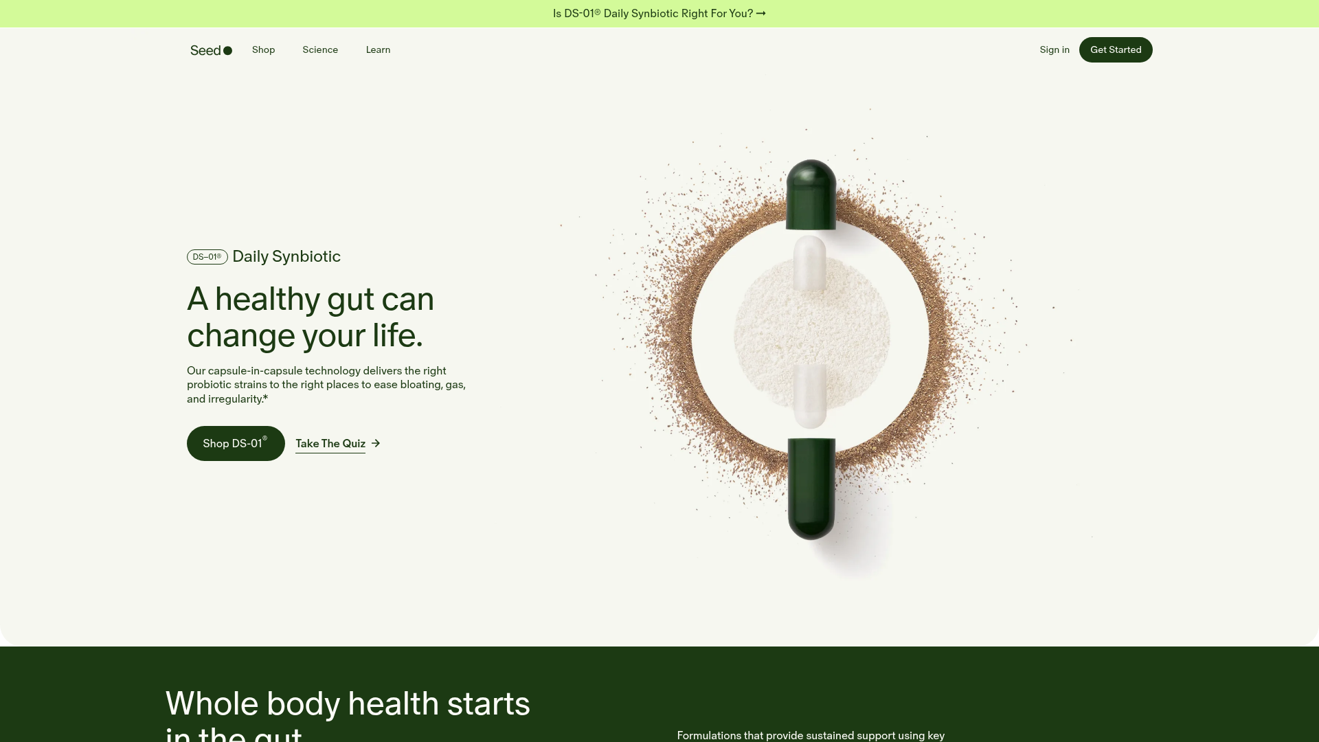
Seed Health Landing Page
An elegant wellness landing page featuring a full-viewport parallax hero, vertical swiper transitions, an interactive product carousel, and a custom video gallery for customer stories.
Overview
This landing page for Seed Health is a masterclass in high-end wellness e-commerce design, blending scientific authority with a minimalist, luxury aesthetic. It features a sophisticated layout that uses ample whitespace, high-fidelity 3D product renders, and specialized video components to build trust and educate the consumer on complex biological products.
Design System
- Color Palette & Visual Hierarchy: The site uses a high-contrast "Naturalist" palette. The background is a soft eggshell/off-white (
#fcfcf9), complemented by a deep "Seed Green" (#1a3c1e) for primary text and call-to-action buttons. Accents include a vibrant lime green for promo bars and "Bundle" labels to draw immediate attention. - Typography: The system utilizes a clean Sans-Serif font with tight letter spacing for headings and a slightly more generous line height for body text (
lineheight="8px"on spans). Hierarchy is established through weight shifts (350 for identifiers, bold for headlines) rather than extreme size differences. - Page Structure:
- Parallax Hero: A full-viewport section with a capsule-in-capsule visual that responds to scroll or swiper transitions.
- Horizontal Product Carousel: A dark-themed section featuring autoplaying video loops of products on floating cards.
- Interactive Visuals: A technical deep-dive section (ViaCap®) using fixed-position text against a dynamic product backdrop.
- Social Proof: A custom video gallery (Mux Player integration) for customer stories and testimonials.
- Reusable Components:
- The "Pill" Button: Dark green rounded buttons with white text, featuring a subtle horizontal slide transition on hover.
- Video Cards: Product cards that replace static images with a
muted playsinline loopvideo, which is a highly effective way to demonstrate packaging quality. - Vertical Swiper: The hero uses a
swiper-verticalclass to transition between core value propositions while maintaining visual continuity.
- Interaction & Motion: The site relies heavily on parallax effects. Images and text containers move at different speeds (
data-swiper-parallax="5%") during scroll. The product carousel uses a custom "grab" cursor transition, indicating a tactile, non-linear browsing experience. - Technical Clues: Built on Next.js with styled-components (noted by
sc-class prefixes). Media is handled via Cloudinary and Mux for optimized, performant video delivery.
Use Cases
- Who should clone this: Brands in biotech, high-end supplements, skincare, or technical consumer electronics that need to explain the "how" behind a premium price point.
- Effective Remixes: Adapt the Video Carousel for a fashion brand to show garment movement, or the Technical Deep-Dive section for a SaaS product to explain a complex software architecture.
- Remix Directions: Swap the organic green palette for high-tech blues (AI/SaaS) or vibrant pastels (Beauty). The information architecture (Problem -> Solution -> Mechanics -> Proof) is universal for conversion-focused landing pages.
- Clone Scope: A full-page clone is best for those wanting to replicate the parallax scrolling experience. Alternatively, the Product Carousel or the Video Testimonial Grid are highly portable sections that can be added to any existing e-commerce site to increase dwell time.
Related Inspirations
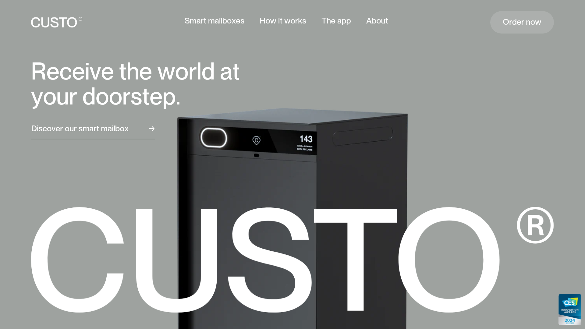
Custo Smart Mailbox Landing Page
A minimalist hardware product landing page featuring a parallax hero section, sticky step-by-step app feature descriptions, and a sophisticated grayscale aesthetic with integrated product sliders.
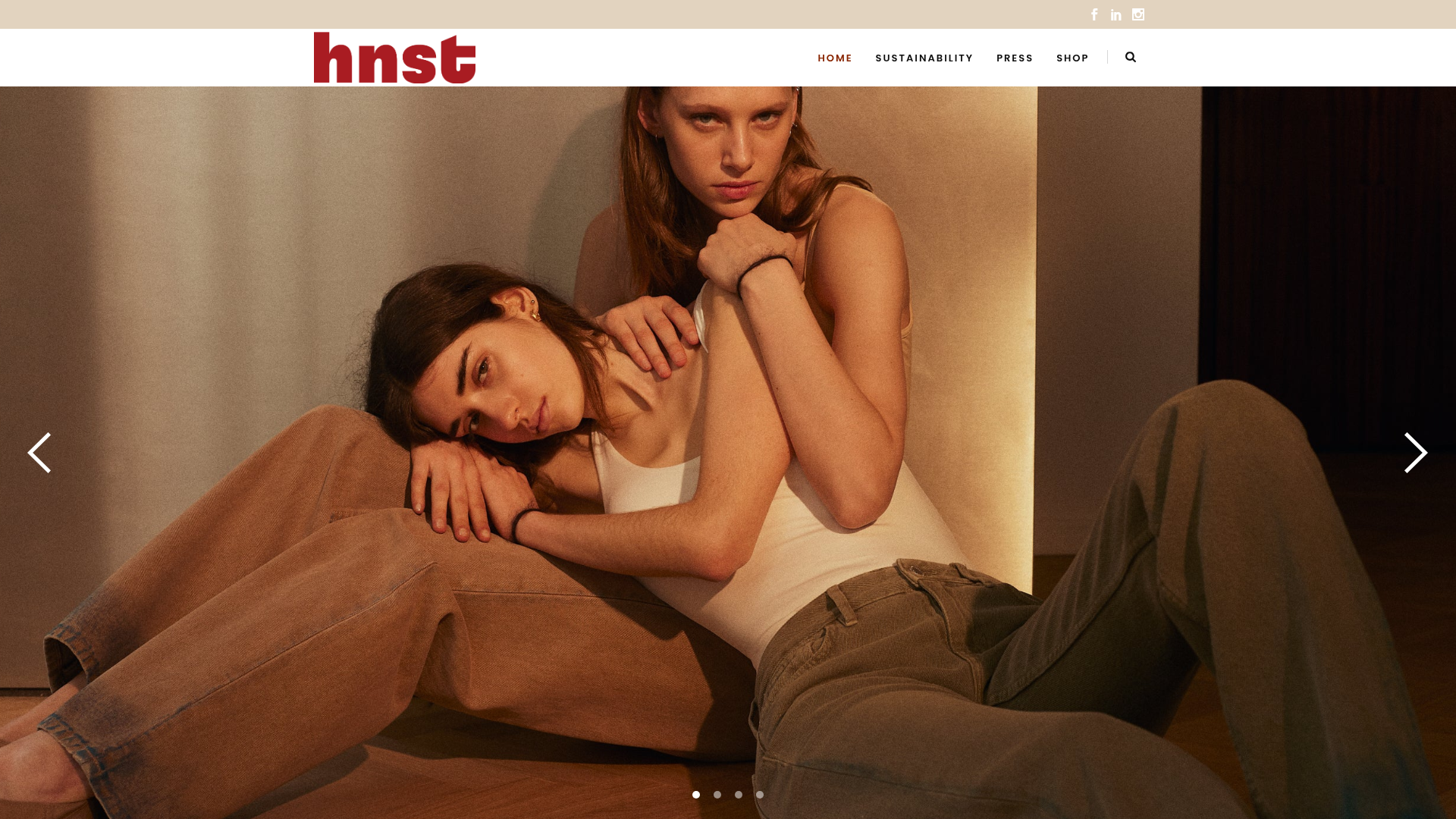
HNST Circular Fashion eCommerce Gallery
A minimalist apparel site featuring a full-screen image slider with parallax effects, grid-based product sections, and a clean typography-focused header for sustainable brand storytelling.

Finn Pet Supplements Landing Page
An e-commerce landing page featuring high-contrast typography, a sticky brand logo banner, parallax scroll effects on product headers, and a clean product grid.
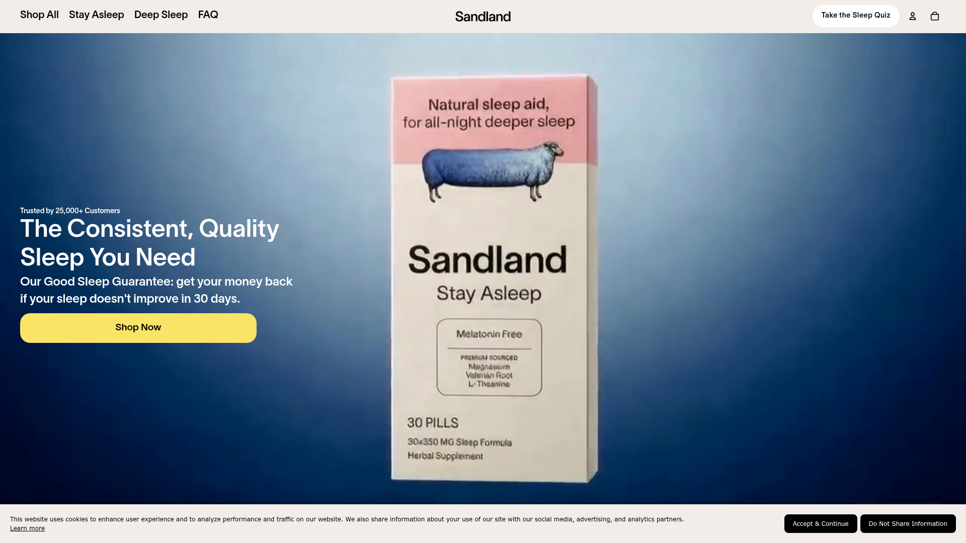
Sandland Sleep Product Landing Page
A high-conversion Shopify layout featuring split-video hero sections, logo-based social proof ribbons, and a testimonial slider integrated with biometric sleep tracker results.
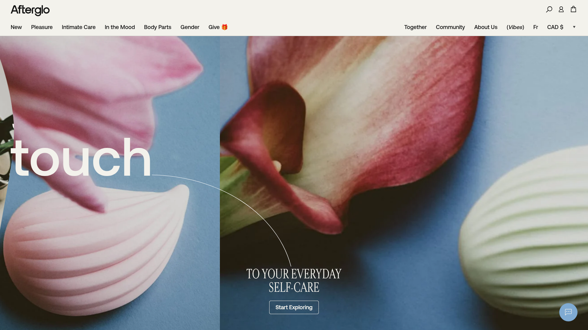
Afterglo Sensual Self-Care Storefront
An elegant e-commerce landing page featuring a split-screen horizontal scrolling hero, kinetic typography with 'vibrating' text animations, and a customized product carousel.

Vibrants Wellbeing E-commerce Landing Page
A clean Shopify-style landing page featuring a full-width hero with overlaid product cards, a horizontal product slider, and interactive cart drawer with utility progress bars.
