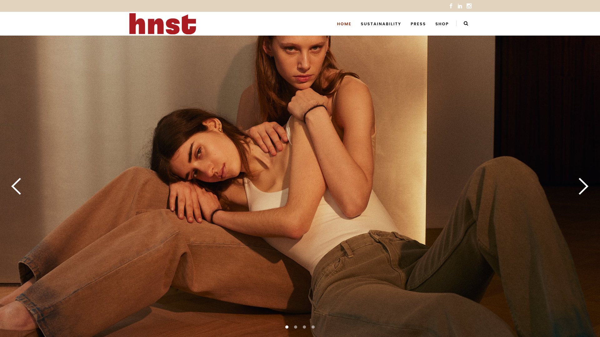
HNST Circular Fashion eCommerce Gallery
A minimalist apparel site featuring a full-screen image slider with parallax effects, grid-based product sections, and a clean typography-focused header for sustainable brand storytelling.
Overview
HNST is a high-end circular fashion eCommerce site that balances editorial storytelling with functional shopping. It serves as an excellent clone reference for building sustainable brands that need to convey high production value through large-scale imagery and sophisticated parallax transitions.
Design System
- Color Palette & Visual Hierarchy: The site uses a neutral, earthy palette dominated by warm beiges and whites to evoke a sustainable and premium feel. High contrast is achieved using a distinct brick-red brand color (
#a63531) for the typography-based logo, ensuring immediate brand recognition against photography. - Typography System: A bold, chunky sans-serif is used for the logo and specific section headers, creating a modern and raw aesthetic. Body text and secondary headings utilize a cleaner, wider sans-serif with generous letter-spacing (e.g.,
letter-spacing: 9pxon slide titles) to maintain a luxury fashion magazine feel. - Page Structure & Flow: The layout follows a classic high-conversion flow: a full-screen hero slider (
qodef-slider) for seasonal campaigns, followed by a mission-driven content block with asymmetric text and images, a full-width parallax quote section, and a horizontal product carousel for direct shopping. - Reusable Components:
- Hero Slider: Full-screen carousel with zoom-in animations and layered text overlays.
- Product Cards: Clean grid-based cards with a "Buy Now" button featuring a simple plus-icon transition.
- Sticky Header: A transparent header that houses a centered logo and minimalist navigation links.
- Interaction & Motion: The site heavily utilizes
skrollableelements for parallax effects, where background images and text overlays shift at different speeds during scroll. Product sliders use theowl-carousellibrary for smooth horizontal touch-based navigation. - Implementation Clues: The HTML structure reveals a reliance on the Qode framework, using specific utility classes like
qodef-full-screenandqodef-animate-image. It uses a grid-based system for the 'Circularity' section, splitting content into LG-6/MD-12 columns for responsive stacking.
Use Cases
- Who Should Clone This: Developers building for sustainable boutiques, luxury apparel brands, or lifestyle products that rely on high-quality visual storytelling rather than high-density product grids.
- Effective Remixes: This pattern is ideal for any brand where the "why" is as important as the "what." Use the mission/quote section to emphasize craftsmanship or origin stories.
- Remix Directions:
- Brand Swap: Keep the layout but replace the earthy tones with high-contrast monochrome for a streetwear aesthetic.
- Architecture Adaptation: Reuse the parallax quote section as a testimonial block for a SaaS product.
- Suggested Clone Scope: A quick section clone of the parallax hero or the mission statement grid is highly effective for landing pages. A full-page clone is best for brands with a limited, curated SKU list that requires an editorial presentation.
Related Inspirations
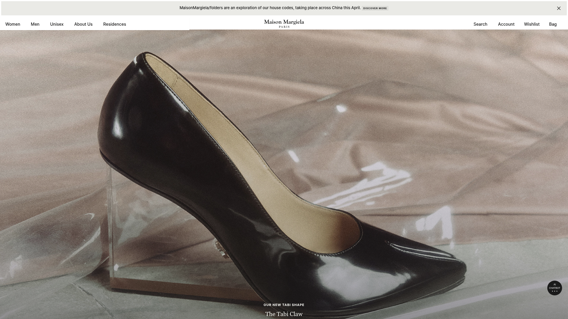
Maison Margiela Luxury E-commerce Landing
A high-fashion storefront featuring full-width immersive hero imagery, a clean swiper product carousel, and alternating two-column editorial content blocks with minimal typography.

Context Gallery High-End Furniture Landing Page
A minimal editorial layout featuring a multi-column product carousel, designer biographies with image-text pairings, and a magazine-style content grid for curated design stories.

Glein Minimalistic Bento Grid eCommerce
A clean, modular layout using a bento-style responsive grid of text teasers and large-scale product imagery for lookbooks and collection browsing.
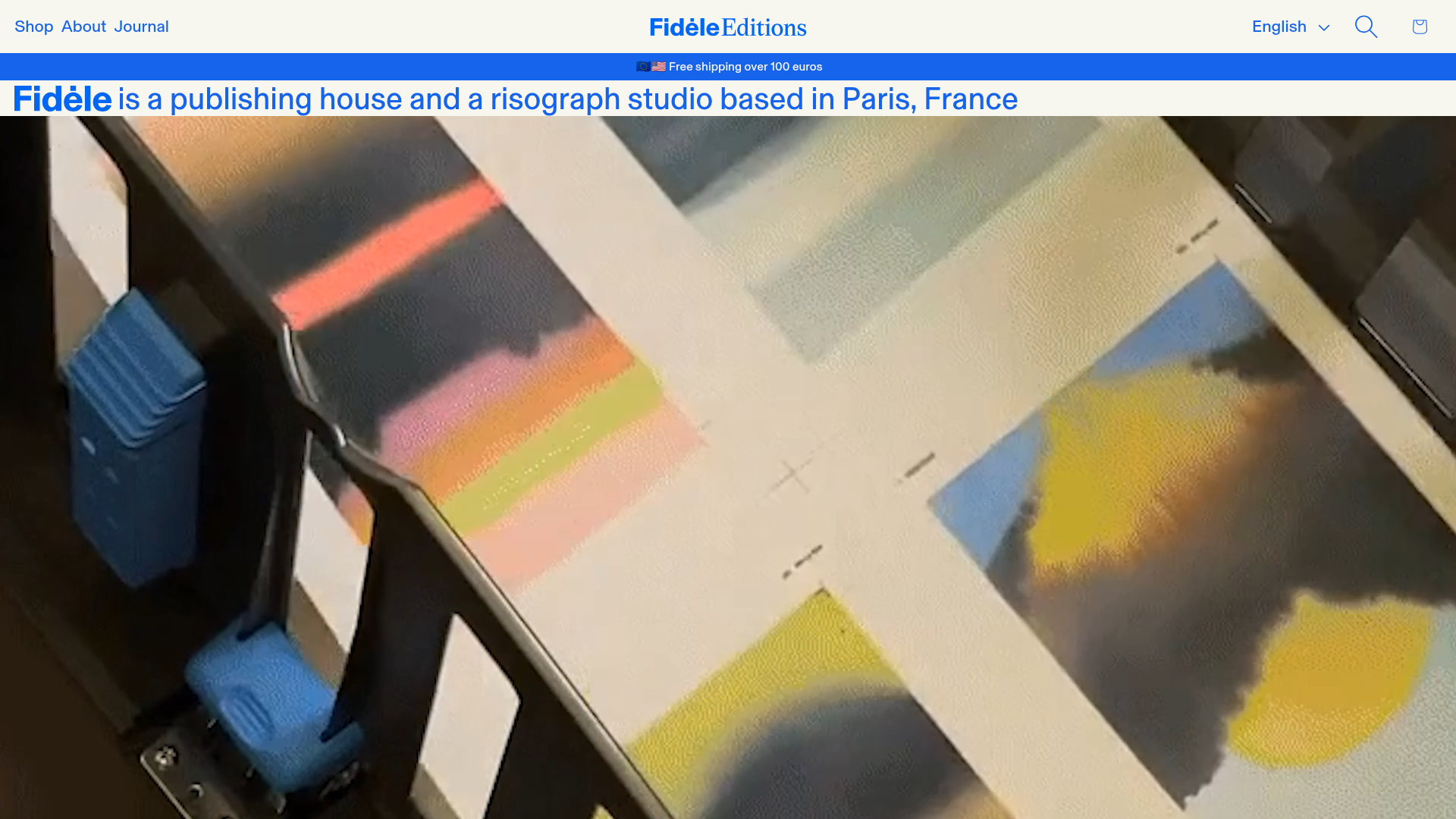
Fidèle Editions Art Studio Store
A minimalist e-commerce layout featuring a high-impact video hero, horizontal product carousels with hover-triggered image swaps, and a clean editorial-style blog section.
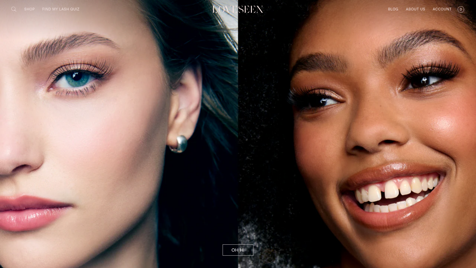
LoveSeen Beauty E-commerce Landing Page
A high-impact beauty retail site featuring a split-screen full-bleed hero image, minimalist navigation, and a horizontally scrolling user-generated content (UGC) Instagram slider.

Basic.Space E-commerce Gallery Clone
A minimalist product marketplace featuring a clean sticky navigation bar, nested flyout menus, and a horizontally scrollable product carousel with hover-state image switching.
