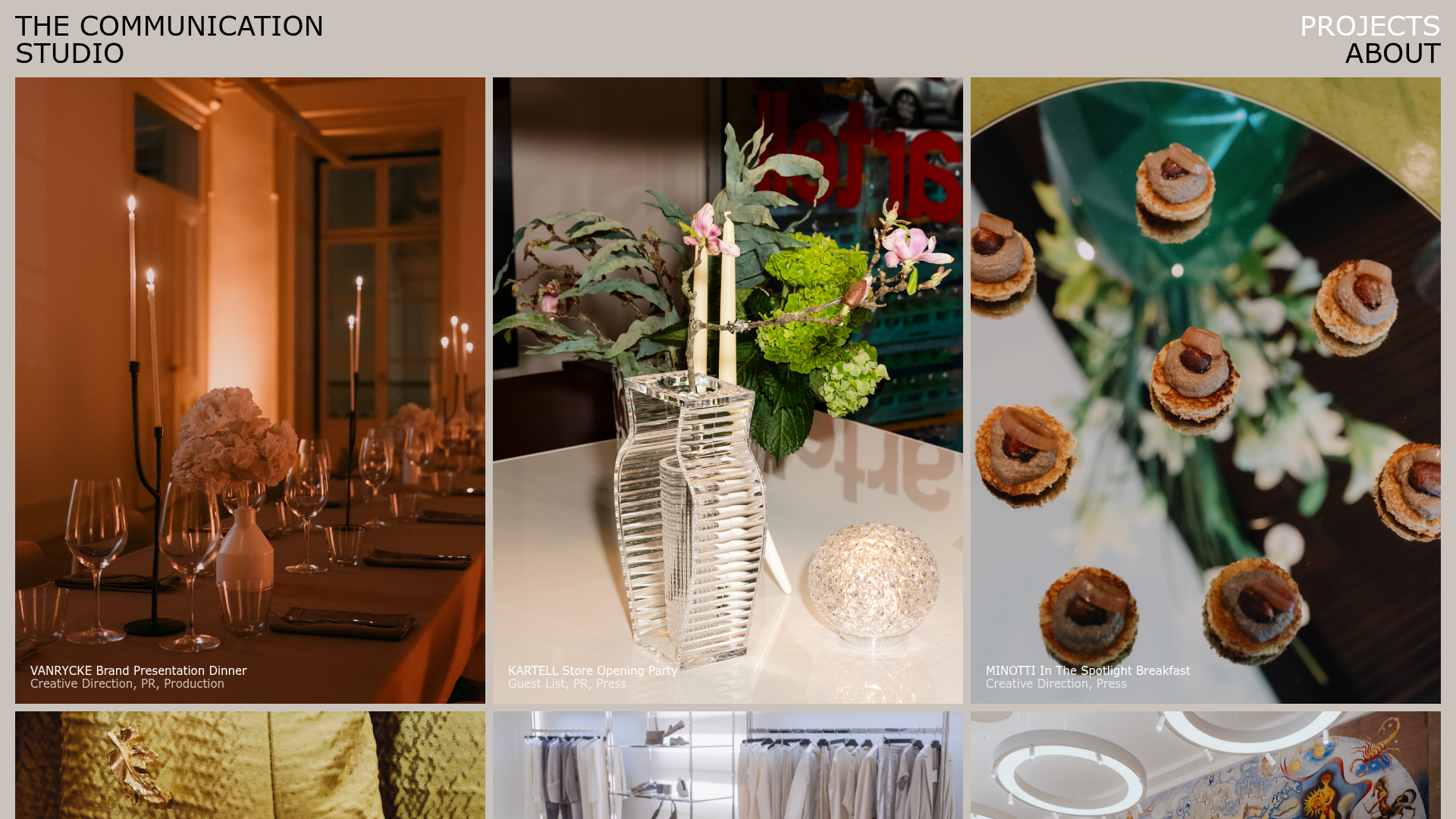
The Communication Studio Portfolio Grid
A minimalist creative agency portfolio featuring a gapless image grid with image-swap hover effects and Tailwind-based reveal animations.
Overview
This portfolio grid belongs to a creative PR and production agency, emphasizing high-fidelity imagery through a minimalist, structured interface. It is an excellent reference for high-end creative portfolios because it balances a rigorous technical layout (CSS grid) with fluid, engaging image-swap interactions that reward user discovery.
Design System
- Color Palette & Visual Hierarchy: The design uses a muted, warm-gray/champagne background (
#c4beaebase feel) which allows vibrant event photography to pop. Hierarchy is primarily driven by image size and layout, with minimal typography overlays to avoid distracting from the visuals. - Typography: Uses a clean, uppercase sans-serif font for navigation and branding. Project titles are rendered in a smaller, lowercase sans-serif font at the bottom of grid items, maintaining a professional and understated corporate identity.
- Page Structure: The site follows a classic header-to-grid flow. The top navigation is fixed or standard at the top, leading into a dense project list of
<li>items within a responsive<ul>grid. - Reusable Components:
- The Adaptive Portfolio Card: An
articleelement using a clever ratio-based height calculationh-[calc(var(--c)*1.333)]based on viewport width. - The Image Swapper: A dual-span image container where the "hover" state blurs the background image and fades in a sharp secondary image.
- The Adaptive Portfolio Card: An
- Interactions and Motion:
- Reveal Animations: Grid items utilize a
data-revealattribute, initially appearing withblur(8px)andopacity: 0before transitioning into focus. - Hover Effects: Uses Tailwind group-hover utilities (e.g.,
md:group-hover/thumbnail:blur) to trigger state changes. The transition is a smoothduration-300 ease-out.
- Reveal Animations: Grid items utilize a
- Responsive Behavior: The HTML structure moves from a single column to
md:grid-cols-2andlg:grid-cols-3. Padding and gap variables (gap-2.5,px-3.75) adjust per breakpoint to maintain proportional whitespace. - Implementation Clues: Built using Tailwind CSS with heavy use of arbitrary values (e.g.,
mt-[--h]) and CSS custom properties for dynamic height calculations. The presence of development guides in the HTML (red/blue grid overlays) indicates a focus on pixel-perfect alignment.
Use Cases
- Who should clone this: Creative studios, event photographers, architects, or high-end fashion brands who have sets of professional photography they want to showcase without heavy text.
- Remixing for products:
- E-commerce: Reuse the image-swap logic for product listings (showing the product on a white background vs. a lifestyle/in-use shot on hover).
- Digital Agencies: Adapt the grid to showcase case studies, where the hover effect reveals a client logo or project stat.
- Suggested Scope: Cloning the Image-Swap Portfolio Grid is the highest-value task here. Developers should extract the
group/thumbnailcontainer logic to instantly elevate standard image galleries. For a quick win, clone the responsive aspect-ratio system (calcvariables) to ensure imagery remains consistent across device sizes.
Related Inspirations

Clase Agency Branding Portfolio
A minimalist design agency portfolio featuring a typographic hero section, full-width image articles, sticky title bars, and integrated scrolling text marquees for a clean editorial layout.

Lundqvist & Dallyn Studio Portfolio
Minimalist design studio portfolio featuring a custom video loader, world clock navigation, and a fluid masonry-style grid for high-quality photography and type design showcases.

AcolorBright Design Agency Portfolio
Minimalist bento-style portfolio layout featuring numerical section headers, horizontally scrolling project teasers, and a clean grayscale client logo grid.
Manna Architects Minimalist Portfolio Grid
A clean, single-page architecture portfolio featuring a centered intro, a varied multi-column image gallery with captions, and a detailed project service breakdown.
Websmith Studio Portfolio Site Template
A clean studio portfolio featuring a responsive bento-style project grid, interactive process cards, and a split-screen testimonial section built with Tailwind CSS.

DashDigital Branding Agency Portfolio Landing
A high-end design portfolio featuring a typographic hero section, interactive client list accordion, horizontal drag-slider, and refined micro-interactions for buttons and images.
