Websmith Studio Portfolio Site Template
A clean studio portfolio featuring a responsive bento-style project grid, interactive process cards, and a split-screen testimonial section built with Tailwind CSS.
Overview
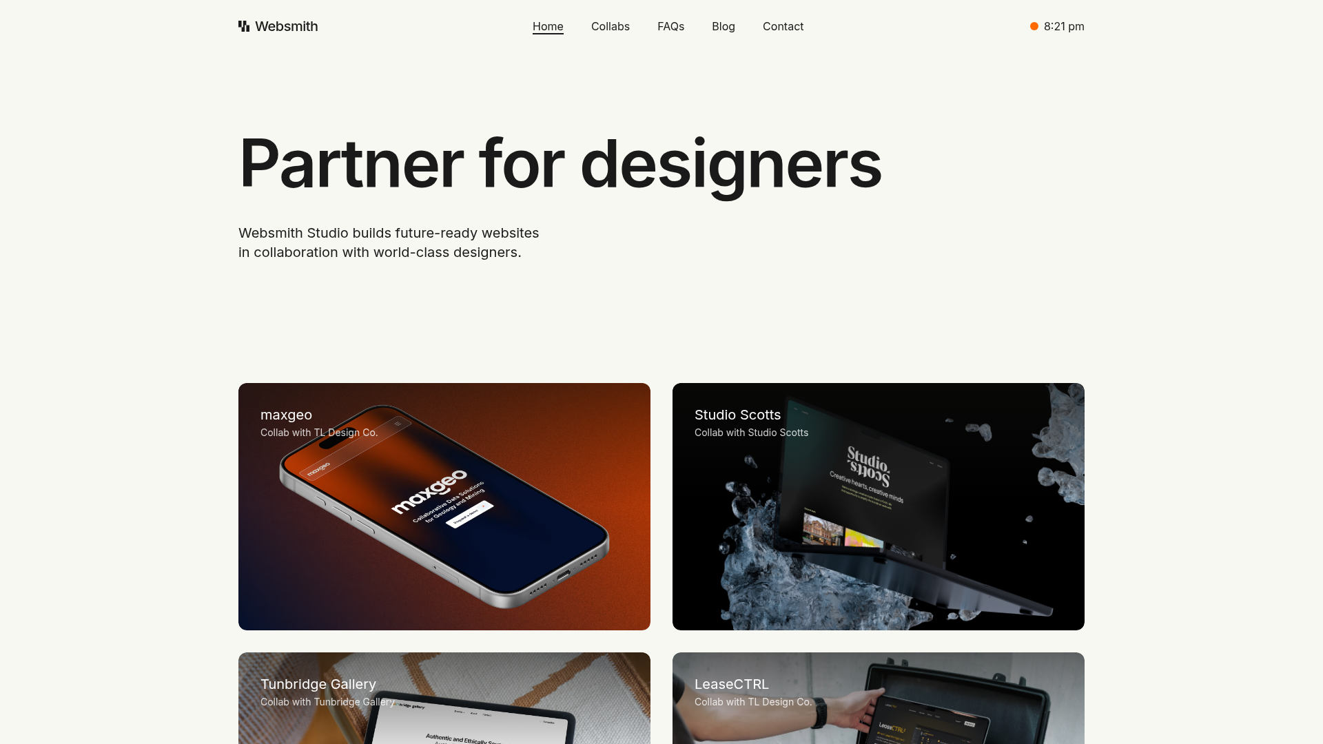
Websmith Studio is a minimalist, high-end agency portfolio that prioritizes large-scale typography and expansive imagery over complex UI. It provides a robust reference for builders who need a clean, grid-based layout that manages project case studies, service offerings, and testimonials with sophisticated simplicity.
Design System
- Color Palette & Visual Hierarchy: The design uses a high-contrast foundation with a light-cream/off-white background and deep charcoal (
text-primary) for text. A subtle accent strategy is used in the "What We Do" section, employing muted pastel backgrounds (light blue, emerald, and red) to categorize different service phases while maintaining a professional aesthetic. - Typography: The system relies on a bold, sans-serif typeface (Inter or similar) featuring extreme weight variants. Headlines use
font-semiboldwithtracking-tightat scales up totext-8xl, creating a strong visual anchor. Body text maintains readability with large sizes (text-lgtotext-xl) and generous leading. - Page Structure & Flow: The layout follows a classic vertical stack: a bold hero headline, a 2-column project grid with immersive image cards, a 4-item service grid ("Plan, Build, Deploy, Maintain"), a split-screen testimonial block, and finally a blog feed.
- Reusable Components:
- Project Cards: Feature an
aspect-6/4oraspect-5/3ratio with a top-down gradient overlay (to-black/60) to ensure white text remains legible over imagery. - Process Cards: Responsive containers that shift from
aspect-2/1on mobile toaspect-videoon desktop, utilizing absolute-positioned SVG icons for visual flair. - Action Buttons: Rounded-lg primary buttons with a smooth
duration-300transition to a medium-gray hover state.
- Project Cards: Feature an
- Interaction Patterns: The project grid utilizes a subtle
group-hover:scale-[1.025]effect on images combined withduration-500transitions for a fluid, premium feel. The HTML suggests asplit-textimplementation for headline animations. - Responsive Implementation: Built with Tailwind CSS, the site uses a
max-w-[1340px]container. The project and process grids seamlessly transition from a stacked 1-column layout on mobile to a balanced 2-column grid starting at themdbreakpoint.
Use Cases
- Who should clone this: Freelance developers, design agencies, or architectural firms looking for a
Related Inspirations

Clase Agency Branding Portfolio
A minimalist design agency portfolio featuring a typographic hero section, full-width image articles, sticky title bars, and integrated scrolling text marquees for a clean editorial layout.

Lundqvist & Dallyn Studio Portfolio
Minimalist design studio portfolio featuring a custom video loader, world clock navigation, and a fluid masonry-style grid for high-quality photography and type design showcases.

AcolorBright Design Agency Portfolio
Minimalist bento-style portfolio layout featuring numerical section headers, horizontally scrolling project teasers, and a clean grayscale client logo grid.
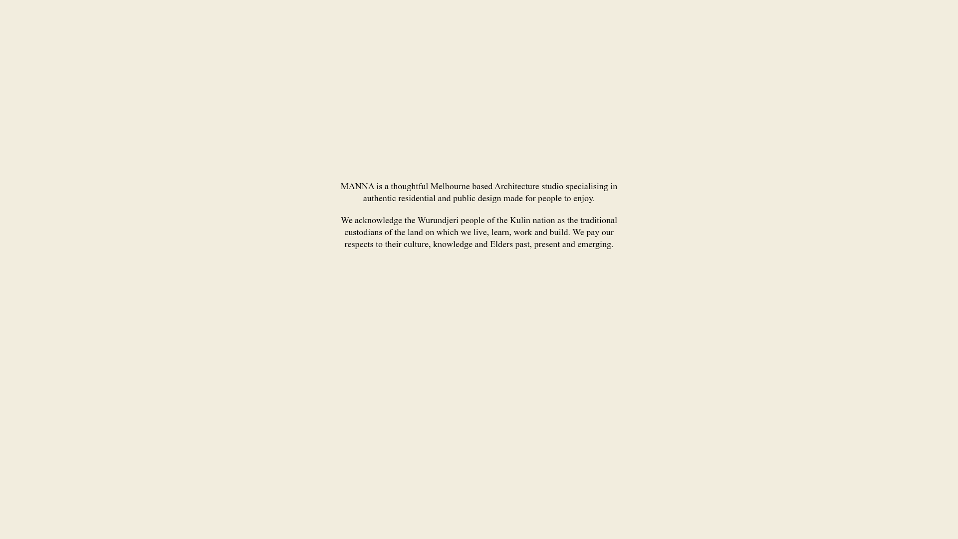
Manna Architects Minimalist Portfolio Grid
A clean, single-page architecture portfolio featuring a centered intro, a varied multi-column image gallery with captions, and a detailed project service breakdown.
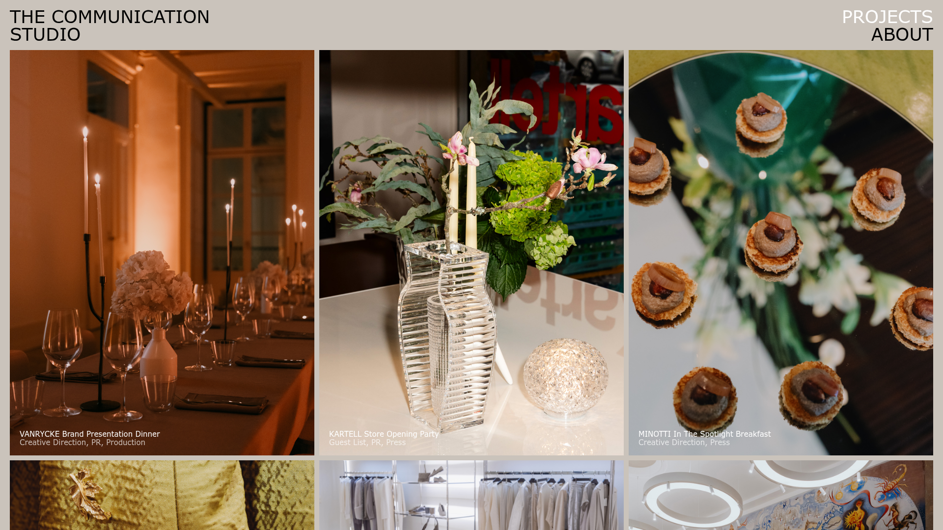
The Communication Studio Portfolio Grid
A minimalist creative agency portfolio featuring a gapless image grid with image-swap hover effects and Tailwind-based reveal animations.

DashDigital Branding Agency Portfolio Landing
A high-end design portfolio featuring a typographic hero section, interactive client list accordion, horizontal drag-slider, and refined micro-interactions for buttons and images.
