Manna Architects Minimalist Portfolio Grid
A clean, single-page architecture portfolio featuring a centered intro, a varied multi-column image gallery with captions, and a detailed project service breakdown.
Overview
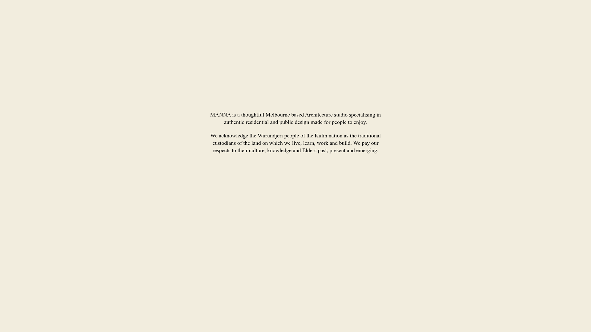
This website is a minimalist, single-page professional portfolio for Manna Architects. It excels as a clone reference due to its sophisticated use of whitespace, a dynamic asymmetrical masonry-style grid, and a clean, typography-led information hierarchy that puts visual content at the forefront.
Design System
- Color Palette & Visual Hierarchy: The site uses a warm, off-white/cream background (#fdfcf0 style) which provides a softer, more organic feel than pure white. The text is high-contrast black/dark grey, ensuring excellent readability. The layout relies on generous padding and margin to separate the intro, gallery, and about sections.
- Typography: The system is dominated by a clean, serif typeface for the intro and body text, with italics used for emphasis and technical services. The scale is modest and balanced, avoiding oversized headings to maintain a quiet, professional tone.
- Page Structure: The layout follows a linear vertical flow: a centered introductory text block (including an acknowledgment of country), followed by a massive image-driven
foliosection, and concluding with a two-columnaboutsection containing services and contact info. - Reusable Components:
- Dynamic Masonry Grid: The
folio__inneruses CSS classes (size_a,size_b,size_c,size_d) to create an irregular, art-gallery style grid where images vary in aspect ratio and column span. - Image Captions: Small-font, subtle photographic captions located immediately beneath images, often including photography credits.
- Bio/Service Block: A flexible two-column layout that pairs a high-quality portrait with a list of architectural services.
- Dynamic Masonry Grid: The
- Interaction & Motion: The design is static-first, prioritizing load speed and clarity. From the HTML structure, the focus is on a seamless vertical scroll experience without heavy animations or JS-heavy navigation.
- Responsive Behavior: The multi-column grid is designed to collapse into a single or double column on smaller viewports. The centered intro text ensures readability across all device widths.
- Implementation Clues: The HTML uses semantic
<section>tags and<figure>elements for the gallery. The CSS naming convention (folio__item,size_a) suggests a custom BEM-style approach for the grid system.
Use Cases
- Who should clone this: Architects, interior designers, landscape artists, and photographers who need a portfolio that feels curated rather than templated.
- Effective Remixes: Creative agencies could remix the grid to feature video reels instead of static images; independent consultants could use the centered intro and bio section for a high-end personal landing page.
- Practical Directions:
- Style Swap: Change the cream background to a dark mode palette with monochromatic images for a more "tech" or "fashion" aesthetic.
- Info Architecture: Replace the long list of services with a vertical accordion for more complex service offerings.
- Suggested Clone Scope: The image grid (
foliosection) is the most valuable asset to clone for those struggling with layout variety. The full-page clone is ideal for those wanting a complete "lean" brand presence.
Related Inspirations

Clase Agency Branding Portfolio
A minimalist design agency portfolio featuring a typographic hero section, full-width image articles, sticky title bars, and integrated scrolling text marquees for a clean editorial layout.

Lundqvist & Dallyn Studio Portfolio
Minimalist design studio portfolio featuring a custom video loader, world clock navigation, and a fluid masonry-style grid for high-quality photography and type design showcases.

AcolorBright Design Agency Portfolio
Minimalist bento-style portfolio layout featuring numerical section headers, horizontally scrolling project teasers, and a clean grayscale client logo grid.
Websmith Studio Portfolio Site Template
A clean studio portfolio featuring a responsive bento-style project grid, interactive process cards, and a split-screen testimonial section built with Tailwind CSS.
The Communication Studio Portfolio Grid
A minimalist creative agency portfolio featuring a gapless image grid with image-swap hover effects and Tailwind-based reveal animations.

DashDigital Branding Agency Portfolio Landing
A high-end design portfolio featuring a typographic hero section, interactive client list accordion, horizontal drag-slider, and refined micro-interactions for buttons and images.
