Healthy Together SaaS Landing Page
A high-end dark mode layout featuring a video waveform hero, word-by-word scroll animations, custom Mega Menu dropdowns, and a swiper-based rotating services slider.
Overview
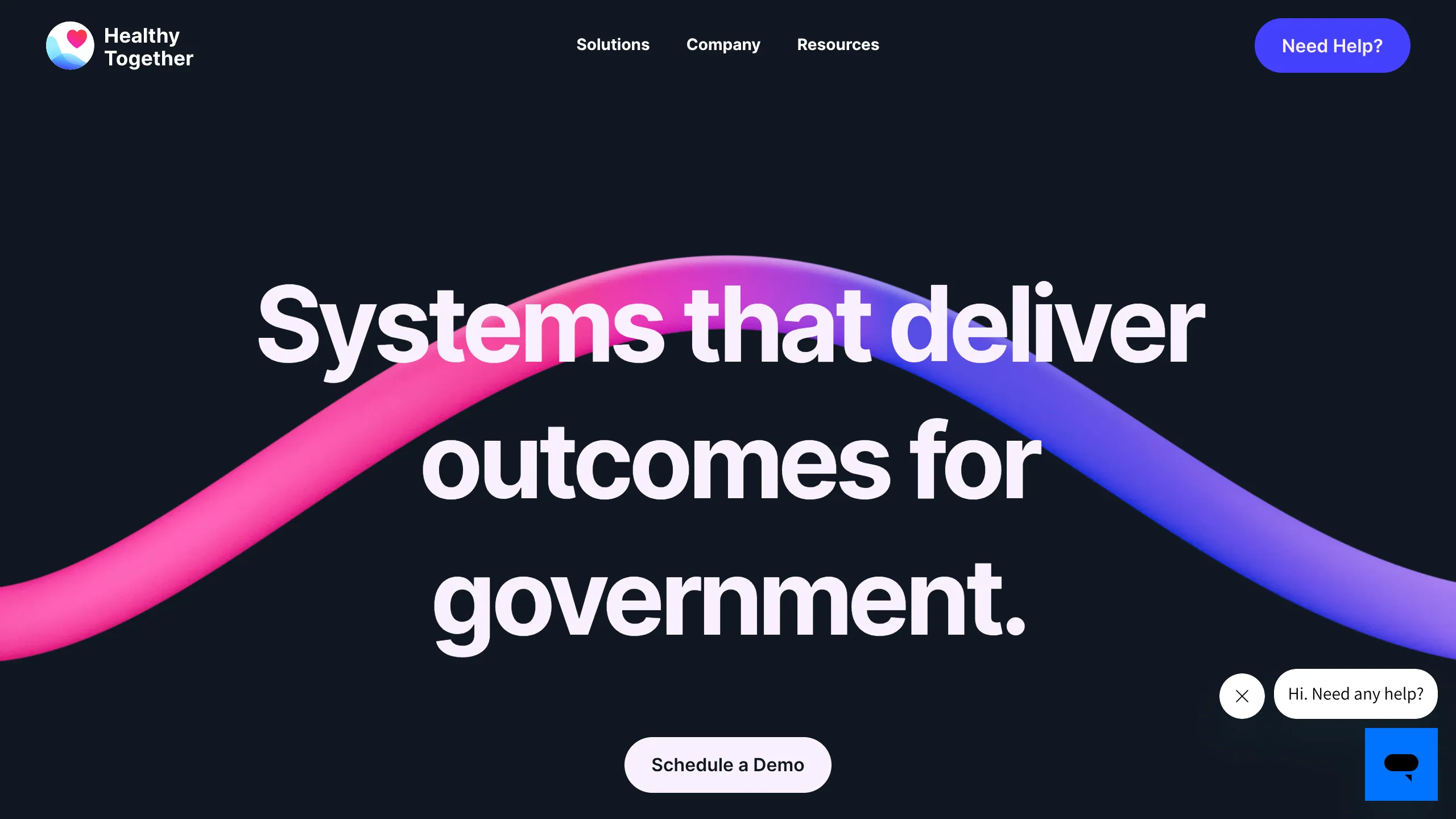
Healthy Together is a high-end SaaS landing page designed for the public sector, featuring a sophisticated dark mode aesthetic combined with fluid motion design. It serves as an excellent reference for builders looking to implement a "premium enterprise" feel through the use of high-quality video backgrounds, word-by-word scroll animations, and complex mega-navigation systems.
Design System
- Color Palette & Visual Hierarchy: The site utilizes a deep navy/near-black background (#000) that allows high-contrast white typography and vibrant neon gradients (pinks, purples, and blues) to pop. The visual hierarchy is established through massive display headings and a clean, spacious layout that prevents the dark theme from feeling cramped.
- Typography: The system uses a bold, geometric Sans Serif for headings with tight tracking. Body text is kept small and legible with generous line heights (150%) to maintain a clean, institutional yet modern look.
- Page Structure: The flow begins with a cinematic hero section featuring a custom video waveform. It transitions into a multi-colored "benefits" section where the background color shifts to a soft lavender, then moves into a vision section featuring a custom Swiper-based service slider, and concludes with a grid of social proof metrics and testimonials.
- Reusable Components:
- Mega Menu: A highly structured dropdown with icon-based category groupings and secondary "Talk to our team" call-to-actions.
- Hero Video Wrapper: A full-bleed background container optimized for high-resolution looping video.
- Brag Bar: A horizontal logo cloud with optimized spacing for government and enterprise partner logos.
- Testimonial Slider: A Swiper.js implementation featuring star ratings and mobile-optimized card layouts.
- Interactions & Motion: The site relies heavily on "word-split" scroll animations where headings fade and slide in word-by-word. There are clear transition patterns where sections scale down slightly as the user scrolls, creating a layered depth effect. Implementation clues point to the use of Webflow Interactions (IX2) and the Lenis library for smooth momentum scrolling.
- Mobile Behavior: The navigation collapses into a full-screen mobile menu with nested accordion-style links. The "Need Help" CTA remains a prominent sticky or primary button to ensure accessibility.
Use Cases
- Who should clone this: Developers building B2B or B2G (Business-to-Government) platforms that need to convey trust, high-tech capabilities, and professional scale.
- Effective Remixes: This layout works exceptionally well for cybersecurity firms, AI infrastructure startups, or fintech platforms. The "Solutions" mega-menu can be easily adapted for any product with a complex feature set.
- Remix Directions: Swap the organic waveform video for abstract geometric 3D renders to change the industry feel; adjust the accent gradient from purple-pink to emerald-blue for a more traditional corporate or financial look.
- Clone Scope: A full-page clone is recommended for those wanting the integrated scroll-into-scale transitions. For a quicker win, the mega-navigation and the logo-driven "Reviews" grid are highly modular and can be reused in any project.
Related Inspirations
EverAfter AI Customer Portal Hero
A SaaS landing page template featuring a glowing product carousel, auto-scrolling logo marquee, accordion-based feature reveals, and an embedded scheduling widget.
LaunchDarkly SaaS Landing Page Hero
A dark-themed developer marketing layout featuring a glowing blurred background, sticky pill-shaped navigation, tabbed feature showcases, and a horizontal logo marquee.
Reflect AI Note-Taking Landing Page
A dark-themed SaaS landing page featuring a glowing aura hero section, pill-shaped navigation, and a floating dashboard interface overlay.

Vercel AI Cloud Landing Page
A modern landing page featuring a minimalist dark-themed navbar, a grid-overlay hero section with radial color gradients, and high-contrast typography for customer success stories.
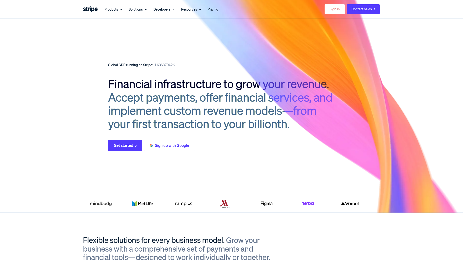
Stripe Modern SaaS Landing Page
A high-conversion landing page featuring a complex mesh-gradient hero, sticky navigation, and a horizontal logo wall for brand social proof.
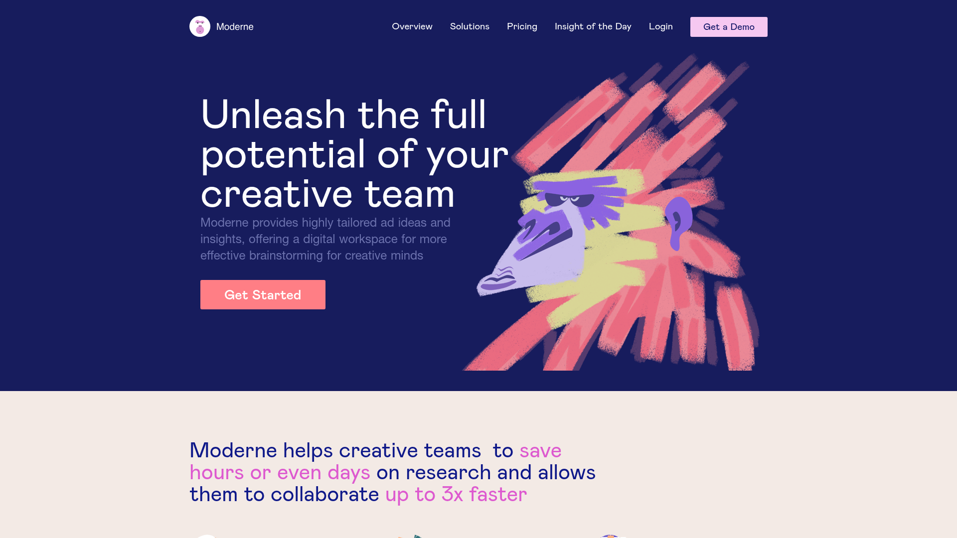
Moderne Creative Landing Page
A high-contrast landing page featuring a dark hero section with an artistic illustration overlay, distinct alternating content blocks, and a visual comparison bar chart component.
