Stripe Modern SaaS Landing Page
A high-conversion landing page featuring a complex mesh-gradient hero, sticky navigation, and a horizontal logo wall for brand social proof.
Overview
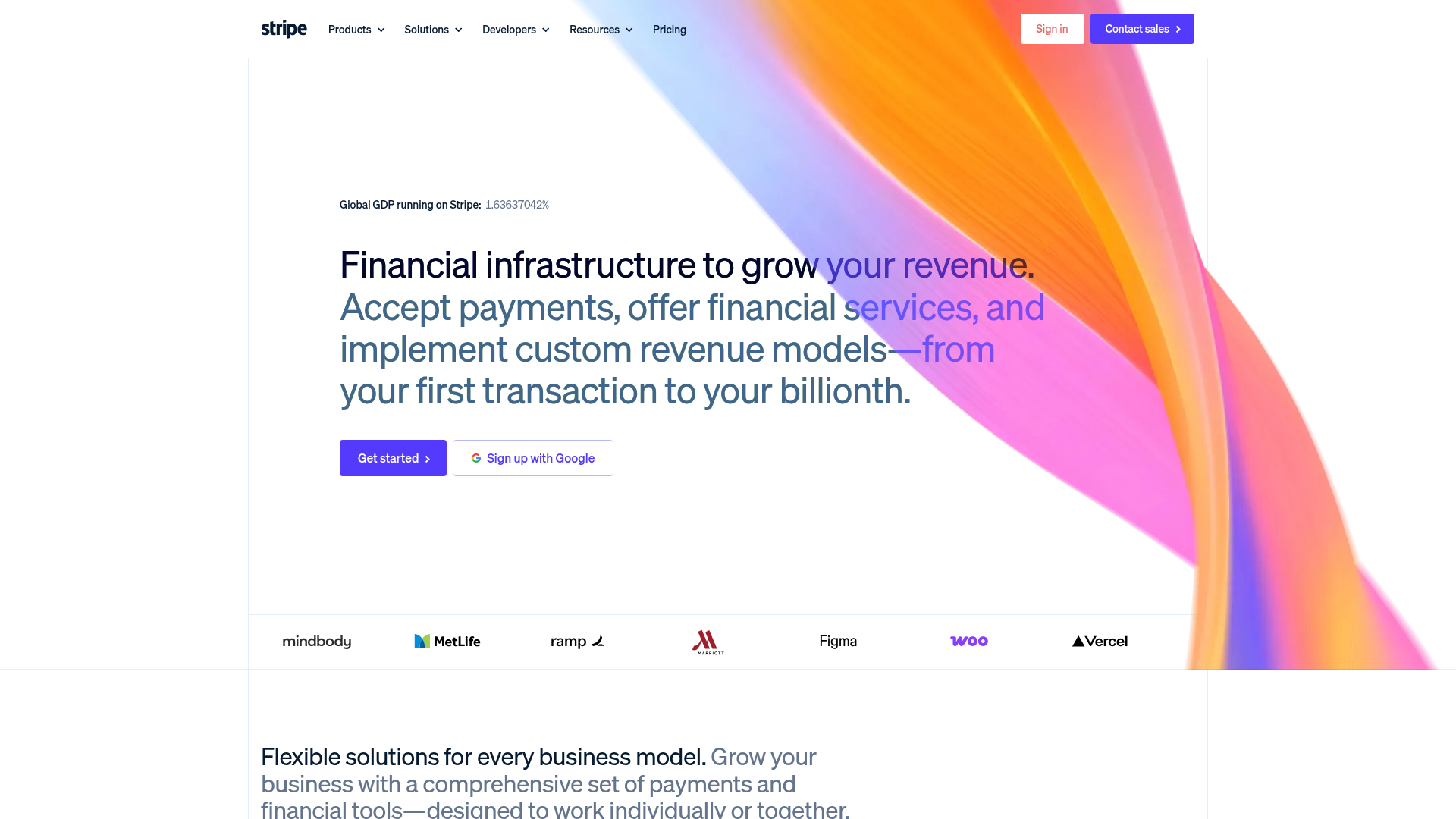
This is a classic modern SaaS landing page template following the high-conversion Stripe aesthetic. It features a distinctive mesh-gradient hero section, a sticky navigation bar with mega-menus, and a responsive logo wall designed to establish immediate social proof for fintech and software products.
Design System
- Color Palette & Visual Hierarchy: The design utilizes a clean white background contrasted against a vibrant, multi-color mesh gradient (purples, oranges, and pinks) in the hero area. Primary actions use a high-contrast "Stripe Blue" (#635bff). Text hierarchy uses dark gray for headers and softer slate grays for subtext, with colorful spans used within headings to emphasize key value propositions.
- Typography: A clean, geometric semi-bold sans-serif is used for display headings. The scale features large hero text with tight letter spacing, transitioning to smaller, high-readability body copy. Weighted emphasis is used strategically in the hero text to guide the eye through the multi-part headline.
- Page Structure & Flow: The layout follows a top-down conversion funnel: Sticky Navbar → Dynamic Hero Section → Social Proof Logo Bar → Feature Overview. Each section is separated by generous white space to prevent visual clutter.
- Reusable Components: Notable components include the primary CTA buttons with chevron icons, the secondary "Sign up with Google" button with a centered logo, and the responsive flexbox-based logo gallery featuring brand partners like Figma, Vercel, and MetLife.
- Interaction & Motion: The UI includes subtle hover transitions on primary buttons (slight opacity or color shifts) and a clean, hidden-to-visible mega-menu system for navigation categories like "Products" and "Solutions."
- Implementation Clues: The structure uses semantic HTML with a
<header>for navigation,<main>for content, and<section>containers. The layout appears to rely on a utility-first approach for spacing and containerization, allowing for a fluid layout that adapts logo density based on viewport width.
Use Cases
- Who should clone this: B2B SaaS startups, fintech platforms, and developer tool providers who need a high-trust, professional identity.
- Effective Remixes: This layout is ideal for any technical product where "scale" and "reliability" are key selling points. The hero section is particularly effective for products that need to showcase a "First transaction to billionth" growth story.
- Practical Remix Directions: Developers can swap the mesh gradient CSS for a brand-specific color palette or static background image. The social proof bar can be easily adapted to showcase different integrations or client categories.
- Suggested Clone Scope: For a quick win, clone the hero section and navigation bar to establish a modern aesthetic. A full-page clone is recommended for teams needing an end-to-end framework for product marketing pages.
Related Inspirations
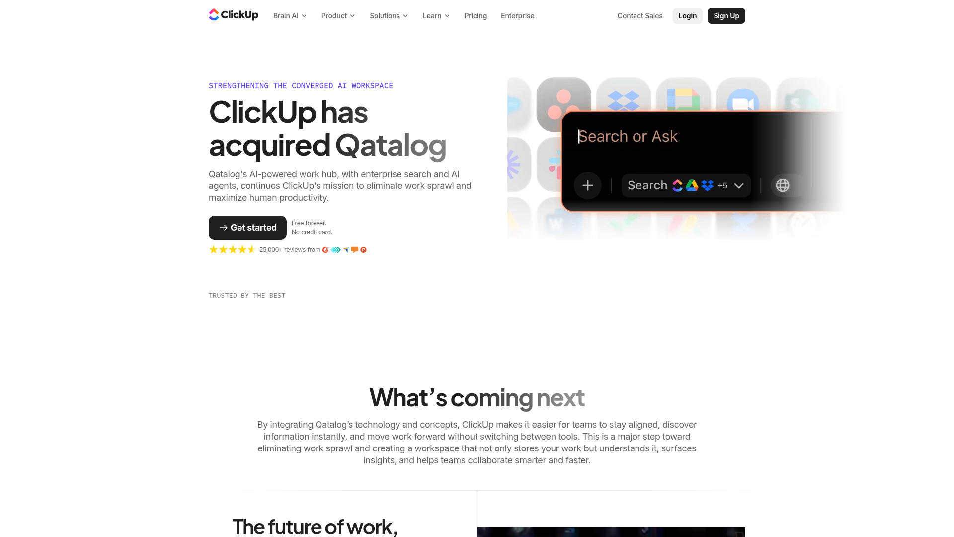
ClickUp Acquisition Hero Landing Page
Features a modern dark-themed hero section with a search UI graphic, bento-style feature grid, and a high-contrast CTA section with decorative gradients.
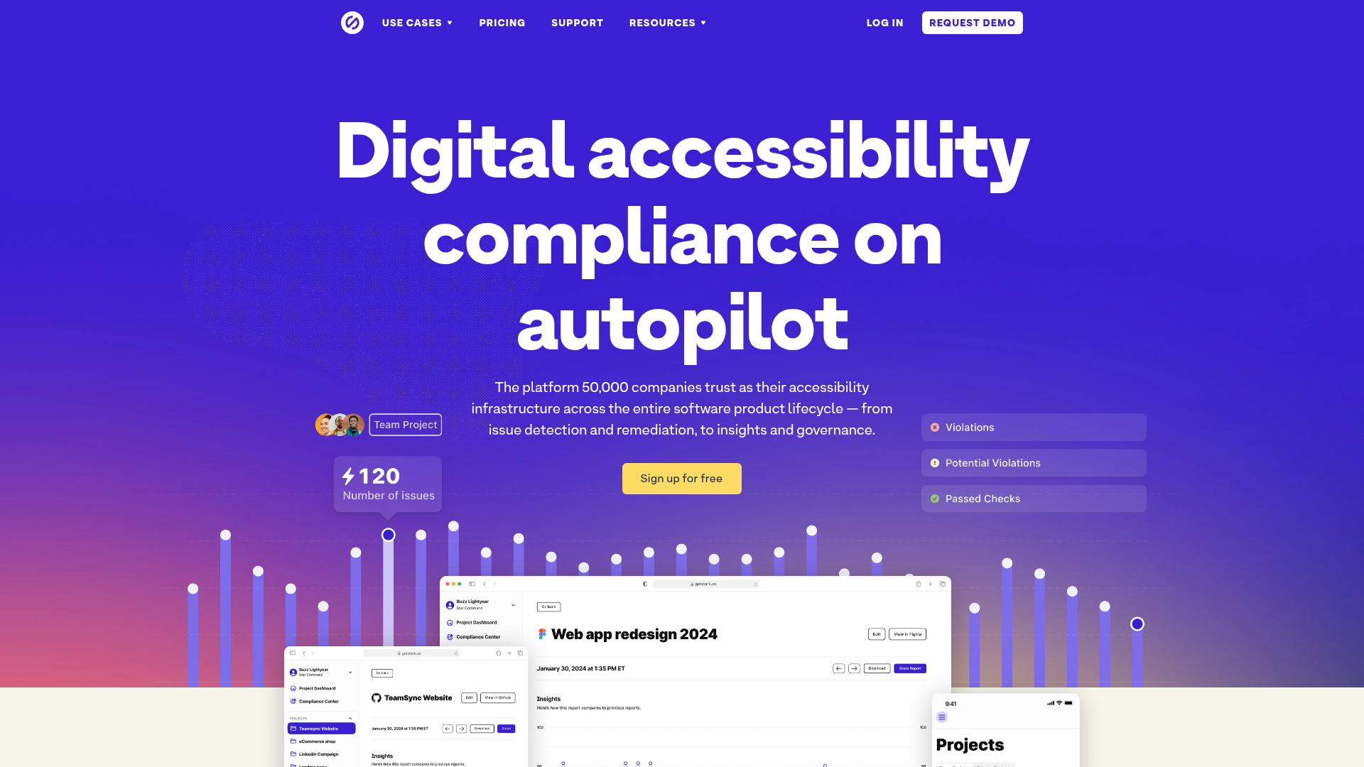
Stark Accessibility Software SaaS Landing Page
A vibrant SaaS landing page featuring a purple gradient hero, layered dashboard mockups, grid-based feature highlights, and segmented user-persona navigation.
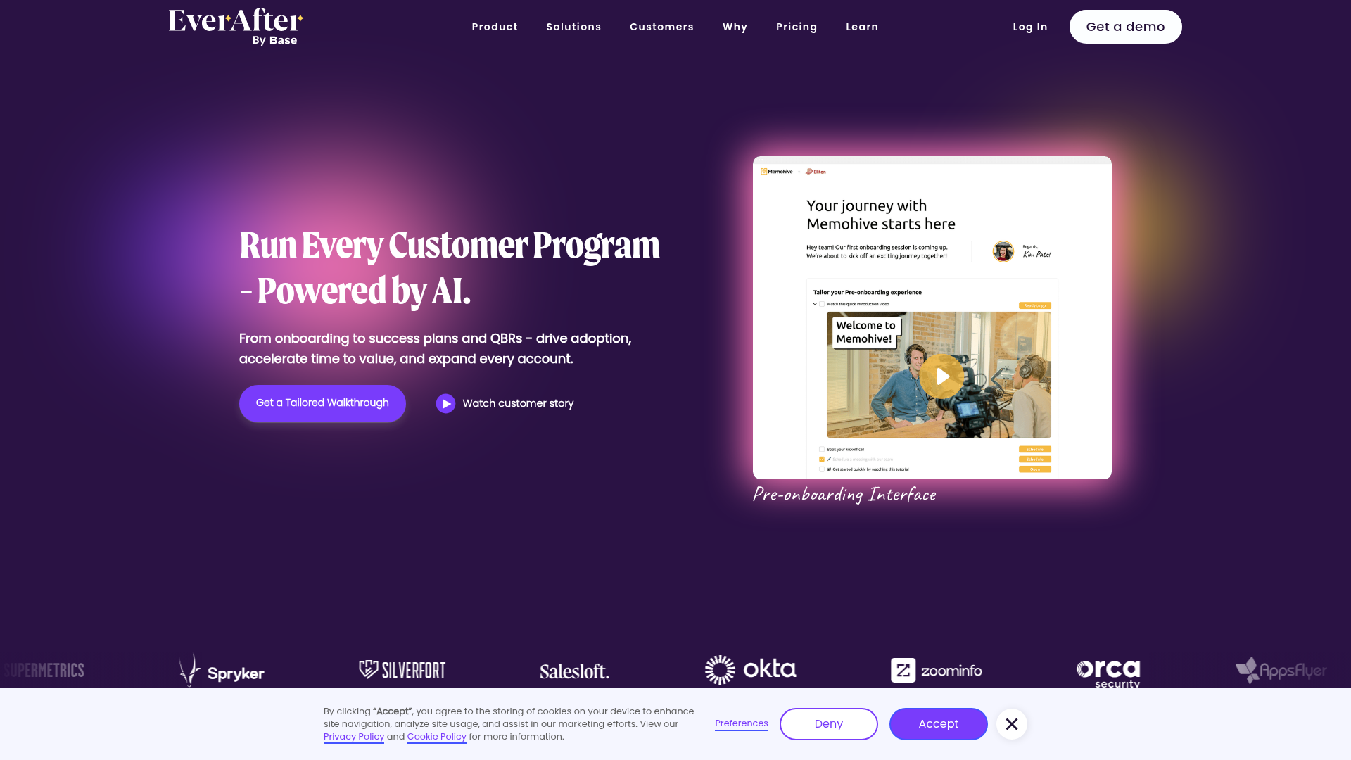
EverAfter AI Customer Portal Hero
A SaaS landing page template featuring a glowing product carousel, auto-scrolling logo marquee, accordion-based feature reveals, and an embedded scheduling widget.
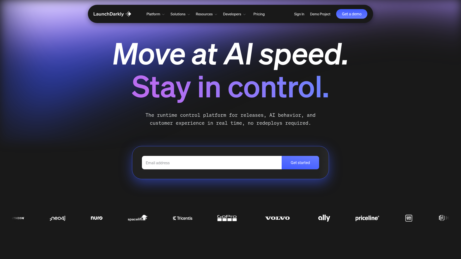
LaunchDarkly SaaS Landing Page Hero
A dark-themed developer marketing layout featuring a glowing blurred background, sticky pill-shaped navigation, tabbed feature showcases, and a horizontal logo marquee.
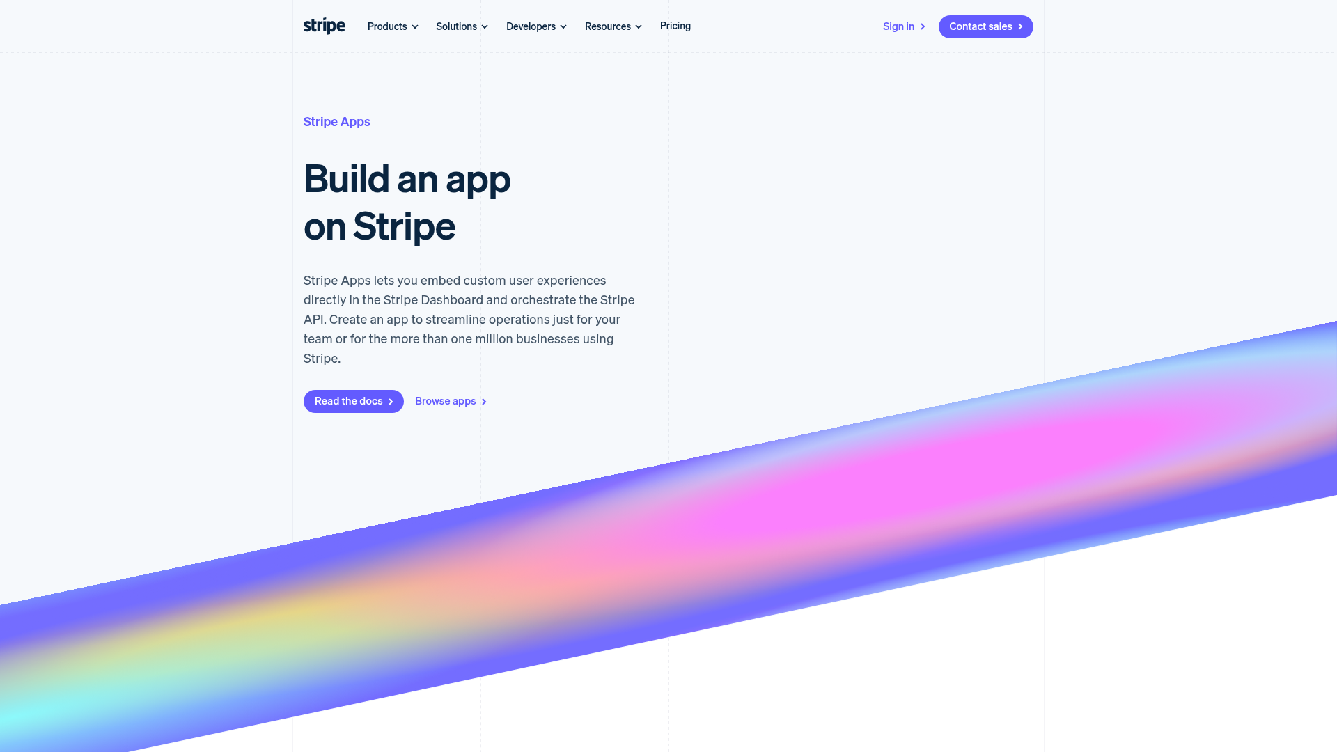
Stripe Apps Developer Portal Landing
A developer-focused landing page featuring a geometric animated gradient hero, multi-column feature sections, carousel components with code editors, and testimonial sliders.
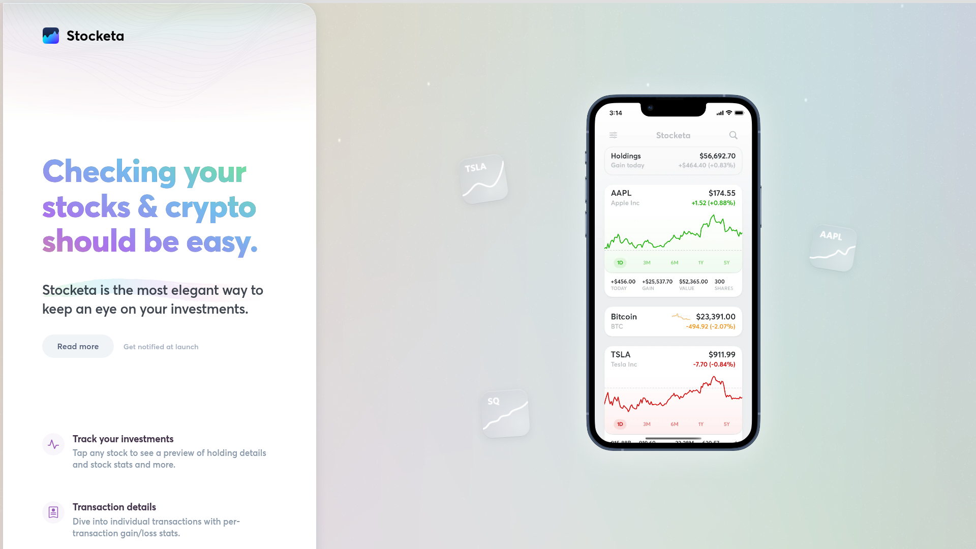
Stocketa Portfolio Tracker Landing Page
A split-screen landing page featuring a text-gradient hero, a sticky mobile app frame with parallax floating elements, and a feature grid with custom icons.
