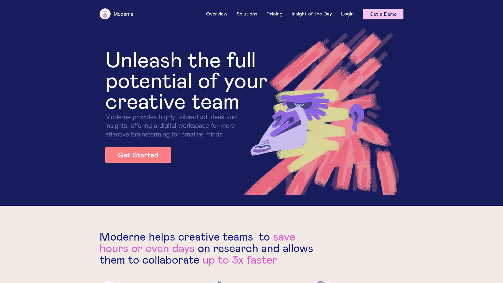
Moderne Creative Landing Page
A high-contrast landing page featuring a dark hero section with an artistic illustration overlay, distinct alternating content blocks, and a visual comparison bar chart component.
Overview
Moderne is a high-impact creative agency landing page that effectively balances a dark, moody hero section with clean, light-mode content blocks. It is an excellent clone reference for its sophisticated use of mixed typography, illustrative overlays, and a unique "Before vs. After" comparison bar chart that visualizes time savings.
Design System
- Color Palette: The design utilizes a deep navy baseline (
#121656) for the hero section, contrasted against an off-white/beige background (#f7f0eb) for the main body. High-energy accent colors like salmon pink (#ff7e85), purple, and mint green provide visual highlights in cards and buttons. - Typography: The system uses a clean sans-serif (Nuxt/standard stack) with a clear hierarchy. Headlines on light backgrounds feature "color-spotting" (e.g., pink or purple spans) to emphasize key performance metrics like "save hours" or "3x faster."
- Page Structure:
- Dark Hero: Centered text content with a large illustrative focal point on the right.
- Metric Summary: Large headline with colored spans followed by a 3-column icon grid.
- Alternating Feature Blocks: Vertical list of features with alternating image/text placement.
- Data Visualization: A comparison section displaying "Before" vs "After" bar values.
- Grid Gallery: A mix of large-format media cards with varied background colors (pink, orange, green).
- CTA Footer: Integrated email signup form with a character mascot overlay.
- Reusable Components:
- Comparison Bar Chart: The
cols__paramsblock which uses relative widths to visualize efficiency gains. - Multi-colored Feature Cards: Rounded containers (
cards__item) with distinct utility-based color coding. - Global Nav: A sticky-ready transparent navigation bar with a clear call-to-action button.
- Comparison Bar Chart: The
- Implementation Clues: The site is built using Nuxt.js (evident from the
#_nuxtwrapper andnuxt-linkclasses) and uses BEM-style CSS naming conventions (e.g.,cols__3cols-item), making it highly modular and easy to extract specific sections.
Use Cases
- Who should clone this: SaaS companies focusing on productivity, creative agencies, or digital collaboration tools that need to translate abstract benefits into tangible metrics.
- Remix Directions:
- Performance Tools: Adapt the comparison bar chart to show speed improvements or cost savings for developer tools.
- Portfolio Sites: Reuse the dark-to-light transition and the
twoColsimage/quote layout for showcase pages. - Branding updates: Swap the hand-drawn illustrations for high-fidelity 3D renders or clean vector icons while keeping the strong grid structure.
- Clone Scope: Designers should prioritize cloning the Hero section for brand impact and the Comparison Chart for data storytelling, even if they choose not to implement the full-page flow.
Related Inspirations

Vercel AI Cloud Landing Page
A modern landing page featuring a minimalist dark-themed navbar, a grid-overlay hero section with radial color gradients, and high-contrast typography for customer success stories.
Stark Accessibility Software SaaS Landing Page
A vibrant SaaS landing page featuring a purple gradient hero, layered dashboard mockups, grid-based feature highlights, and segmented user-persona navigation.
EverAfter AI Customer Portal Hero
A SaaS landing page template featuring a glowing product carousel, auto-scrolling logo marquee, accordion-based feature reveals, and an embedded scheduling widget.
Copilot Money Finance Landing Page
A dark-themed finance landing page featuring a centered animated hero section with floating category badges, integrated trust badges, and a clean minimalist navigation bar.
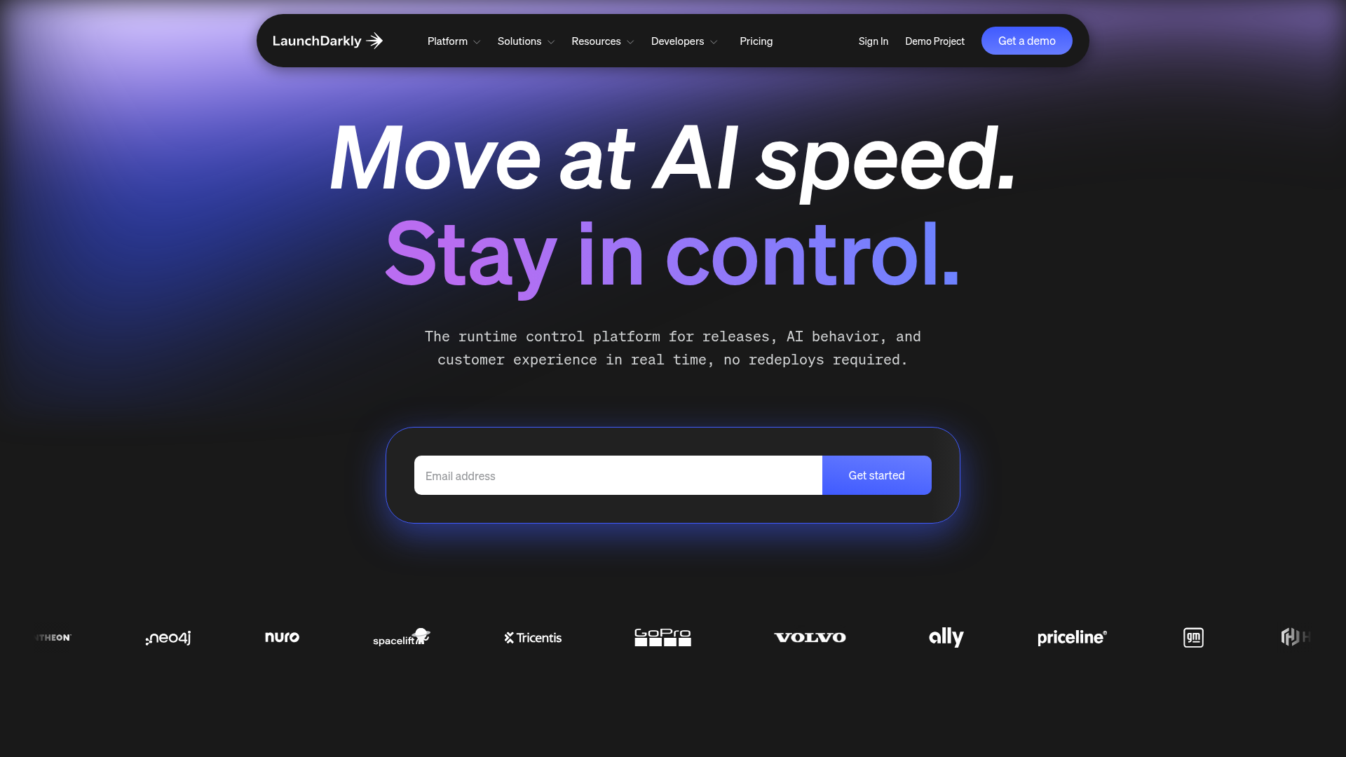
LaunchDarkly SaaS Landing Page Hero
A dark-themed developer marketing layout featuring a glowing blurred background, sticky pill-shaped navigation, tabbed feature showcases, and a horizontal logo marquee.
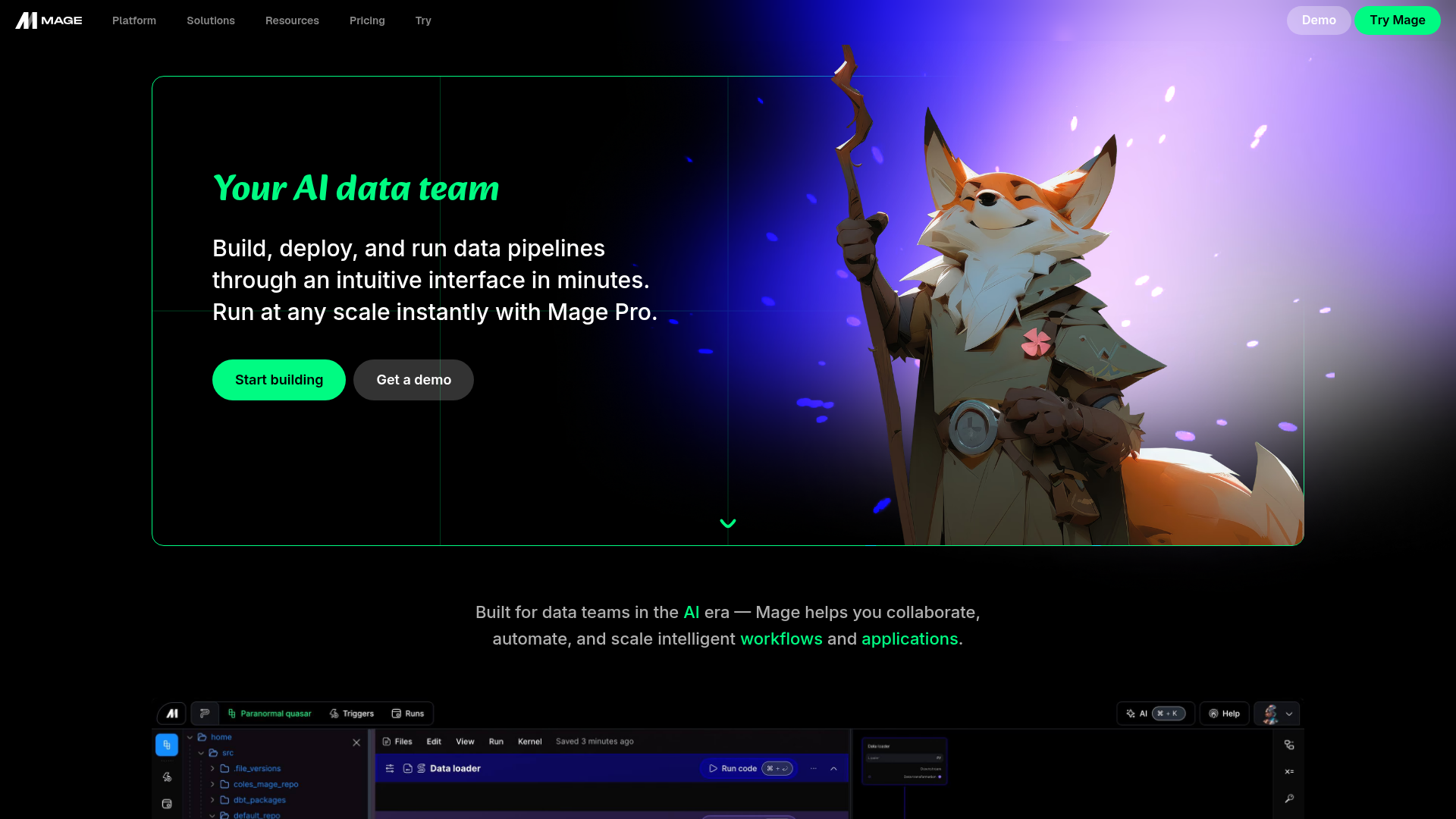
Mage AI Landing Page Hero
A dark-themed developer tool landing page featuring a split-screen hero layout with a high-quality illustration, call-to-action buttons, and a bottom code editor interface preview.
