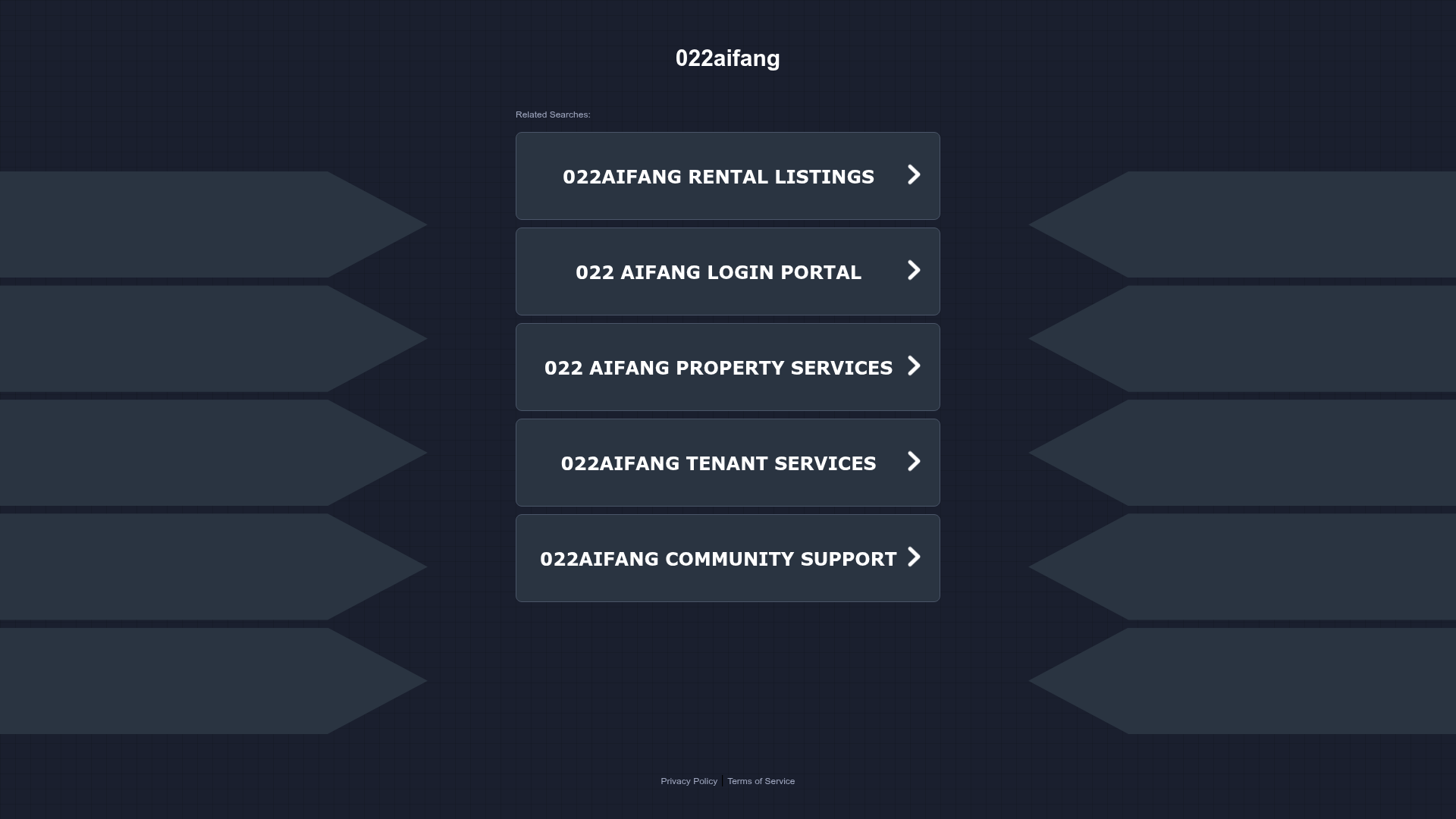
022aifang Link Gallery Landing Page
A dark-themed directory layout featuring symmetrical chevron side graphics and a centralized stack of hover-active navigation cards for resource links.
Overview
This landing page is a clean, dark-themed link directory or resource hub designed for high-visibility navigation. It features a symmetrical, grid-based aesthetic with decorative chevron graphics that draw the eye toward a central list of interactive service links. It is a strong reference for builders needing a minimalist 'Linktree-style' portal that feels more integrated and premium than a standard mobile-only link list.
Design System
- Color Palette & Visual Hierarchy: The site uses a deep navy-to-black background (
#121826range) with a subtle grid overlay. Contrast is achieved through bright white uppercase typography for primary links and a muted grey for secondary text like "Related Searches". Decorative elements on the sides use a very dark slate, keeping the focus on the central white text. - Typography: The system relies on a bold, sans-serif typeface. Primary navigation items are set in all-caps with generous letter spacing to enhance readability. The hierarchy is simple: a large center-aligned brand title at the top and uniform scale for all navigation cards.
- Page Structure & Flow: The layout is strictly centered. It follows a top-down flow: Brand Title > "Related Searches" label > Vertical Stack of 5 Navigation Cards > Footer. The symmetrical side chevrons act as "bookends" to prevent the central column from feeling isolated on wide screens.
- Reusable Components:
- Navigation Cards: The
lielements containing the.contentdiv are prime for reuse. They feature a border-radius, subtle background tint, and a right-aligned chevron icon (arrow.png) that indicates interactivity. - Decorative Sidebars: The
.decorative-leftand.decorative-rightcontainers with their stacked.chevrondivs are a unique way to fill whitespace without distracting from the main content.
- Navigation Cards: The
- Interaction Patterns: Hover states on the list items are intended to provide visual feedback (typically a slight background lighten or opacity shift). The use of the
arrow.pngwithin each link suggests a standard click-through behavior to external portals. - Implementation Clues: The HTML reveals a traditional structure using
<ul>and<li>for the list, wrapped in a.list_wrapper. The decorative side elements are absolute or flex-positioned containers (decorative-left) containing simple div-based shapes.
Use Cases
- Who should clone this: Developers building landing pages for domain parking, corporate internal resource portals, or multi-service real estate directories.
- Remixing effectively: This pattern is perfect for a "Brand Hub" or "Legal/Compliance" portal. You can remix it by swapping the static chevrons for brand-specific iconography or moving away from the dark theme to a high-contrast light mode with colorful cards.
- Practical directions: Consider making the central cards responsive using CSS Grid or Flexbox. The current layout is highly effective for "Mobile-First" design since the central column naturally stacks.
- Clone Scope: A full-page clone is recommended to maintain the symmetry, but the central
.list_wrappercomponent can be extracted individually for use as a "Quick Links" section on a larger homepage.
Related Inspirations
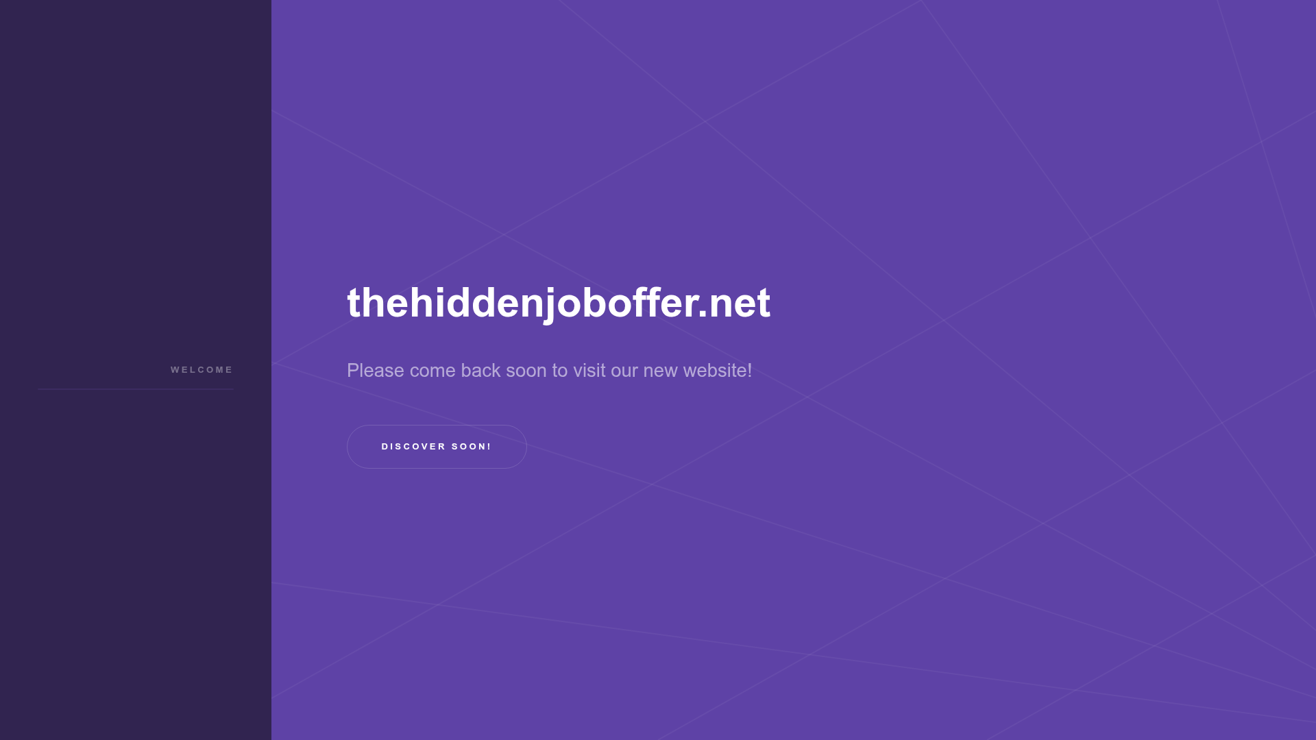
The Hidden Job Offer Landing Page
A minimalist purple-themed coming soon page featuring a side navigation bar, a centered hero section with a geometric background, and a primary call-to-action button.
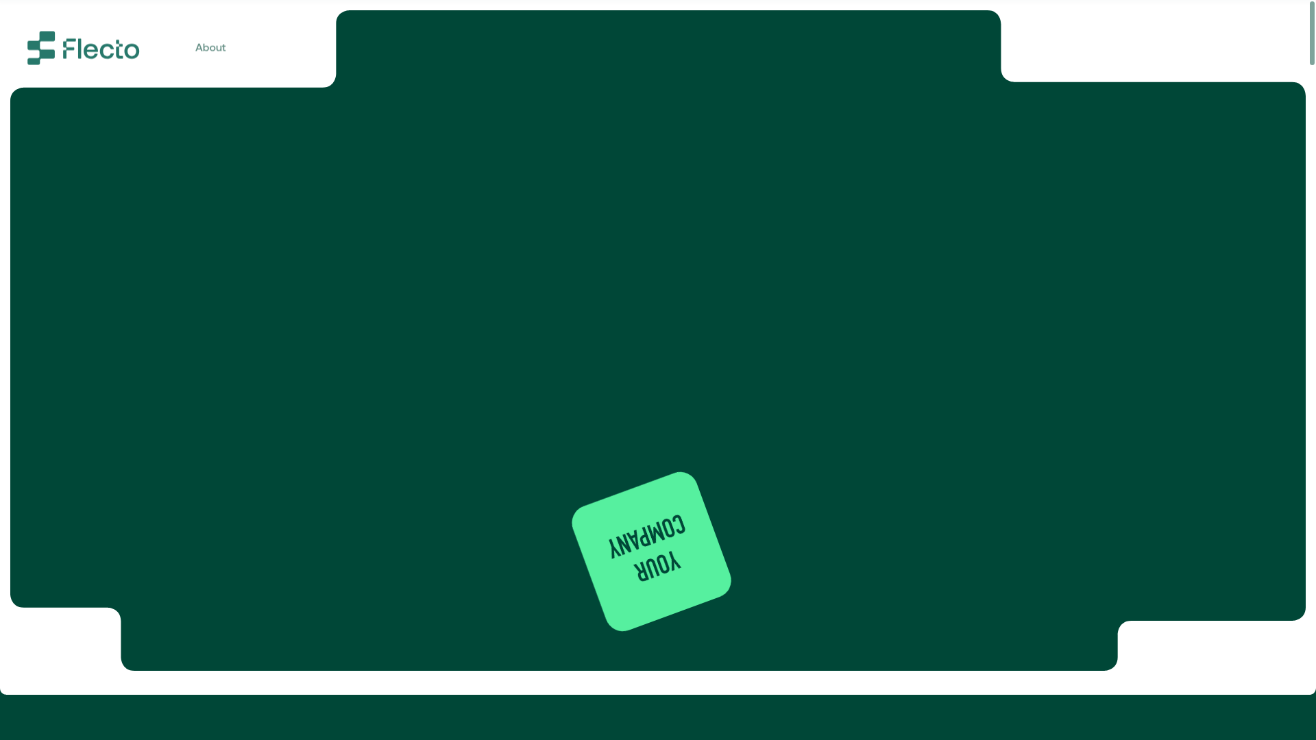
Flecto Rental Platform Modern Landing Page
A high-fidelity software landing page featuring interactive device mockups, a vertical visual timeline, bento-style management cards, and scroll-triggered GSAP animations.
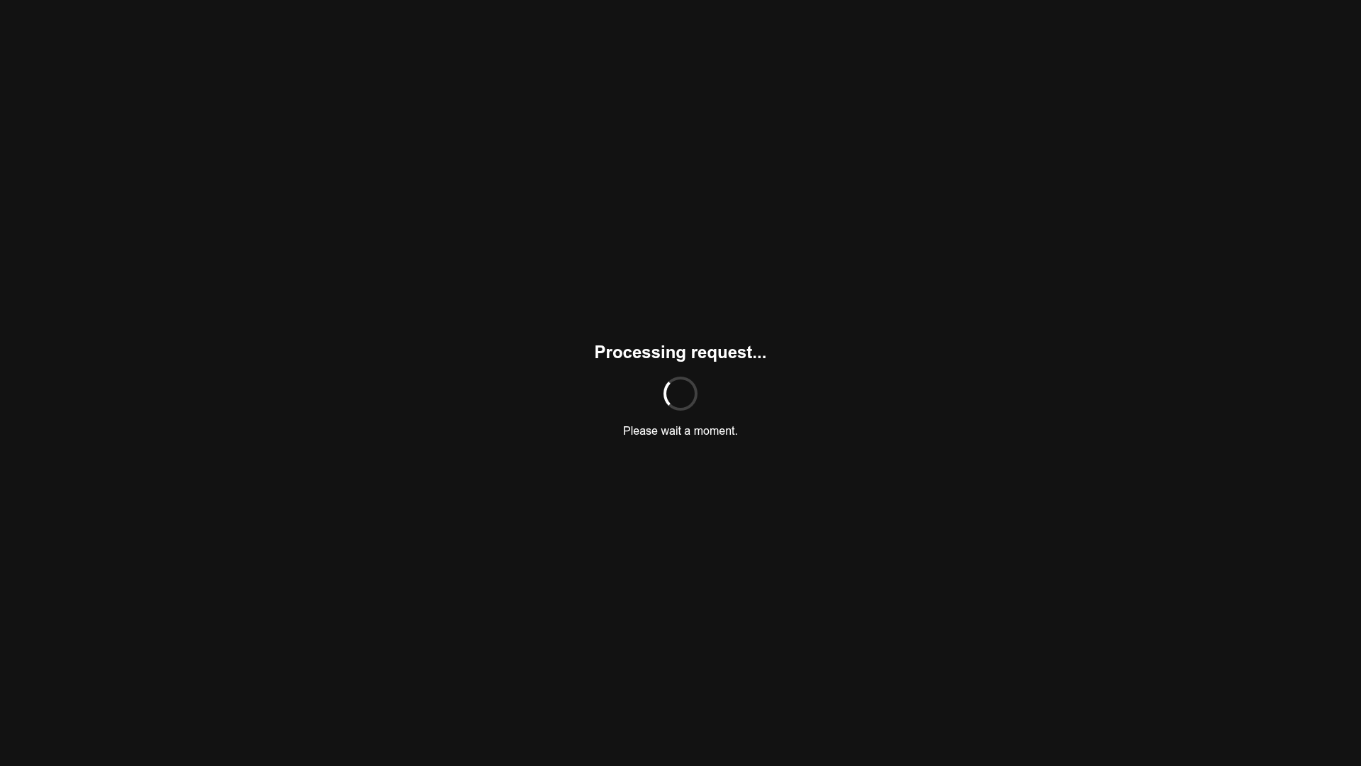
Minimalist Dark Mode Loading Screen
A clean, dark-themed redirection page featuring a centered typography layout and a CSS circular loading spinner for asynchronous processing states.
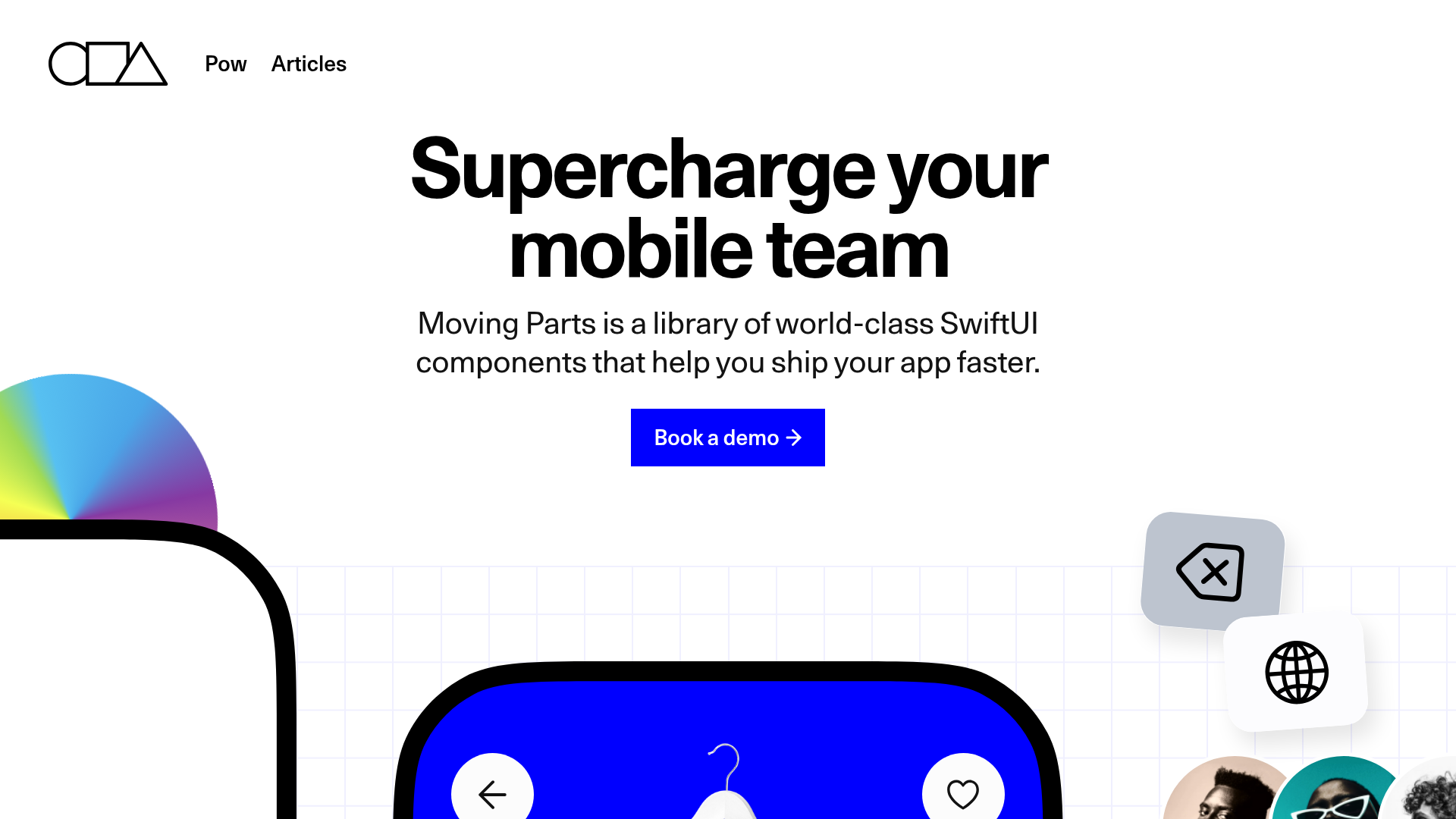
Moving Parts SwiftUI Component Library
A high-performance landing page featuring a interactive code comparison toggle, animated mobile UI previews, and a clean minimalist aesthetic for developer tools.
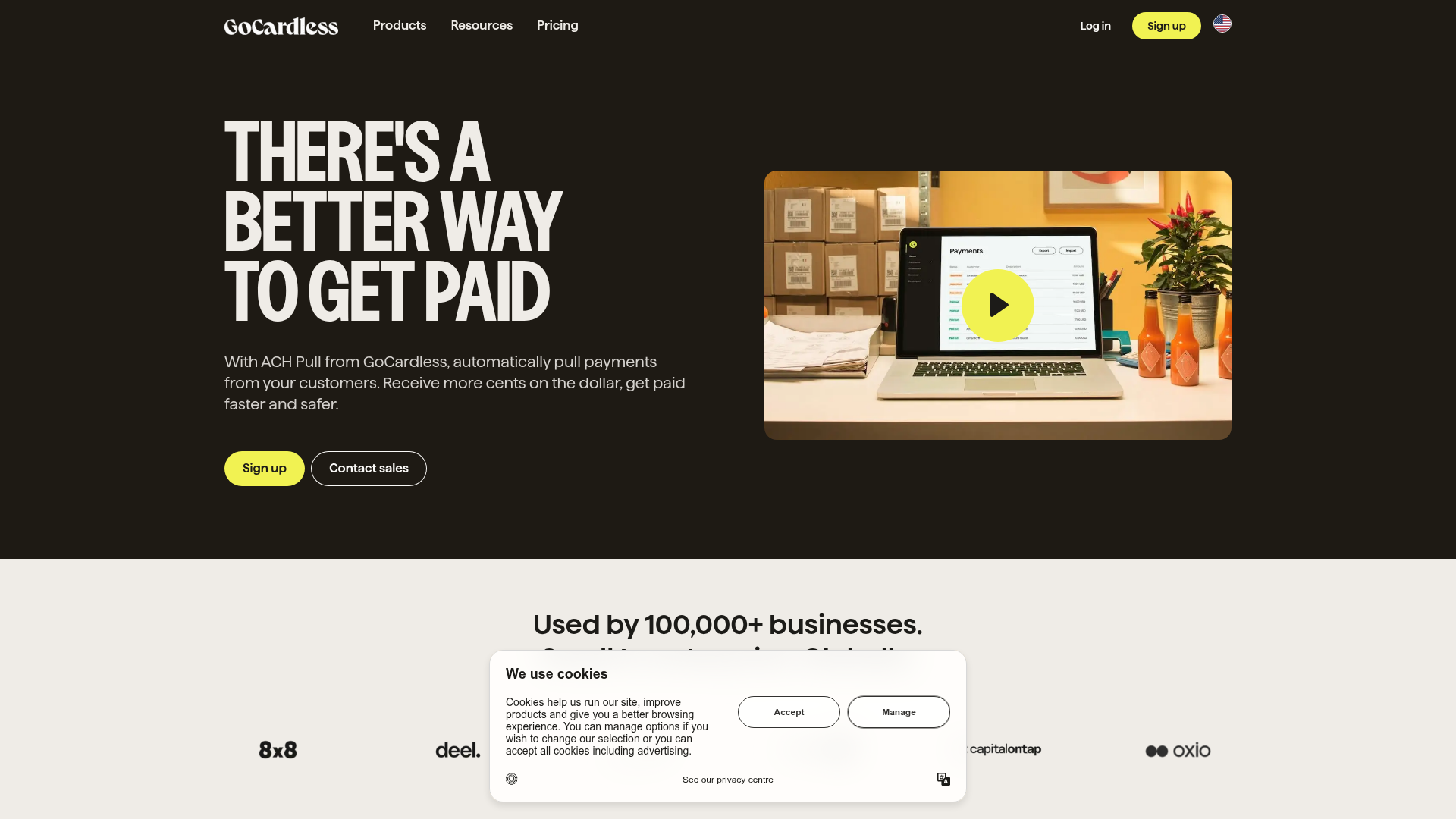
GoCardless Payments Platform Landing Page
A dark-themed fintech landing page featuring a split-screen video hero, bento-style feature cards, a horizontal logo slider, and step-by-step accordion guides.
Hourly App Landing Page
A minimalist iOS app landing page featuring a bold typographic hero, responsive grid-based screenshot displays, and custom SVG illustrations with CSS animations.
