Moving Parts SwiftUI Component Library
A high-performance landing page featuring a interactive code comparison toggle, animated mobile UI previews, and a clean minimalist aesthetic for developer tools.
Overview
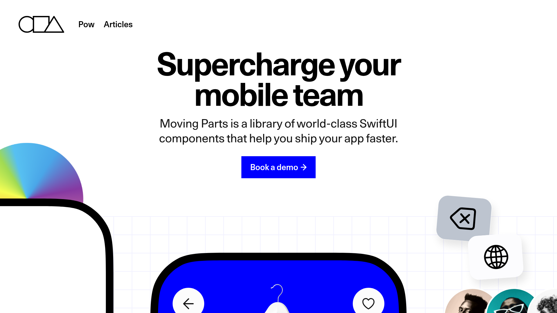
Moving Parts is a high-performance landing page for a developer tool library that uses high-fidelity UI simulations to demonstrate value. It is an excellent clone reference for technical products that need to showcase complex interface components through clean, minimalist aesthetic and interactive code comparisons.
Design System
- Color Palette & Visual Hierarchy: The design uses a high-contrast foundation of pure white (#FFFFFF) and deep black (#000000), accented by a vibrant 'electric' blue (#0000FF) for primary calls-to-action and key UI elements. This creates a professional, utility-first appearance where interactive elements stand out immediately against a sterile background.
- Typography: The system utilizes a bold, sans-serif headings with tight letter-spacing for high-impact readability. Supporting body text is smaller and lighter, using a classic sans-serif stack that prioritizes legibility in technical contexts.
- Page Structure: The layout follows a sophisticated three-column hero section. The side columns feature floating, 'snapped' mobile UI components (checkout screens, product pails, and avatar stacks), while the center column focuses on the core value proposition and a primary 'Book a demo' CTA. This is followed by a 'Boilerplate' section featuring a literal side-by-side comparison of raw code vs. library-driven code.
- Reusable Components:
- Interactive Code Switcher: A custom toggle (
mvp-switch) that swaps a 200+ line code block for a concise 5-line implementation. - Floating UI Cards: Rounded-corner mobile mockups that use realistic shadows and internal layouts like
mvp-vstackandmvp-hstackfor vertical and horizontal alignment. - Progressive Entry Fields: Form fields for credit card data that include inline validation icons and progress indicators.
- Interactive Code Switcher: A custom toggle (
- Interaction & Motion: Based on the HTML structure, the site uses custom web components (prefixed with
mvp-) to handle layout and state. The 'swipe' and 'pager' elements (ImagePager) suggest a focus on horizontal touch-based movement simulated for the desktop display. - Mobile Behavior: The design implements a responsive grid that collapses the three-column hero into a single stacked column. The HTML uses classes like
show-if-mobileandhide-if-mobileto swap or reorder elements specifically for smaller viewports.
Use Cases
- Who should clone this: Developers of UI libraries, SDKs, or SaaS tools who need to prove their product's efficiency by showing 'Before' vs. 'After' code examples.
- Effective Remixes: This pattern works well for e-commerce platforms wanting to showcase a seamless checkout experience or mobile app agencies looking to display their UI/UX portfolio in a simulated device environment.
- Remix Directions: Replace the SwiftUI-specific code block with JavaScript/React snippets or CSS frameworks. The 'floating' app components can be swapped for dashboard widgets or data visualization tiles to suit B2B analytics tools.
- Suggested Clone Scope: The Hero section (with its specialized side-column layout) and the Code Comparison block are the most high-value sections to clone individually for immediate impact on developer-facing pages.
Related Inspirations
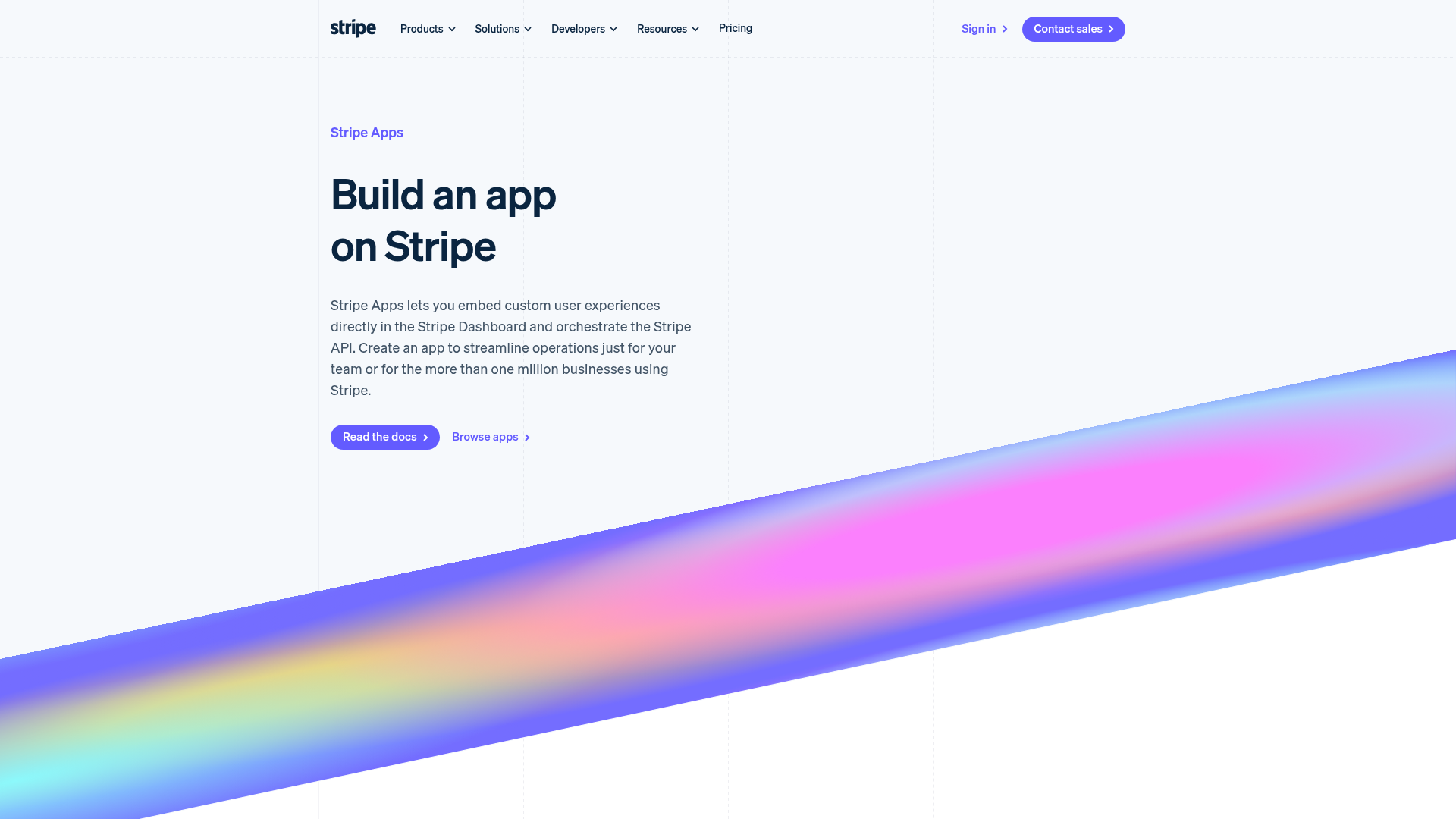
Stripe Apps Developer Portal Landing
A developer-focused landing page featuring a geometric animated gradient hero, multi-column feature sections, carousel components with code editors, and testimonial sliders.
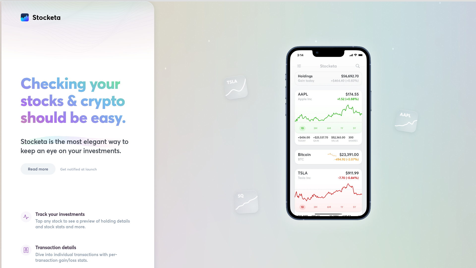
Stocketa Portfolio Tracker Landing Page
A split-screen landing page featuring a text-gradient hero, a sticky mobile app frame with parallax floating elements, and a feature grid with custom icons.
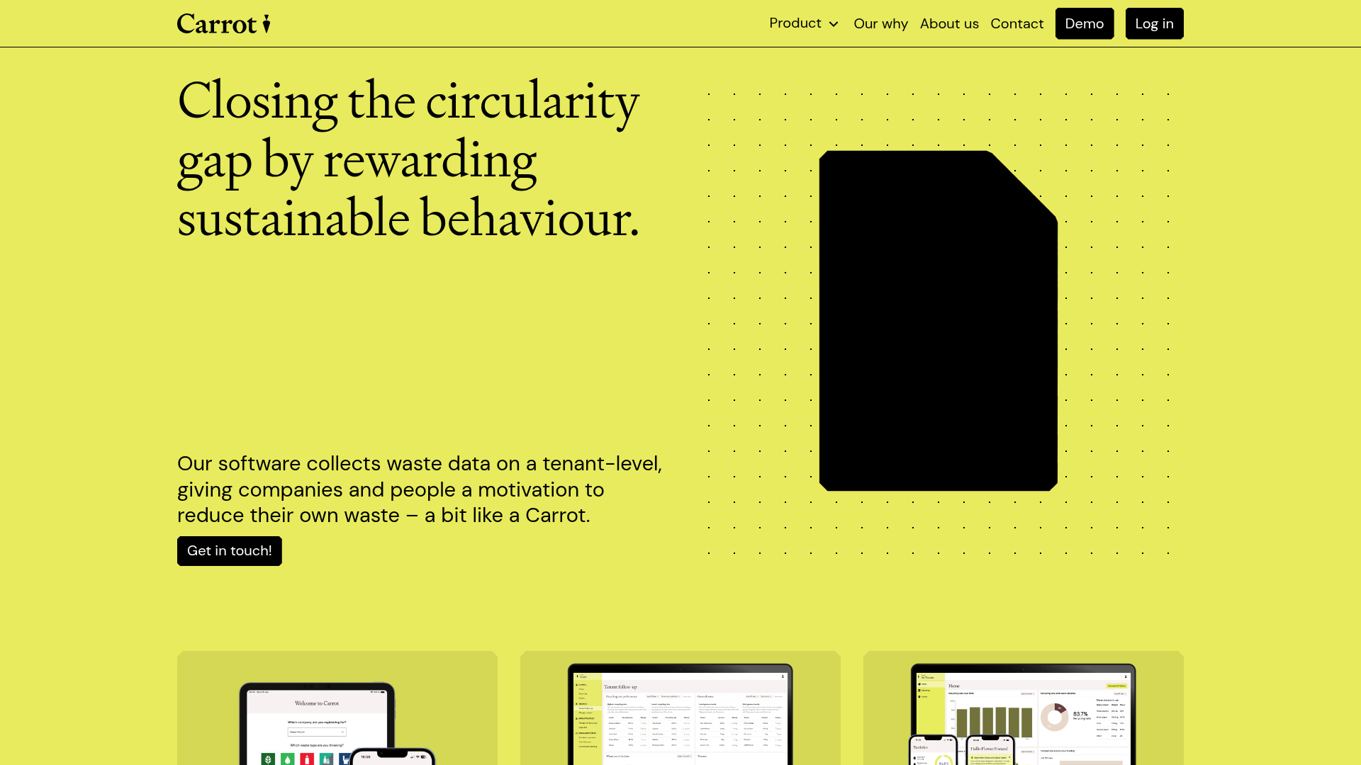
Carrot Sustainability Dashboard Landing Page
A minimalist SaaS layout featuring an animated typography hero, clean card-based feature grids, vertical split-screen marketing sections, and a structured testimonial component.
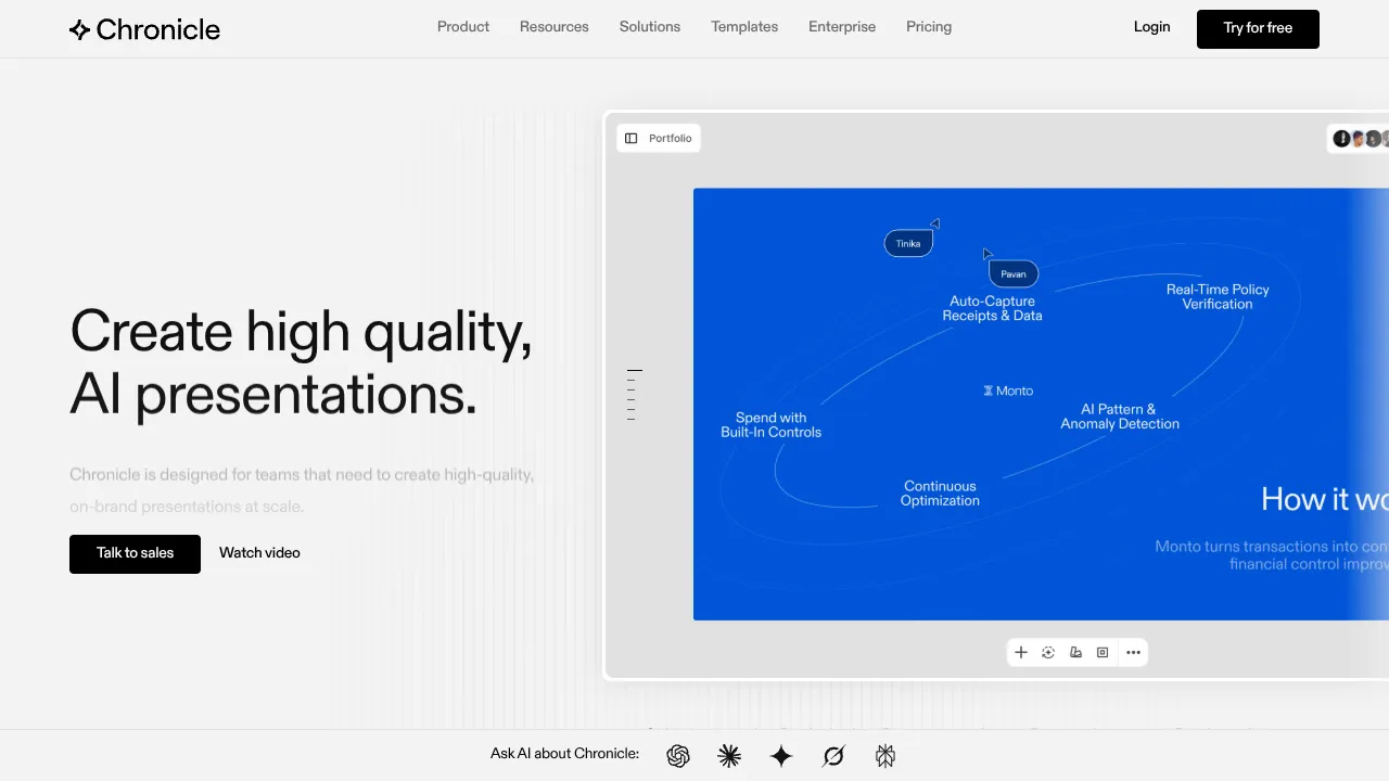
Chronicle AI Presentation Landing Page
A high-end SaaS layout featuring an animated slide-deck hero, sticky navigation with mega-menus, a bento-style feature grid, and an interactive before-and-after image slider.
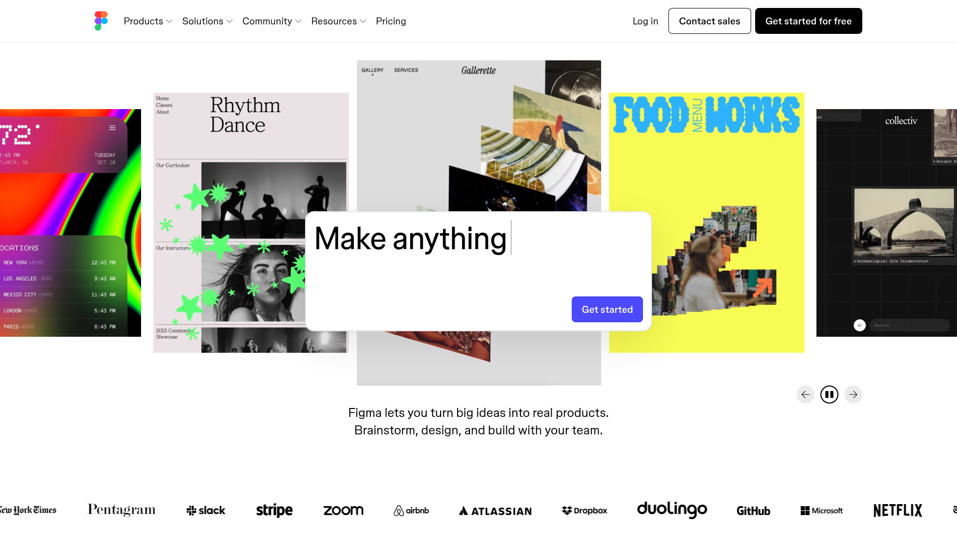
Figma Landing Page Gallery Hero
A dynamic landing page featuring a center-focused search bar hero, a horizontally-scrolling interactive video carousel, and a clean brand logo grid.
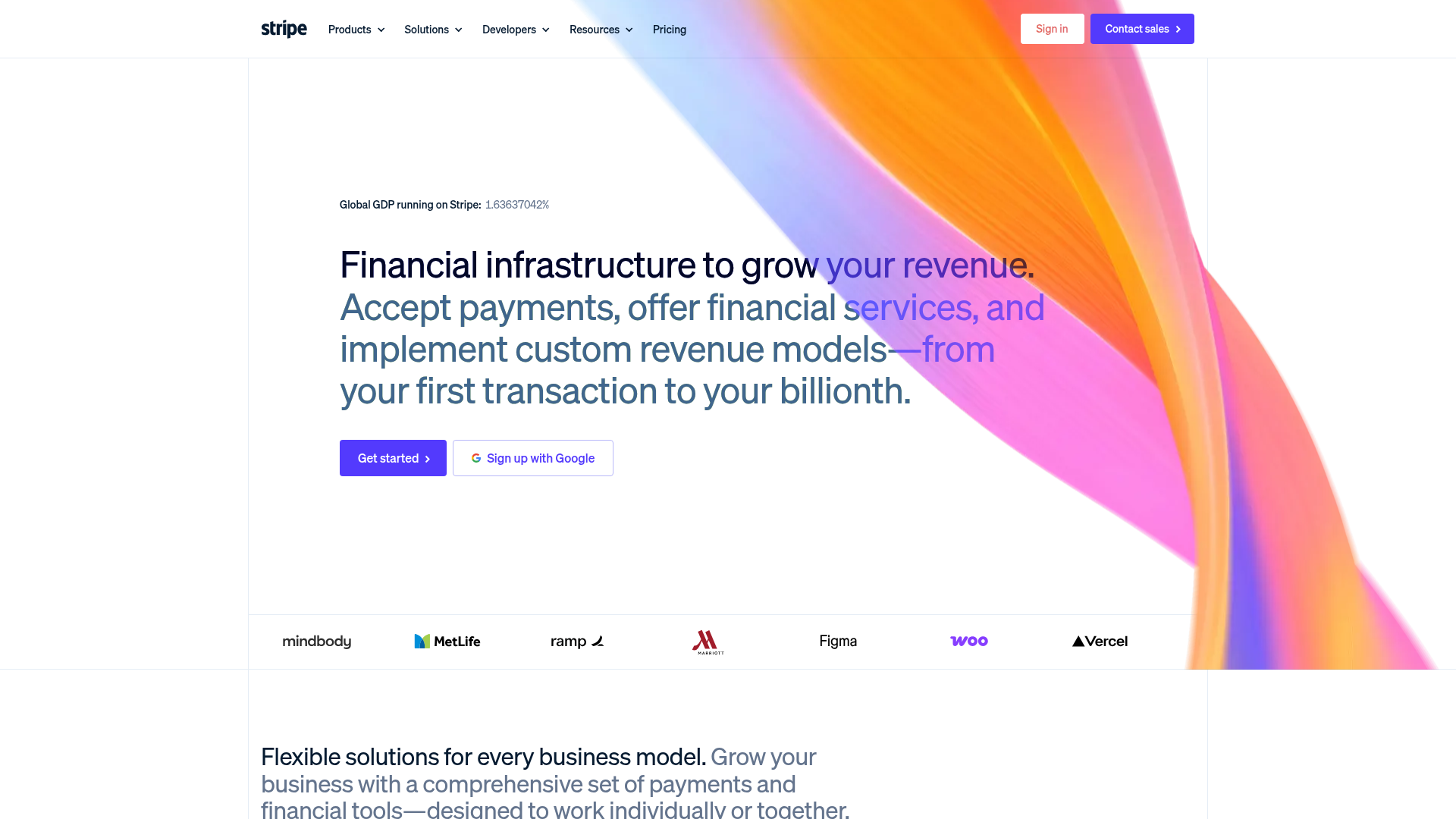
Stripe Modern SaaS Landing Page
A high-conversion landing page featuring a complex mesh-gradient hero, sticky navigation, and a horizontal logo wall for brand social proof.
