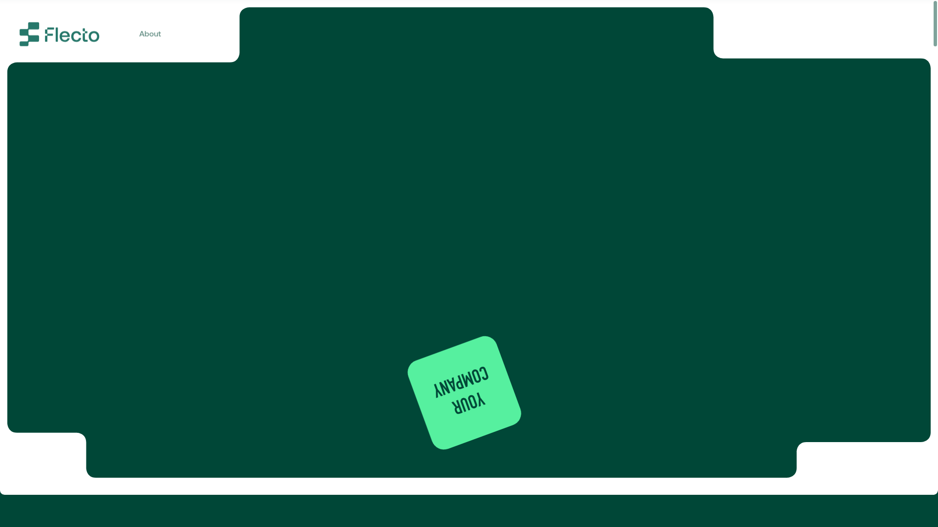
Flecto Rental Platform Modern Landing Page
A high-fidelity software landing page featuring interactive device mockups, a vertical visual timeline, bento-style management cards, and scroll-triggered GSAP animations.
Overview
Flecto’s landing page is a high-performance SaaS marketing site designed to make complex rental management software feel accessible. It is a premier reference for cloning because of its masterful use of "bento box" layout patterns and sophisticated scroll-triggered hardware simulations that bridge the gap between B2B software and consumer-facing retail.
Design System
- Color Palette & Visual Hierarchy: The site uses a deep "Forest Green" (#004737) as its primary foundation, creating a professional, trustworthy atmosphere. This is offset by high-contrast accents of "Flecto Mint" (#3BF09F) for primary actions and highlights, with soft "Light Mint" backgrounds used to separate secondary sections.
- Typography: A clean, sans-serif font is used throughout with a clear hierarchy. Headlines use large, bold weights with tight tracking, while "upper-titles" are styled as small-caps outlined or filled badges (e.g., "For your Business") to provide context without clutter.
- Page Structure: The layout follows a logical progression: Trusted Mention strip (Forbes, TechCrunch) → Product Feature Scrollytelling (featuring the "Flecto Link" and interactive phone mockup) → Sustainability Mission → Management Bento Grid → Insurance/Protection block → Distribution Channels.
- Reusable Components:
- Interactive Device Mockups: The phone frame component (
fto-phone) transitions between "Bookings" and "Inventory" states via UI toggles. - Bento Management Cards: The
renter-cardandproduct-cardscomponents are perfect for repurposing into dashboard previews or data-heavy feature displays. - Visual Timeline: A vertical dot-and-bridge stepper (
ftc-visual-timeline) that animates to guide users through a workflow. - Interactive Toggles: Custom styled switches (
for-the-owner-switcher) that trigger state changes in adjacent UI mockups.
- Interactive Device Mockups: The phone frame component (
- Interaction & Motion: The site relies heavily on GSAP-driven scroll animations. Elements fade in with a slight upward translation (
translate3d(0px, -30px, 0px)), and the masonry testimonial grid uses parallax offsets where different columns scroll at varied speeds. - Implementation Clues: The HTML reveals a Nuxt.js (Vue) framework utilizing Locomotive Scroll for smooth scrolling and complex scroll-section mapping (e.g.,
data-scroll-section-id). Components are highly modular, following a BEM-like naming convention (e.g.,bottom-view-payment-container).
Use Cases
- Who should clone this: Developers building SaaS landing pages for logistics, fintech, or any platform that requires demonstrating a dual-sided marketplace (provider vs. customer) through interactive mockups.
- Effective Remixes:
- Eco-SaaS: The sustainability section with its organic shapes and leaf accents can be adapted for any green-tech product.
- App Portfolio: The vertical timeline and phone simulation sections are ideal for mobile app developers showcasing a specific user journey.
- Practical Remix Directions: Swap the deep green for a bright ultraviolet or blue to shift the brand from "sustainable/organic" to "web3/enterprise." Reuse the "bento" cards specifically to showcase platform integrations or data analytics features.
- Suggested Clone Scope: For a fast win, clone the
for-the-ownersection to create an interactive product demo. For a full brand overhaul, the entire scroll-driven architecture provides a gold-standard framework for high-conversion marketing.
Related Inspirations
022aifang Link Gallery Landing Page
A dark-themed directory layout featuring symmetrical chevron side graphics and a centralized stack of hover-active navigation cards for resource links.
Moving Parts SwiftUI Component Library
A high-performance landing page featuring a interactive code comparison toggle, animated mobile UI previews, and a clean minimalist aesthetic for developer tools.

GoCardless Payments Platform Landing Page
A dark-themed fintech landing page featuring a split-screen video hero, bento-style feature cards, a horizontal logo slider, and step-by-step accordion guides.
The Hidden Job Offer Landing Page
A minimalist purple-themed coming soon page featuring a side navigation bar, a centered hero section with a geometric background, and a primary call-to-action button.
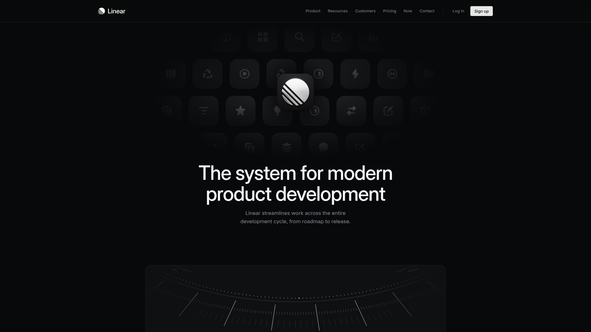
Linear Product Features Landing Page
A premium dark-themed landing page featuring a minimalist aesthetic, bento style icon grids, sleek typography, and high-contrast call-to-action buttons.
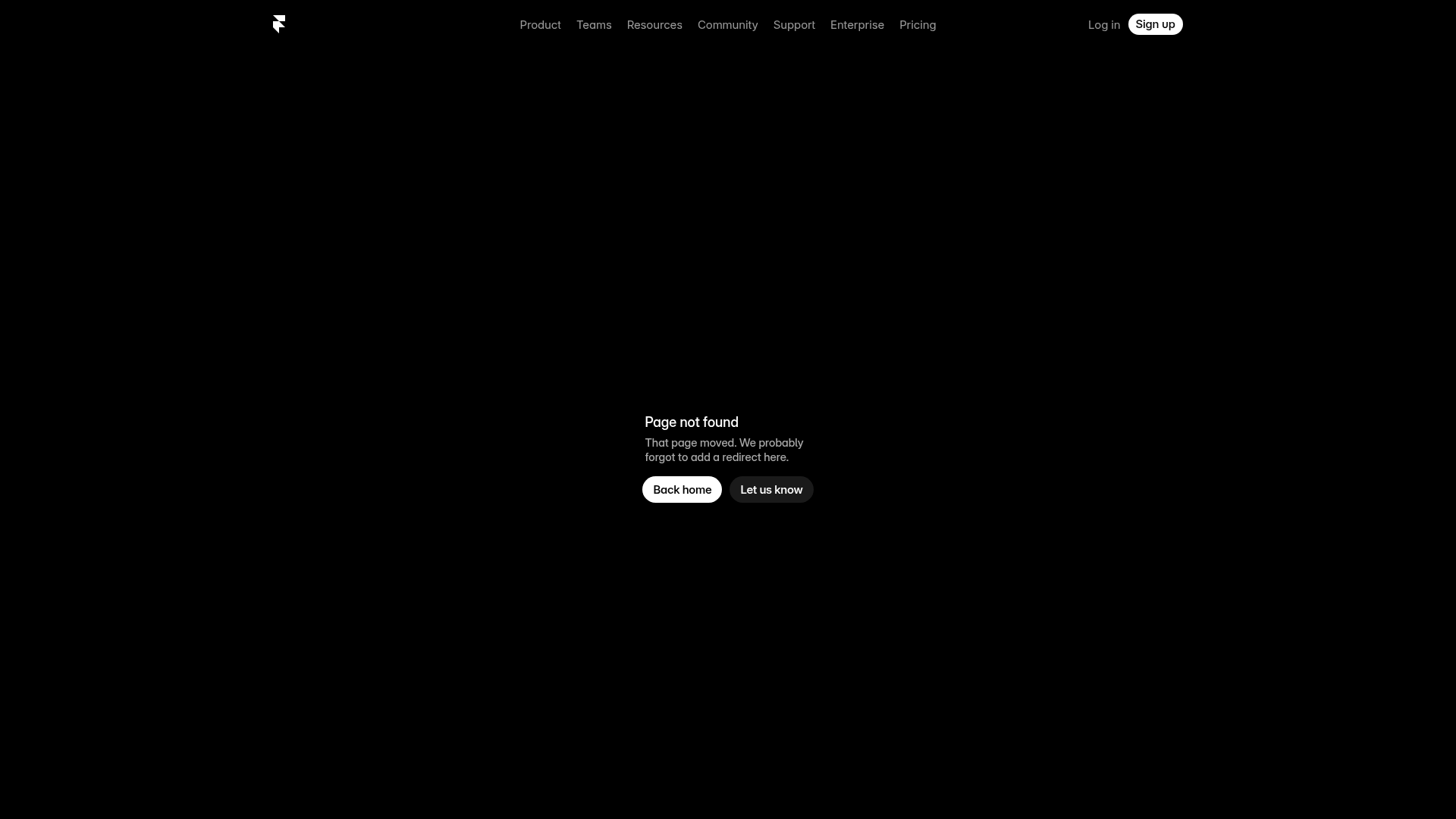
Framer Dark 404 Error Page
A minimalist dark mode error page featuring a clean centered layout, monochromatic navigation, and pill-shaped call-to-action buttons.
