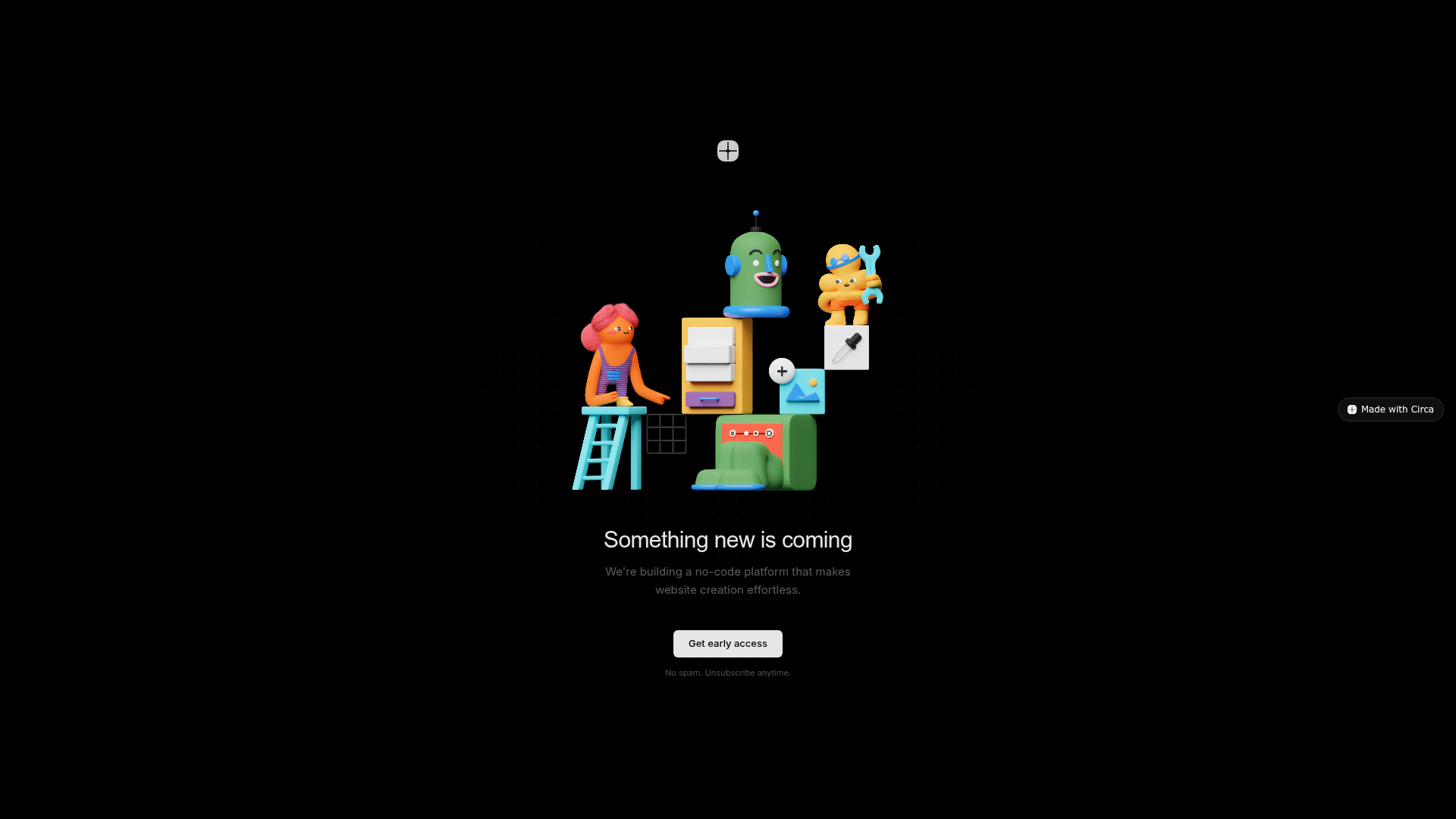
Circa Minimalist Launch Landing Page
A dark-themed waiting list template featuring a subtle dot-grid background, centered flexbox layout, and a video hero section with a call-to-action button.
Overview
This minimalist landing page serves as a high-impact waiting list for a product launch, prioritizing visual flair and a single clear call-to-action. It is a strong reference for builders because it demonstrates how to achieve a premium 'dark mode' aesthetic using simple CSS techniques like dot-grid backgrounds and radial gradients to frame a 3D video hero.
Design System
- Color Palette & Visual Hierarchy: The design uses a deep black background (
#000) with white elements at varying opacities for hierarchy. Primary text sits attext-white/90, descriptions attext-white/35, and metadata attext-white/30. The high-contrast white button (bg-white/[0.9]) stands as the focal point. - Typography: The system relies on the Geist sans-serif typeface. It uses a tight scale where the H1 is
24px-30pxwith a negative letter-spacing of-0.02emfor a modern, compact look. Body text and buttons are kept small (13px-15px) to emphasize whitespace. - Page Structure: A simple vertically centered flexbox layout. It follows a top-down flow: Logo → Video Hero → Heading → Description → CTA → Disclaimer.
- Reusable Components: The core components are the Centered CTA block and the Subtle Dot Grid Background. The background is achieved via a
radial-gradientrepeating at24pxintervals combined with a secondary large radial gradient that creates a vignette effect to darken the edges of the screen. - Interaction & Motion: The hero features an auto-playing, looping 3D animation (
.mp4) that provides life without user input. The button utilizes a smoothtransition-colorsduration of 200ms for hover states. - Implementation Clues: The page is built with Tailwind CSS utility classes (evident from classes like
min-h-screen,flex-col, andtext-white/30) and modern web standards such asbackdrop-filter: blur(8px)for the fixed bottom badge.
Use Cases
- Who should clone this: Solo founders, developers launching a beta, or studios needing a high-quality 'Coming Soon' placeholder that doesn't look like a standard template.
- Remix Directions: Swap the
.mp4video with a high-quality Lottie animation or a static 3D render. The dot-grid background can be easily modified by changing thergbaopacity or thebackground-sizeto adjust density. - Practical Adaptations: This layout is ideal for mobile-first marketing. Since it uses a fixed-width container for text (
max-w-[340px]), the layout remains consistent and professional across all screen sizes. - Clone Scope: A full-page clone is recommended as a boilerplate for any project in the 'stealth' or 'early access' phase.
Related Inspirations
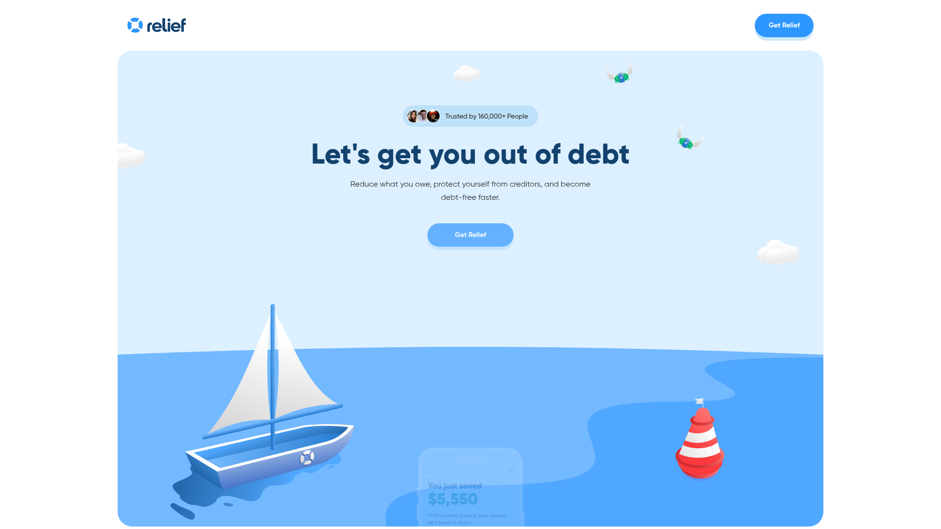
Relief App Debt Management Landing Page
A clean fintech landing page featuring an animated SVG hero, marquee testimonial cards, bento-style feature sections, and a structured FAQ accordion.
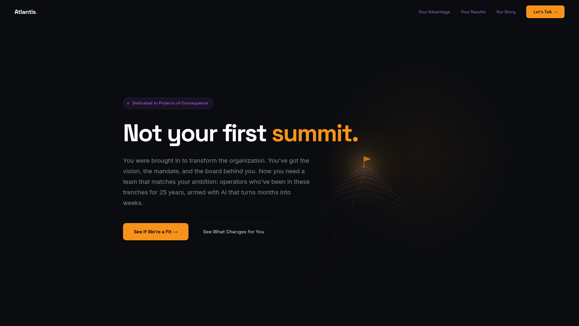
Atlantis Tech Engineering Services Landing Page
A dark-themed professional services layout featuring a custom SVG mountain hero, logo cloud, benefits grid, process timeline, and a dual-column 'fit' comparison section.
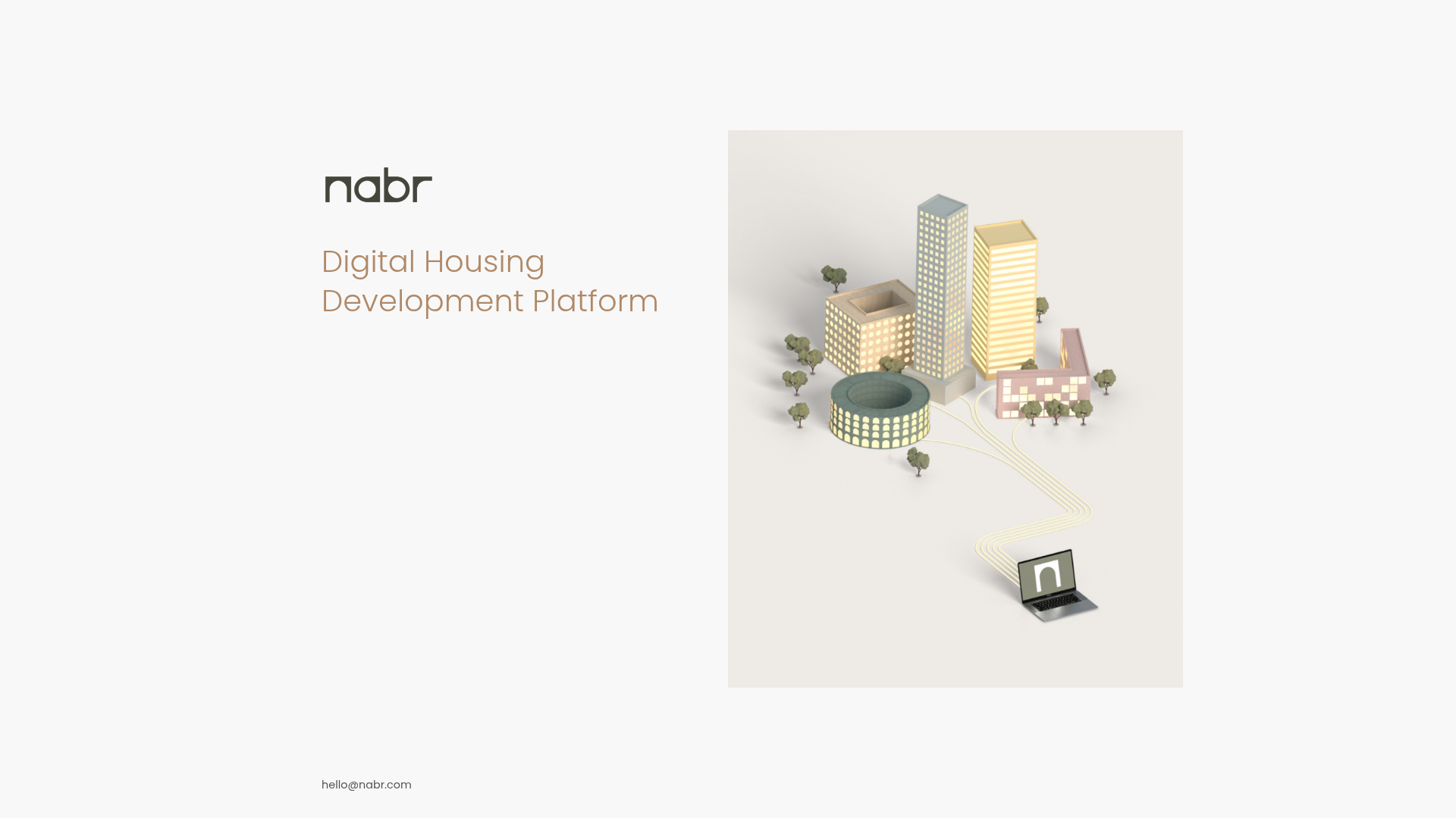
Nabr Digital Housing Landing Page
A minimalist two-column landing page featuring a clean aesthetic, stylized typography, and a simple split layout for combining large-scale imagery with text.
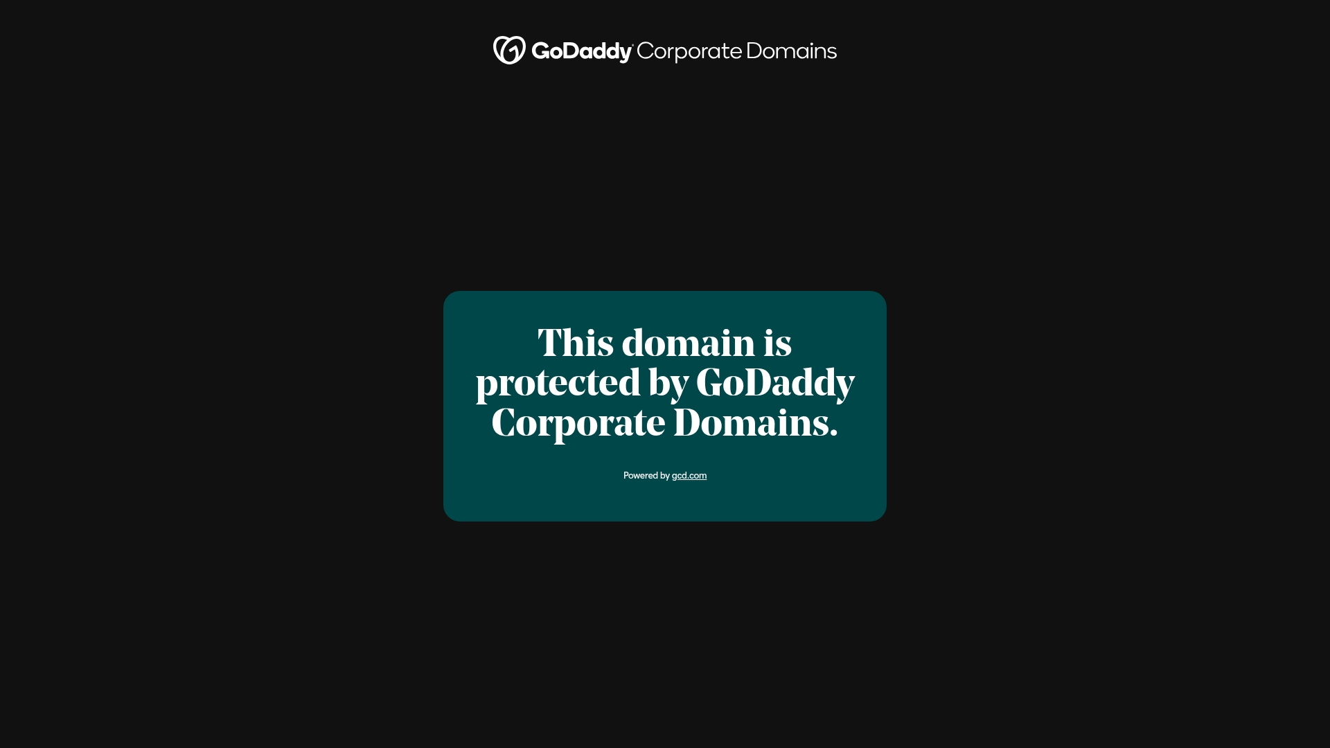
GoDaddy Corporate Domain Protection Page
A minimalist domain verification layout featuring a centered card, large serif typography, and a logo header on a dark background.

Good Glyphs Font Showcase Landing Page
A single-page layout featuring an interactive type tester, donation form with custom amount logic, and a contributor gallery using swiper-based glyph previews.
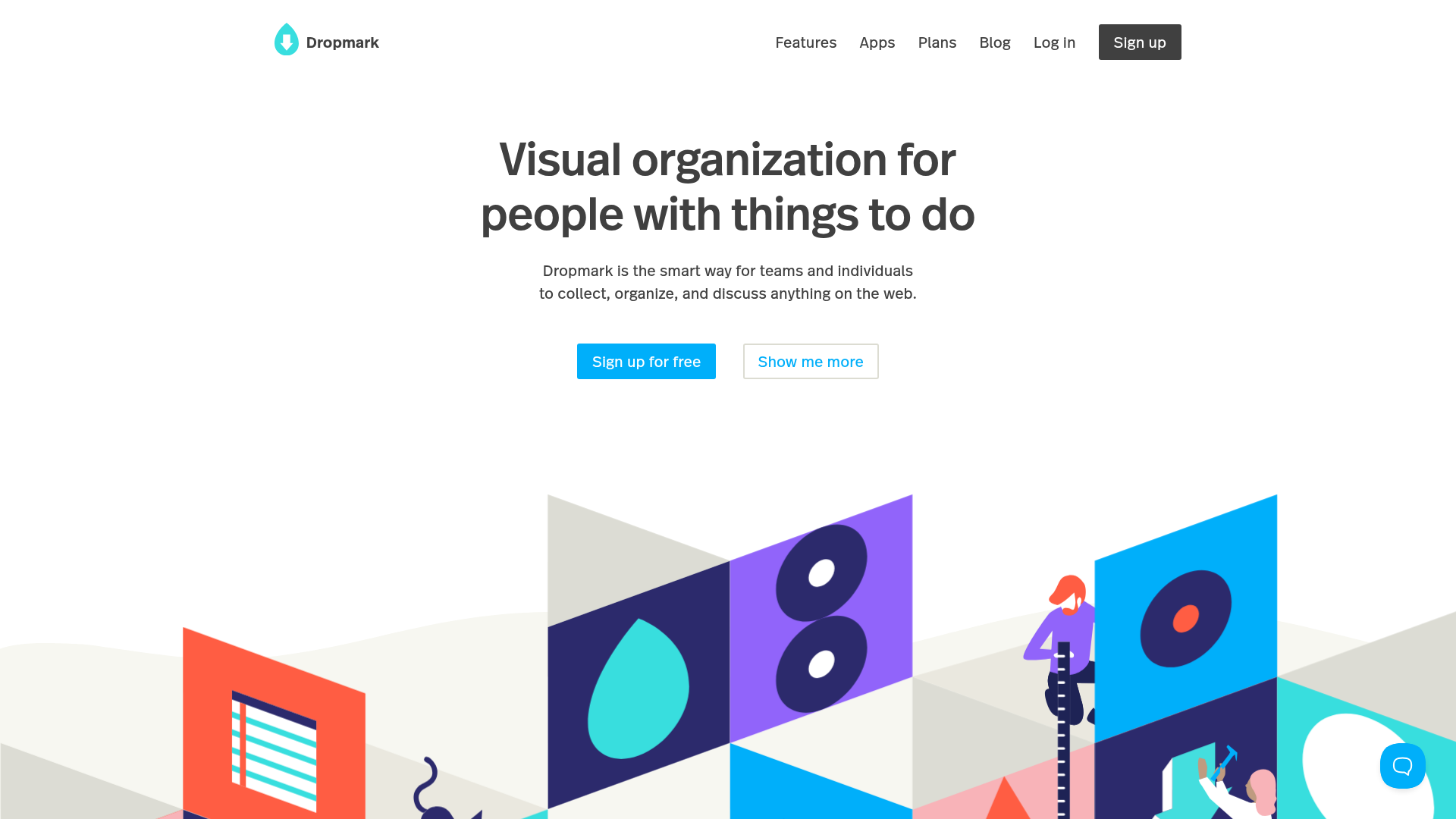
Dropmark Visual Organization Landing Page
Features a clean minimalist hero section with split-action buttons, a vibrant vector illustration footer, and an interactive horizontal flickity carousel for case studies.
