Atlantis Tech Engineering Services Landing Page
A dark-themed professional services layout featuring a custom SVG mountain hero, logo cloud, benefits grid, process timeline, and a dual-column 'fit' comparison section.
Overview
This landing page for Atlantis Tech is a premium, high-trust professional services layout designed for enterprise consulting and engineering squads. It uses a dark-themed, high-contrast aesthetic to communicate authority and modern execution, making it an excellent reference for B2B agencies, technical service providers, or high-end productized services.
Design System
- Color Palette & Visual Hierarchy: The site uses a deep black background (
--bg-dark) with a primary action color of vibrant amber/orange (--accent). Text hierarchy is strictly enforced through opacity: pure white for headings, 60-70% white for subtext, and 30% white for labels or decorative elements. Success metrics and highlights use the orange accent to draw immediate visual attention. - Typography: The system relies on a clean, sans-serif stack. Headings use tight letter-spacing and bold weights for a sophisticated feel. Labels (like "The Pattern" or "Your Results") are rendered in all-caps with increased letter-spacing to create a "functional" or "technical" UI aesthetic.
- Page Structure: The flow follows a "Problem-Solution-Proof-Process" sequence:
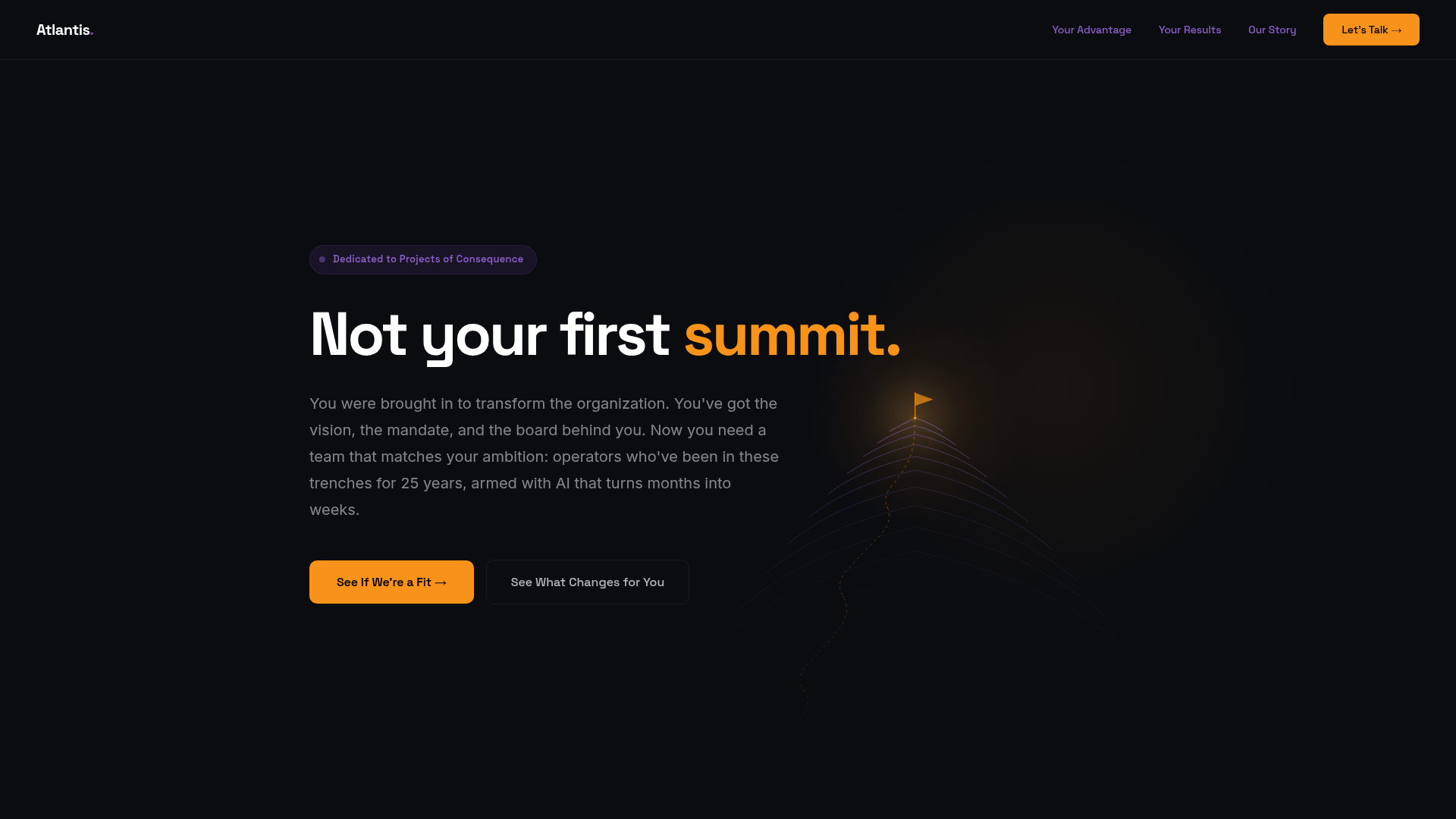
- Hero: Problem statement with a custom SVG mountain and dual-button CTA.
- Social Proof: Multi-row text-based logo cloud for established brands.
- The Thesis: A narrative grid comparing old-school consulting with modern leverage.
- Benefits Grid: Six cards with custom icons and clear value-proposition headings.
- Outcomes & Social Proof: Metric-driven cards and a focused "In the Arena" case study section.
- Timeline/Path: A 4-step vertical list explaining the engagement process.
- The Fit: A high-contrast comparison table for qualification.
- Reusable Components:
- The "Fit" Grid: A two-column card layout (
fit-leftandfit-right) using checkmarks and dashes to qualify leads. - Outcome Cards: Large metric displays (e.g., "4×") with high-contrast highlight spans.
- SVG Section Dividers: Sophisticated, low-opacity technical drawings (contours, signals, compasses) used as thematic visual breaks.
- The "Fit" Grid: A two-column card layout (
- Implementation Clues: The HTML reveals a custom CSS variable-driven system (
--white-30,--bg-card,--accent). Sections are logically separated by<section>tags and use flex/grid for responsive alignment. The footer includes a dynamic CTA that reveals a contact form via an ID toggle (#cta-reveal).
Use Cases
- Who should clone this: Technical consultants, engineering agencies, and cybersecurity firms that need to move away from generic "corporate blue" looks to a more modern, developer-centric aesthetic.
- Remixing for different products: This layout works perfectly for a SaaS platform targeting enterprise leadership. The "mountains" and "summits" metaphor can be swapped for "velocity," "security," or "growth" by simply changing the SVG assets and primary accent color (e.g., to a neon green for security or a deep violet for AI tools).
- Suggested Clone Scope: A full-page clone is highly effective for a centerpiece service offering. For a quicker build, the "Fit" comparison section and the "How-Step" timeline are individual components that can be lifted to add credibility to any existing service page.
Related Inspirations
Moxie PR Agency Landing Page
A dark-themed agency site featuring an animated typewriter hero, ticker-style marquee, interactive case study cards with video backgrounds, and a vertical sticky services section.
EarlyDog Managed Ops Landing Page
A minimalist landing page featuring a bold geometric hero illustration, asymmetrical grid layouts, and clean typography for service-based businesses.
Stellar agency landing page
Dark-mode design agency landing page featuring a horizontal scroll gallery, tabbed CMS portfolios, and a unique button animation pattern with integrated availability status.

Good Glyphs Font Showcase Landing Page
A single-page layout featuring an interactive type tester, donation form with custom amount logic, and a contributor gallery using swiper-based glyph previews.

Niklas Rosén Designer Portfolio Index
A minimalist, responsive grid-based portfolio index featuring a clean 16-column layout, typographic list components, and a custom dark mode transition.
Minimalist Dark Mode Loading Screen
A clean, dark-themed redirection page featuring a centered typography layout and a CSS circular loading spinner for asynchronous processing states.
