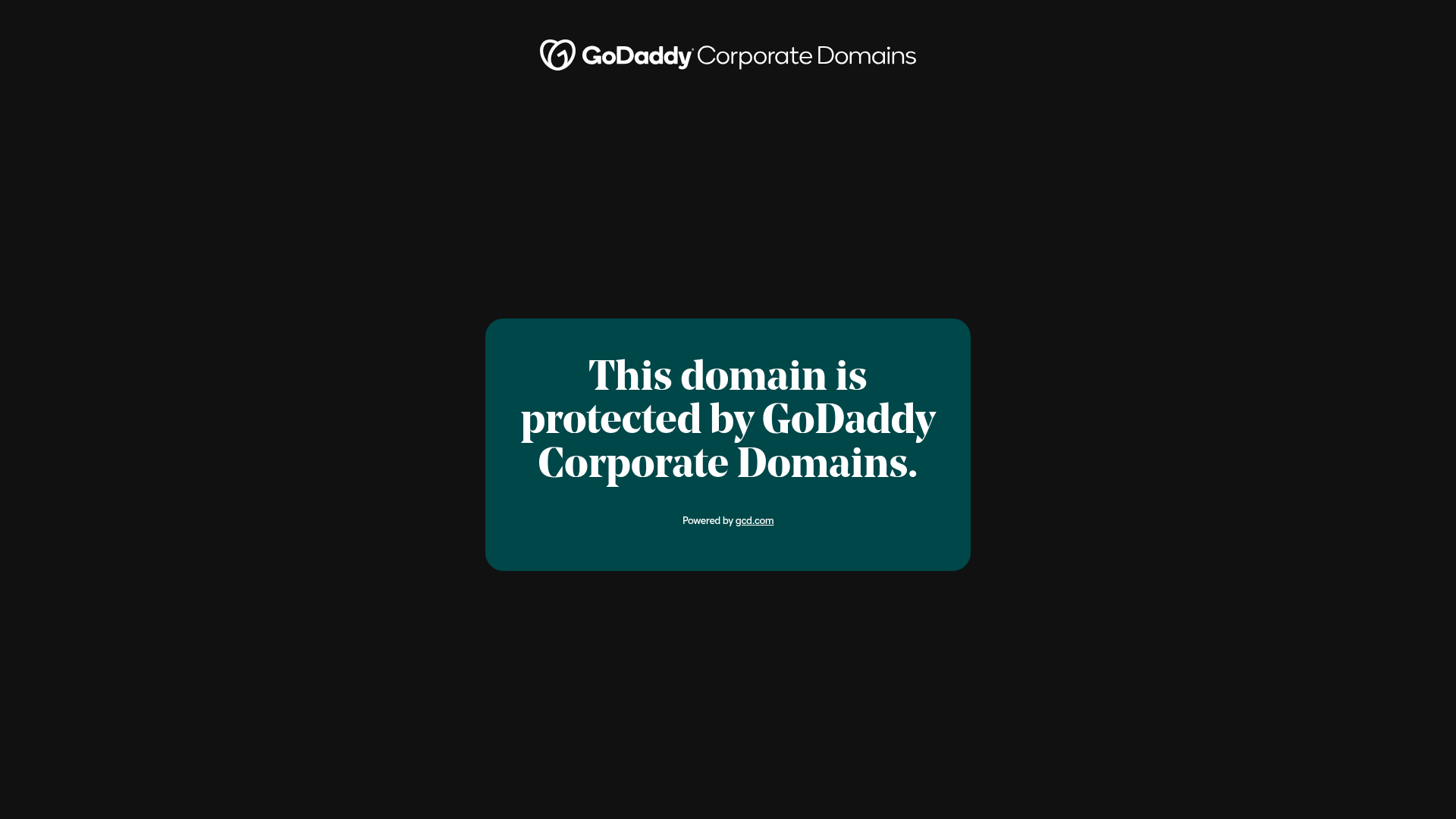
GoDaddy Corporate Domain Protection Page
A minimalist domain verification layout featuring a centered card, large serif typography, and a logo header on a dark background.
Overview
This is a high-utility, minimalist domain protection landing page designed for corporate security and brand verification. It serves as an excellent reference for high-intent, single-purpose layouts where clarity, authority, and brand identity must be communicated instantly through minimal UI elements.
Design System
- Color Palette & Visual Hierarchy: The design utilizes a high-contrast dark theme. A deep black background (
bg-black) serves as the canvas for a focal teal/dark-green card (referenced asbg-blue-700in the utility classes but visually appearing as dark forest green). The hierarchy is established by the stark white typography on the dark card, ensuring the primary message is unavoidable. - Typography system: A bold, high-contrast serif typeface is used for the primary H1 to evoke a sense of established authority and prestige. The scale is generous, ranging from
42pxto52pxon desktop. Supporting text uses a smaller (14px), medium-weight sans-serif for technical details and links. - Page Structure: The layout is a classic vertically centered container. It features a top-aligned logo header followed by a centrally positioned card that contains the primary status message and a footer-style link.
- Reusable Components: The central "Status Card" is highly reusable. It features significant internal padding (
pt-[52px] px-[32px] pb-[36px]) and a large corner radius (rounded-[24px]), making it a perfect template for alerts, maintenance pages, or login modals. - Interaction Patterns: The implementation includes subtle hover states on links, specifically targeting color shifts (
text-blue-100). The presence of agrecaptcha-badgeindicates integrated background security services. - Responsive Behavior: The HTML uses Tailwind CSS utility classes to manage scale. The typography shifts from
42px(mobile) to52px(desktop) to maintain impact across devices while the container maintains amax-w-[640px]to prevent text lines from becoming too long on ultra-wide screens.
Use Cases
- Who should clone this: Security startups, domain registrars, and corporate IT departments needing a professional "Holding" or "Protected" page for inactive assets.
- Remixing for other products: This pattern is highly effective for "Coming Soon" pages, maintenance mode screens, or 404 error pages where a brand wants to maintain a sophisticated image.
- Practical Directions: Designers can remix this by swapping the serif font for a modern monospaced font for a developer-tooling aesthetic, or changing the card color to a brand-specific gradient while keeping the centered structural layout.
- Clone Scope: This is an ideal "quick section clone." The entire functional layout is contained within a single
<section>tag and a centereddiv, making it easy to drop into any existing project as a standalone utility page.
Related Inspirations

GoCardless Payments Platform Landing Page
A dark-themed fintech landing page featuring a split-screen video hero, bento-style feature cards, a horizontal logo slider, and step-by-step accordion guides.
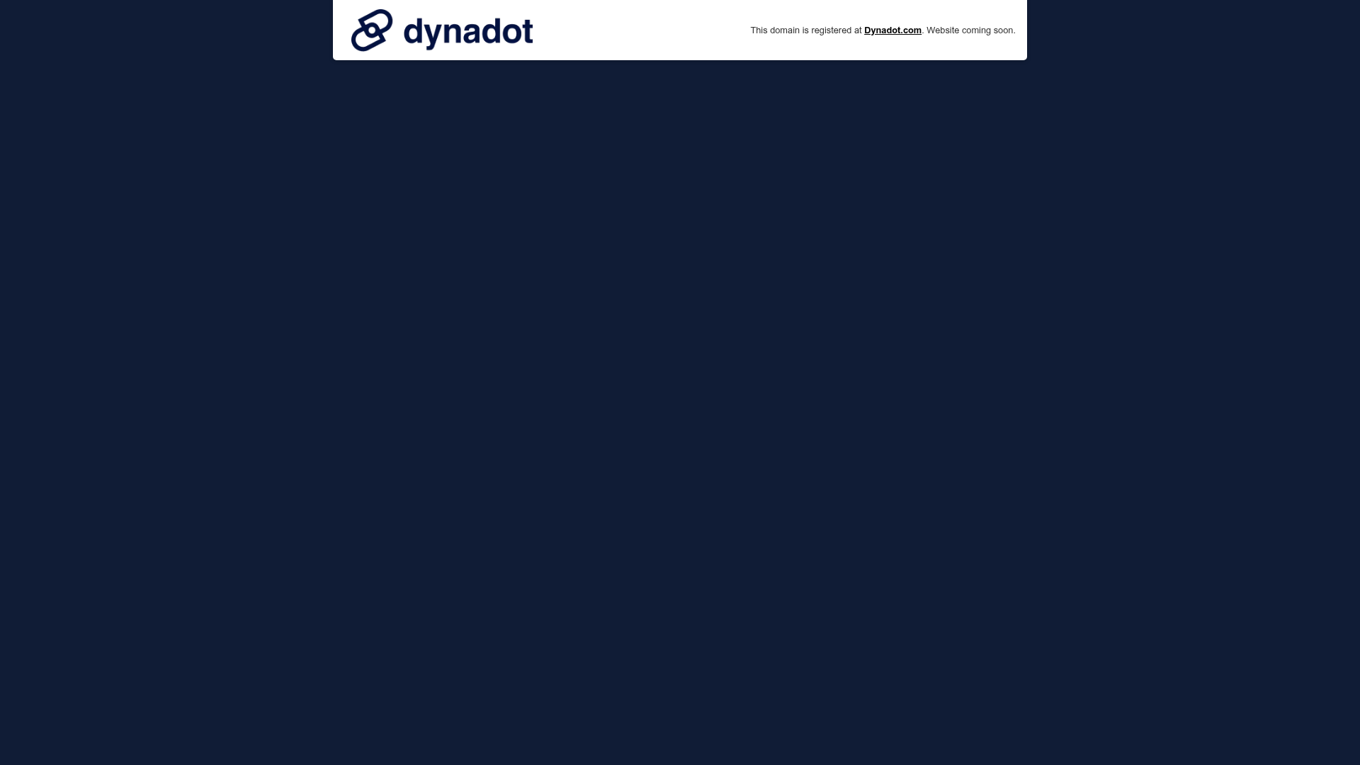
Dynadot Domain Parking Page
A minimalist domain registration placeholder featuring a branded sticky header banner and a full-height dark background layout.
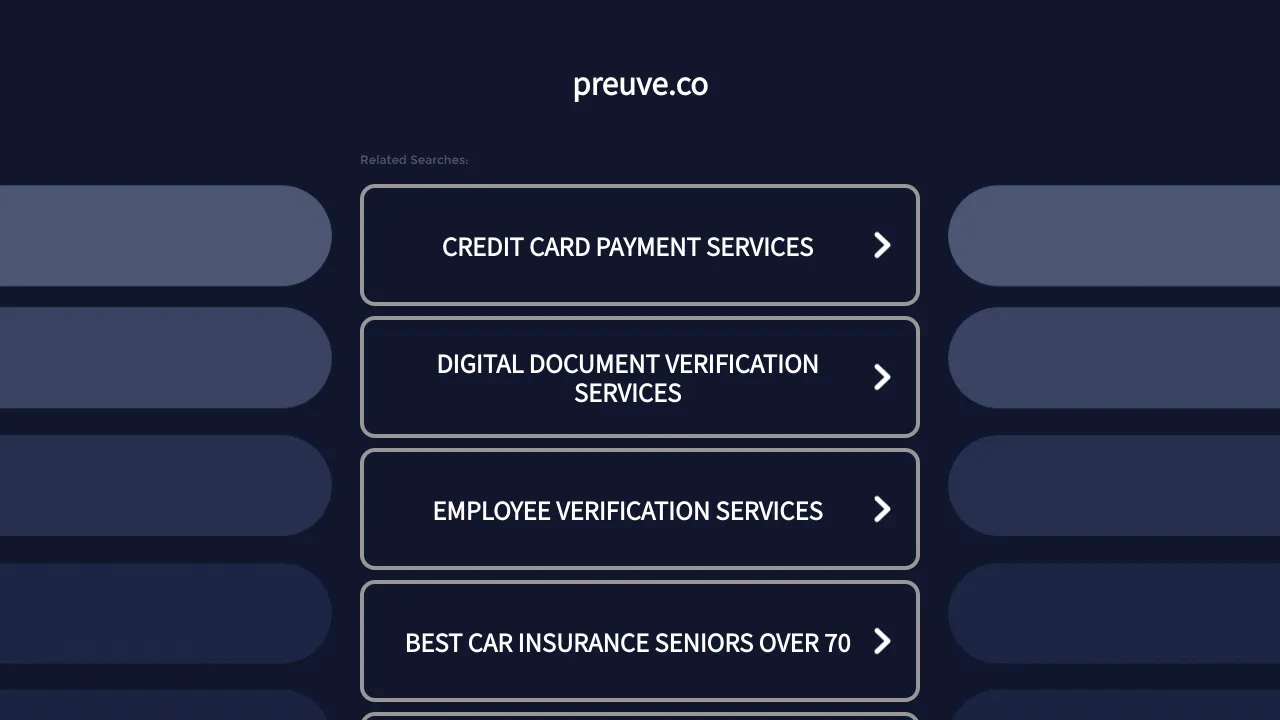
Preuve.co Search Index Landing Page
A dark-themed search directory layout featuring a centered brand header and vertically stacked rectangular navigation cards with chevron icons and hover effects.
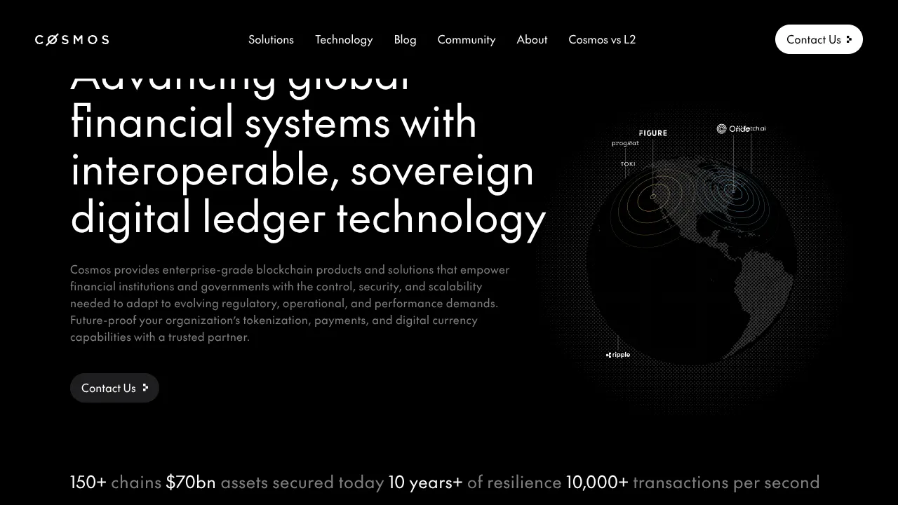
Cosmos Network Enterprise Landing Page
A dark-themed blockchain hero section featuring a minimalist navigation header, high-contrast typography, a stylized digital globe graphic, and a statistics-based footer ribbon.
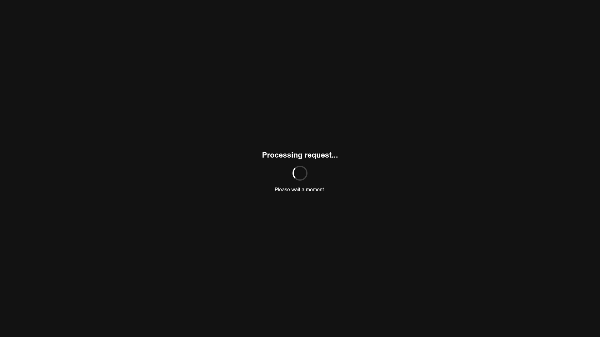
Minimalist Dark Mode Loading Screen
A clean, dark-themed redirection page featuring a centered typography layout and a CSS circular loading spinner for asynchronous processing states.
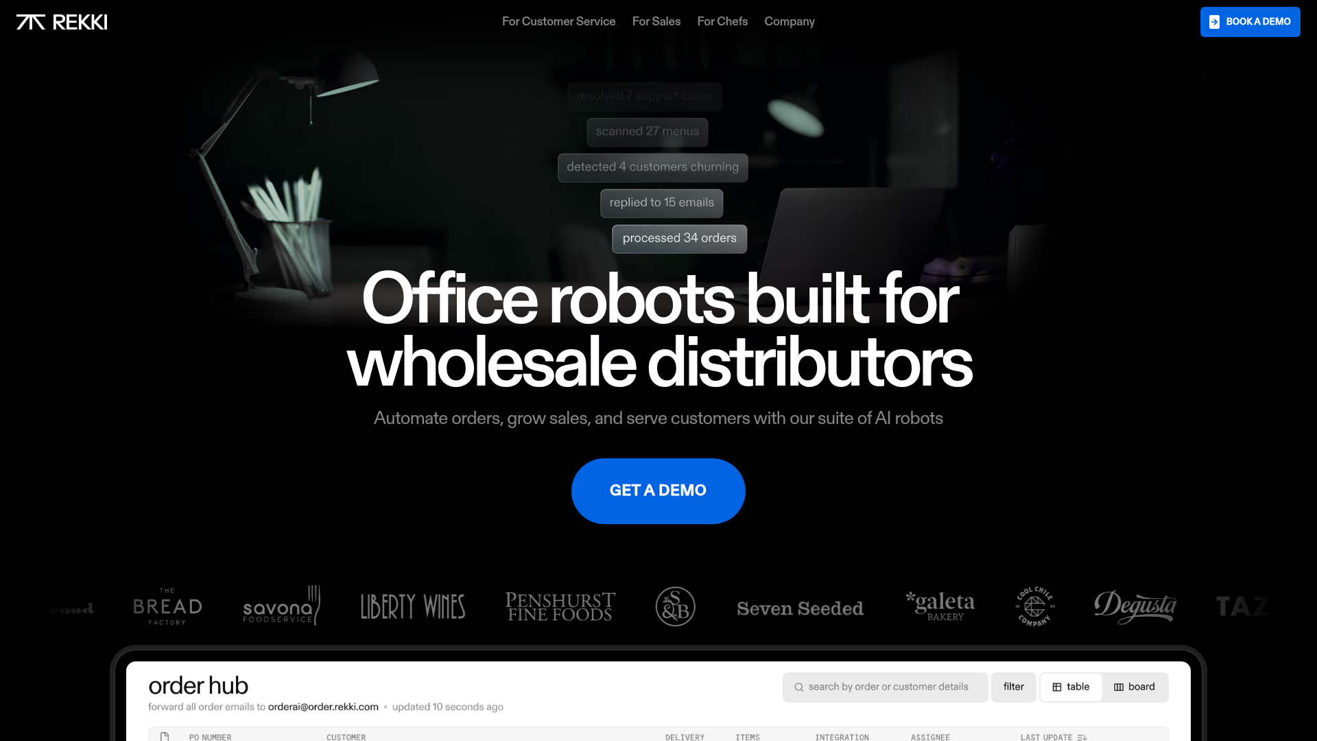
REKKI AI Automation SaaS Landing Page
A high-impact dark-mode landing page featuring a floating label hero section, marquee brand logos, an interactive dashboard UI preview, and card-based testimonial grids.
