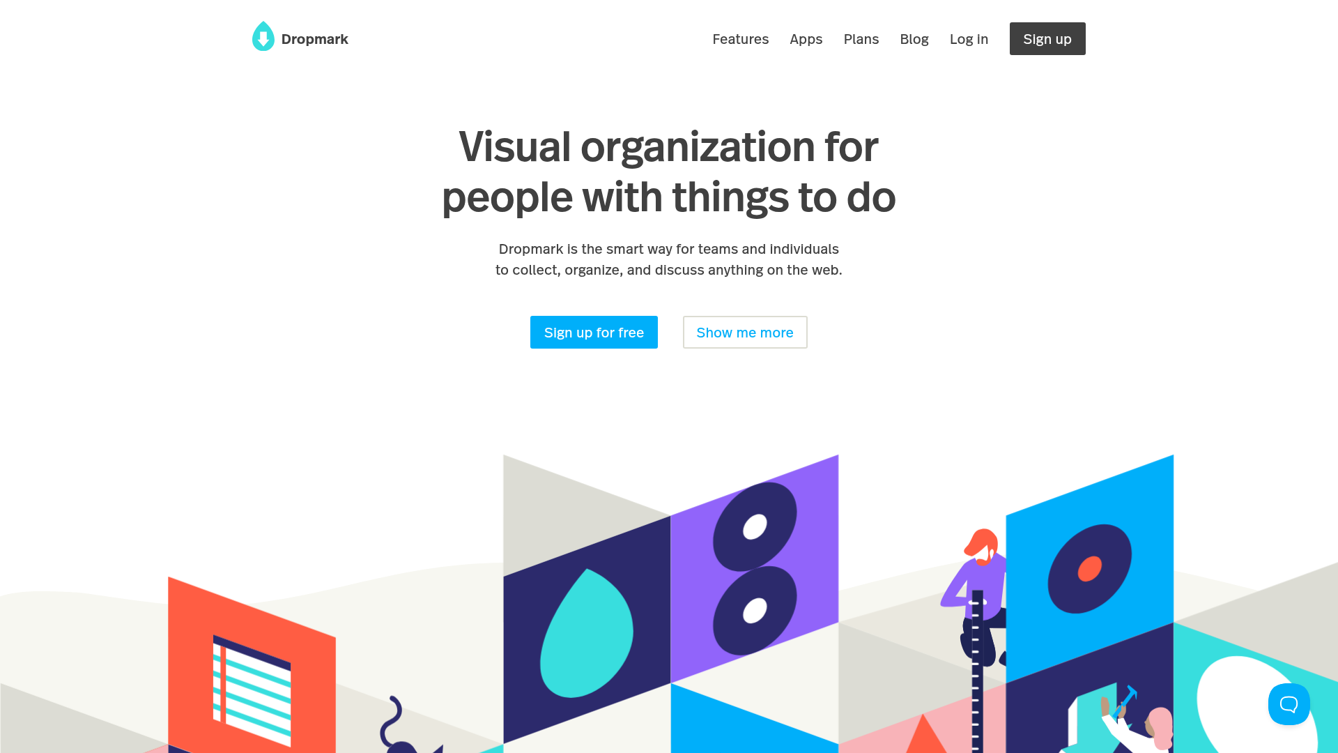
Dropmark Visual Organization Landing Page
Features a clean minimalist hero section with split-action buttons, a vibrant vector illustration footer, and an interactive horizontal flickity carousel for case studies.
Overview
Dropmark’s landing page is a masterclass in combining high-end minimalist copy with playful, vibrant visuals. It effectively uses a clean hero section to establish immediate value, followed by a dynamic, horizontally scrolling carousel that serves as social proof and feature education. This is an excellent reference for builders who want to balance professional SaaS aesthetics with a creative, approachable brand voice.
Design System
- Color Palette & Visual Hierarchy: The design uses a high-contrast white background for the hero to prioritize readability. The primary action color is a vibrant Cyan (#00affa), used for the main CTA and branding. The hierarchy is defined by varying font weights and sizes rather than heavy borders, with a colorful, geometric vector illustration providing a strong visual anchor at the transition point.
- Typography system: The site uses a clean, modern sans-serif. The H1 is set in a large, bold weight with tight leading for impact, while the body text uses a medium weight in a muted grey to prevent visual clutter. The navigation links use a smaller, lighter-weight font to keep the focus on the central message.
- Page Structure: The layout follows a classic inverted pyramid: a centered Hero (H1, subtext, split CTAs), followed by a massive decorative illustration that transitions into a horizontal Flickity-powered carousel for case studies and interactive content, and finally a "Trusted for years" statistics block.
- Reusable Components:
- Split CTAs: A primary filled button ("Sign up for free") paired with a secondary ghost/outlined button ("Show me more").
- Flickity Carousel: A horizontal draggable slider with custom indicators (dots) and arrow navigation, perfect for showcasing portfolio items or blog posts.
- Stats Grid: A clean list-based layout for displaying platform metrics (collections, items, users) using bold, blue-accented numbers.
- Interaction and Motion: The primary interaction is the draggable
flickity-enabledcarousel, which usestranslateXtransforms for smooth performance. Hover states on the navigation and buttons are subtle, maintaining the minimalist feel. - Implementation Clues: The HTML reveals a custom class structure (
marketing__hero,feature__image) suggesting a BEM-inspired naming convention. It uses the Flickity library for the slider and a sticky customer support beacon in the bottom-right corner.
Use Cases
- Who should clone this: Creative agencies, productivity tool startups, and portfolio-driven platforms that need to showcase a mix of utility and inspiration.
- Effective Remixes:
- Portfolio Sites: Swap the Hero text for a personal statement and use the carousel to display recent projects.
- SaaS Onboarding: Use the hero-then-slider pattern to guide users through different feature sets or "How to" guides.
- Practical Remix Directions: Replace the abstract vector illustrations with high-fidelity screenshots of a product to shift the focus from "feel" to "function." The stats block at the bottom can be easily adapted for a "features list" by swapping the numbers for icons.
- Suggested Clone Scope: The Hero section and the Flickity carousel are the most valuable components to clone. The carousel's structure (
featurecards with top/bottom image halves) is a unique way to display content that is more engaging than a standard grid.
Related Inspirations

Slite SaaS Knowledge Base Landing Page
A clean SaaS hero section with a conversational headline, secondary call-to-action buttons, and a structured software interface preview featuring user testimonials.
Figma Landing Page Gallery Hero
A dynamic landing page featuring a center-focused search bar hero, a horizontally-scrolling interactive video carousel, and a clean brand logo grid.
MetaMusic Service Landing Page
Features a horizontal scrolling card deck, animated SVG illustrations, a partner logo marquee, and a multi-step process layout with notched corner UI components.
FigJam Product Landing Page
A collaborative tool showcase featuring a centered hero section, logo marquee, vertical tabbed feature switcher, and interactive carousel for templates.
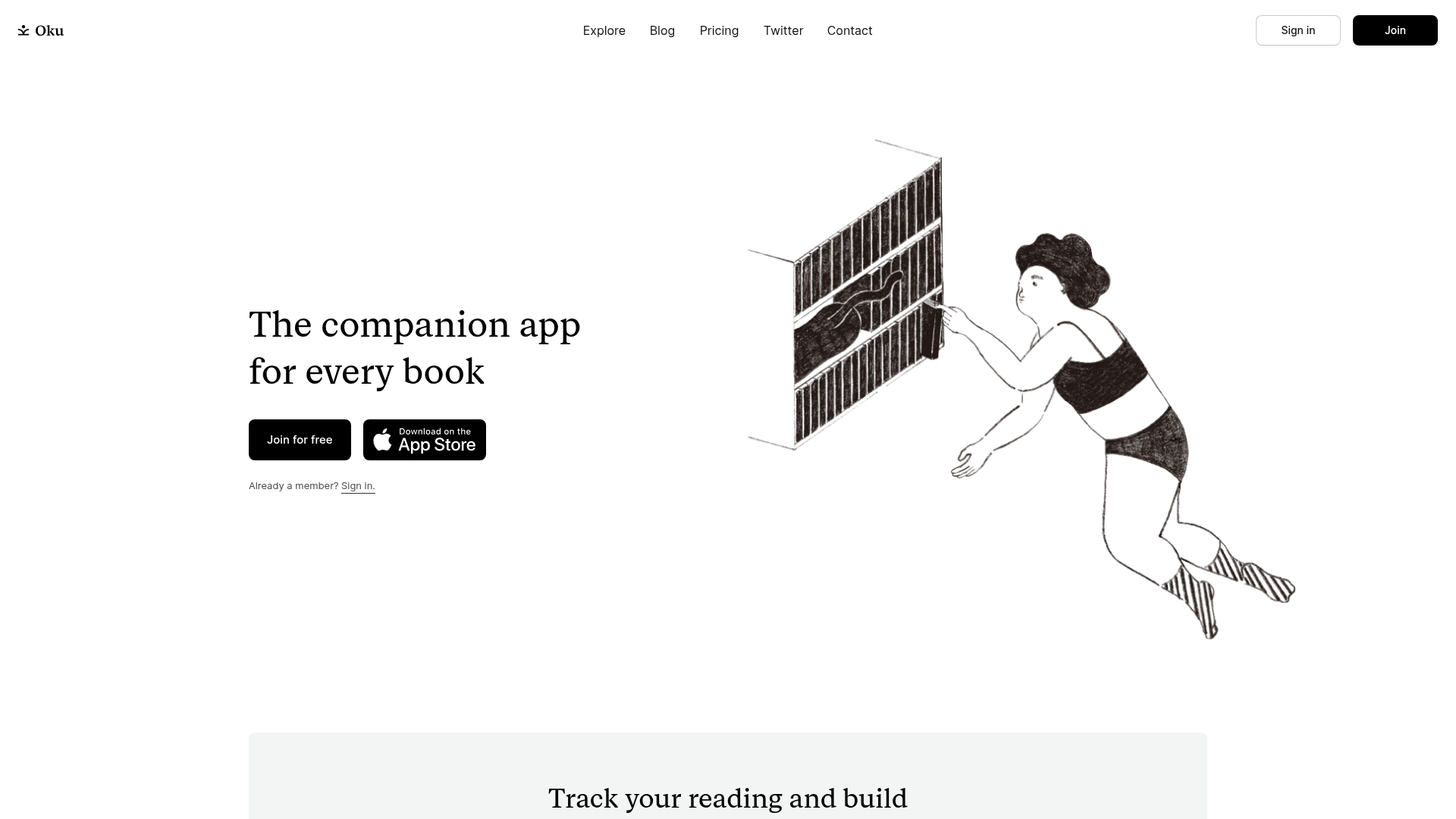
Oku Minimalist Book Tracking Landing Page
A clean, typography-focused landing page featuring a minimalist header, illustrated hero section, and clear call-to-action buttons for app downloads.
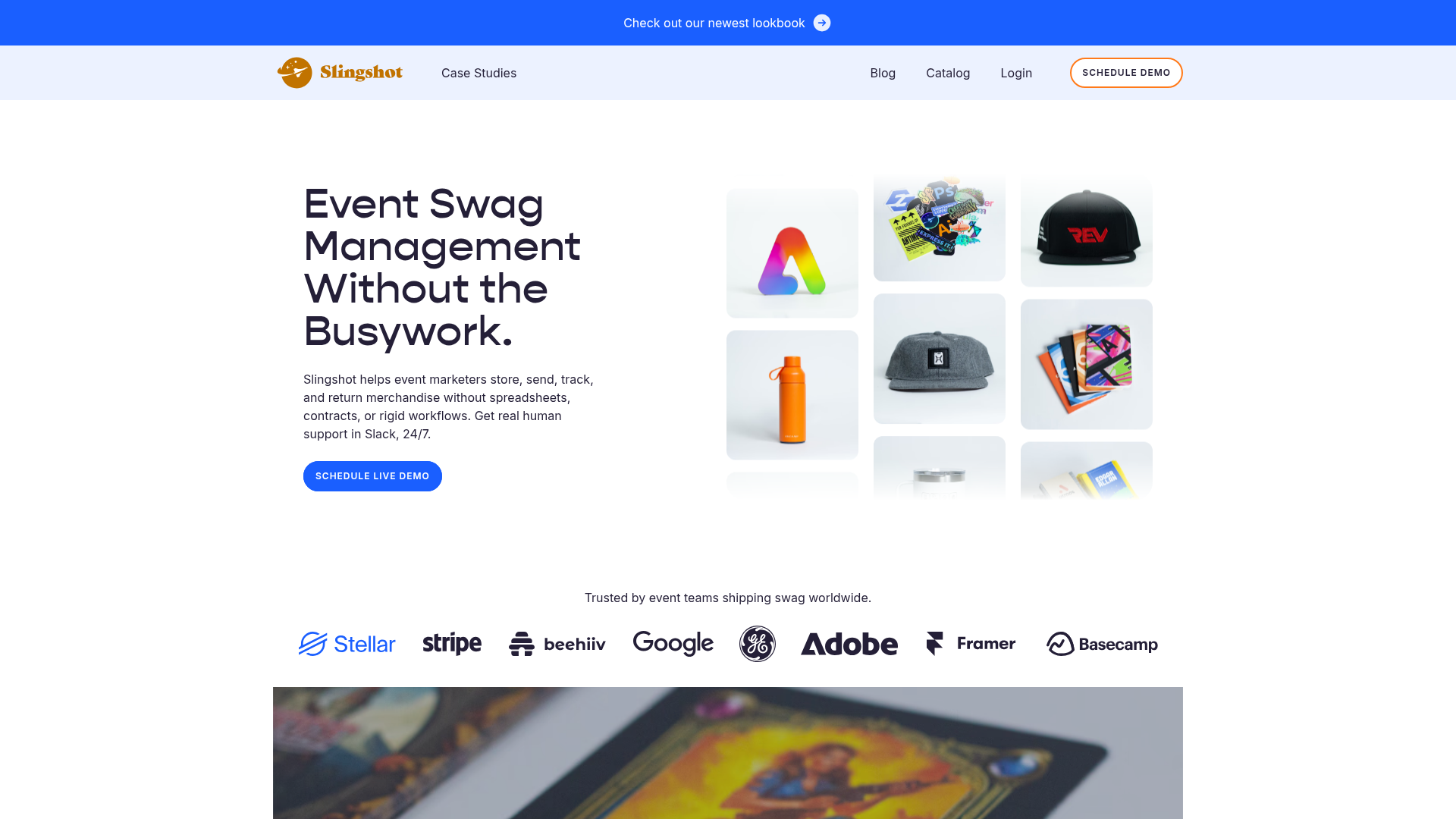
Slingshot Event Swag Hero and Logos
A clean SaaS landing page featuring a split hero layout with promotional product imagery, a call-to-action button, and a monochrome brand logo trust bar.
