Alec Babala Monochrome Portfolio Layout
A minimalist, high-contrast monochrome portfolio featuring a typewriter-style grid for writing logs, photography tiles, and structured career experience sections.
Overview
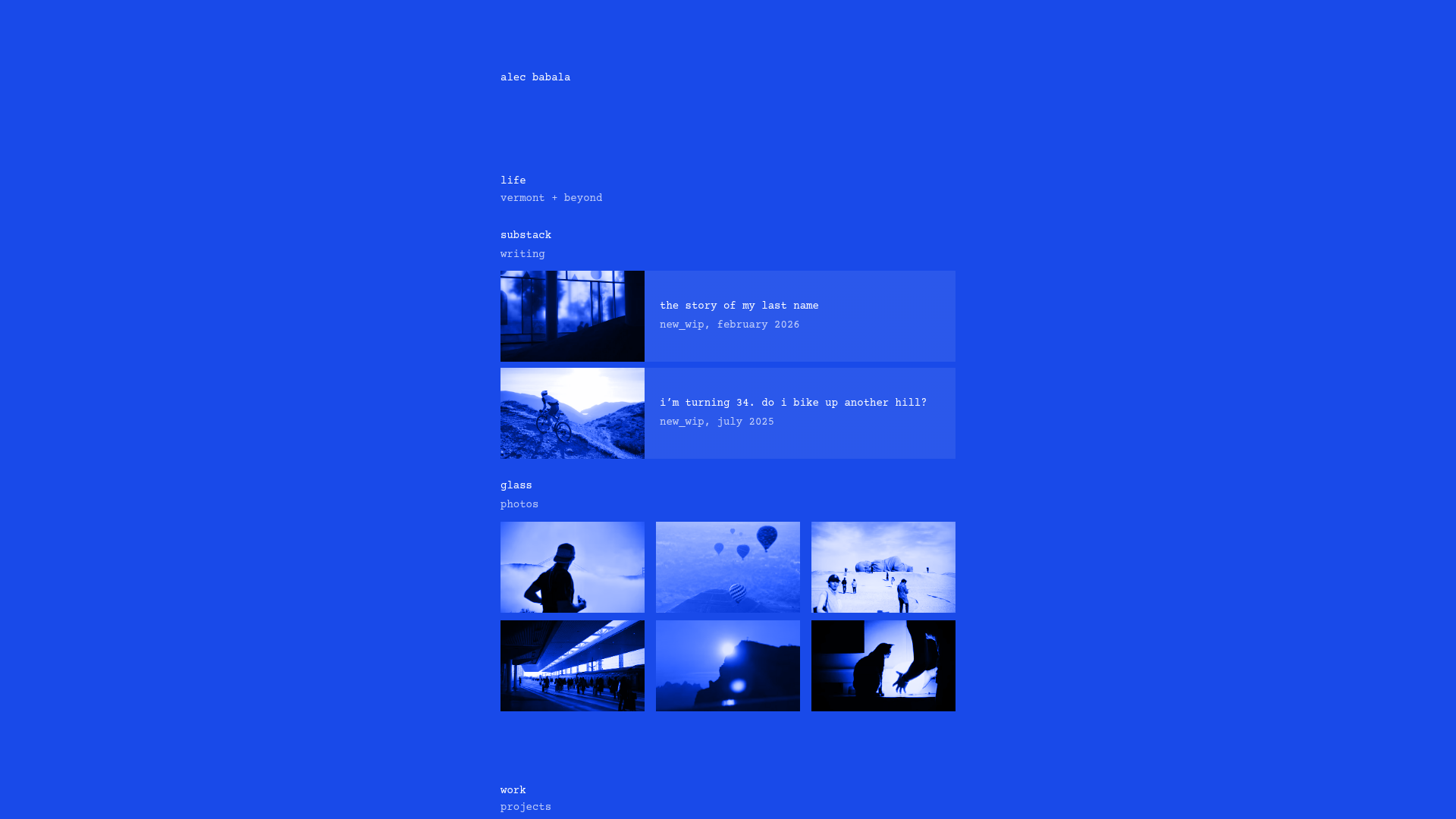
This portfolio is a masterclass in high-contrast, monochrome minimalism, utilizing a striking cobalt blue background with white monospaced typography. It effectively balances personal writing logs, a photography gallery, and professional experience within a single-column, structured grid that feels both brutalist and refined.
Design System
- Color Palette & Visual Hierarchy: The design uses a dual-tone approach—saturated blue (#1a47f3) for the background and white for text and image overlays. Visual hierarchy is established through vertical spacing and strict alignment rather than font weight or color variety.
- Typography System: The system relies entirely on a monospaced, typewriter-style typeface. Text is generally kept at a small, uniform scale (likely 12px-14px), with category headers (e.g., "work", "play") serving as the primary anchors.
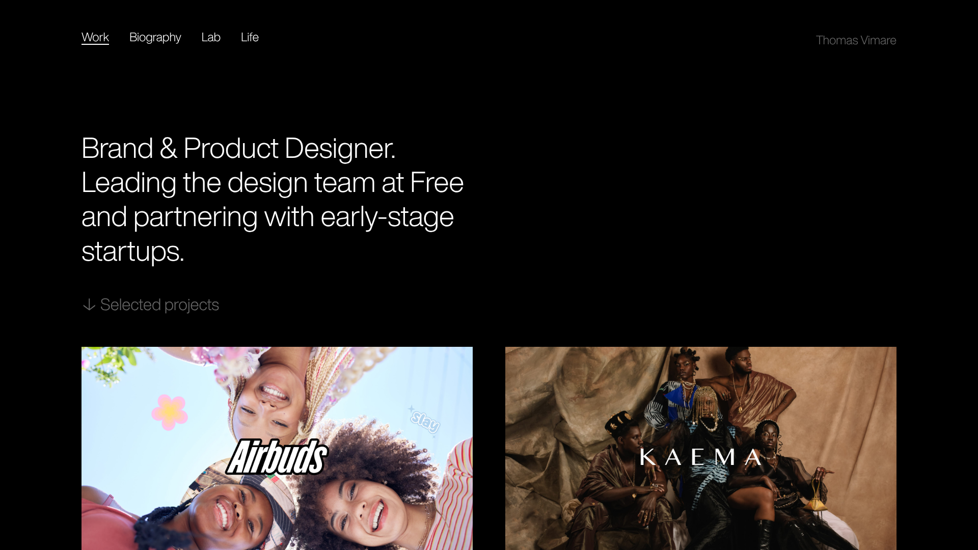
- Page Structure: The layout flows vertically through chronological or categorical blocks: Header/Intro -> Writing (Large tiles) -> Photos (Small 3-column grid) -> Work Experience (List format) -> Personal Projects -> Contact.
- Reusable Components:
- Media Cards: Horizontal tiles for writing that combine a 1:1 image with text on the right.
- Photo Grid: A minimalist 3-column masonry/grid for photography without borders or padding between images.
- Experience List: A structured three-column row layout (Company | Role | Date) used for the 'Work' and 'Play' sections.
- Interaction & Implementation: The HTML indicates a heavy use of nested flexbox containers (
css-9uyk0n,css-paq0kv) to maintain the rigid alignment. Images are processed with a blue duotone filter to maintain the monochrome aesthetic, a technique builders should replicate to achieve the same cohesive look. - Mobile Behavior: The single-column core structure and flexible grid suggest a seamless collapse where the 3-column photo grid likely transitions to 1 or 2 columns, while the horizontal writing cards stack vertically.
Use Cases
- Who should clone this: Creative technologists, UX researchers, or minimalist photographers who want their work to be the focus without the distraction of a complex UI.
- Effective Remixes: This layout works exceptionally well for "Digital Gardens," technical resumes, or architectural portfolios.
- Practical Remix Directions:
- Thematic Swap: Change the cobalt blue to a deep forest green or stark black while maintaining the monospaced font for a different brand "mood."
- Info Architecture: Adapt the 'Work' section list into a 'Services' or 'Pricing' table by swapping the date column for a price point.
- Selective Reuse: The photo grid component is highly portable for any gallery-heavy landing page.
- Suggested Clone Scope: A full-page clone is recommended to capture the specific rhythm of the vertical spacing, which is essential to the minimalist impact of this design.
Related Inspirations

Clase Agency Branding Portfolio
A minimalist design agency portfolio featuring a typographic hero section, full-width image articles, sticky title bars, and integrated scrolling text marquees for a clean editorial layout.

Ayaka B. Ito Creative Portfolio
A minimalist design portfolio featuring an immersive full-screen hero image, clean typographic navigation, and a structured layout for showcasing branding and editorial projects.

Lundqvist & Dallyn Studio Portfolio
Minimalist design studio portfolio featuring a custom video loader, world clock navigation, and a fluid masonry-style grid for high-quality photography and type design showcases.
Minimalist Dark Designer Portfolio Grid
A clean, dark-themed portfolio featuring a bold typography hero section and a staggered two-column image grid with subtle entrance animations.

AcolorBright Design Agency Portfolio
Minimalist bento-style portfolio layout featuring numerical section headers, horizontally scrolling project teasers, and a clean grayscale client logo grid.
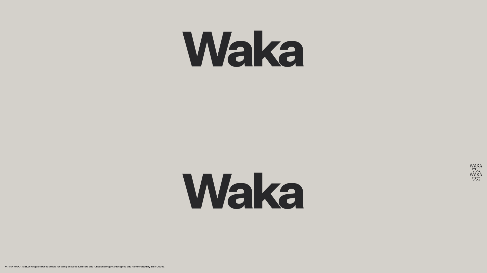
Waka Waka Furniture Portfolio
A minimalist design showcase featuring a custom cursor, parallax scroll effects, and a vertical image grid layout for high-end product displays.
