Minimalist Error Page Template
A clean and minimalist static error page featuring a simple vertical centered layout with typography-focused messaging and a single call-to-action link.
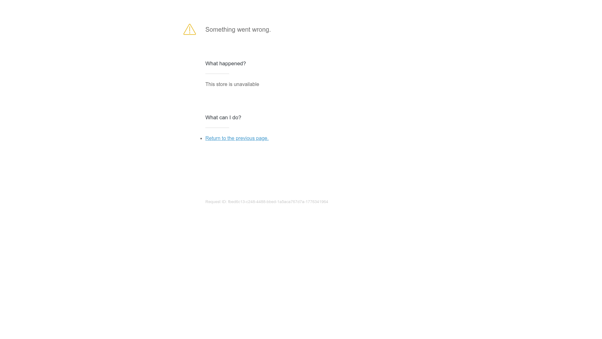
Overview
This is a minimalist error page template designed for e-commerce or SaaS platforms to communicate service interruptions. It is an excellent clone reference for developers who need a highly legible, distraction-free 'Something went wrong' state that maintains a professional aesthetic while providing a clear path to resolution.
Design System
- Color Palette & Visual Hierarchy: The design uses a high-contrast monochromatic base with subtle accents. Primary text is dark gray (#333), secondary info is medium gray, and the Request ID is light gray for low prominence. A yellow warning icon provides a single point of visual warning.
- Typography System: The system relies on a sans-serif stack. It uses a clear hierarchy: a large bold header for the primary error status, followed by h3 headers ('What happened?') to organize diagnostic information. Links are distinctively styled in a bright blue for immediate recognition.
- Page Structure: The layout is vertically centered with a maximum width container. It follows a logical informational flow: Icon + Main Error Message -> Cause Analysis -> Action Items -> System Metadata (Request ID).
- Reusable Components: The utility-first
content--blockstructure is highly modular. The list-based 'What can I do?' section is a reusable pattern for any help center or FAQ micro-component. - Responsive Behavior: The centered single-column layout is natively responsive, requiring no complex media queries to maintain readability on mobile devices.
- Implementation Clues: The HTML uses semantic
divwrappers with descriptive classes likewrapperandcontent--block. The use of an icon font/SVG class (ico-40-svg) suggests a modular icon system integration.
Use Cases
- Who should clone this: Developers building Shopify apps, SaaS dashboards, or e-commerce checkout flows that require standard fallback pages for 404, 500, or maintenance states.
- Remix Directions: Swap the generic yellow warning icon for a brand-specific illustration or lottie animation. Replace the 'Return to previous page' link with a primary action button like 'Contact Support' or 'Check System Status'.
- Suggested Scope: This is ideal for a full-page clone. The layout is simple enough to serve as a global error boundary component in React or Vue applications, where the 'What happened?' text can be injected dynamically via props.
Related Inspirations
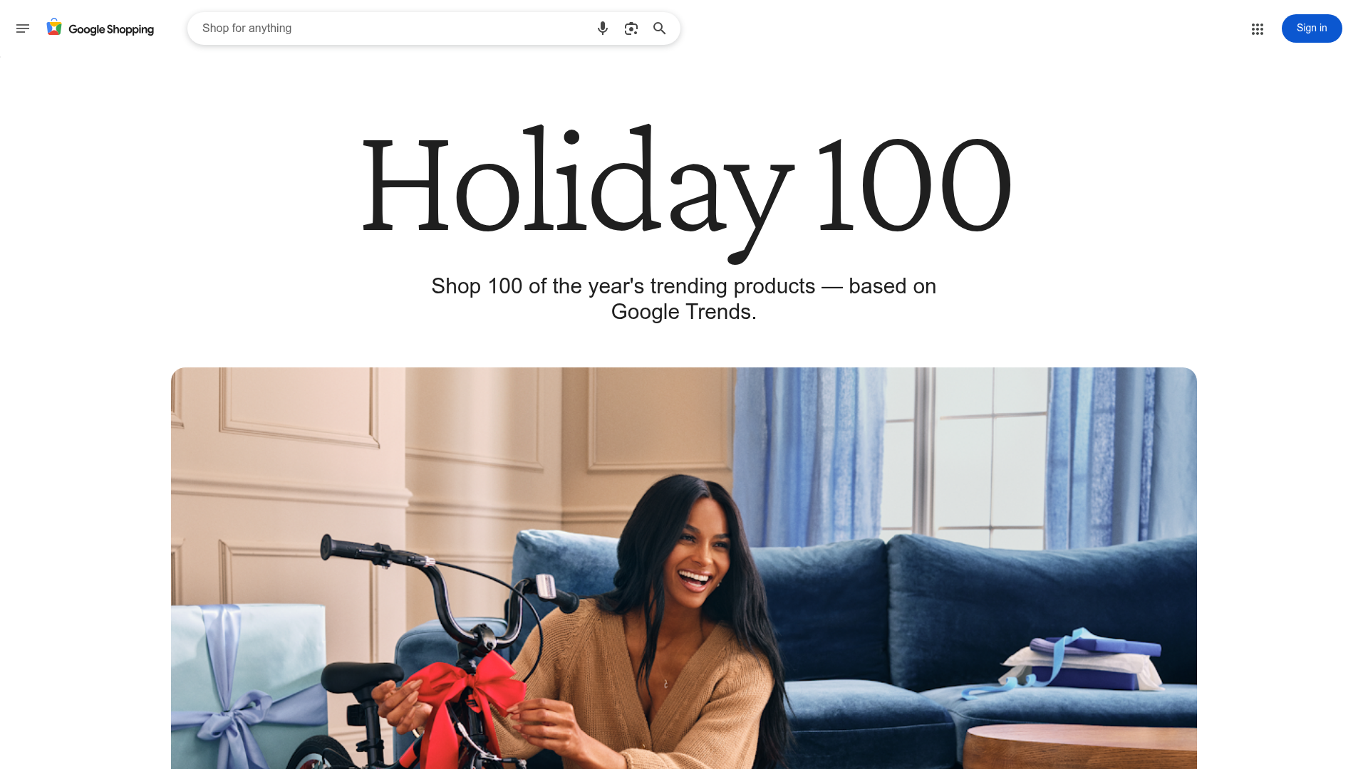
Google Holiday 100 Curator Landing Page
A minimalist e-commerce showcase featuring a wide hero section, clean search integration, and a bold typography-driven header designed for trending product collections.

Finn Pet Supplements Landing Page
An e-commerce landing page featuring high-contrast typography, a sticky brand logo banner, parallax scroll effects on product headers, and a clean product grid.
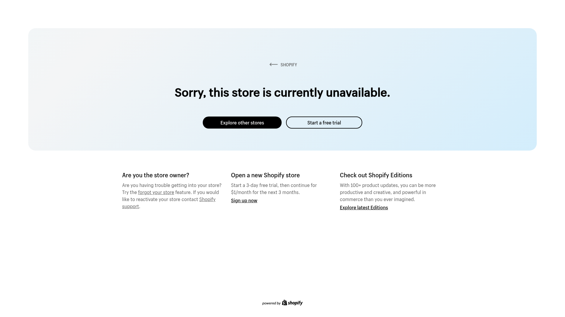
Shopify Unavailable Store Landing Page
A clean, centered error page layout featuring a hero card with rounded corners, primary/secondary action buttons, and a three-column information grid for support and CTAs.

Isla Beauty Skincare E-commerce Store
A clean Shopify-based storefront featuring a split-hero landing page, a step-by-step product system carousel, and a split-screen testimonial section with localized product image sidebars.
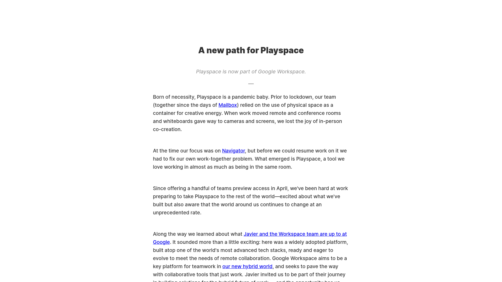
Playspace Acquisition Announcement Minimalist Layout
A clean, center-aligned announcement template featuring a vertical stack of rich text content and linked text elements on a neutral background.
Sandland Sleep Product Landing Page
A high-conversion Shopify layout featuring split-video hero sections, logo-based social proof ribbons, and a testimonial slider integrated with biometric sleep tracker results.
