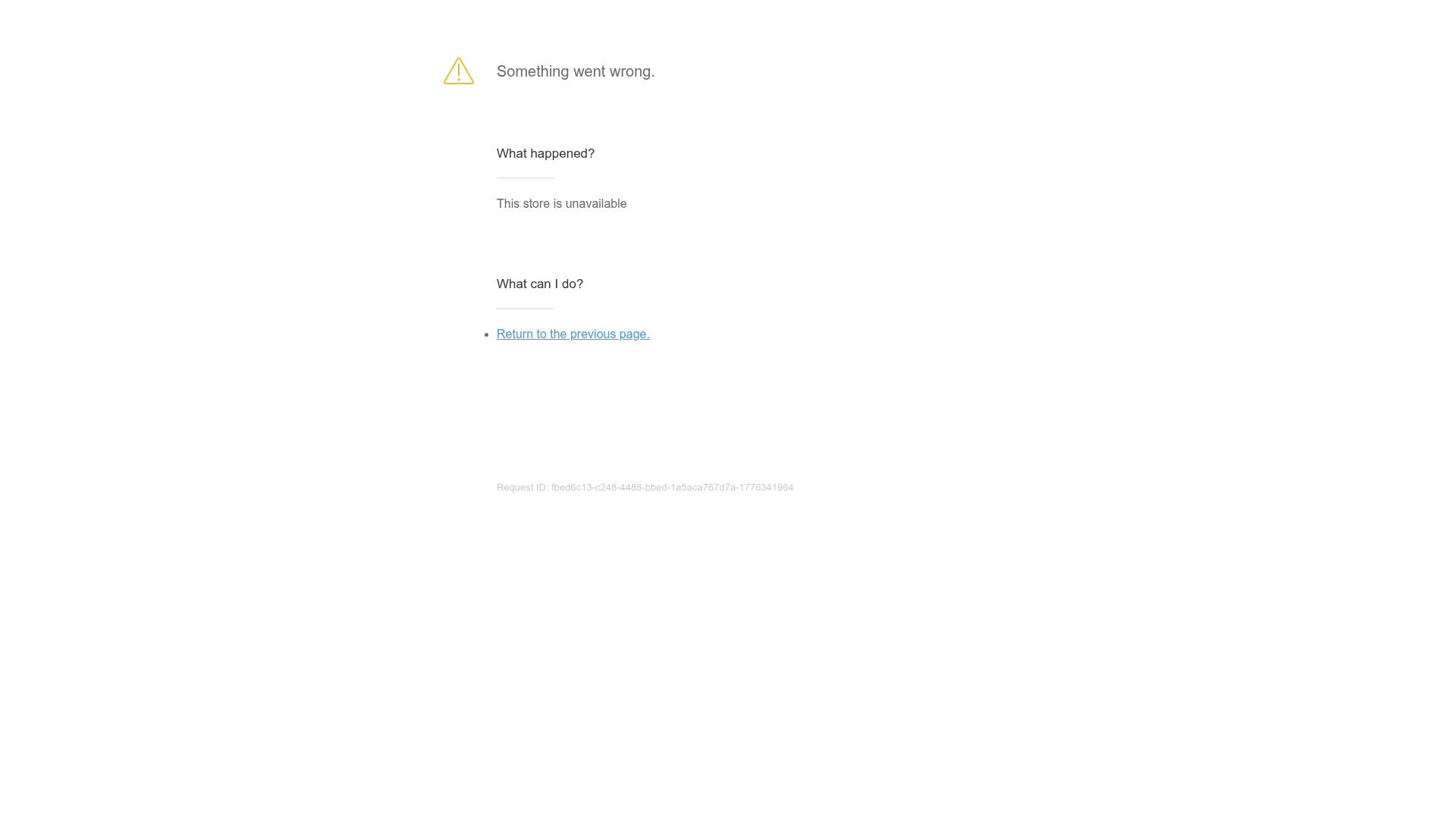
Shopify Unavailable Store Landing Page
A clean, centered error page layout featuring a hero card with rounded corners, primary/secondary action buttons, and a three-column information grid for support and CTAs.
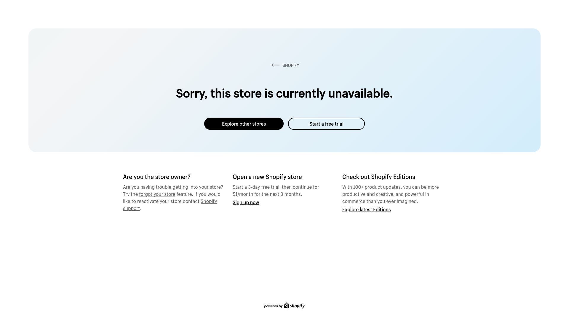
Overview
This is a minimalist, high-conversion landing page designed by Shopify for unavailable store domains. It serves as a masterclass in turning a negative user experience (a 404/error state) into a marketing opportunity using a clean layout, clear hierarchy, and focused calls-to-action (CTAs).
Design System
- Color Palette & Visual Hierarchy: The page uses a soft, light blue gradient hero section (
#dcf0f9) encased in a large, rounded-corner container. This creates a friendly, non-aggressive atmosphere for an error message. High contrast is achieved with a jet-black primary button and a white secondary button with a thin border. - Typography System: The design relies on a clean, sans-serif font stack. The headline is bold and centered for immediate impact, while supporting text uses a smaller, regular weight for readability. External links within captions are underlined to indicate interactivity without disrupting the text flow.
- Page Structure & Flow:
- Navigation: A simple "Back" breadcrumb (
.back-button) anchored at the top left of the card. - Hero Section: A centered bold headline flanked by two primary action buttons (
.link-container). - Information Grid: A three-column layout (
.cta-row) below the main card provides specific paths for different user personas (Store Owners, New Merchants, Fans). - Footer: A minimal "powered by" logo centered at the bottom.
- Navigation: A simple "Back" breadcrumb (
- Reusable Components:
- Pill Buttons: The rounded "pill" style buttons are highly reusable for landing pages.
- Three-Column CTA Grid: A classic pattern for value propositions or feature sets.
- Rounded Hero Container: Useful for framing critical announcements or login screens.
- Implementation Clues: The HTML structure uses basic utility classes (
.tcfor text-center,.clearfix) and a simple flex-like row/column structure for the supporting content. It prioritizes semantic clarity with classes like.error-messageand.supporting-content.
Use Cases
- Who should clone this pattern: Developers building error pages (404, 500), maintenance mode screens, or simple "Coming Soon" landing pages.
- Effective Remixes: This layout works perfectly for a personal bio link page (Linktree alternative) or a minimalist app landing page where the header/hero explains the product and the three columns below explain key features.
- Practical Remix Directions:
- Brand Swap: Replace the light blue background-animation with a brand-specific gradient or a static image.
- IA Adaptation: Change the bottom three columns from support links to "Latest News," "Testimonials," or "Pricing Plans."
- Scope: This is best cloned as a full-page layout to preserve the intentional whitespace and balance between the hero card and the lower grid.
Related Inspirations
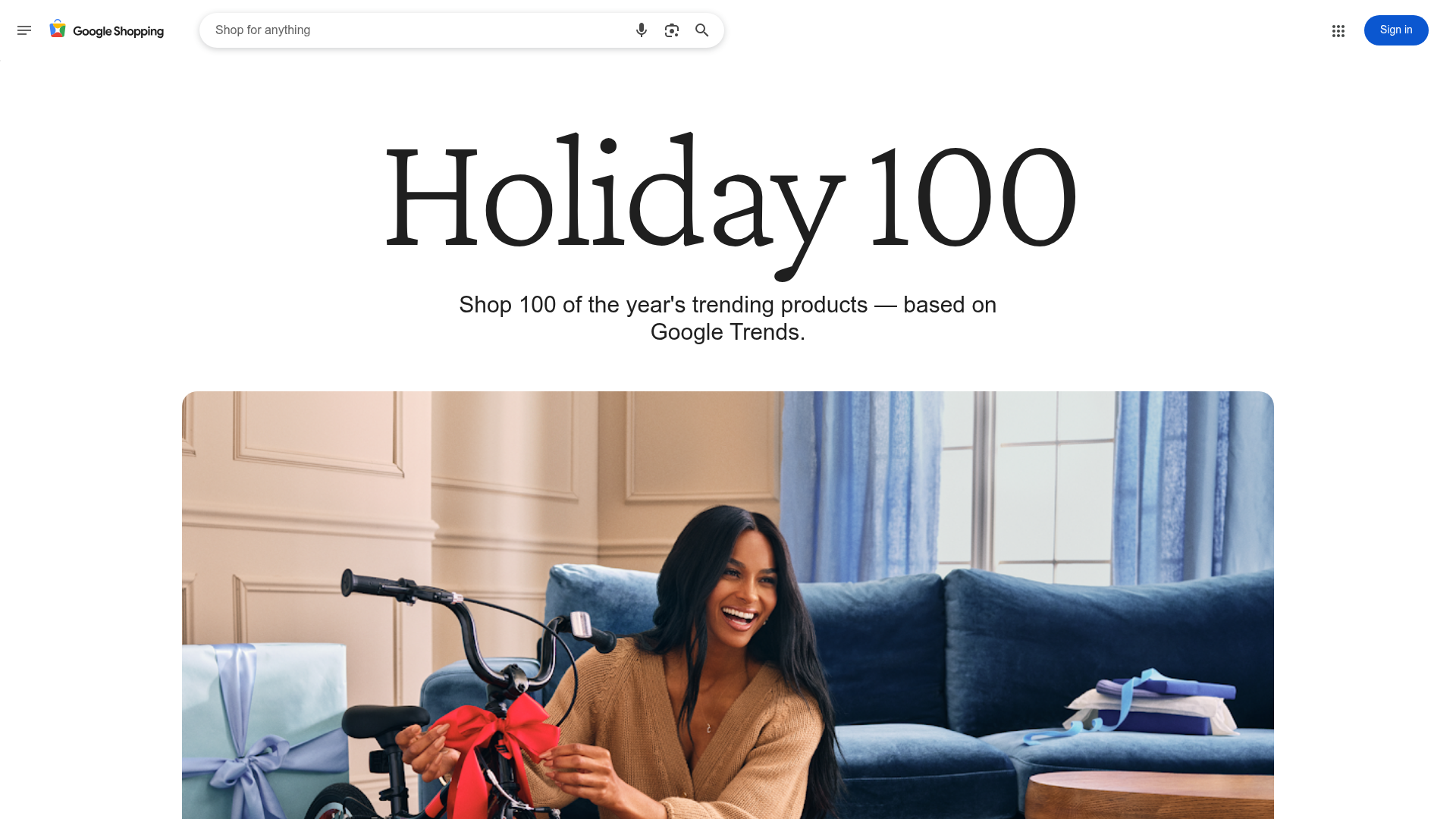
Google Holiday 100 Curator Landing Page
A minimalist e-commerce showcase featuring a wide hero section, clean search integration, and a bold typography-driven header designed for trending product collections.

Finn Pet Supplements Landing Page
An e-commerce landing page featuring high-contrast typography, a sticky brand logo banner, parallax scroll effects on product headers, and a clean product grid.
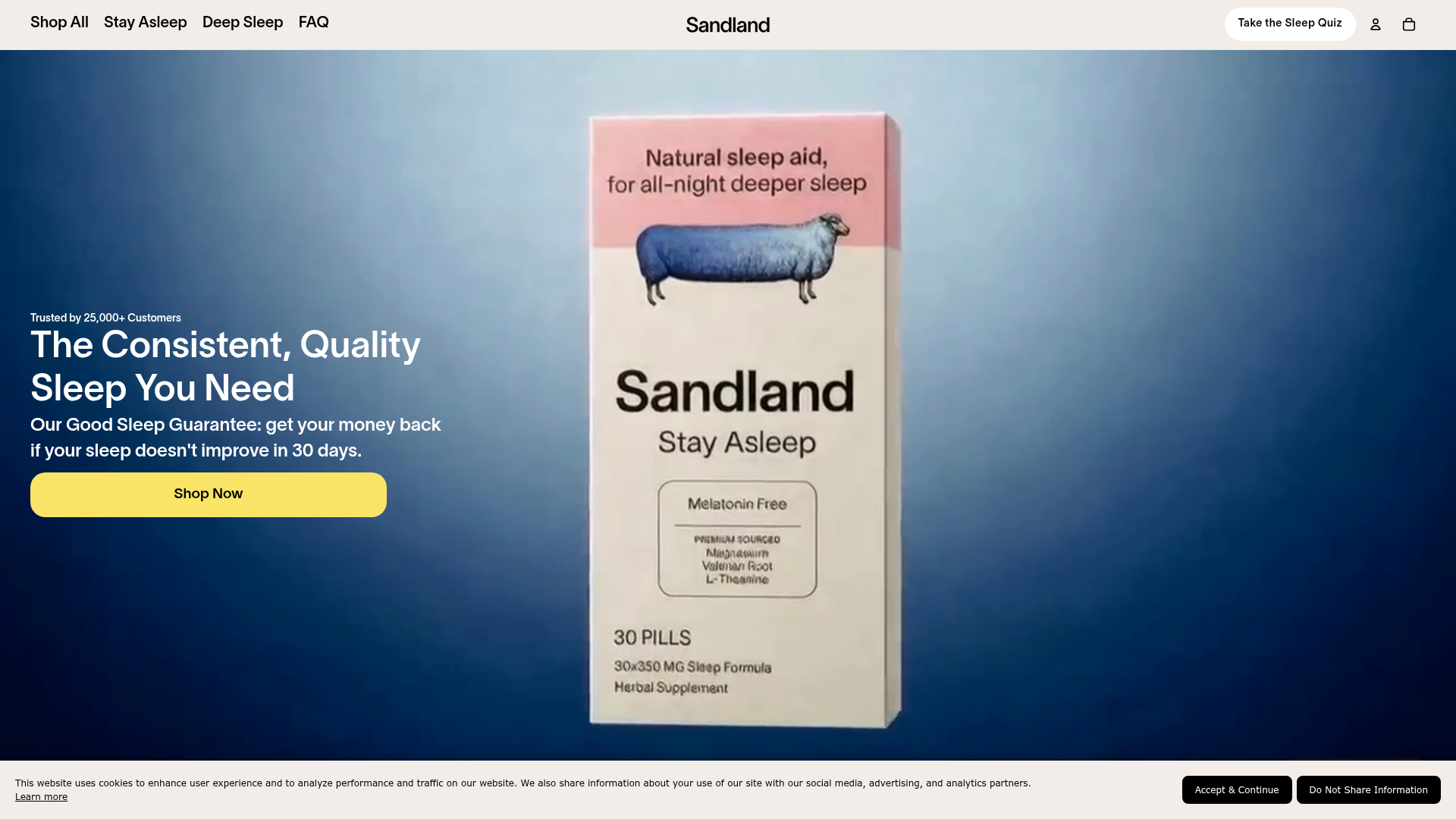
Sandland Sleep Product Landing Page
A high-conversion Shopify layout featuring split-video hero sections, logo-based social proof ribbons, and a testimonial slider integrated with biometric sleep tracker results.
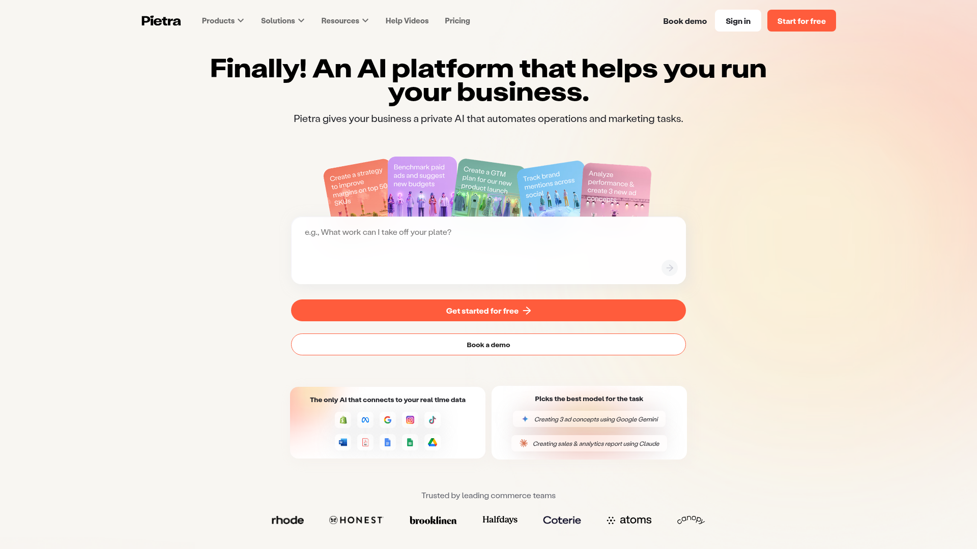
Pietra AI Platform Landing Page
A commerce-focused landing page featuring a centralized AI input hero, colorful floating value-prop cards, a bento-style integration showcase, and tabbed feature sections with side-by-side comparisons.
Minimalist Error Page Template
A clean and minimalist static error page featuring a simple vertical centered layout with typography-focused messaging and a single call-to-action link.

Isla Beauty Skincare E-commerce Store
A clean Shopify-based storefront featuring a split-hero landing page, a step-by-step product system carousel, and a split-screen testimonial section with localized product image sidebars.
