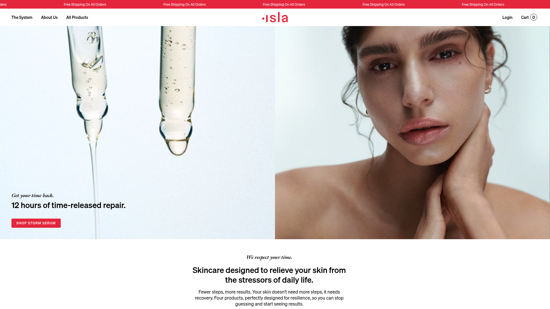
Isla Beauty Skincare E-commerce Store
A clean Shopify-based storefront featuring a split-hero landing page, a step-by-step product system carousel, and a split-screen testimonial section with localized product image sidebars.
Overview
Isla Beauty is a premium skincare e-commerce site that uses a clean, editorial aesthetic to simplify a multi-step product routine. It is an excellent reference for builders looking to combine high-end lifestyle photography with a structured, conversion-focused Shopify layout that emphasizes product education.
Design System
- Color Palette & Visual Hierarchy: The site uses a minimalist base of white (#ffffff) and off-white/beige (#f8f6f3) to allow product photography to pop. A vibrant "Error Red" (#e4263d) acts as the primary accent color for the animated announcement bar, call-to-action (CTA) buttons, and star ratings, creating a high-contrast focal point against the neutral backgrounds.
- Typography: The system utilizes a mix of a clean sans-serif for navigation and secondary headings (caps style) and a high-contrast serif for body copy and headlines to evoke a luxury magazine feel. Hierarchy is established through generous letter spacing in uppercase labels (e.g., "SHOP STORM SERUM").
- Page Structure: The layout follows a logical educational funnel:
- Split-Hero: Large-scale imagery introduces the brand vibe and a single hero product.
- Brand Narrative: Center-aligned rich text section for mission statements.
- Product System: A numbered 1-4 step-by-step product carousel.
- Social Proof: Award logos followed by a split-screen testimonial section featuring a fixed product image and a scrolling quote carousel.
- Reusable Components: Notable elements include the sticky transparent-to-solid header, the "Step" label system for categorized products, and the ticker-style announcement bar. The product cards are "borderless" and rely on soft background tints to define their boundaries.
- Interactions & Motion: The site uses
data-aos(Animate On Scroll) attributes (e.g.,fade-in-image-zoom,img-in) to trigger smooth entrance animations. Buttons feature subtle hover states, and the product grid utilizes Flickity for smooth touch-responsive dragging on mobile. - Implementation Clues: The site is built on Shopify, indicated by the
shopify-sectionclass architecture. It utilizes lazy-loading (lazyloadedclass) for high-resolution images to maintain performance despite the heavy use of visual assets.
Use Cases
- Who should clone this: This pattern is ideal for "regime-based" brands (skincare, supplements, hair care) where the value proposition is an integrated system rather than isolated products.
- Effective Remixes: Medical or wellness services could adapt the "Step 1-4" system to explain a patient journey or treatment plan. Home goods brands could use the split-hero to show a "room view" versus a "product detail view."
- Practical Directions:
- Typography Swap: Exchange the luxury serif for a bold, chunky sans-serif to pivot from "Editorial Beauty" to "Gen-Z Tech/Streetwear."
- Information Architecture: Adapt the split-screen testimonial section to compare service tiers instead of reviews.
- Clone Scope: A full-page clone is recommended for brands with 4-8 core products. For larger catalogs, cloning the specific "Product System Carousel" (isla-system-grid-slider) provides a powerful way to cross-sell within a crowded shop.
Related Inspirations
Graf Lantz Minimalist E-commerce 404
A clean Shopify-based error page featuring a full-width video hero with a CTA button, a detailed multi-column footer, and a sophisticated slide-out cart drawer.
LAK Gallery Minimalist E-commerce Showcase
A clean collectible design shop featuring an alphabetical grid layout, category-driven horizontal scrolls, and high-contrast typography for luxury product catalogs.
Apple iPhone Product Showcase Landing Page
Minimalist tech storefront featuring a clean icon-based navigation menu, horizontal device lineup cards, and high-quality hero imagery for hardware product marketing.

Context Gallery High-End Furniture Landing Page
A minimal editorial layout featuring a multi-column product carousel, designer biographies with image-text pairings, and a magazine-style content grid for curated design stories.

Glein Minimalistic Bento Grid eCommerce
A clean, modular layout using a bento-style responsive grid of text teasers and large-scale product imagery for lookbooks and collection browsing.

Stojo Collapsible E-commerce Storefront
A Shopify layout featuring a prominent discount modal, mosaic grid hero sections, and clean product cards with integrated color swatches and quick-buy functionality.
