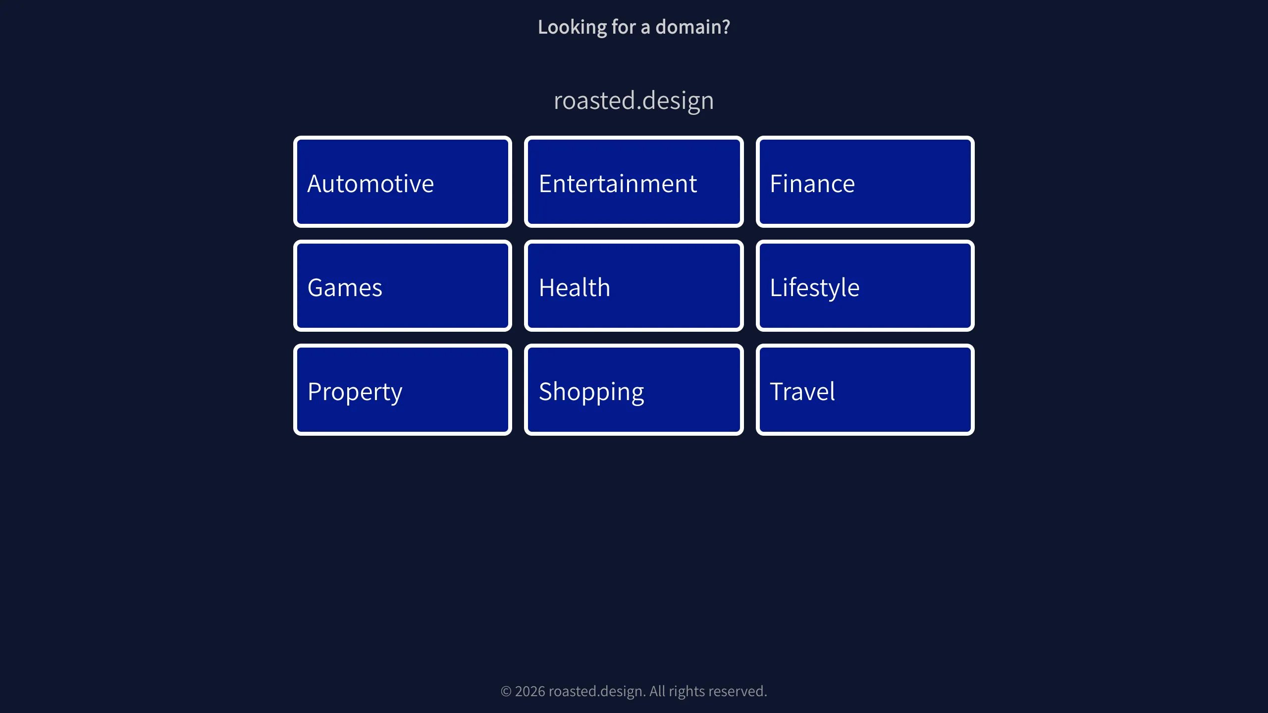
Roasted.design Domain Parking Grid Layout
A minimalist dark-themed landing page featuring a centered 3x3 category grid of clickable navigation tiles with clean border styling.
Overview
This is a minimalist domain parking landing page that uses a structured 3x3 grid layout to direct traffic to various search categories. It is a strong clone reference for builders needing a clean, focused navigation portal or a non-distracting 'Coming Soon' page with high visual clarity.
Design System
- Color Palette & Visual Hierarchy: The design employs a deep navy blue background (
#0B1437style) with high-contrast white text. The visual hierarchy is centered around the navigation tiles, which utilize a slightly brighter blue fill and a sharp 2px white solid border to command attention against the dark backdrop. - Typography System: A clean, sans-serif font is used throughout. Hierarchy is established through size: the secondary header and domain name are larger and slightly more prominent than the category labels within the tiles.
- Page Structure & Flow: The layout follows a classic vertical stack: header text asking a question, the primary domain identifier, a centered 3x3 grid container (
kw-grid), and a legal footer. Everything is vertically and horizontally centered in the viewport. - Reusable Components: The
kw-tilecomponent is the core asset—a large, clickable block with internal padding and rounded corners that serves as a robust navigation element. - Interaction Patterns: The HTML structure uses standard
<a>tags for tiles, indicating they are fully clickable areas. The uniform sizing of the tiles ensures a predictable and balanced interface. - Implementation Clues: The code uses semantic class naming (e.g.,
kw-tile,kw-grid) suggesting a utility-first CSS approach or a custom stylesheet designed for rapid grid distribution.
Use Cases
- Who should clone this pattern: Developers looking for a professional 'Under Construction' or 'Portfolio Portal' where users need to be redirected to specific sub-sites or services.
- Effective Remixes: This layout is perfect for link-in-bio pages, simple category-based directory sites, or minimalist dashboard navigation.
- Remix Directions:
- Brand Style: Swap the navy blue for corporate brand colors or a glassmorphism effect on the tiles.
- Information Architecture: Replace the 3x3 grid with a 2xN grid for mobile-first designs or add SVG icons inside each tile for better visual cues.
- Enhanced State: Add CSS hover effects (e.g., scale-up or background color shift) to the tiles to improve interactivity.
- Suggested Clone Scope: A full-page clone is ideal as the entire layout consists of only five main functional elements, making it an excellent 'starter' template for simple web projects.
Related Inspirations
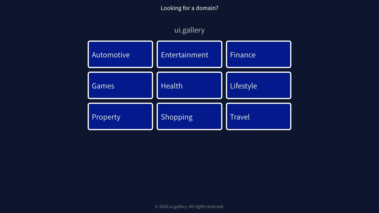
UI.Gallery Domain Parking Tile Grid
A minimalist dark-themed landing page template featuring a responsive centered 3x3 grid of clickable category tiles with subtle borders.
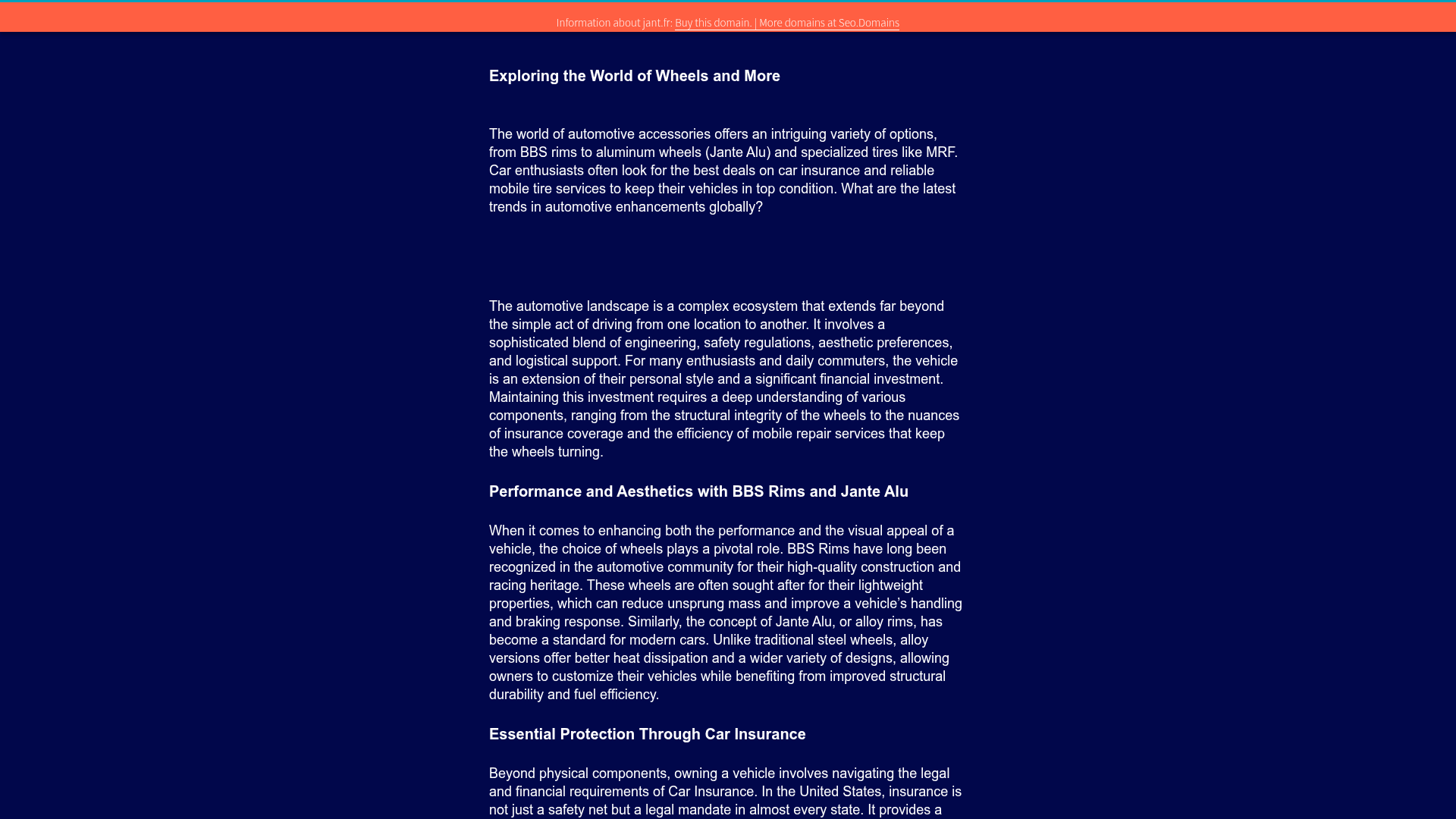
Automotive Article Landing Page Template
A clean, dark-themed content layout featuring a header banner, nested article sections with structured headings, and a responsive Bootstrap-styled pricing table.

Good Glyphs Font Showcase Landing Page
A single-page layout featuring an interactive type tester, donation form with custom amount logic, and a contributor gallery using swiper-based glyph previews.

Niklas Rosén Designer Portfolio Index
A minimalist, responsive grid-based portfolio index featuring a clean 16-column layout, typographic list components, and a custom dark mode transition.
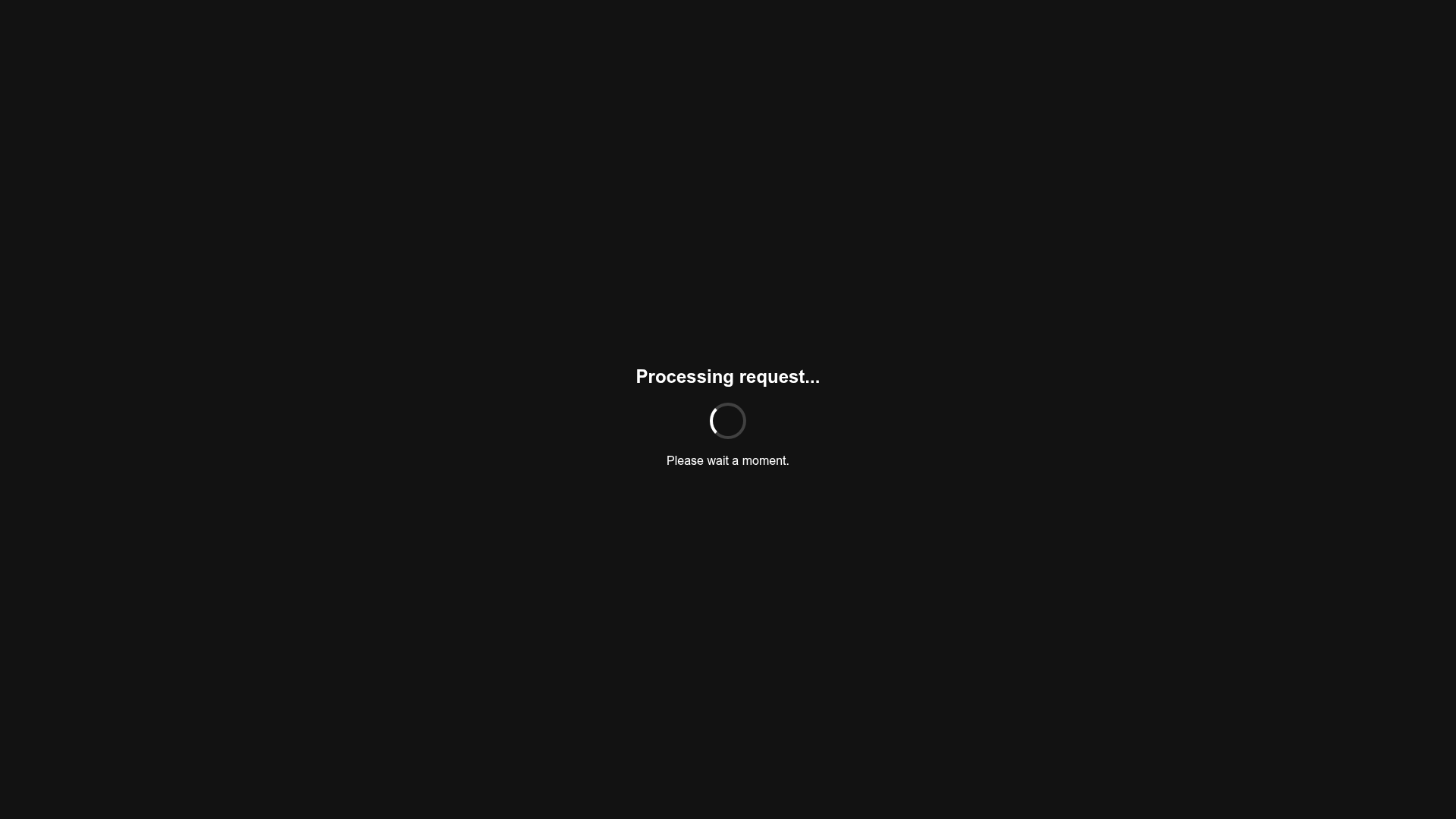
Minimalist Dark Mode Loading Screen
A clean, dark-themed redirection page featuring a centered typography layout and a CSS circular loading spinner for asynchronous processing states.

Vercel AI Cloud Landing Page
A modern landing page featuring a minimalist dark-themed navbar, a grid-overlay hero section with radial color gradients, and high-contrast typography for customer success stories.
