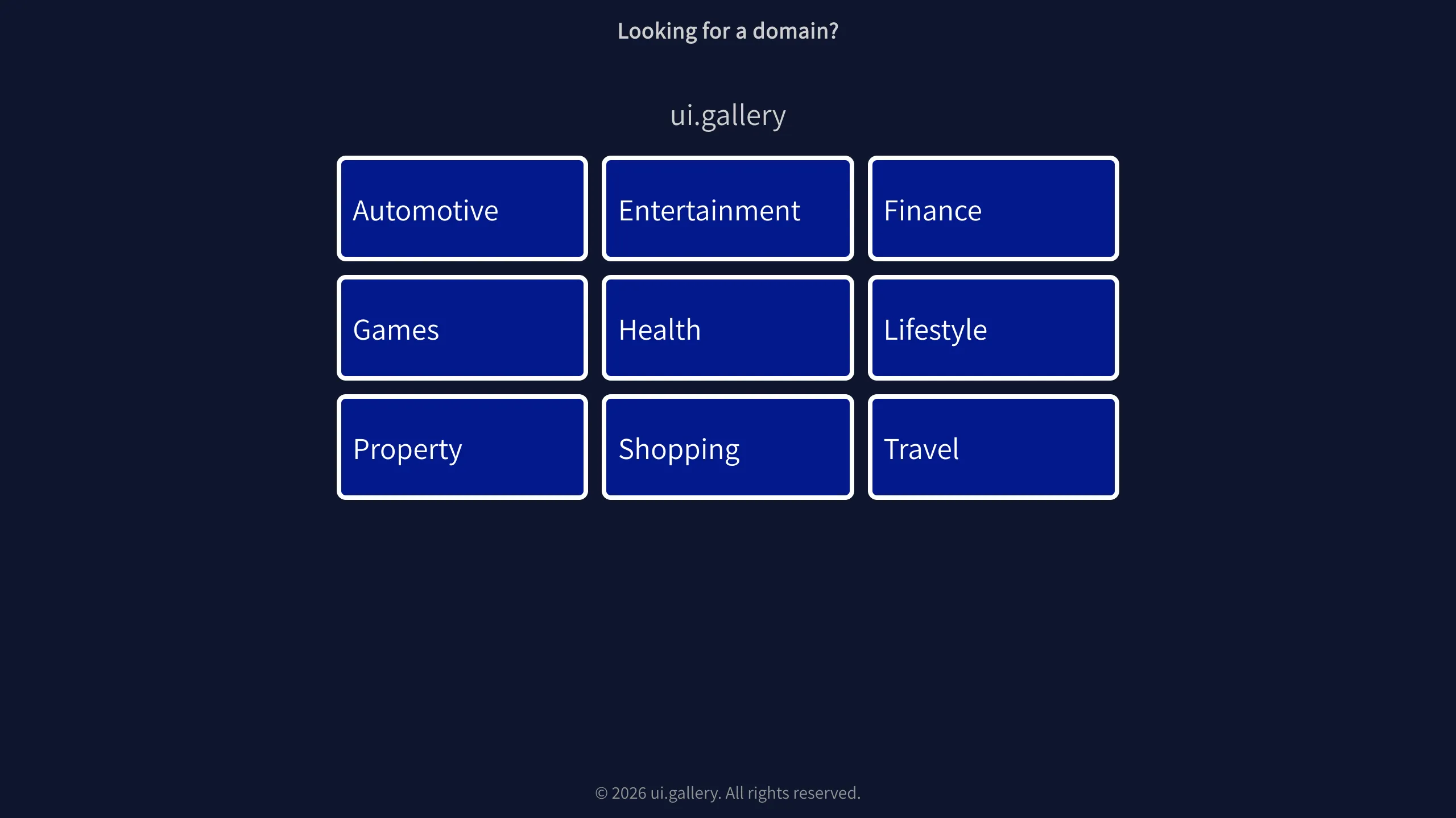
UI.Gallery Domain Parking Tile Grid
A minimalist dark-themed landing page template featuring a responsive centered 3x3 grid of clickable category tiles with subtle borders.
Overview
This UI pattern is a minimalist domain parking or landing page designed to categorize navigation options into a clean, 3x3 tile grid. It is an excellent reference for builders who need a high-contrast, distraction-free layout that emphasizes central call-to-action (CTA) tiles over dense text content.
Design System
- Color Palette & Visual Hierarchy: The design uses a deep navy blue background (#0b112d) to create a sophisticated, dark-mode atmosphere. Highlights are achieved using pure white for text and tile borders, creating maximum contrast. The primary domain name (
.kw-domain) serves as the central focal point of the hierarchy. - Typography: A clean sans-serif font is used throughout. There is a clear scale: the sub-header and footer use smaller, lower-opacity text, while the domain name and tile labels are larger and high-contrast to guide the eye.
- Grid Structure: The page is structured vertically with a header (
Looking for a domain?), the headline (ui.gallery), a central responsive grid (.kw-grid), and a legal footer. Transitions between these sections are balanced with generous white space (negative space). - Reusable Components: The core component is the
.kw-tile. These are stylized anchor tags with defined padding, rounded corners, and white borders. Each tile is self-contained and easily duplicable for different categories. - Responsive Behavior: The 3x3 grid is designed for easy collapsing into a single-column or 2-column layout on smaller viewports. The use of flexbox or CSS grid is evident in the alignment of the tiles.
- Implementation Clues: The HTML uses semantic class naming (e.g.,
kw-tile,kw-grid) suggesting a utility-first or custom CSS approach rather than a heavy framework like Bootstrap.
Use Cases
- Who should clone this pattern: Developers creating link-in-bio pages, simple directory sites, or coming-soon pages that need to segment users into different service categories immediately.
- Effective Remixes: This layout effectively serves as a "hub" page for an ecosystem of apps. A builder could remix this by replacing the text labels with icons or brand logos inside the tiles.
- Practical Directions: To remix, consider adding a hover state to the
.kw-tileclass (such as a background color shift or a slight scale up). You might also adapt the 3x3 grid into a 2x2 grid for smaller feature sets. - Clone Scope: This is ideal for a full-page clone as a starting point for a portfolio or a simple gateway page where minimalism and speed of navigation are priorities.
Related Inspirations
Automotive Article Landing Page Template
A clean, dark-themed content layout featuring a header banner, nested article sections with structured headings, and a responsive Bootstrap-styled pricing table.
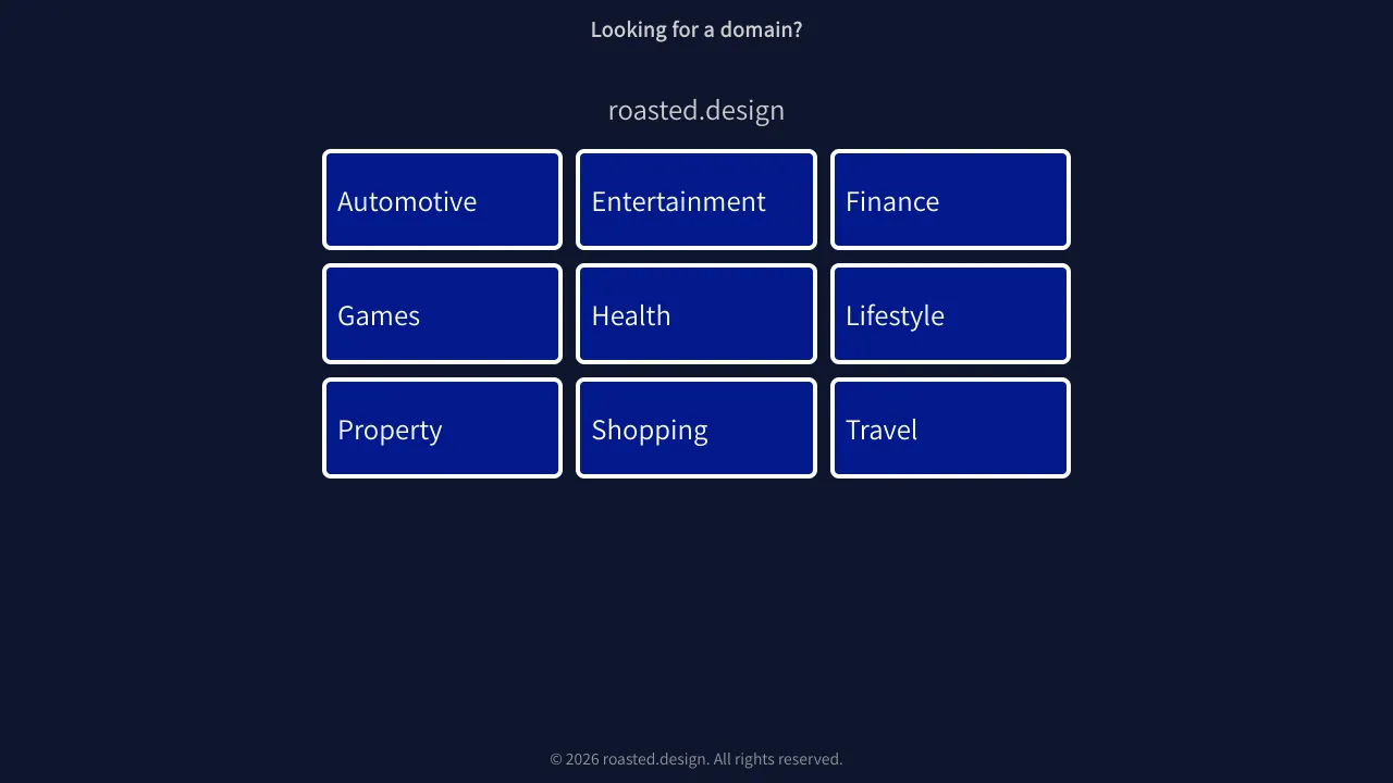
Roasted.design Domain Parking Grid Layout
A minimalist dark-themed landing page featuring a centered 3x3 category grid of clickable navigation tiles with clean border styling.

Good Glyphs Font Showcase Landing Page
A single-page layout featuring an interactive type tester, donation form with custom amount logic, and a contributor gallery using swiper-based glyph previews.

Niklas Rosén Designer Portfolio Index
A minimalist, responsive grid-based portfolio index featuring a clean 16-column layout, typographic list components, and a custom dark mode transition.
Minimalist Dark Mode Loading Screen
A clean, dark-themed redirection page featuring a centered typography layout and a CSS circular loading spinner for asynchronous processing states.

Vercel AI Cloud Landing Page
A modern landing page featuring a minimalist dark-themed navbar, a grid-overlay hero section with radial color gradients, and high-contrast typography for customer success stories.
