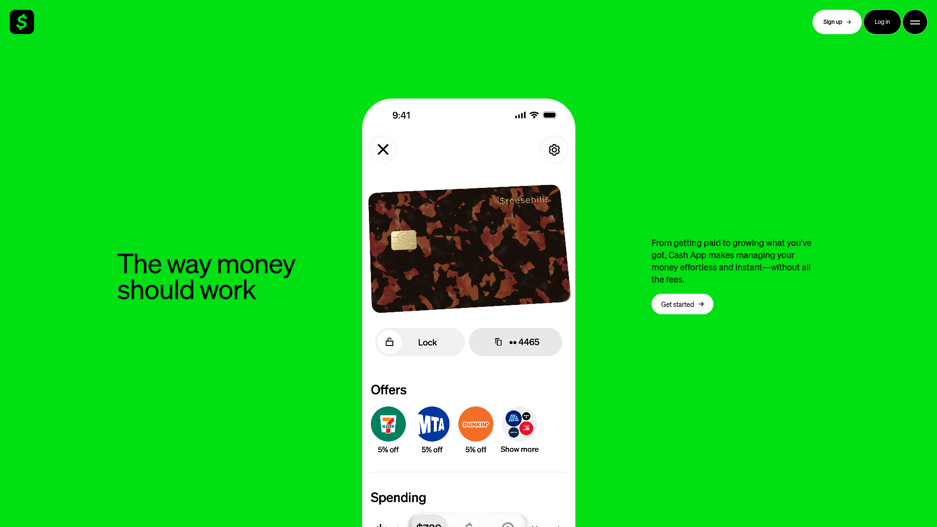
Cash App Vibrant Animated Landing Page
A minimalist, high-contrast landing page featuring responsive mobile app mockups, floating button UI, and a bold typography-centric hero section.
Overview
This landing page is a masterclass in minimalist, high-impact branding, utilizing a saturated neon green background and bold black typography. It effectively bridges the gap between web and mobile by centering an interactive app mockup as the primary visual anchor, making it a powerful reference for fintech and SaaS startups looking to prioritize mobile-first product experiences.
Design System
- Color Palette & Visual Hierarchy: The primary brand color is a vibrant electric green (#00D632), paired with high-contrast black (#000000) for text and UI elements. The hierarchy is established by the massive heading on the left balanced against a detailed mobile UI in the center.
- Typography System: A bold, geometric sans-serif (resembling Cash Market or similar branding) is used. The hero heading features tight tracking and large font size, while the body text on the right uses a smaller, highly readable weight for functional descriptions.
- Page Structure & Section Flow: The layout follows a three-column horizontal split in the hero section: big-scale messaging on the left, a vertical mobile app mockup in the center, and a brief value proposition with a Call to Action (CTA) on the right.
- Reusable Components:
- Pill Buttons: Rounded buttons with subtle arrow icons (e.g., 'Get started', 'Sign up').
- Mobile Mockup: A layered UI frame containing a custom debit card graphic, horizontal action buttons ('Lock'), and circular merchant icons for reward offers.
- Navigation: A floating-style top header with a brand logo and distinct button styles for 'Sign up' and 'Log in'.
- Interaction & Motion Patterns: The design implies a focal point transition; the static screenshot suggests a clean entry where the mobile frame might float or slide in. The 'Sign up' button uses a white background to differentiate from the black 'Log in' button.
- Implementation Clues: The HTML structure indicates a modular approach, using clean containers to house the three-way split hero, ensuring that the central mobile mockup remains the focal point across different screen widths.
Use Cases
- Who should clone this pattern: Mobile App developers, Fintech startups, and digital utility brands that want to demonstrate their app's interface immediately upon page load.
- Effective Remixes: Crypto wallets, fitness tracking apps, or lifestyle subscription services can adopt the 'bold color + centered device' layout to showcase their proprietary UI/UX features.
- Practical Remix Directions: Swap the neon green for a brand-specific primary color; replace the debit card with a dashboard preview or a video feed; keep the high-contrast typography but adjust the copy for a 'Product Hunt' style launch page.
- Suggested Clone Scope: For a quick win, clone the hero section's three-column layout and the pill-shaped button components. For a full-page project, replicate the navigation bar and the structured responsive behavior of the mobile mockup container.
Related Inspirations
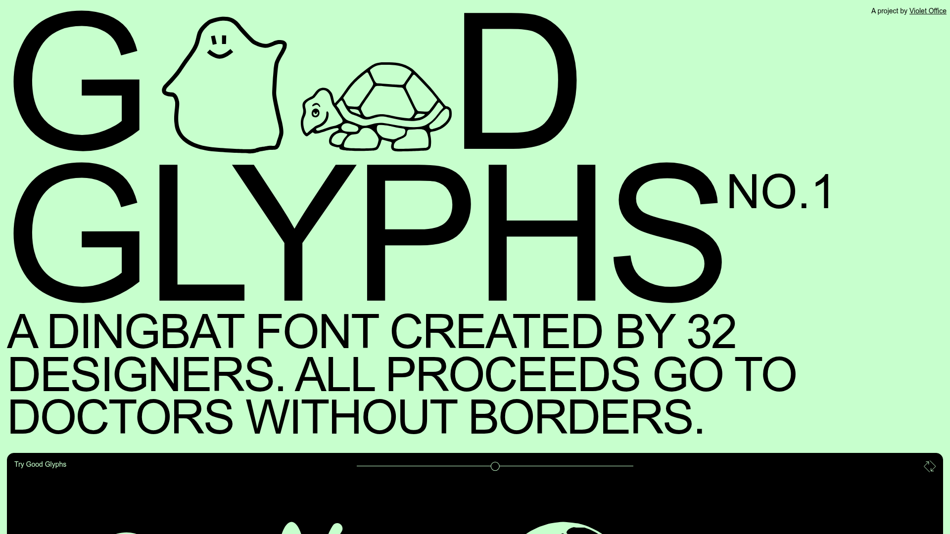
Good Glyphs Font Showcase Landing Page
A single-page layout featuring an interactive type tester, donation form with custom amount logic, and a contributor gallery using swiper-based glyph previews.
Special Offer Studio Landing Page
Minimalist full-screen landing page featuring a centered logo, bold flat-color background, and accessible skip link structure using Nuxt.js and Tailwind CSS.
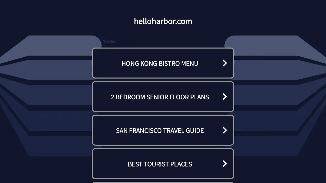
HelloHarbor Search Landing Page
A dark-themed mobile-responsive search portal featuring vertically stacked navigations cards with chevron indicators and simple header branding.
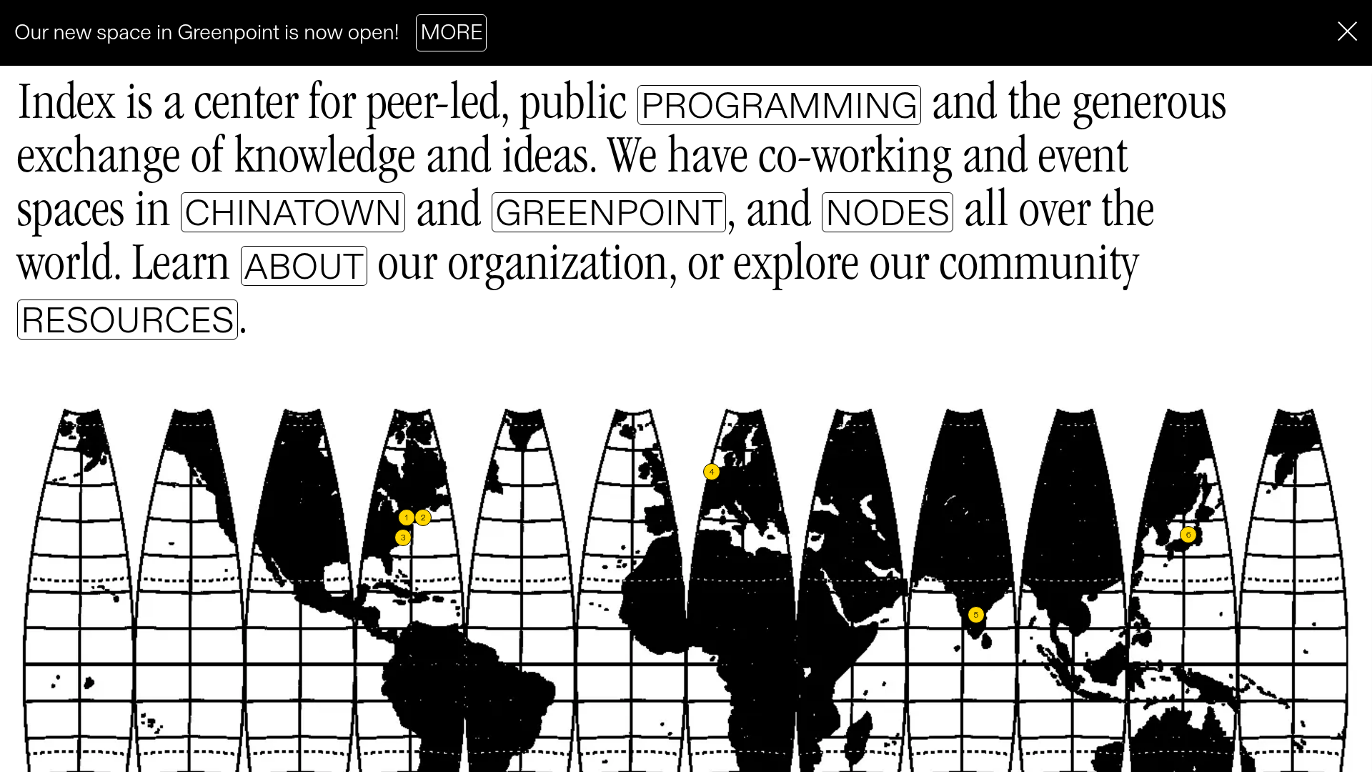
Index Community Space Landing Page
A minimalist, text-heavy landing page featuring a segmented world map visualization and an interactive sentence-based navigation layout.
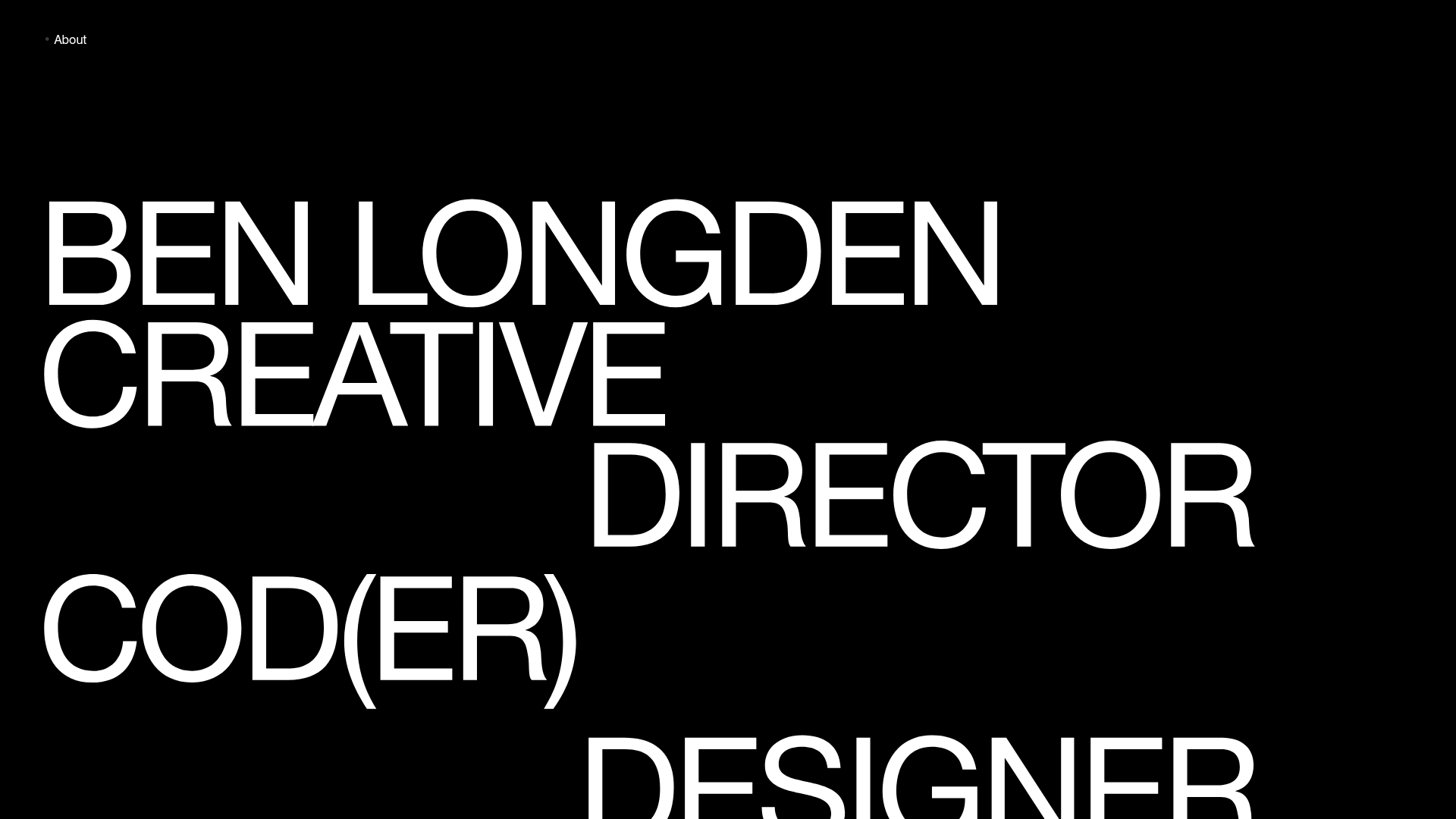
Ben Longden Minimalist Creative Portfolio
A bold typography-focused site featuring a large-scale overlapping hero section, horizontal image carousels for projects, and a scrolling text marquee footer.
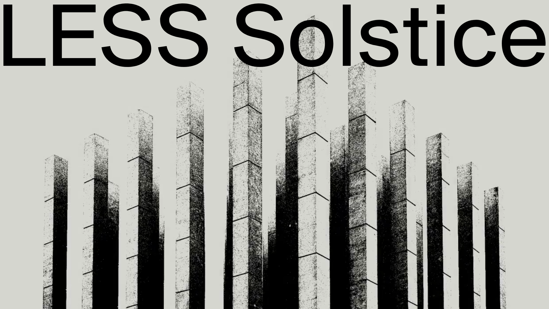
LESS Solstice Immersive Video Landing Page
A minimalist landing page featuring a full-screen background video hero with a lightweight sticky header and transparent interaction layer.
