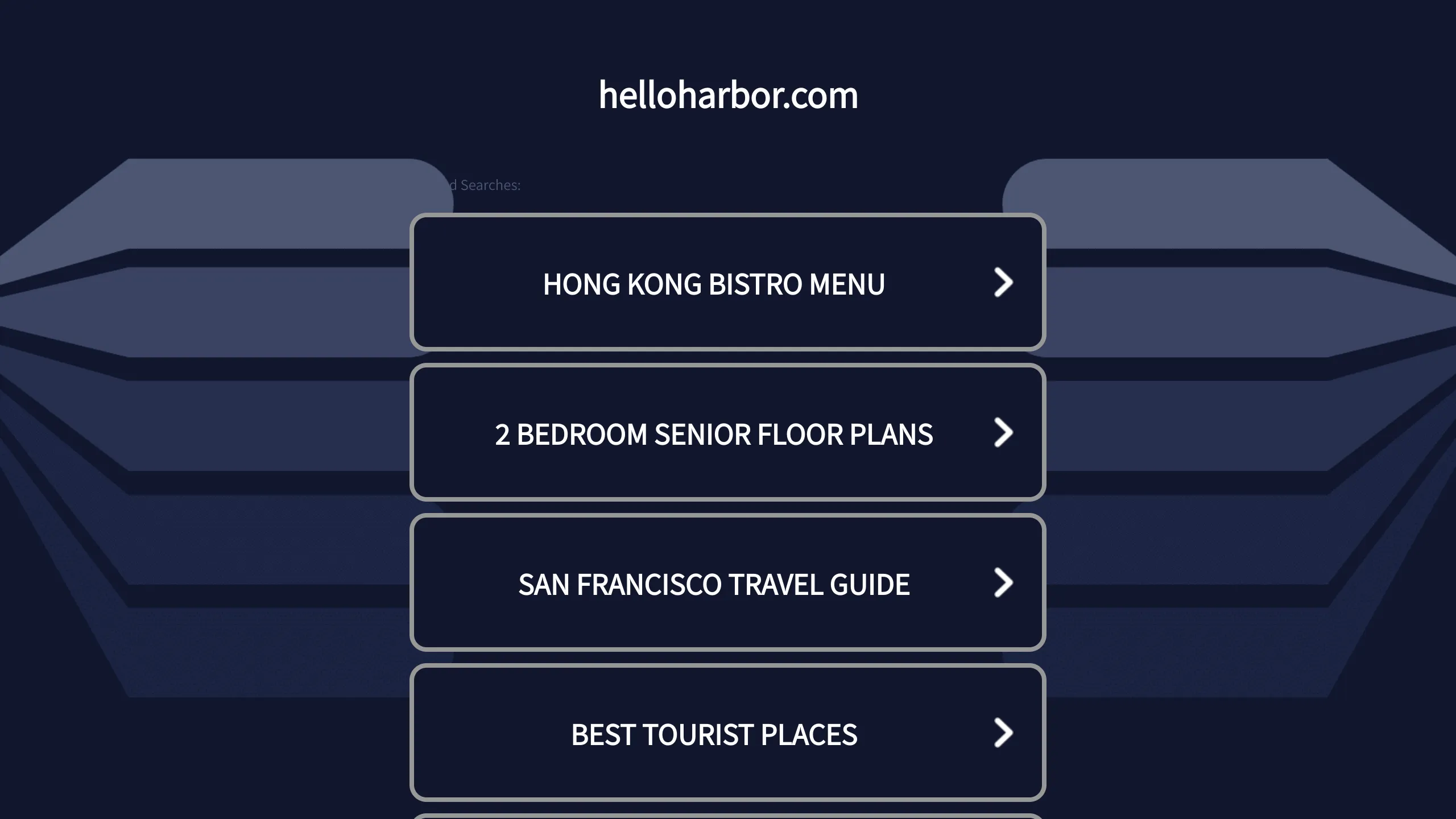
HelloHarbor Search Landing Page
A dark-themed mobile-responsive search portal featuring vertically stacked navigations cards with chevron indicators and simple header branding.
Overview
This landing page is a minimalist, mobile-centric search portal designed for high-intent traffic and high-contrast accessibility. Its structure emphasizes quick, focused navigation via a vertical stack of interactive link cards, making it an excellent reference for builders creating directory sites, link-in-bio alternatives, or simplified transition pages.
Design System
- Color Palette & Visual Hierarchy: The design utilizes a deep navy-to-midnight blue (#0D1426) background with a subtle, stylized geometrical abstract graphic in the background to add depth. The cards provide a high-contrast dark-mode interface, using a slightly lighter navy fill and light gray/white borders to define interactive areas.
- Typography: The interface uses a clean, sans-serif font (likely a system font like Helvetica or Inter) rendered in all-caps within the navigational buttons for better legibility and a crisp, modern aesthetic. The branding at the top is lowercase, providing a distinct stylistic contrast to the navigation links.
- Page Structure & Flow: The layout follows a centered vertical axis starting with a simple text-based logo, followed by a stacked array of rounded-corner rectangular blocks. Each block has identical proportions to maintain rhythm and predictability.
- Reusable Components: The primary component is the 'Navigation Card' — a full-width container featuring centered text and a right-aligned chevron icon (
>) to signify affordance. The header branding is a minimalist single-text element that can be easily swapped for a logo image. - Interactions & Motion: While the capture is static, the chevron placement and defined borders suggest a clear hover/active state where the entire card acts as a trigger area. The geometry of the background suggests a fixed position or a parallax effect upon scrolling.
- Responsive Behavior: The design is intrinsically 'mobile-first,' using a narrow max-width for the button stack that ensures consistency across small phone screens and centered symmetry on larger desktop displays.
Use Cases
- Who should clone this pattern: Developers building 'Link-in-bio' style pages, domain parking landing pages, or high-conversion affiliate search portals.
- Effective Remixes: This pattern can be remixed into a client portal login page, a simplified FAQ directory, or a mobile menu overlay for a larger website.
- Remix Directions: Builders can swap the dark theme for a high-energy brand gradient, replace text links with descriptive service icons, or use the card stack as a curated 'Top Products' list for an e-commerce landing page.
- Suggested Clone Scope: A full-page clone is recommended as the layout is concise and modular. Reusing the CSS container and button classes will provide a robust framework for any list-based navigation profile.
Related Inspirations
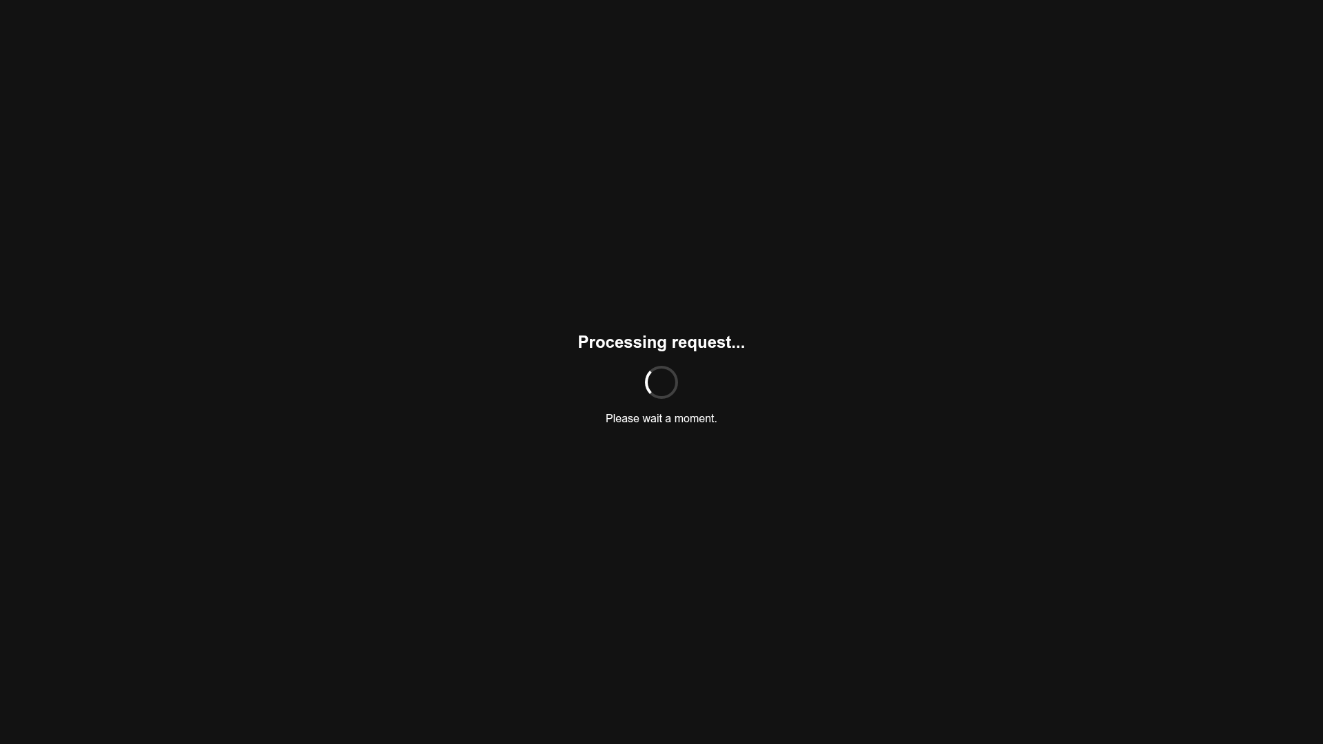
Minimalist Dark Mode Loading Screen
A clean, dark-themed redirection page featuring a centered typography layout and a CSS circular loading spinner for asynchronous processing states.
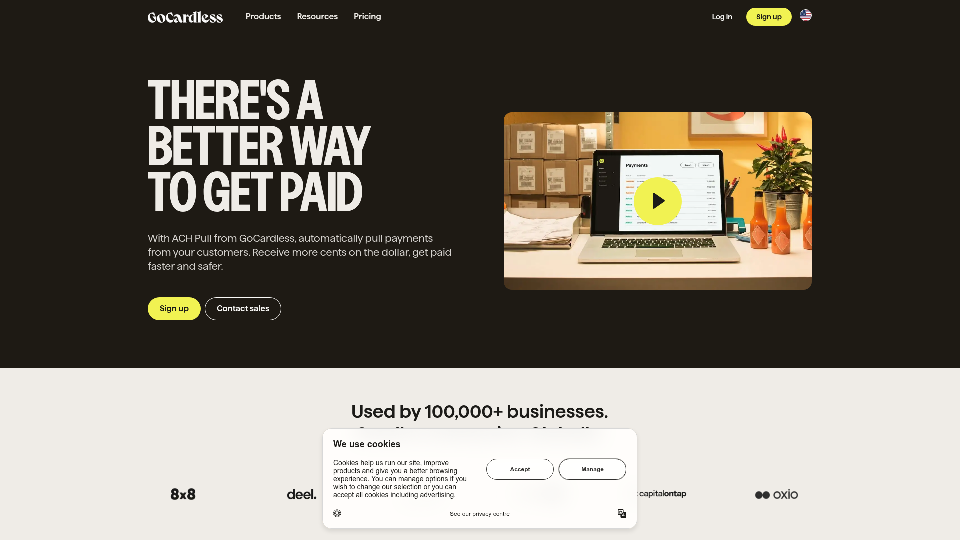
GoCardless Payments Platform Landing Page
A dark-themed fintech landing page featuring a split-screen video hero, bento-style feature cards, a horizontal logo slider, and step-by-step accordion guides.

Jacob Leech Portfolio Portfolio Site
A minimalist developer portfolio with custom cursor interactions, scroll-triggered text animations, a clean resume layout, and unique full-width graphic components.
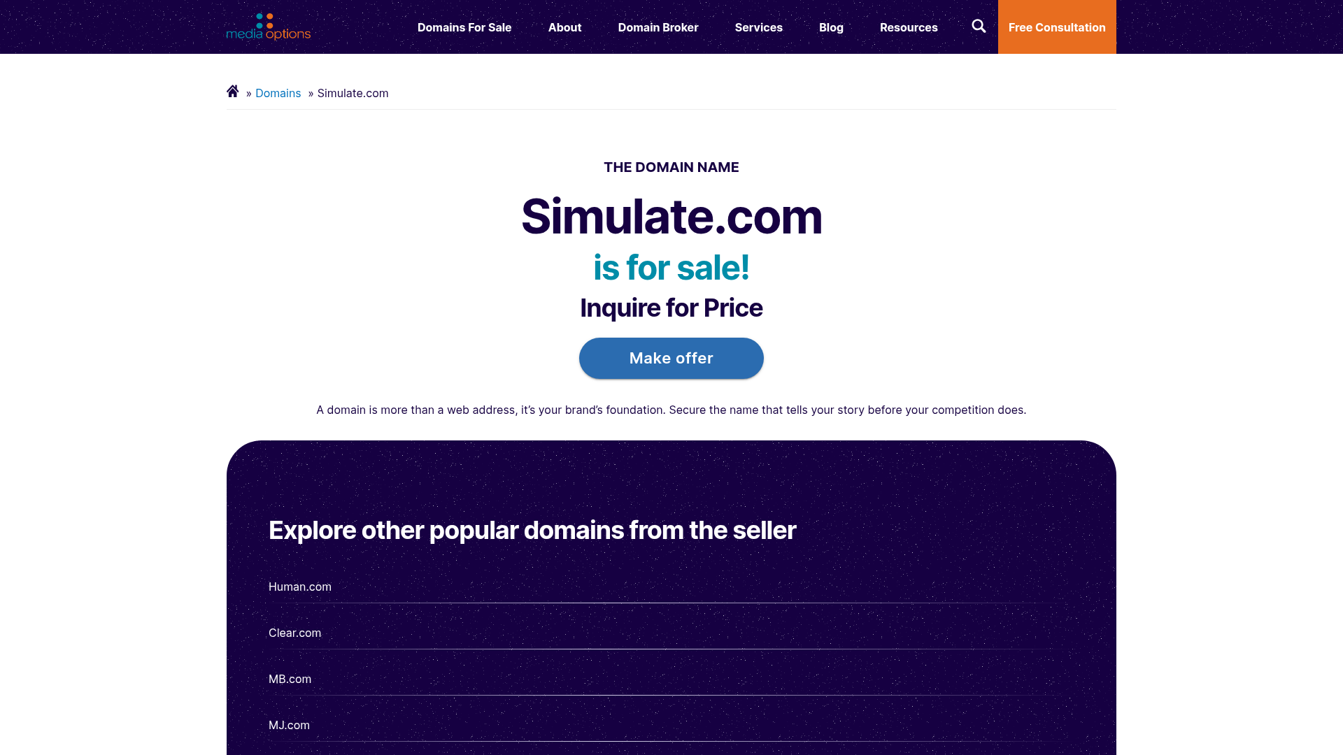
Domain For Sale Landing Page
A clean, centered landing page layout featuring a hero section for asset sales, a prominent CTA button, and a list-based showcase of related items.
Dynadot Domain Parking Page
A minimalist domain registration placeholder featuring a branded sticky header banner and a full-height dark background layout.
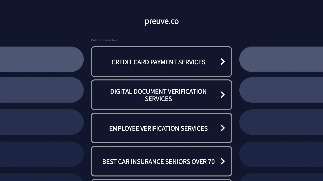
Preuve.co Search Index Landing Page
A dark-themed search directory layout featuring a centered brand header and vertically stacked rectangular navigation cards with chevron icons and hover effects.
