Ben Longden Minimalist Creative Portfolio
A bold typography-focused site featuring a large-scale overlapping hero section, horizontal image carousels for projects, and a scrolling text marquee footer.
Overview
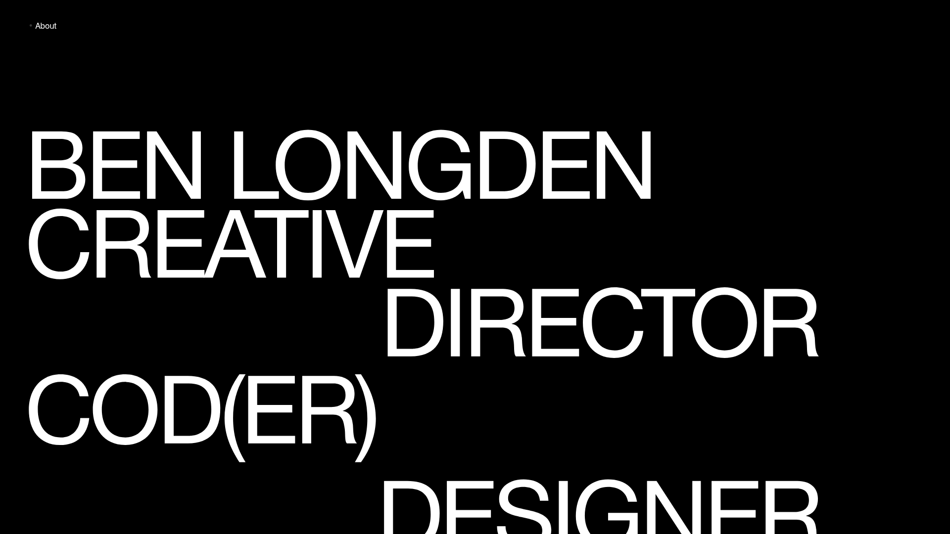
Ben Longden’s portfolio is a masterclass in brutalist minimalism and typography-driven design. It uses massive, overlapping headlines to create a high-impact hero section that immediately establishes a creative identity through scale and negative space. This is an excellent reference for builders wanting to create a "designer-as-brand" portfolio that prioritizes visual authority over traditional layout structures.
Design System
- Color Palette & Visual Hierarchy: The site uses a high-contrast monochromatic palette (pure white text on a black background). Hierarchy is established through extreme scale rather than color, with primary job titles occupying the majority of the viewport.
- Typography System: The system relies on a bold, sans-serif grotesque typeface. It features massive responsive font sizes for the hero section, with specific "name-drop" styling that uses tight line-height to allow characters to overlap. Secondary information (sub-headers) uses uppercase styling for clarity.
- Page Structure & Section Flow: The layout follows a vertical progression: a collapsible "About" section at the top, an overlapping hero headline area, followed by repeated full-width project modules consisting of a title/discipline pair and an image carousel. The page concludes with a continuous horizontal marquee.
- Reusable Components:
- Typography Hero: The
name-dropcontainer is a high-value component for bold branding. - Image Carousels: The
carouselanddotssystem for portfolio project displays. - Ticker Footer: The
ticker-wraphorizontal scrolling marquee for service listings and accolades. - About Toggle: A flex-based menu that expands to reveal expertise and client lists.
- Typography Hero: The
- Interaction & Motion Patterns: The carousel uses
dotsfor navigation andlazyloading for image performance. The ticker provides continuous motion at the bottom of the page, acting as an "always-on" status bar. - Implementation Clues: The HTML reveals a container-based structure (
page-wrapper) using Flexbox (flex-top,flex-menu,flex-about) for alignment. The project images are managed via a simple class-based display system (image display), suitable for lightweight JavaScript implementation.
Use Cases
- Who should clone this: Independent designers, creative directors, and developers looking for a high-impact, low-maintenance site that focuses on images and bold statements rather than long-form copy.
- Remix Directions:
- Brand Evolution: Switch the black-and-white scheme for a vibrant duo-tone pairing to fit a more energetic brand identity.
- Information Architecture: Adapt the
tickerat the bottom to serve as a "Currently Available" or "Latest News" bar. - Content Strategy: Reuse the
about-memulti-column grid for a services page or a detailed resume view.
- Clone Scope: A full-page clone is best to maintain the specific typographic tempo, but the
fullwidthcarousel blocks can be extracted easily for use in more traditional layouts.
Related Inspirations
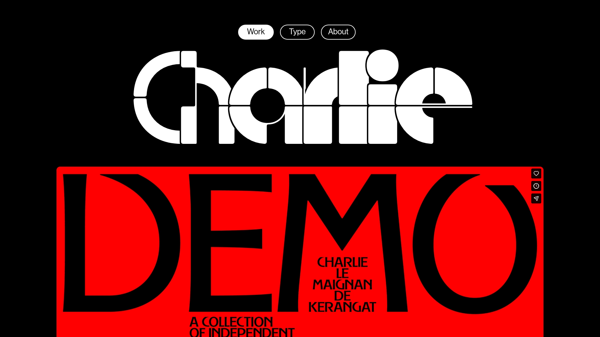
Charlie Le Maignan Portfolio Archive
A minimalist dark-mode portfolio featuring high-contrast typography, a geometric logo header, and an integrated full-width video gallery showcasing independent creative work.

Jacob Leech Portfolio Portfolio Site
A minimalist developer portfolio with custom cursor interactions, scroll-triggered text animations, a clean resume layout, and unique full-width graphic components.
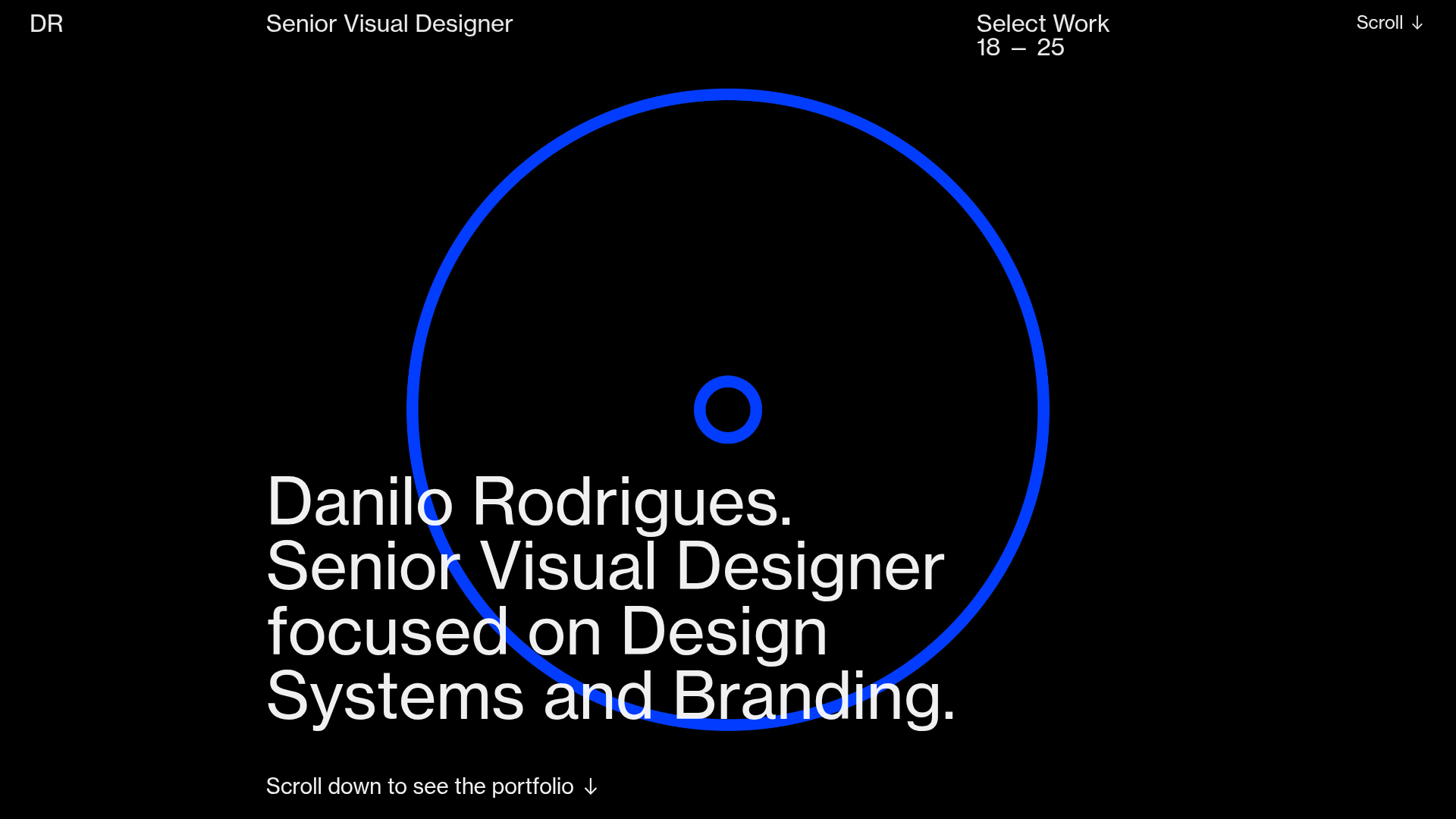
Danilo Rodrigues Designer Portfolio Landing
A minimalist, high-impact design portfolio featuring a full-screen image carousel hero, fluid typography, large scroll-triggered key visuals, and a clean grid-based case study layout.
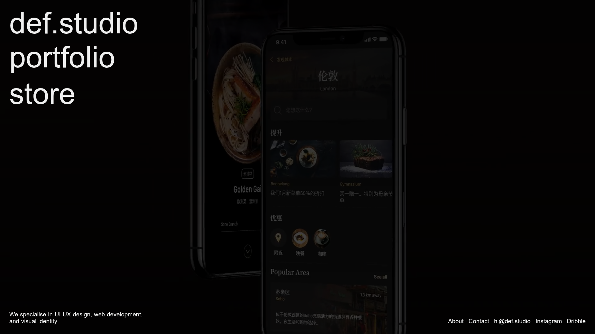
Def.studio Design Agency Portfolio
A dark-themed portfolio featuring a full-screen video background, smooth scroll transitions, and a vertical list of large-scale media-driven project cards with lazy-loaded video previews.
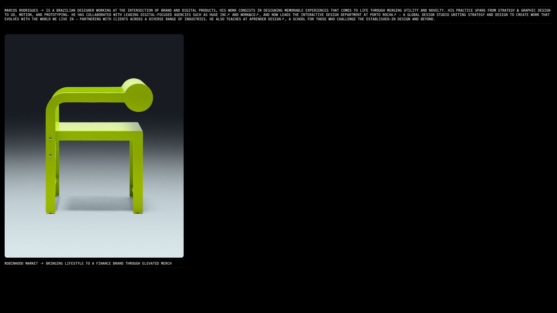
Marcos Rodriguez Minimalist Design Portfolio
A dark-themed personal site featuring a high-contrast monospaced header, a full-height centered image/video slideshow, and minimal thin-rule horizontal dividers.
Danny Garcia Portfolio and Blog
A minimalist, typography-focused personal website featuring a dark mode aesthetic, canvas-based hero background, and a structured timeline layout for blog posts and work history.
