Katherine Pihl Design Portfolio Grid
A minimalist portfolio layout featuring a multi-column image and video grid, category filtering, and a text-heavy footer for services and collaborators.
Overview
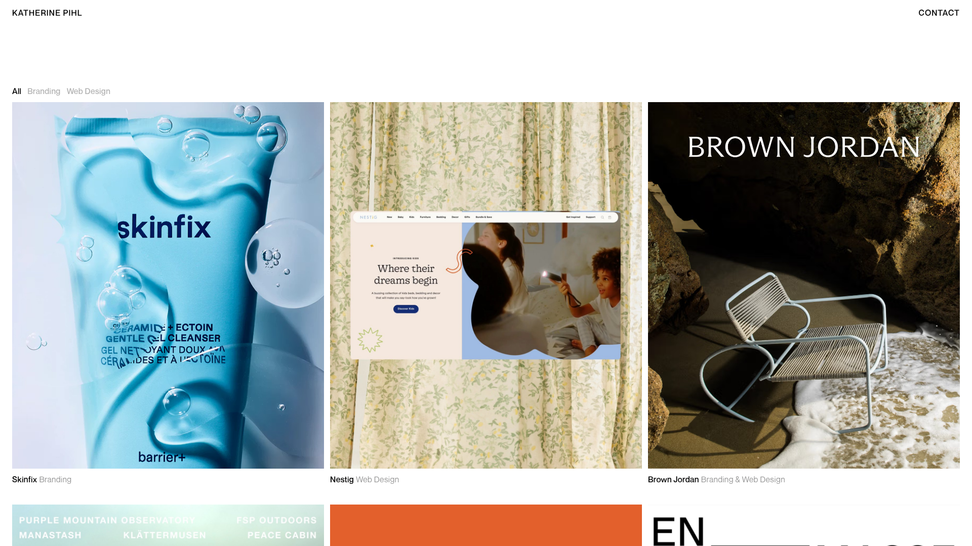
This Katherine Pihl design portfolio is a masterclass in minimalist visual storytelling, featuring a clean multi-column grid that seamlessly integrates static photography and autoplaying video. It is an excellent clone reference for creatives who want a "luxury-minimalist" aesthetic where the work takes center stage with zero ornamentation. The interaction logic relies on subtle typography shifts and a sophisticated filtering system to organize diverse project types.
Design System
- Color Palette & Visual Hierarchy: The site uses a monochrome foundation of pure black text (
text-black) on a crisp white background. Content hierarchy is achieved through opacity rather than color, usingtext-black/30for inactive states andtext-black/40for secondary metadata. - Typography: The system uses a clean Sans-Serif for functional labels (titles, project tags) and a large Serif font in the footer for brand narrative. Titles use a
16pxscale with1.2line height and500weight, while the footer utilizes a larger32pxserif for character. - Page Structure:
- Minimal Header: Persistent left-aligned name and right-aligned contact link.
- Category Filter: Horizontal checkbox-driven navigation for sorting content (All, Branding, Web Design).
- High-Impact Grid: A responsive 1 to 3 column layout (
grid-cols-2on medium screens,grid-cols-3on large) featuring fixed aspect ratio containers (aspect-[17/20]). - Detailed Footer: A three-section layout including a bio, services list, and collaborator marquee.
- Reusable Components:
- Project Card: A robust component including an aspect-ratio-locked media container (supporting both
<img>and looped<video>) with a title and metadata row directly underneath. - Opacity Filter Nav: A toggle-style filter bar that uses conditional classes for active/inactive text states.
- Footer Grid: A 12-column grid layout (
800:grid-cols-12) that demonstrates how to balance long-form copy with lists.
- Project Card: A robust component including an aspect-ratio-locked media container (supporting both
- Interactions: Subtle CSS transitions (
duration-300 ease-in-out-cubic) are applied to titles on hover. Media items utilize an "underline-hover" effect on titles and an invisiblelink-coverthat makes the entire image clickable. - Technical Implementation: Built using Next.js and Tailwind CSS. It leverages
mux.comfor high-performance video streaming and Sanity IO for image asset management, evidenced by thelqip(Low-Quality Image Placeholder) strings in the HTML.
Use Cases
- Who should clone this: Independent designers, photographers, or boutique agencies looking for a high-end, gallery-style digital presence.
- Effective Remixes: High-end e-commerce brands could remix the grid for product lookbooks. Architecture firms can use the mixed video/image grid to showcase project site walk-throughs alongside static renders.
- Remix Directions: Swap the monochromatic scheme for a high-contrast dark mode; change the serif footer to a monospace font for a more "dev-focused" or technical aesthetic; or expand the checkbox filter into a more complex tagging system.
- Clone Scope: The grid component and filter bar are the most valuable pieces for a quick section clone. For a full-page clone, the footer's responsive 12-column distribution offers a great template for information-heavy about sections.
Related Inspirations

Clase Agency Branding Portfolio
A minimalist design agency portfolio featuring a typographic hero section, full-width image articles, sticky title bars, and integrated scrolling text marquees for a clean editorial layout.

Ayaka B. Ito Creative Portfolio
A minimalist design portfolio featuring an immersive full-screen hero image, clean typographic navigation, and a structured layout for showcasing branding and editorial projects.

Lundqvist & Dallyn Studio Portfolio
Minimalist design studio portfolio featuring a custom video loader, world clock navigation, and a fluid masonry-style grid for high-quality photography and type design showcases.
Minimalist Dark Designer Portfolio Grid
A clean, dark-themed portfolio featuring a bold typography hero section and a staggered two-column image grid with subtle entrance animations.

AcolorBright Design Agency Portfolio
Minimalist bento-style portfolio layout featuring numerical section headers, horizontally scrolling project teasers, and a clean grayscale client logo grid.
Waka Waka Furniture Portfolio
A minimalist design showcase featuring a custom cursor, parallax scroll effects, and a vertical image grid layout for high-end product displays.
