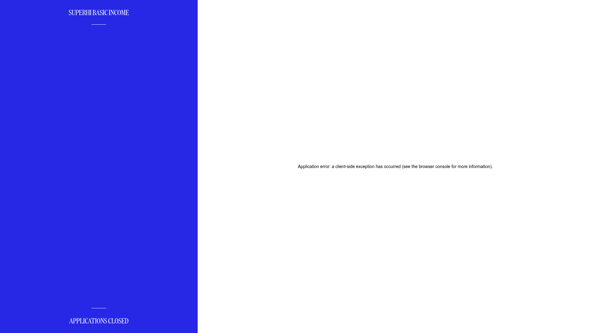
SuperHi Basic Income Countdown Microsite
A minimalist split-screen layout featuring a vertical status bar, central canvas integration, and a countdown timer component for event-driven landing pages.
Overview
This minimalist microsite features a striking split-screen layout designed for status updates and event countdowns. It is an excellent reference for builders looking to implement high-impact, low-content landing pages that utilize vertical space and canvas-based background animations to create a premium feel.
Design System
- Color Palette & Visual Hierarchy: The design is dominated by a high-contrast 'Electric Blue' (#2E2EF5) sidebar against a clean white canvas. The blue acts as the primary focal point, creating a bold enclosure for the site’s status messaging and identity.
- Typography: The site uses a sophisticated serif typeface for headings (visible in 'SUPERHI BASIC INCOME' and 'APPLICATIONS CLOSED'). Text is presented in all-caps with generous letter spacing, positioned at the extreme top and bottom of the vertical bar to frame the content.
- Page Structure: The layout uses a horizontal split. The left column (approximately 33% width) serves as a persistent status and branding bar, while the right column (approximately 66% width) is reserved for a central
<canvas>element intended for dynamic, interactive visuals (currently displaying a placeholder error in the provided viewport). - Reusable Components:
- Vertical Status Bar: A flexbox-based container that anchors branding at the top and state-information (like the countdown) at the bottom.
- Canvas Container: A dedicated
<section>using a<canvas class="world">tag, ideal for injecting Three.js or p5.js visualizations.
- Implementation Clues: The HTML structure indicates a Next.js application (
id="__next") utilizing Styled Components for CSS-in-JS (evident from thesc-prefixed class names). The use of flex-direction and 100vh containers ensures the content remains perfectly centered and responsive.
Use Cases
- Who should clone this: Developers launching waitlists, 'coming soon' pages, or minimalist digital scholarship applications.
- Remix Directions: Swap the electric blue for a brand-specific primary color; replace the centralized error/canvas area with a simple email capture form or a high-resolution hero image. The vertical sidebar can be remixed into a navigation menu for more complex sites.
- Clone Scope: For a quick win, builders should clone the split-screen CSS layout (flexbox) and the vertical branding bar to create a sophisticated mobile-first landing page with minimal effort.
Related Inspirations

Stripe Press Interactive Book Gallery
A high-end catalog featuring an immersive 3D canvas, horizontal scrolling product lists, and dynamic detail sections with thematic color-shifting backgrounds and integrated buy-flows.
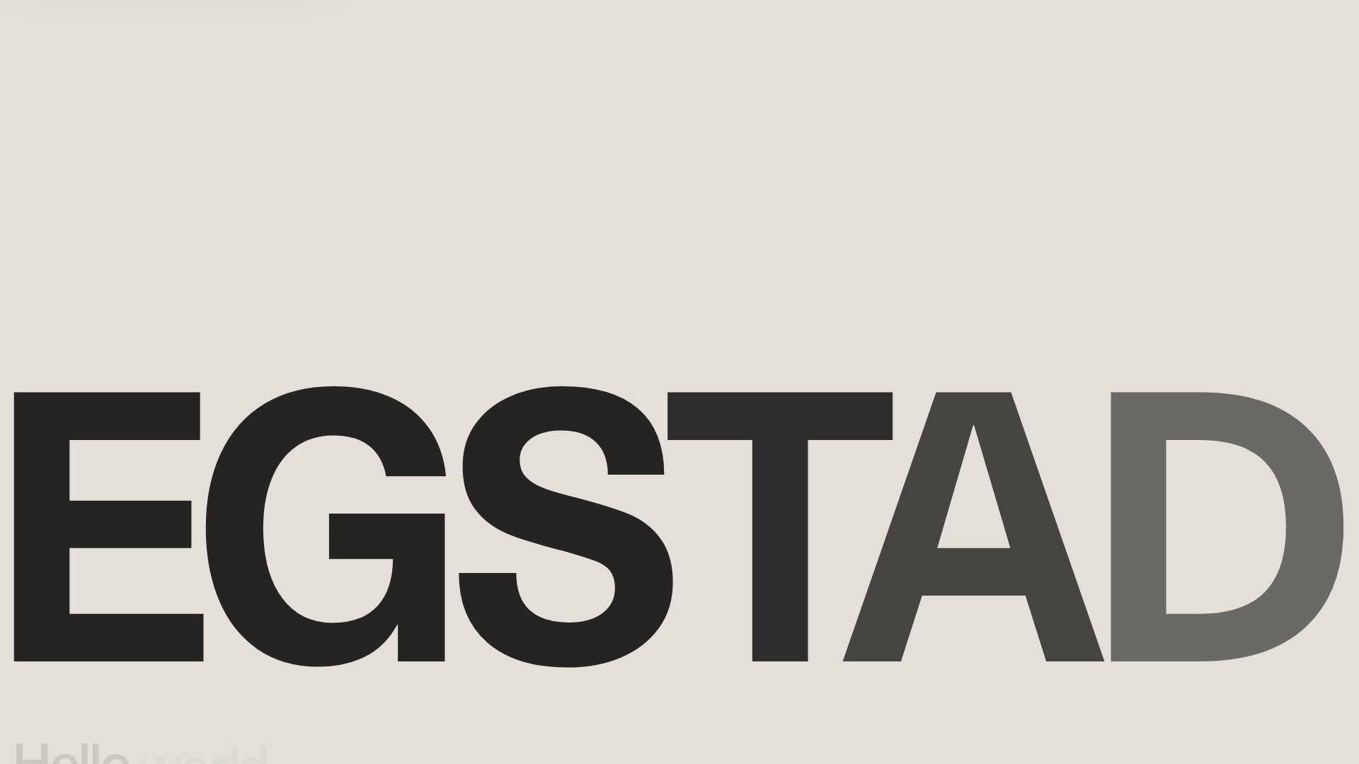
Egstad Minimalist Design Portfolio
A refined Nuxt.js portfolio featuring bold variable typography, interactive canvas elements, and a clean grid-based layout for showcasing design work.
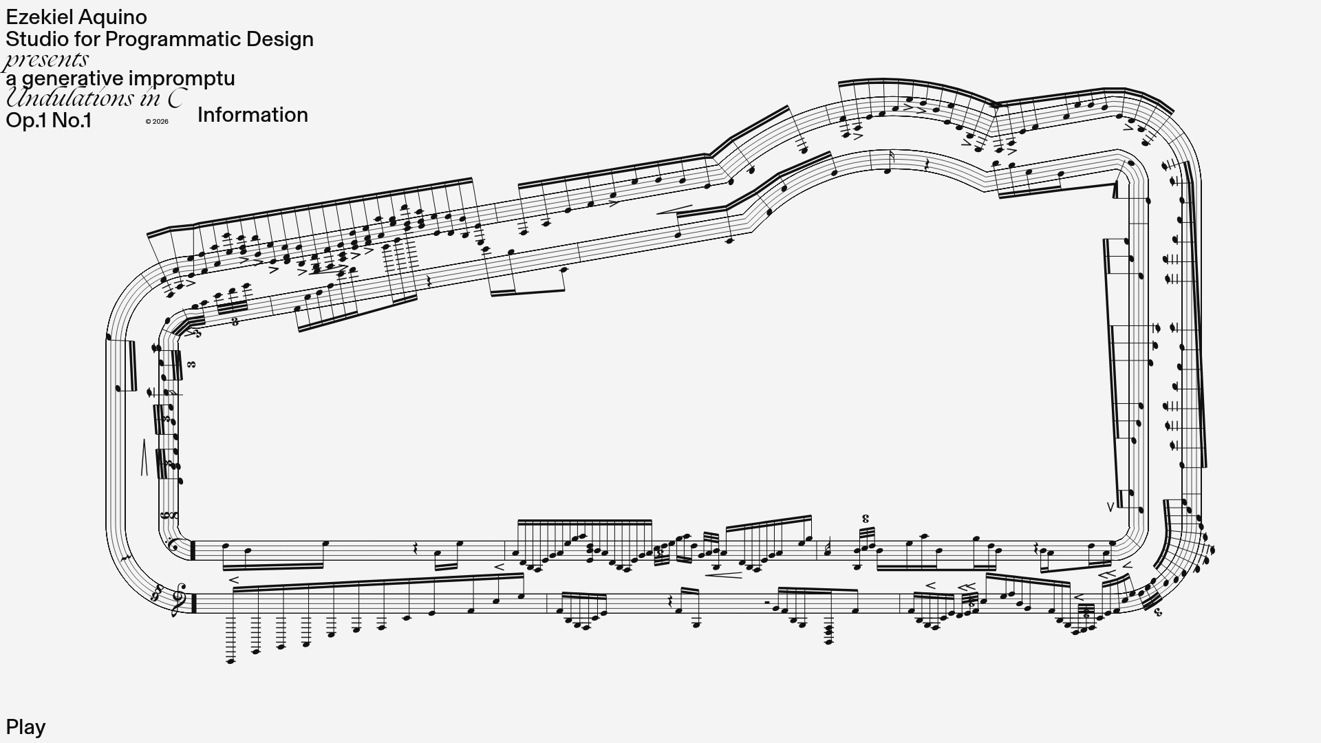
Generative Music Visualization Portfolio Canvas
A creative coding project featuring a generative musical score on a dynamic canvas with a play/pause interaction and custom notation rendering.
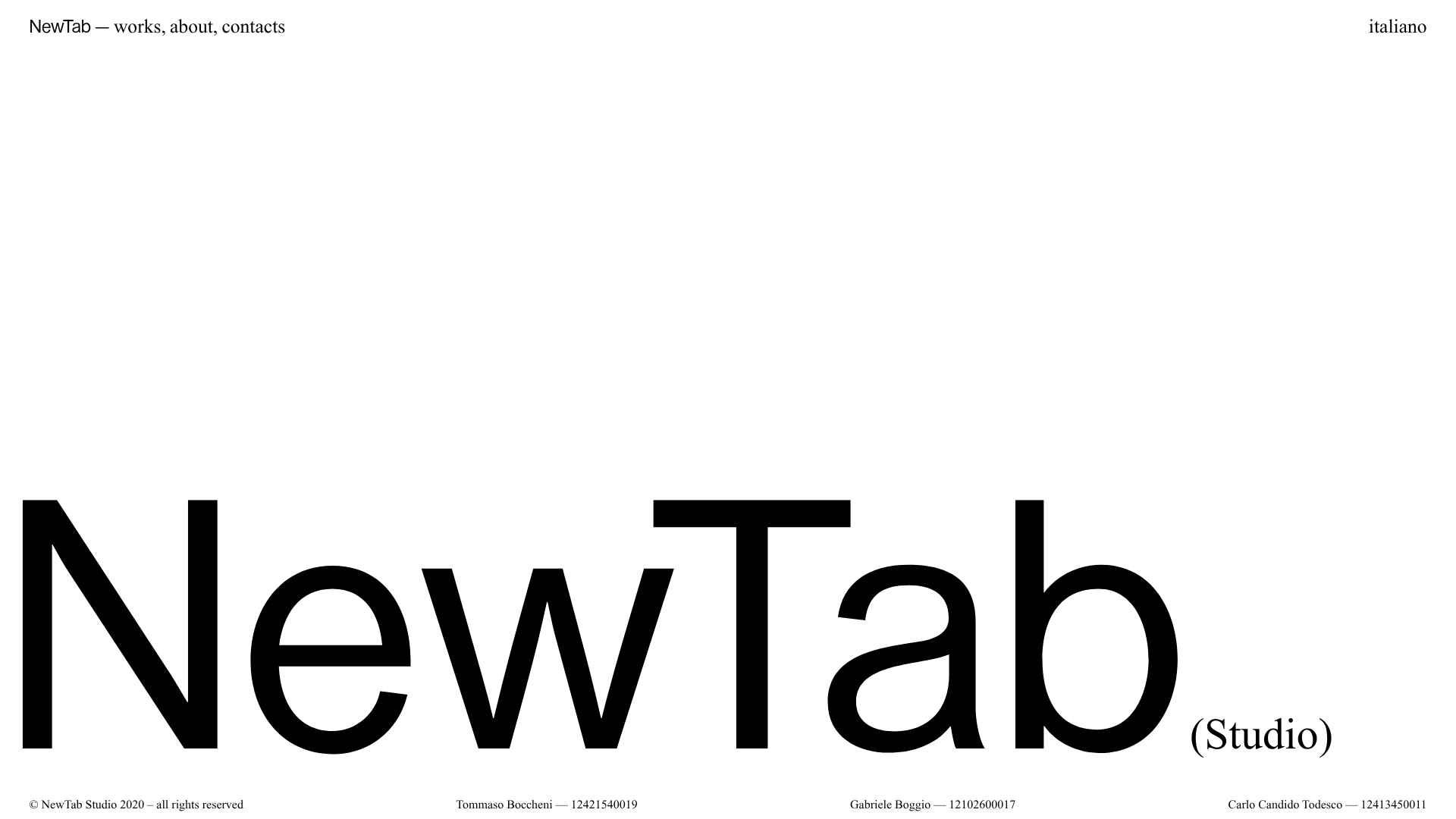
NewTab Studio Minimalist Portfolio Landing Page
A clean, typography-focused landing page featuring an oversized SVG/canvas hero title, a top-aligned navigation bar, and a minimalist footer layout.
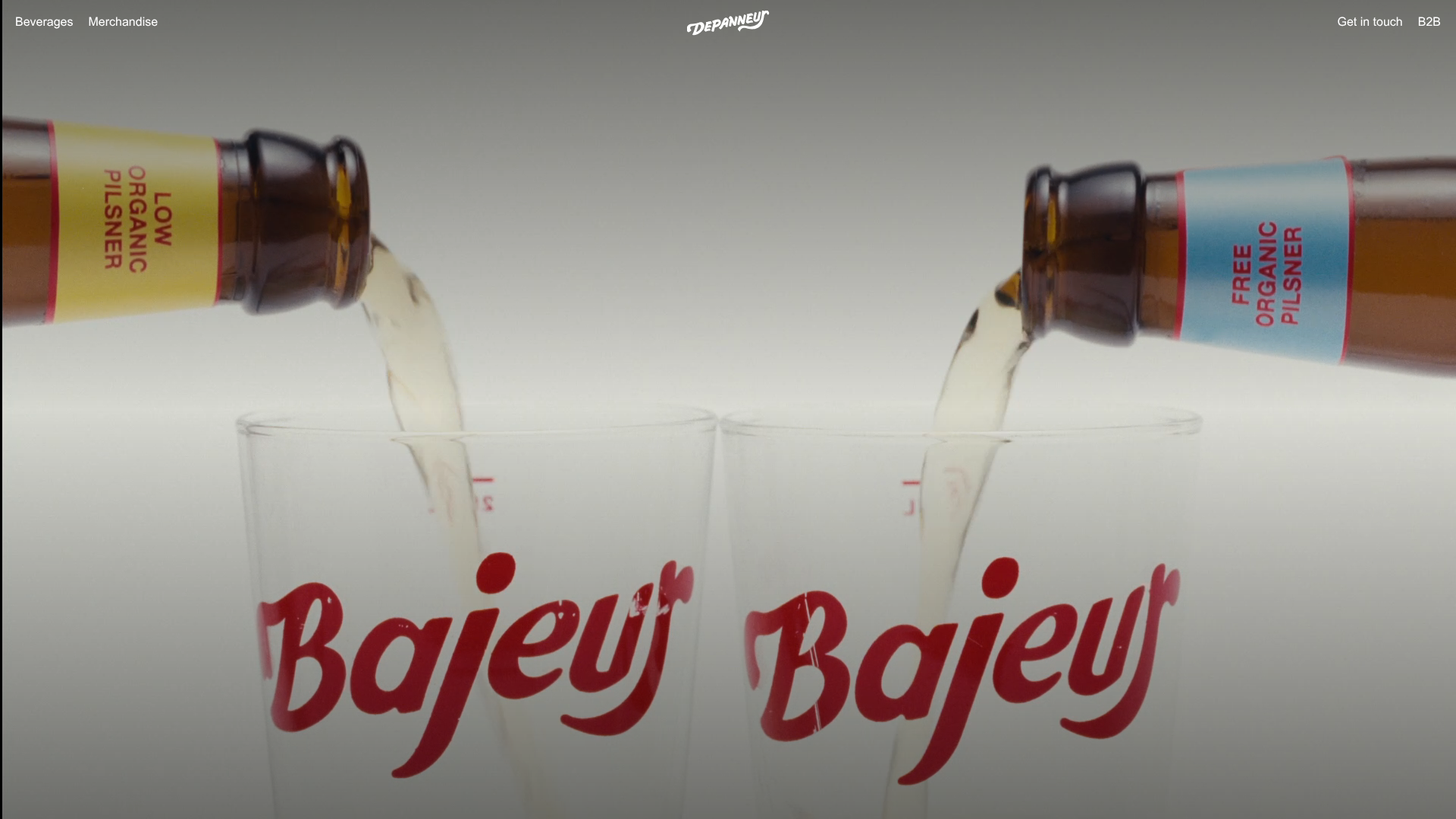
Depanneur Beverage E-commerce Hero
A minimalist Shopify storefront featuring a full-screen background video hero, sticky translucent navigation, and integrated mobile menu components.
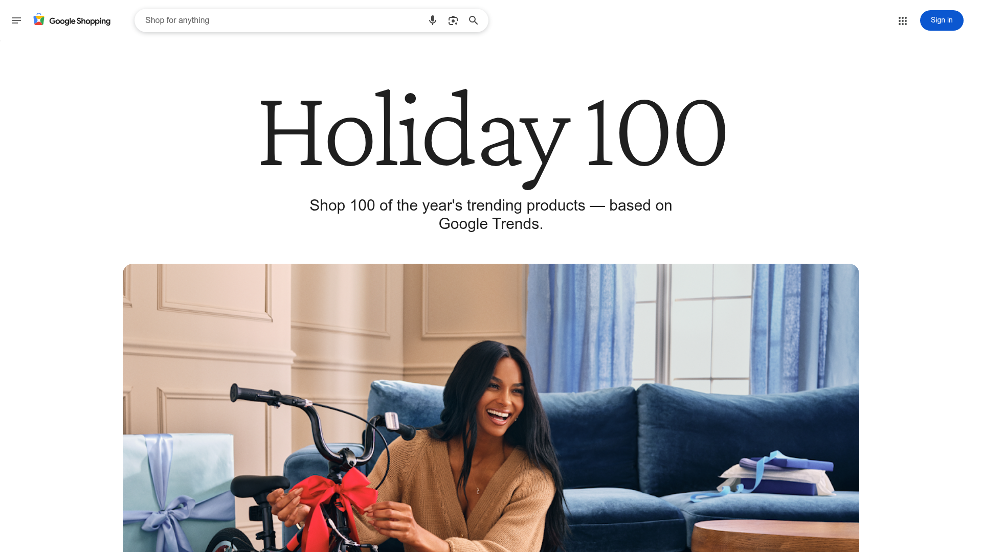
Google Holiday 100 Curator Landing Page
A minimalist e-commerce showcase featuring a wide hero section, clean search integration, and a bold typography-driven header designed for trending product collections.
