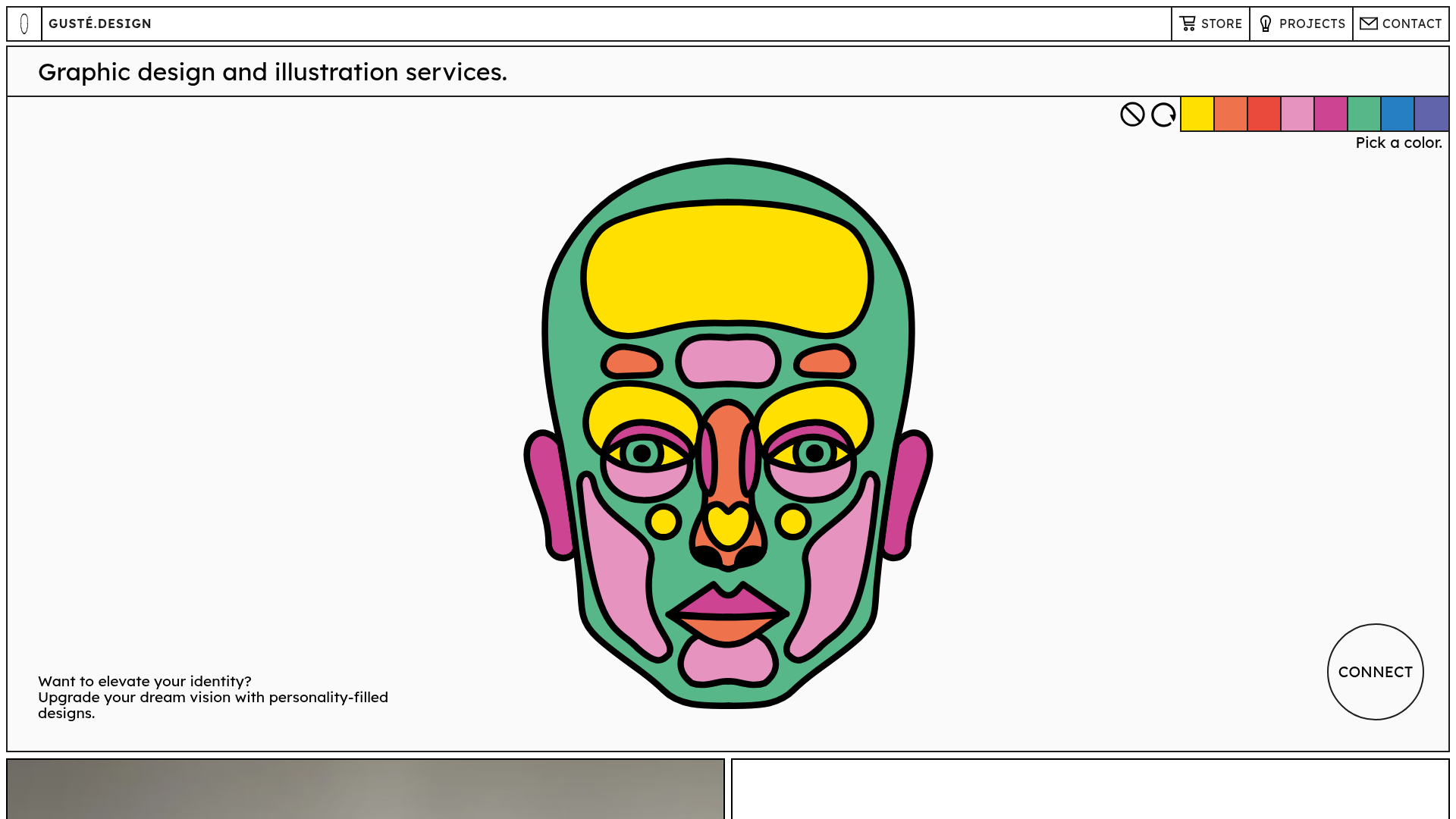
Guste Design Interactive Portfolio
A minimalist portfolio layout featuring a grid-based design, SVG-based interactive color picker in the hero section, and clean thin-border UI components.
Overview
This minimalist portfolio for Guste Design showcases a clean, grid-centric aesthetic that balances high-impact illustration with functional white space. It is an excellent clone reference for its clever use of interactivity (an SVG color picker) and its consistent adherence to a high-contrast, thin-border design language that feels both modern and artistic.
Design System
- Color Palette & Visual Hierarchy: The site uses a high-contrast monochromatic base (pure black on off-white/light gray) with a vibrant, 8-color primary palette (yellow, orange, red, pink, magenta, green, blue, purple). The hierarchy is established through heavy black strokes (2px) that frame every element, creating a "comic-book" or blueprint feel.
- Typography: The system relies on a clean, geometric sans-serif (resembling Jost or similar) used in varying scales. Large headers utilize
Type-module--titleMedium, while body text remains small but highly legible with generous line-height (1.6) and letter spacing. - Page Structure & Flow: The layout follows a modular grid. It begins with a hero section containing the interactive SVG face and color palette, followed by alternating blocks of square-ratio images and text-heavy "About" or "Store" cards bounded by 2px black borders.
- Reusable Components:
- Interactive Hero: An SVG-based illustration synchronized with a horizontal color palette.
- Grid Cards: Split-screen containers where one half is a
gatsby-image-wrapperand the other is a text block with standardized padding (4em). - Thin-Border UI: A navigation bar and footer defined by simple black line dividers rather than background shifts.
- Connect Button: A floating circular CTA that breaks the rigid rectangular grid.
- Interaction Patterns: The primary interaction is the "Pick a color" feature, which likely uses CSS variables or state management to update SVG fills. Buttons feature a direct state change, and images utilize a zoom overlay (
data-rmiz-btn-open). - Implementation Clues: Built using Gatsby and Sanity CMS, the HTML reveals a CSS Modules approach (e.g.,
Hero-module--Hero--51395) for scoped styling and highly structured accessibility features likeA11yNavigation(skip-to-content links).
Use Cases
- Who should clone this: Illustrators, graphic designers, or boutique creative agencies who want their work to be the primary focus while maintaining a distinct, "designed" site identity.
- Target Products: Personal portfolios, curated lookbooks, or small-scale e-commerce stores (as seen with the "Art Collection" store link).
- Remix Directions:
- Visual Identity: Swap the 2px black borders for softer shadows or different stroke weights to change the mood from "graphic" to "minimalist."
- Interactive Elements: Replace the SVG face with a logo or product wireframe that users can colorize to visualize customizations.
- Architecture: Retain the grid-based split-card layout but use it as a service list or a case study breakdown.
- Clone Scope: The Hero color-picker is a great single-section clone for engagement, while the full-page layout is ideal for those needing a structural framework that handles both text and high-resolution imagery equally well.
Related Inspirations
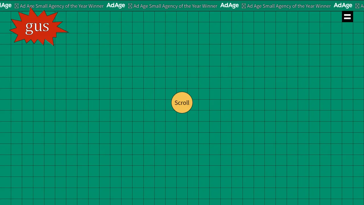
Gus Portfolio Three.js Canvas Landing
An interactive WebGL landing page featuring a Three.js grid background, a marquee announcement bar, and a centered scroll-driven animation scale effect.
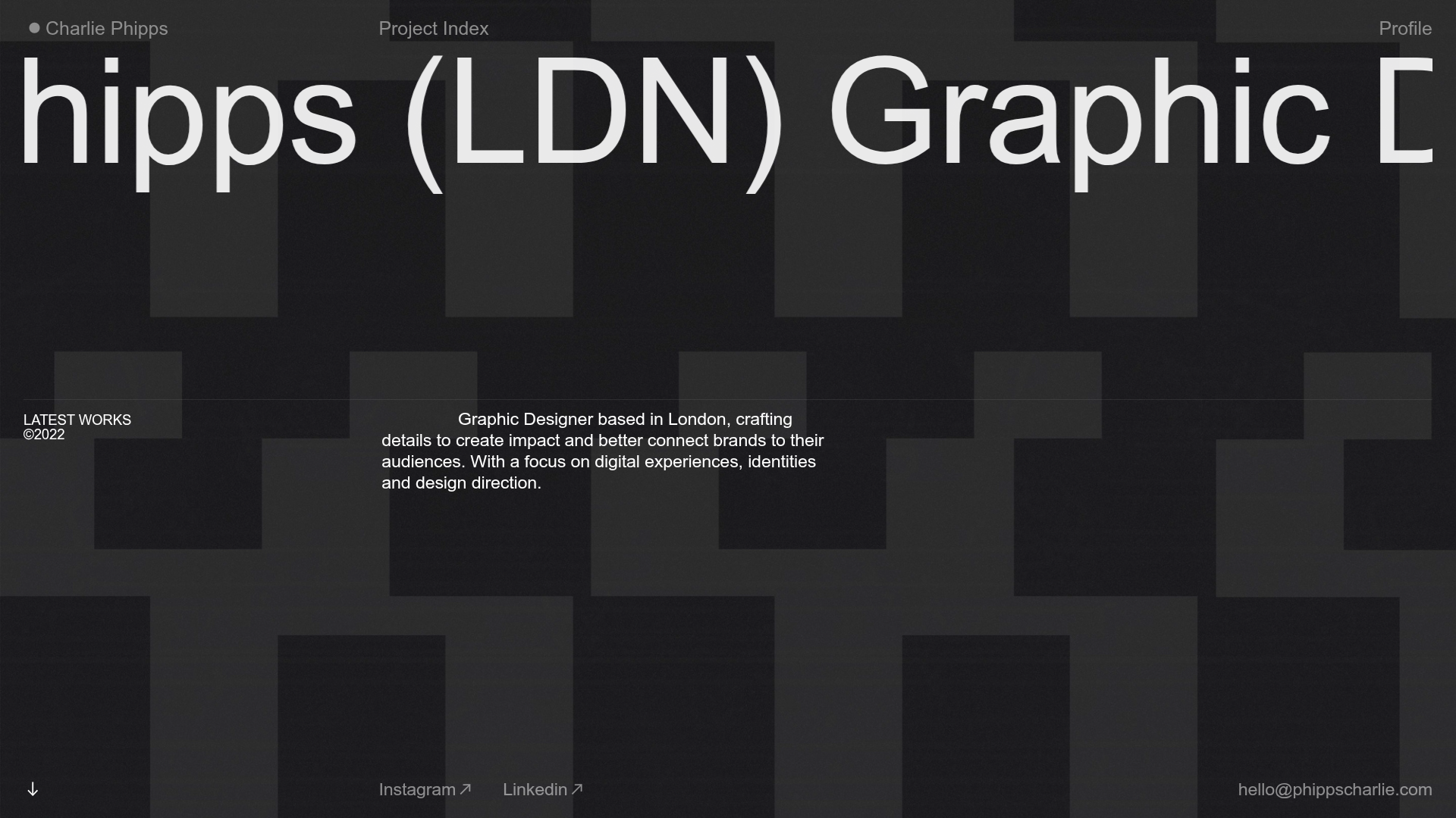
Charlie Phipps Portfolio Hero Layout
A dark-themed portfolio featuring a large horizontal scrolling marquee header, full-bleed video backgrounds, and a clean typography-focused grid for case studies.
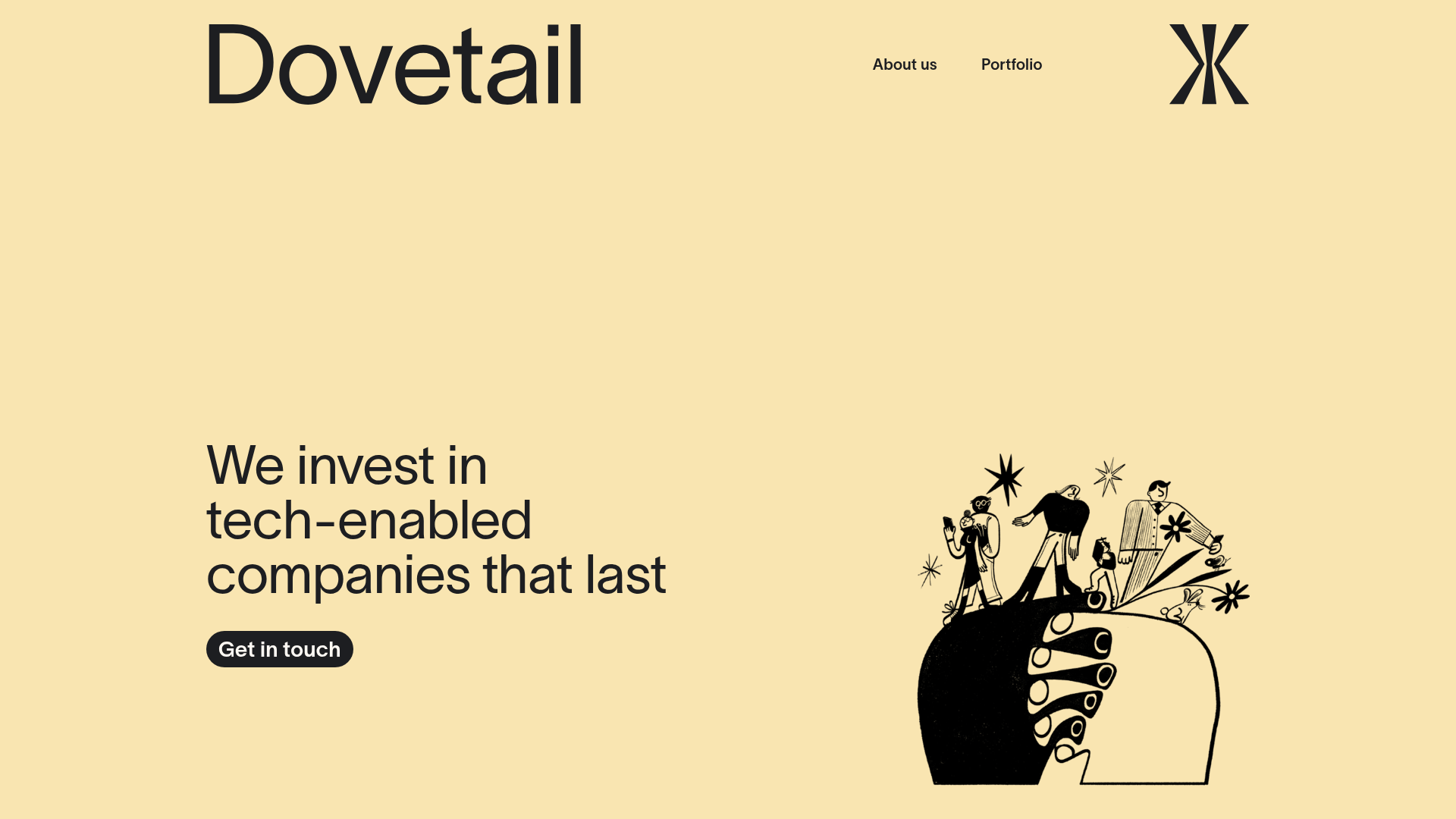
Dovetail Venture Portfolio Landing Page
A minimalist investment site featuring a warm pastel palette, distinctive hand-drawn illustrations, horizontal carousel for project cases, and a clean typography-focused grid layout.
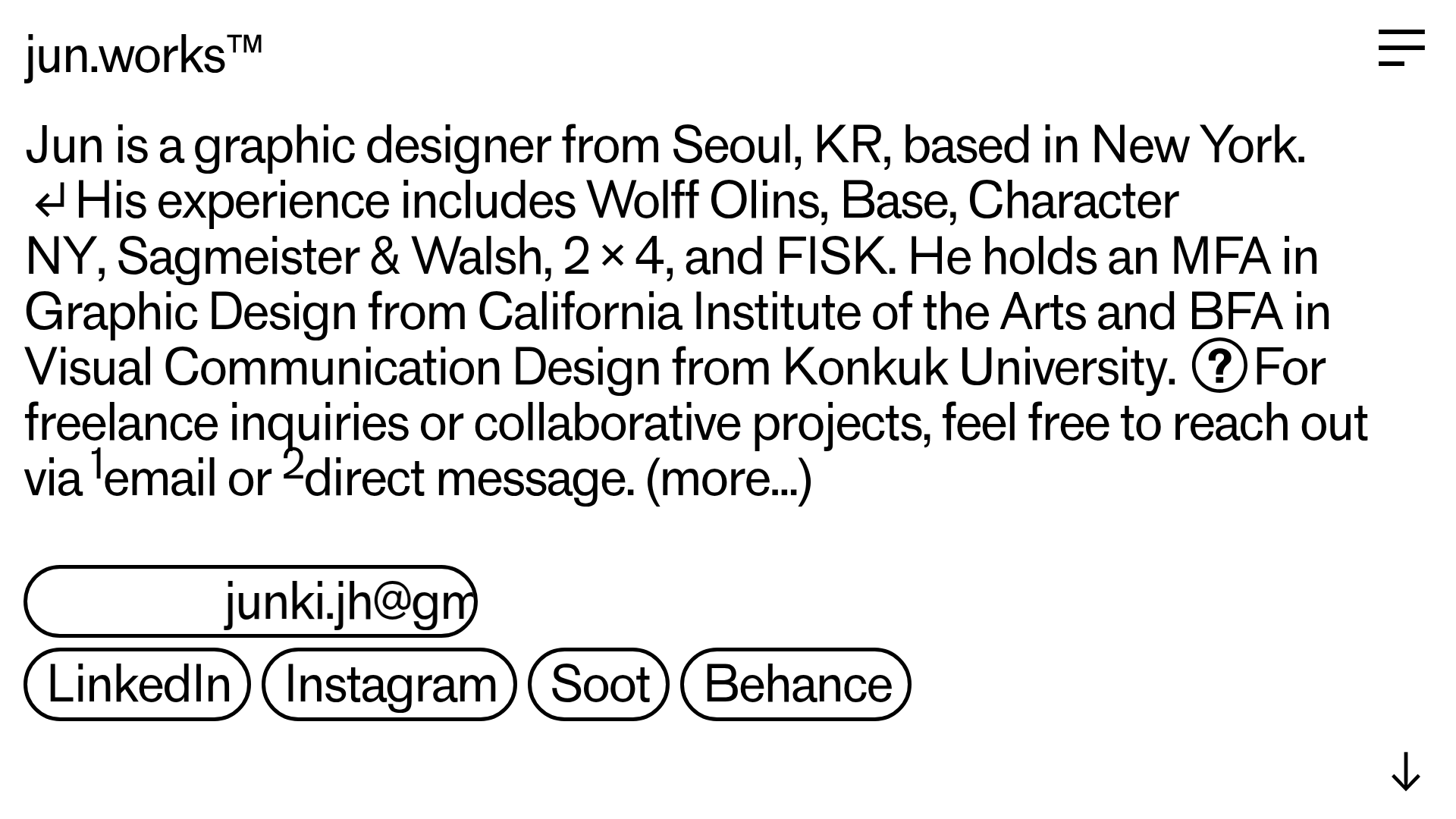
Jun Works Portfolio Landing Page
Minimalist graphic design portfolio featuring a text-heavy layout with image-on-hover tooltips, a pill-shaped marquee contact card, and a categorized hashtag tag cloud for project navigation.
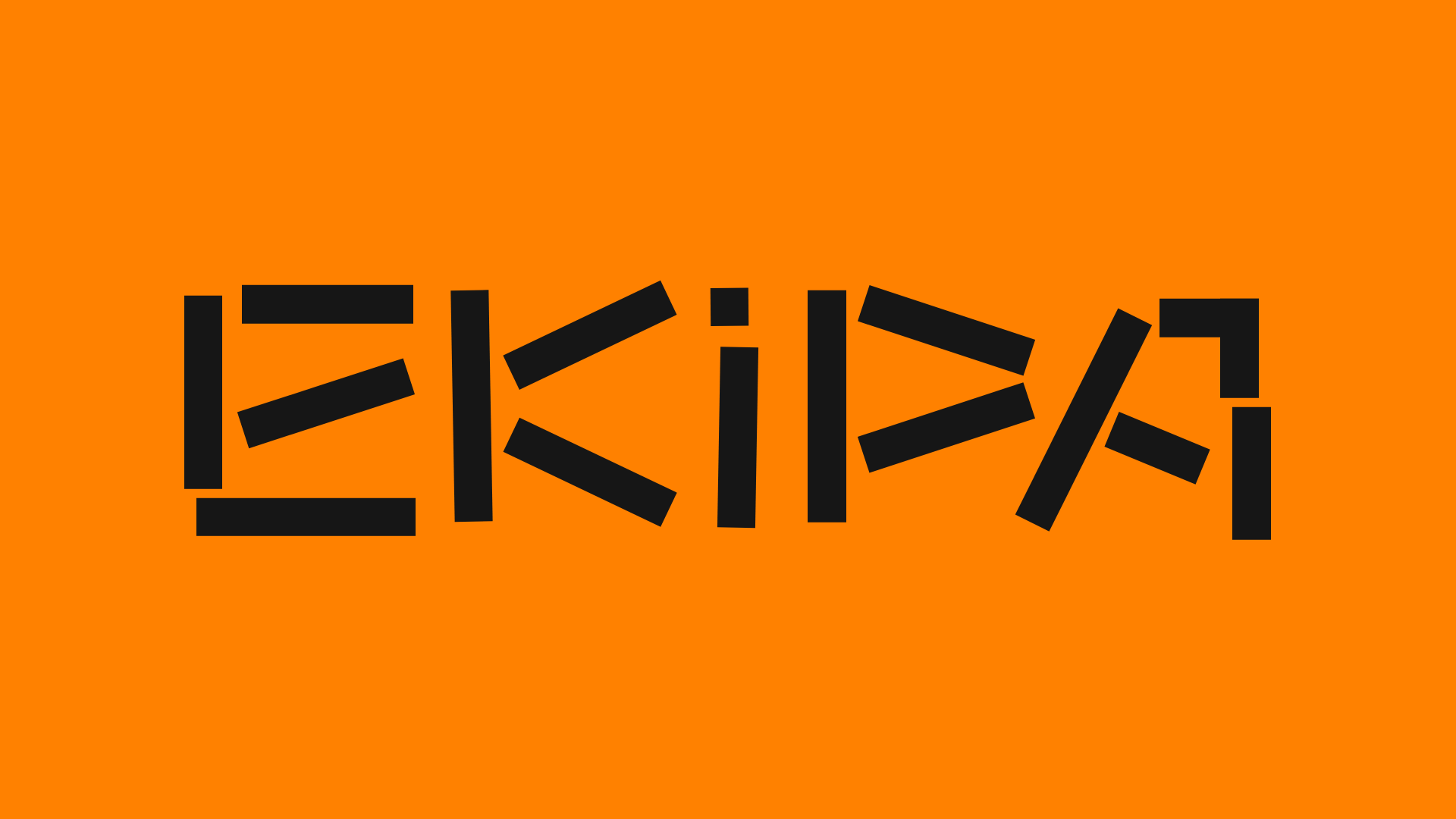
Ekipa Agency Artist Roster Site
A minimalist agency portfolio featuring a dynamic block-based logo, colorful background transitions, and a hover-activated image preview grid for an artist roster.

Something Special Studios Agency Portfolio
Minimalist creative agency site featuring a grid-based landing animation, custom video backgrounds, and a hidden expandable navigation menu.
