Something Special Studios Agency Portfolio
Minimalist creative agency site featuring a grid-based landing animation, custom video backgrounds, and a hidden expandable navigation menu.

Overview
Something Special Studios is a high-end creative agency portfolio that utilizes a sophisticated 12-column grid and heavy-duty motion design to establish a premium brand presence. It is an excellent reference for builders looking to master complex reveal animations, state-driven transitions, and minimalist layouts that center around immersive full-screen media.
Design System
- Color Palette & Visual Hierarchy: The primary background uses a "Cream" tone (
bg-cream) with high-contrast black typography. Hierarchy is handled through heavy font weights for core brand statements and extremely light, small scale text (text-s) for supporting data points like team locations (NY/LA). - Typography: The system leans into a high-contrast grotesque sans-serif. It uses an ultra-bold display scale for titles (
text-xxl) paired with a functional, condensed body type for project metadata and navigation. - Page Structure & Section Flow: The experience begins with a fixed landing overlay (
#landingText) featuring a rhythmic grid-based text animation. This transitions into a main portfolio view that includes a custom work filter (#filtersDesktop) and a vertical scroll area (#mainPage) for project showcases. - Reusable Components:
- Dynamic Logo: An "expanding" brand name in the header that transitions from initials (SSS*) to the full studio name on hover using a clip-path or width/opacity transition.
- Grid-Based Preloader: A structured text animation involving repeaters (
#row-1through#row-7) that provides a premium entrance to the site. - Video Backgrounds: Full-screen Vimeo-integrated loopers (
#landingVideoActual) with object-cover styling and precise z-index layering.
- Interaction & Motion Patterns: Extensive use of
cubic-bezier(0.8, 0, 0.2, 1)for easing, creating a signature "expensive" feel. Motion includes staggered text delays, opacity fades on scroll, and a menu toggle that slides with a 1000ms easing curve. - Mobile Behavior: The site relies on a dedicated
#mobileMenuand specifictext-xxlMobilesizing to ensure the oversized typography remains legible and impactful on smaller viewports. - Implementation Clues: Built with Vue.js (noted by
data-v-attributes) and Tailwind CSS utility classes (e.g.,grid-cols-12,z-50,ease-custom).
Use Cases
- Who should clone this: Creative directors, independent designers, and boutique production houses needing a loud but minimal portfolio entrance.
- Effective Remixes: Perfect for high-fashion lookbooks, architecture firm portfolios, or editorial-style landing pages where visual impact through video and motion overrides heavy text content.
- Remix Directions: Swap the cream/black palette for high-saturation neon/dark mode for a digital product agency. Reuse the expanding logo component (
expandingSSS) and the 12-column staggered preloader for any project involving a load-time brand reveal. - Clone Scope: The intro animation (
#landingText) and the header expansion logic are the most valuable components for quick cloning, while the full portfolio logic is better suited for a ground-up themed site.
Related Inspirations
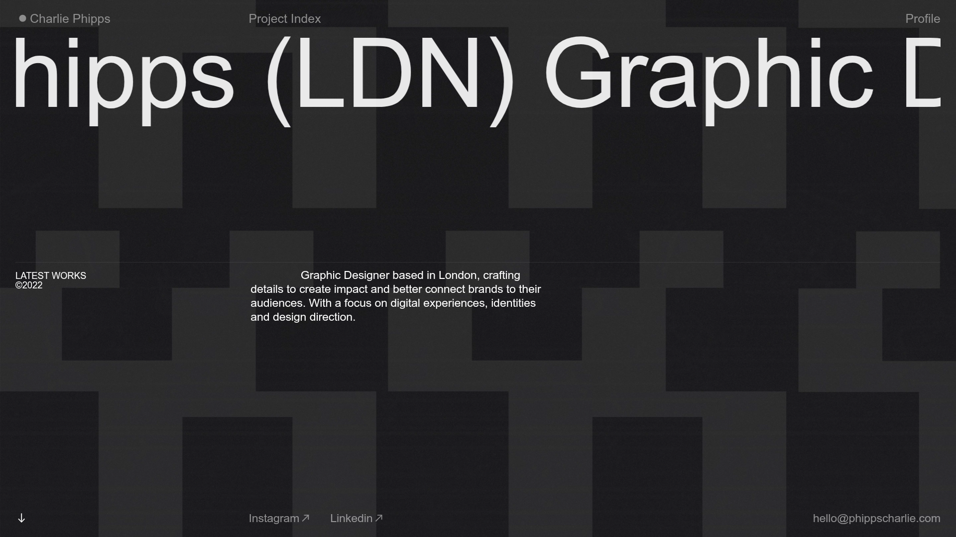
Charlie Phipps Portfolio Hero Layout
A dark-themed portfolio featuring a large horizontal scrolling marquee header, full-bleed video backgrounds, and a clean typography-focused grid for case studies.
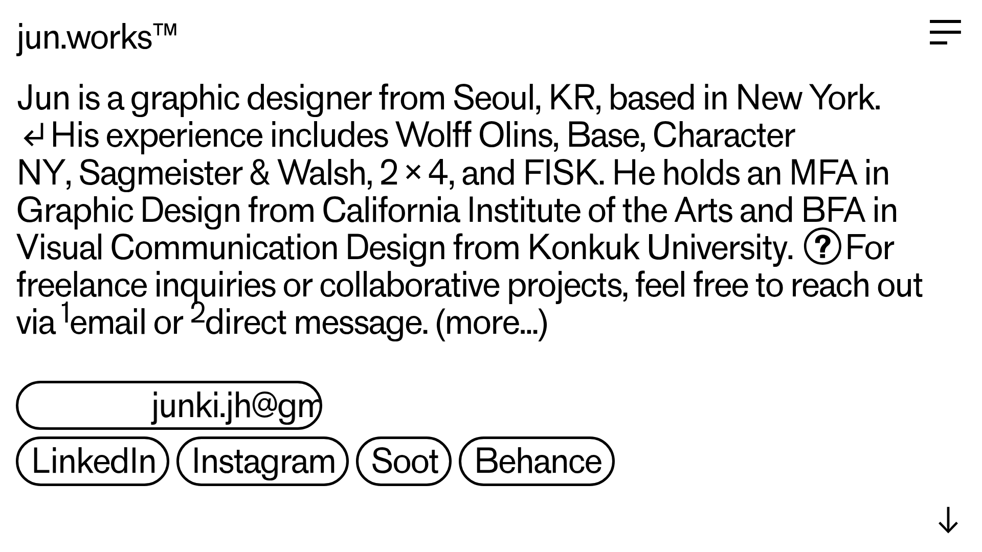
Jun Works Portfolio Landing Page
Minimalist graphic design portfolio featuring a text-heavy layout with image-on-hover tooltips, a pill-shaped marquee contact card, and a categorized hashtag tag cloud for project navigation.
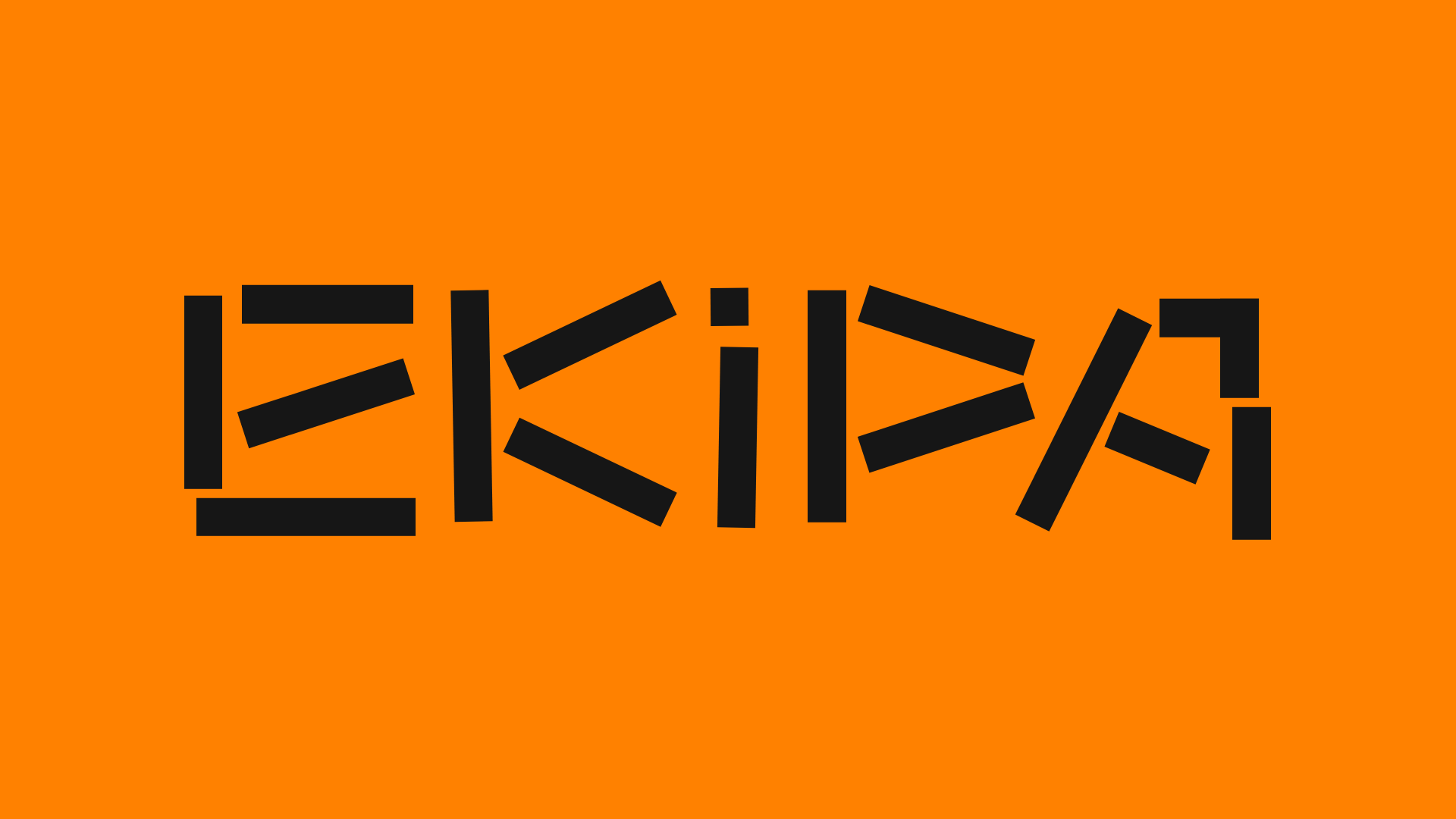
Ekipa Agency Artist Roster Site
A minimalist agency portfolio featuring a dynamic block-based logo, colorful background transitions, and a hover-activated image preview grid for an artist roster.
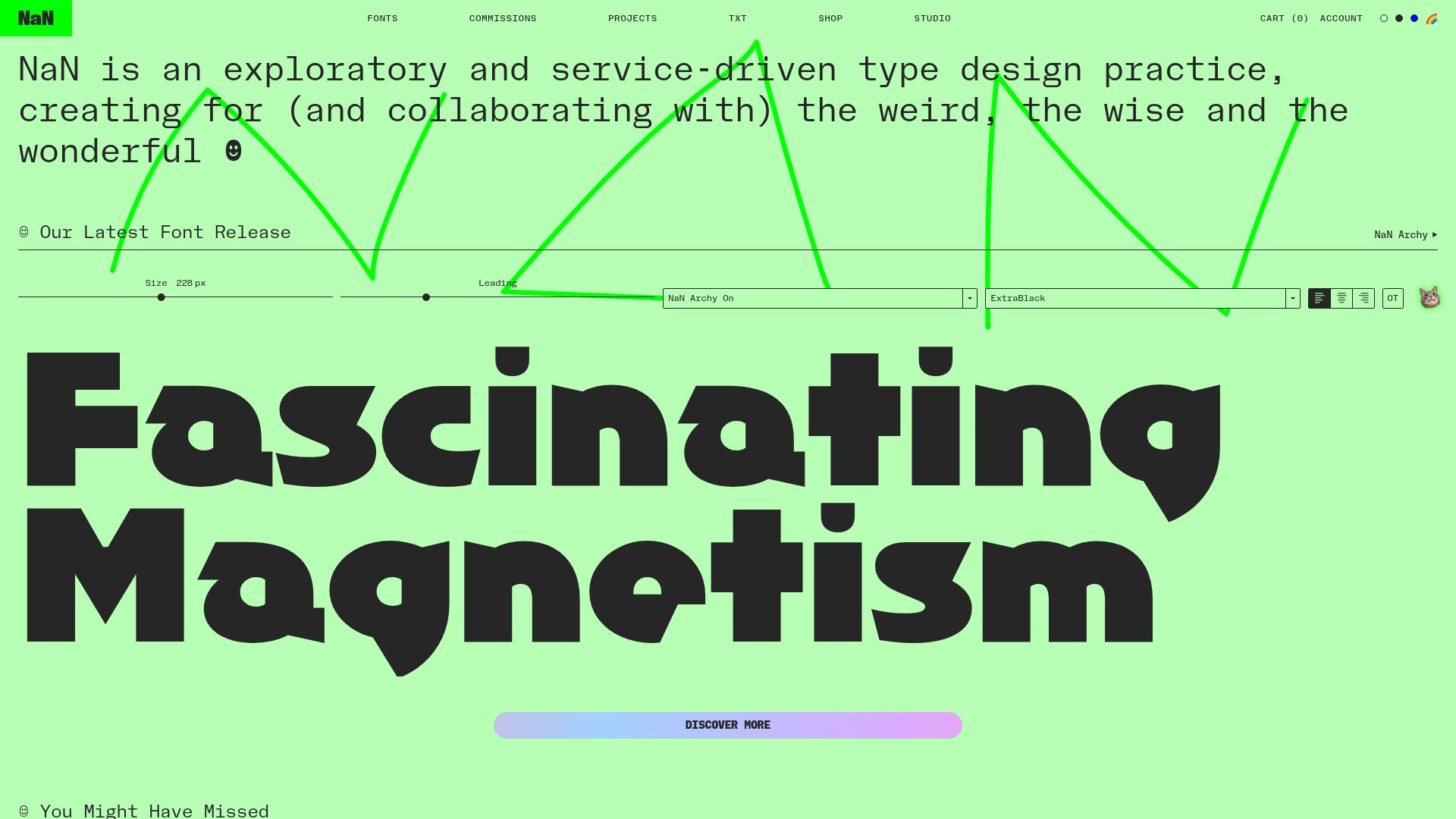
NaN Type Foundry Typography Showcase
A font-centric layout featuring a signature interactive type tester, a minimalist grid-based font gallery with hover effects, and a bold, high-contrast aesthetic.
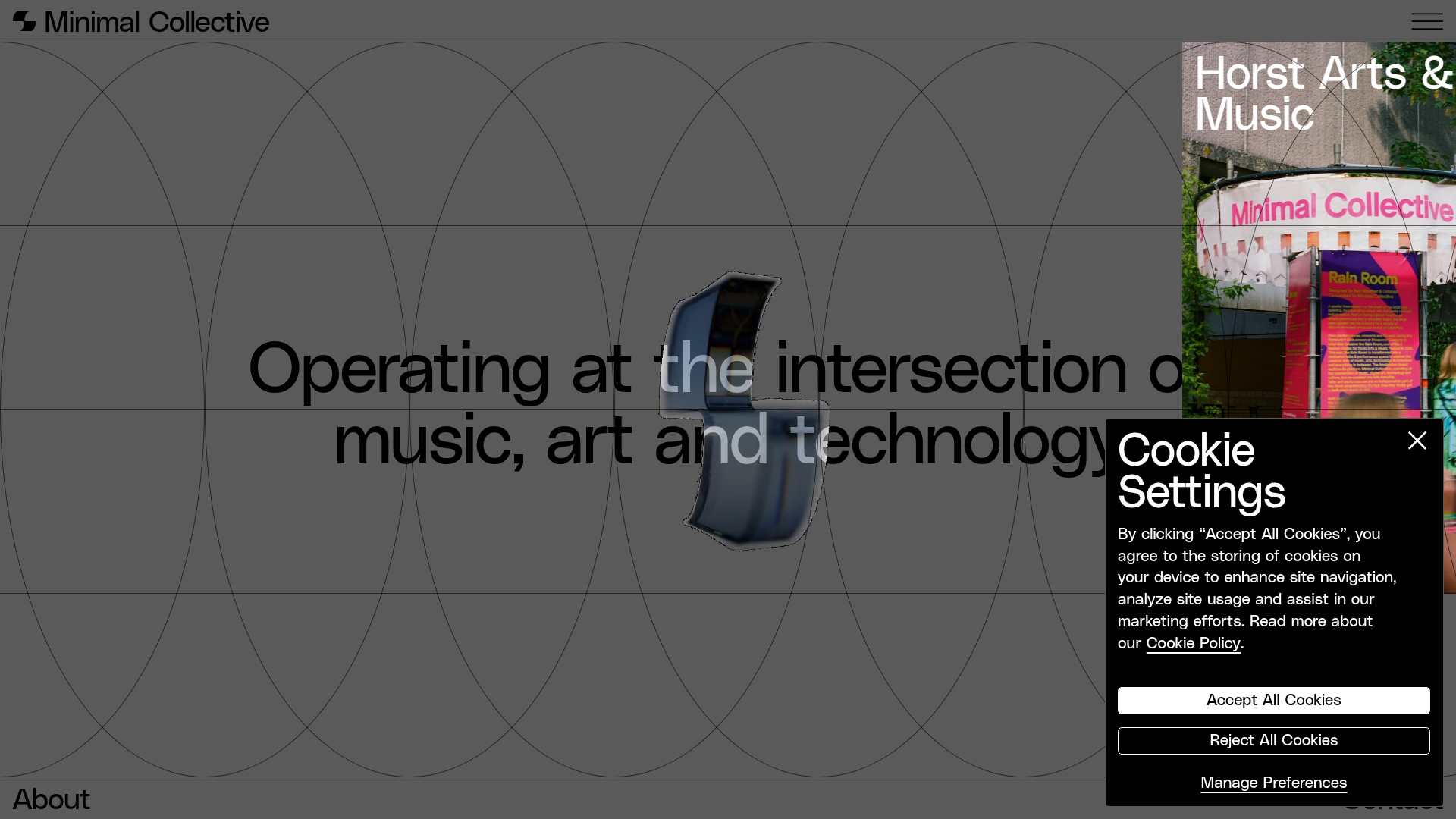
Minimal Collective Media Grid Portfolio
A high-end creative portfolio featuring a dynamic grid layout, parallax scroll animations, image hover overlays, and a minimalist full-screen page transition system.
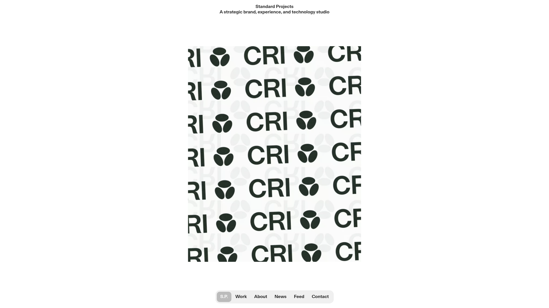
Standard Projects Portfolio with Sticky Hero
A minimalist studio layout featuring a full-height animated carousel, sticky header typography, and a dynamic masonry element grid for case studies.
