Jun Works Portfolio Landing Page
Minimalist graphic design portfolio featuring a text-heavy layout with image-on-hover tooltips, a pill-shaped marquee contact card, and a categorized hashtag tag cloud for project navigation.
Overview
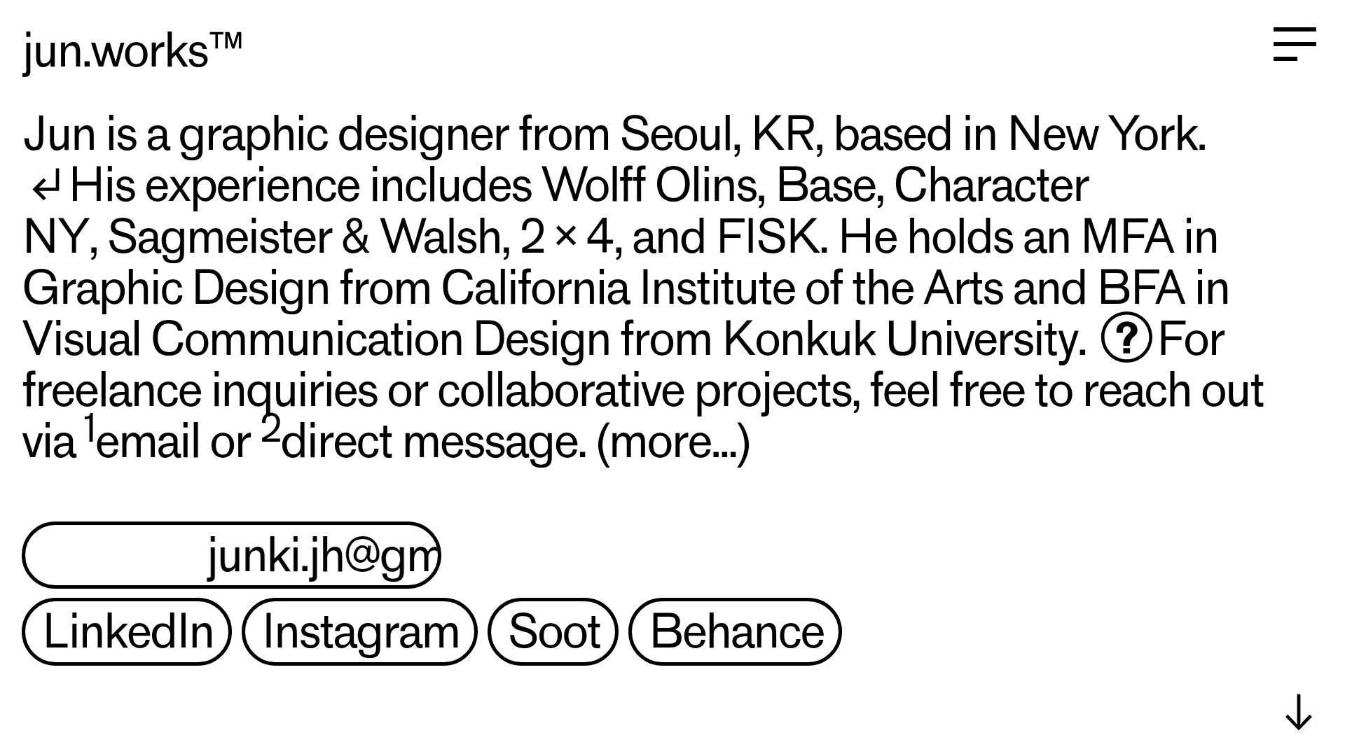
Jun Works is a minimalist, text-first portfolio landing page that prioritizes information density and typographic play over traditional image grids. It is an excellent clone reference for designers who want to showcase professional experience and creative services through a sophisticated, editorial-inspired single-page layout. The design's strength lies in its "image-on-hover" mechanism, which keeps the interface clean while allowing for visual deep dives.
Design System
- Color Palette & Visual Hierarchy: The site uses a high-contrast, monochromatic (black-on-white) scheme. Hierarchy is established through scale and layout rather than color, with large-scale body text serving as the primary visual element.
- Typography: The typography is a clean, neo-grotesque sans-serif. The design uses a varied scale, featuring oversized body copy for the biography, small caps and superscripts (e.g., ¹email) for footnotes, and bold tags for navigation.
- Page Structure: The flow is vertical and segmented:
- High-impact narrative bio at the top.
- A marquee-style contact card with a pill-shaped border.
- A two-column grid listing services and high-profile clients.
- A dense tag cloud of hashtags for project filtering.
- Reusable Components:
- Image-on-Hover Tooltips: The
hover-imageandhover-titleclasses allow hidden SVGs (like agency or client logos) to appear only when the text is engaged. - Pill Marquee: A customized
<div class="marquee">with a thick 0.35rem border and 10rem border-radius, creating a distinct call-to-action. - Hashtag Cloud: A horizontal list of
#prefixed links that act as the primary navigation for the portfolio.
- Image-on-Hover Tooltips: The
- Interactions: The primary motion pattern is the lateral movement of the marquee and the absolute-positioned hover effects. The design also utilizes a custom hamburger menu in the top right for secondary site navigation.
- Implementation Clues: Built on the Cargo collective platform, the site uses a grid-based layout (
grid-row,grid-col) and custom CSS for the marquee animation and hover states.
Use Cases
- Creative Professionals: Ideal for graphic designers, writers, or art directors who want an "anti-portfolio" that emphasizes their resume and client list over a simple gallery.
- Studio Landing Pages: Small agencies can remix this by swapping the personal bio for a studio mission statement and using the hashtag cloud to categorize service offerings.
- Remix Directions:
- Information Architecture: Use only the top bio and marquee section as a high-end "Coming Soon" or "Link in Bio" page.
- Visual Style: Replace the monochromatic look with bold brand colors while maintaining the pill-shaped UI elements and large typography.
- Clone Scope: A quick section clone of the marquee and hover-trigger logic provides immediate value for any text-heavy site, while a full-page clone is best for a complete personal brand overhaul.
Related Inspirations
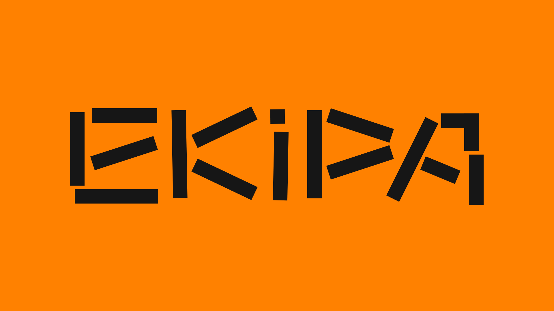
Ekipa Agency Artist Roster Site
A minimalist agency portfolio featuring a dynamic block-based logo, colorful background transitions, and a hover-activated image preview grid for an artist roster.
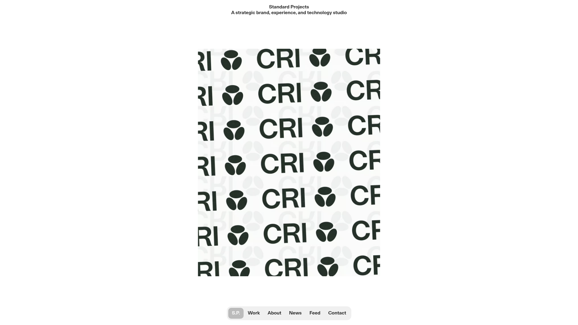
Standard Projects Portfolio with Sticky Hero
A minimalist studio layout featuring a full-height animated carousel, sticky header typography, and a dynamic masonry element grid for case studies.
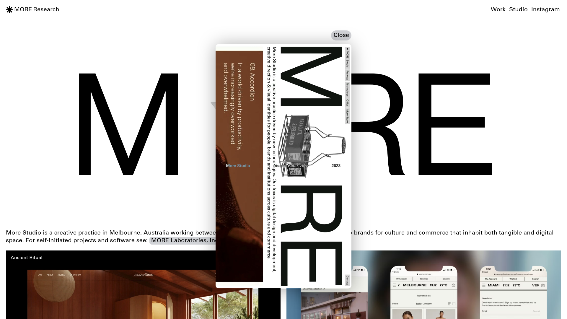
More Studio Creative Agency Portfolio
A high-end creative portfolio featuring oversized experimental typography, immersive video modals, accordion-based project lists, and unique cursor-following hover effects.
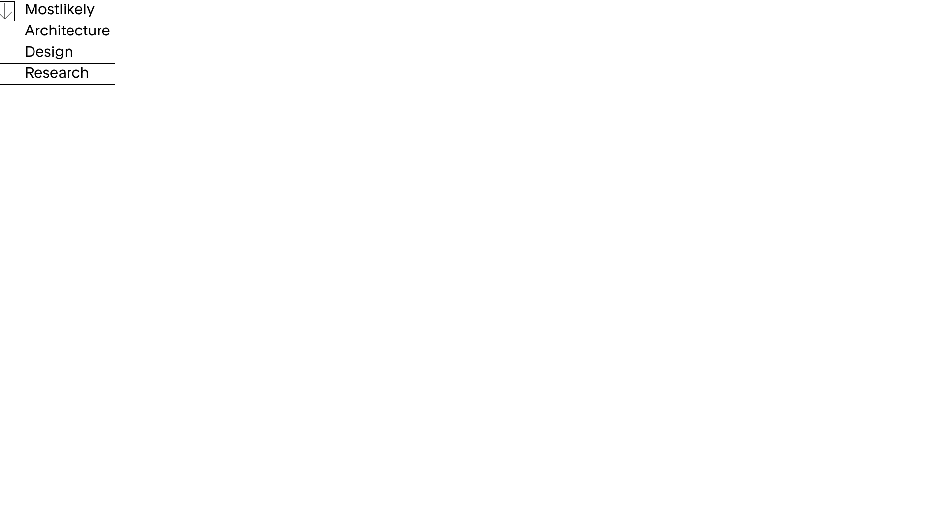
Mostlikely Architecture Portfolio Site
A minimalist portfolio layout featuring a multi-layered cube interaction, vertical image scrolling with lazy-loading, and a grid-based screensaver view for design and research projects.
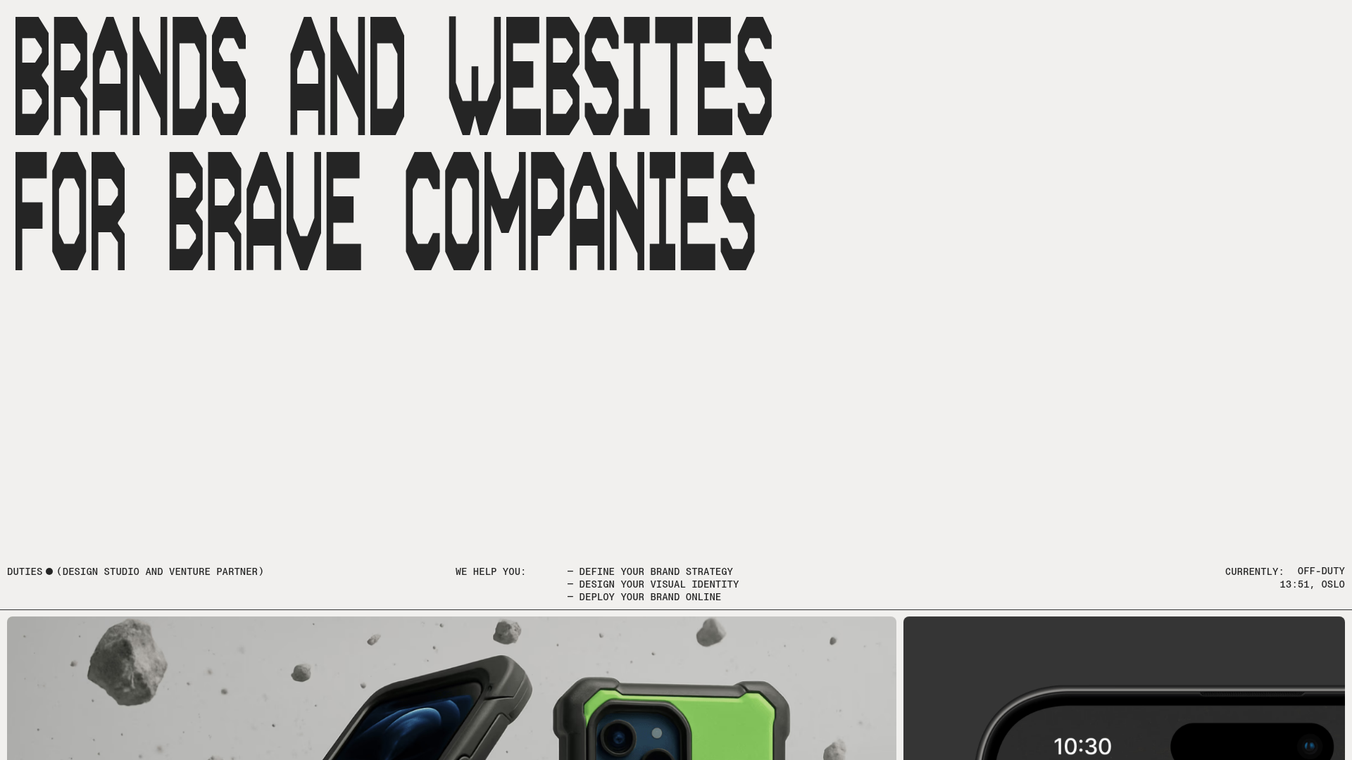
Duties Studio Agency Landing Page
A high-impact agency template featuring bold typography, a minimal technical footer, and a clean grid layout for visual case studies.
Studio Lathe Minimalist Portfolio List
A high-contrast, minimalist portfolio layout featuring a dense list-based project index with flexible category labeling and a full-screen yellow background.
