Transmissions Balenciaga Portfolio Showcase
A minimalist fashion exhibition site featuring a full-width image slider, masked text reveal animations, and a responsive grid of portrait and landscape project canvases.

Overview
This website is a sophisticated digital exhibition for the Cristóbal Balenciaga Museum, showcasing student portfolios through a high-impact, minimalist interface. It is an excellent reference for builders wanting to master immersive horizontal-style layouts, masked text animations, and a seamless transition between landing pages and project galleries.
Design System
- Color Palette & Visual Hierarchy: A strict monochromatic base (stark white and deep black) provides high contrast, ensuring the high-fashion photography remains the focal point. Use of the
bw(black/white) andbbclass naming in HTML suggests a theme-swapping utility system. - Typography: The system relies on a clean, modern sans-serif for information and a distinctive, high-contrast serif (italicized) for brand emphasis, such as "Cristóbal Balenciaga." The hierarchy uses large-scale titles masked within containers for reveal animations.
- Page Structure & Flow: The site utilizes a full-screen intro header (
home__logo) followed by a horizontally-scrollingfeatured__container. This container holds a series offeatured__projectblocks that vary betweenis-portraitandis-landscapeaspect ratios to create a dynamic visual rhythm. - Reusable Components:
- Masked Content Blocks: The
.maskand.intro__text__animationclasses provide a template for reveal effects on scroll or load. - Project Canvases: The
project__crpwrapper is a robust container for handling mixed-orientation media. - Ajax Loader: A persistent
ajax__ghostandpage__preloadsystem for smooth, single-page-application style transitions.
- Masked Content Blocks: The
- Interaction & Motion: The HTML indicates a heavy reliance on enter/exit animations. Notable features include a responsive logo that swaps between desktop and mobile versions via background-image URLs and a "device rotation" prompt for mobile users ensuring the intended experience.
- Responsive Behavior: The presence of
message__desktopandmessage__mobileclasses shows a design that enforces specific viewing conditions, while the grid itself adapts portrait/landscape orientations to the viewport width.
Use Cases
- Who should clone this pattern: Creative directors, luxury brand designers, and photographers looking for a digital portfolio that feels like a physical gallery space.
- Effective Remixes: This layout is ideal for architecture firms, premium furniture catalogs, or high-end editorial lookbooks where visual storytelling precedes technical data.
- Practical Remix Directions:
- Theme Swap: Replace the monochromatic palette with brand-specific colors while keeping the
.maskreveal logic. - Grid Adaptation: Repurpose the
featured__projectorientation logic to create a non-traditional product grid for e-commerce splash pages. - Navigation Mod: Reuse the
page__menulogic for a clean, overlay-style site navigation that doesn't distract from the imagery.
- Theme Swap: Replace the monochromatic palette with brand-specific colors while keeping the
- Suggested Clone Scope: Start with a full-page clone to capture the complex interplay between the loading states, text masks, and the horizontal scroll container before pruning for specific project needs.
Related Inspirations
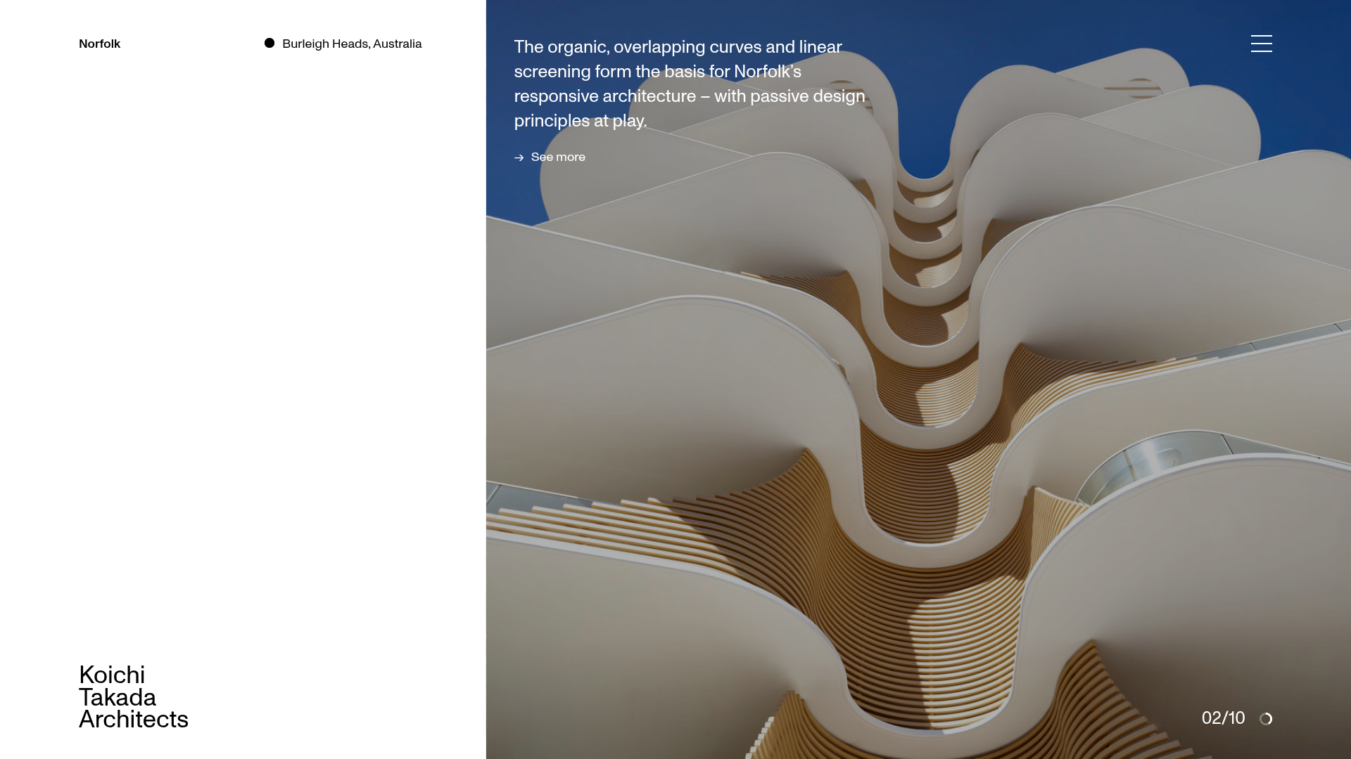
Koichi Takada Architects Portfolio Home
A high-end architectural portfolio featuring a split-screen layout with an interactive project slider, sticky typography, and smooth transition animations.
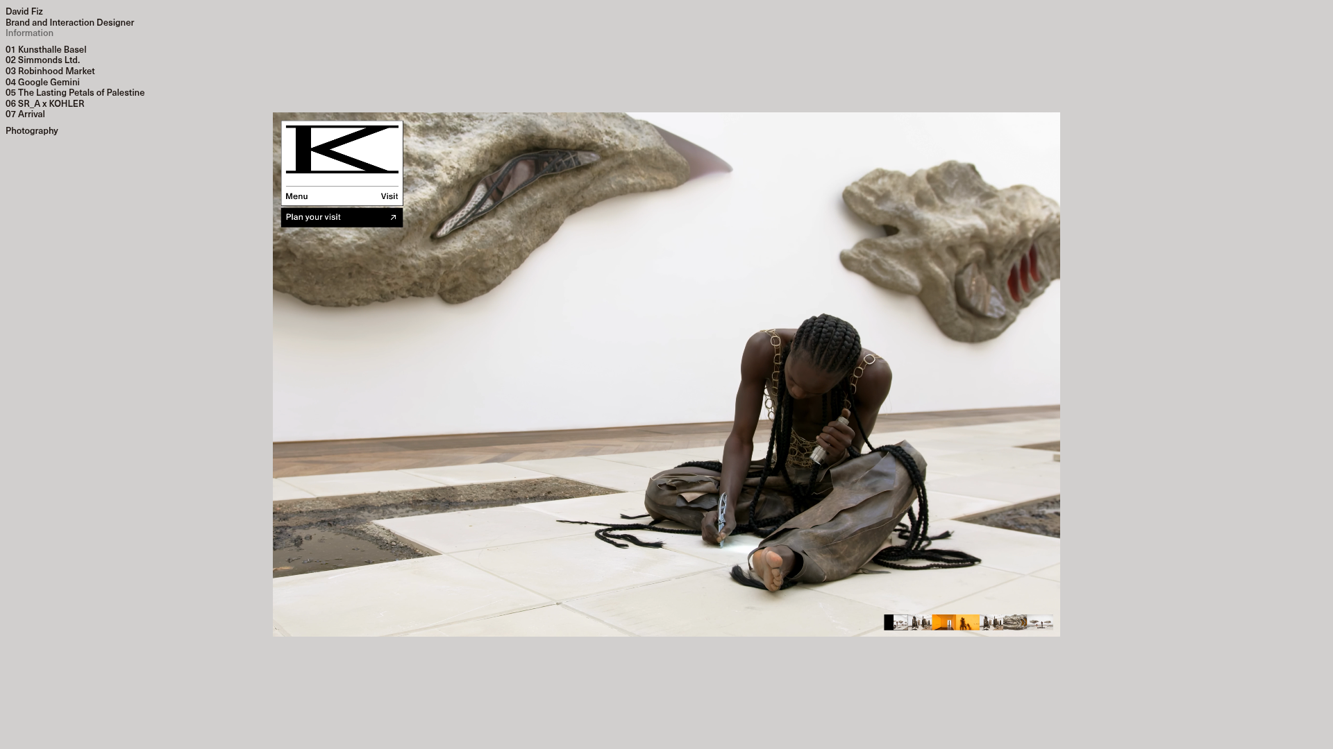
David Fiz Visual Design Portfolio
A minimalist portfolio featuring a fixed sidebar navigation paired with an immersive, full-screen media showcase and interactive project-specific image carousels.

Offten Interactive Typographic Hero
A Svelte-based immersive landing page featuring a full-screen WebGL background, brush-style text underlines, and scroll-triggered character animations.
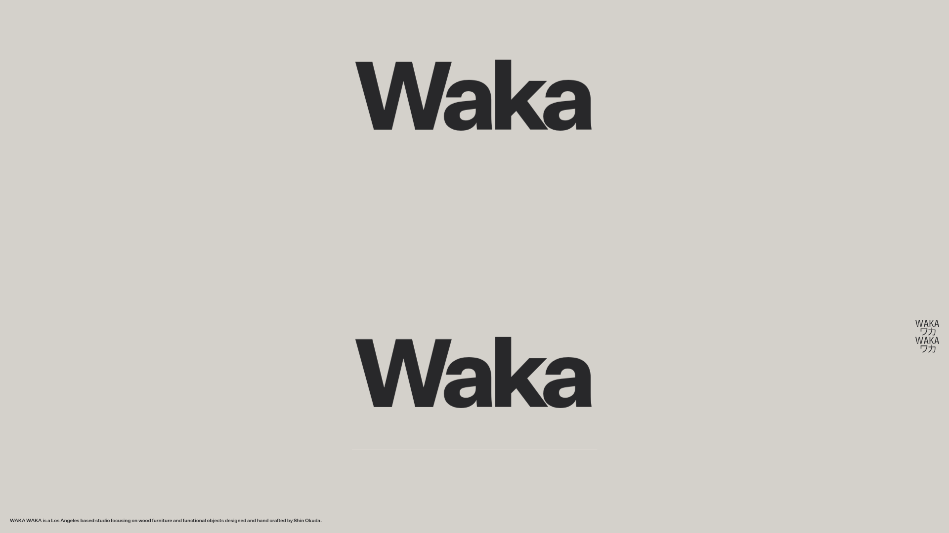
Waka Waka Furniture Portfolio
A minimalist design showcase featuring a custom cursor, parallax scroll effects, and a vertical image grid layout for high-end product displays.

Dima Kutsenko Photography Portfolio Hero
A refined dark-mode portfolio featuring a full-screen image loader, tiered typography animations, and creative text-distortion hover effects for high-end fashion branding.
Unknown Untitled Design Portfolio Screensaver
A minimalist, experimental design agency website featuring an automated image-layout screensaver and oversized typography overlays.
