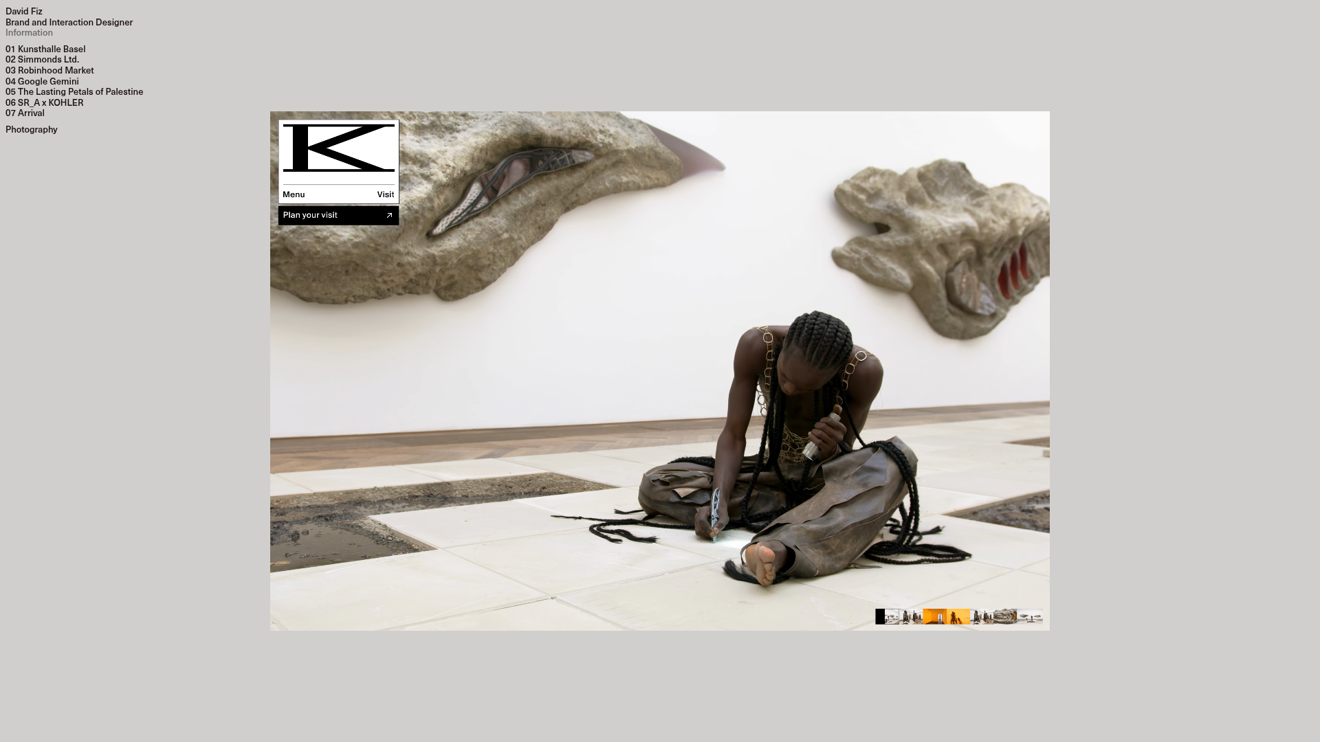
David Fiz Visual Design Portfolio
A minimalist portfolio featuring a fixed sidebar navigation paired with an immersive, full-screen media showcase and interactive project-specific image carousels.
Overview
David Fiz’s portfolio is a masterclass in brutalist minimalism and immersive media presentation. It features a high-contrast sidebar navigation paired with a large-scale project showcase, making it an excellent reference for designers or studios who want their work to take center stage without navigational clutter.
Design System
- Color Palette & Visual Hierarchy: The design utilizes a strict monochrome foundation of high-contrast blacks and off-whites (or light greys). This neutral backdrop ensures that the colorful media assets (videos and high-resolution photography) dominate the visual field. There is a clear hierarchy between the navigation (fixed left) and the content (expanding right).
- Typography: The system relies on a clean, sans-serif typeface (likely a grotesk style). It uses a small, uniform font scale with generous leading for project lists. Emphases are handled through numbering (e.g., "01", "02") and bold weight for the designer’s name, maintaining a utilitarian aesthetic.
- Page Structure: The layout is split into a fixed-width left sidebar (
.navigation) and a flexible, full-screen media container (#canvas-parent). The sidebar is organized into three distinct blocks: identity/info, a numbered project list with a hidden 'Archive' dropdown, and a secondary photography link. - Reusable Components:
- Fixed Sidebar: A vertical navigation block (
.div-block-160) that remains static as media changes. - Project Dropdown: A clean
w-dropdowncomponent for managing secondary or archived work without vertical bloating. - Media Showcase: An interactive slider (
.df-showcase) that supports both high-bitrate video loops and static images.
- Fixed Sidebar: A vertical navigation block (
- Interactions & Motion: The UI uses subtle hover states on text links. The primary interaction is the project slider, which utilizes full-width navigation zones (
.df-nav-left,.df-nav-right) for intuitive browsing. Videos are set toautoplay,muted, andloopfor a seamless "living gallery" feel. - Implementation Clues: Built with Webflow (indicated by
w-class prefixes), the site uses a custom<video>embed within a Flexbox or Grid-based layout. The media delivery uses a CDN (b-cdn.net) to ensure large assets load quickly within the canvas.
Use Cases
- Who should clone this: Independent designers, creative directors, and boutique agencies whose primary value proposition is high-quality visual output.
- Effective Remixes: This pattern is ideal for architecture portfolios, fashion lookbooks, or cinema-focused landing pages where text is secondary to motion and imagery.
- Remix Directions:
- Info Architecture: Adapt the numbered list to categories (e.g., "Web", "Branding", "Motion").
- Styling: Replace the brutalist grey background with mid-century modern earth tones for a warmer aesthetic.
- Sectioning: Clone only the fixed sidebar if you prefer a standard scrolling project feed on the right rather than a full-canvas slider.
- Clone Scope: A full-page clone is recommended to preserve the sophisticated relationship between the fixed navigation and the immersive content area.
Related Inspirations
Waka Waka Furniture Portfolio
A minimalist design showcase featuring a custom cursor, parallax scroll effects, and a vertical image grid layout for high-end product displays.
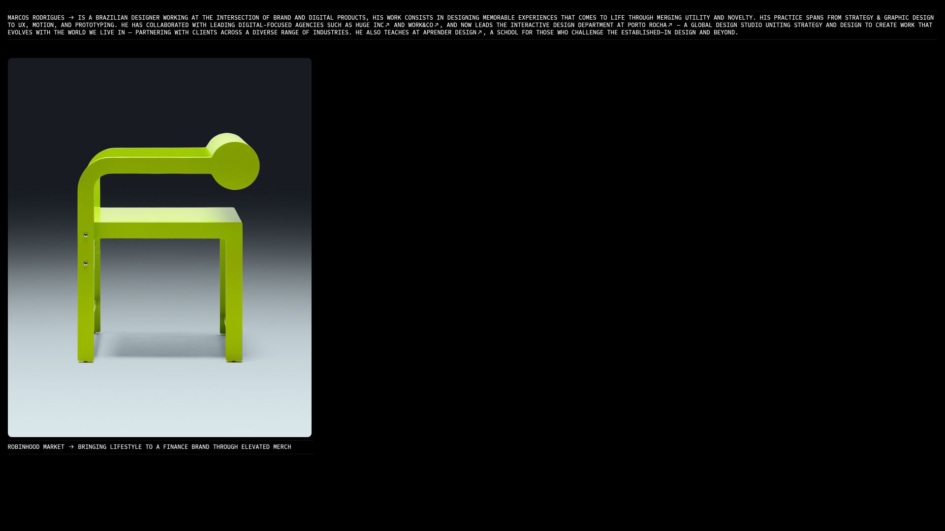
Marcos Rodriguez Minimalist Design Portfolio
A dark-themed personal site featuring a high-contrast monospaced header, a full-height centered image/video slideshow, and minimal thin-rule horizontal dividers.
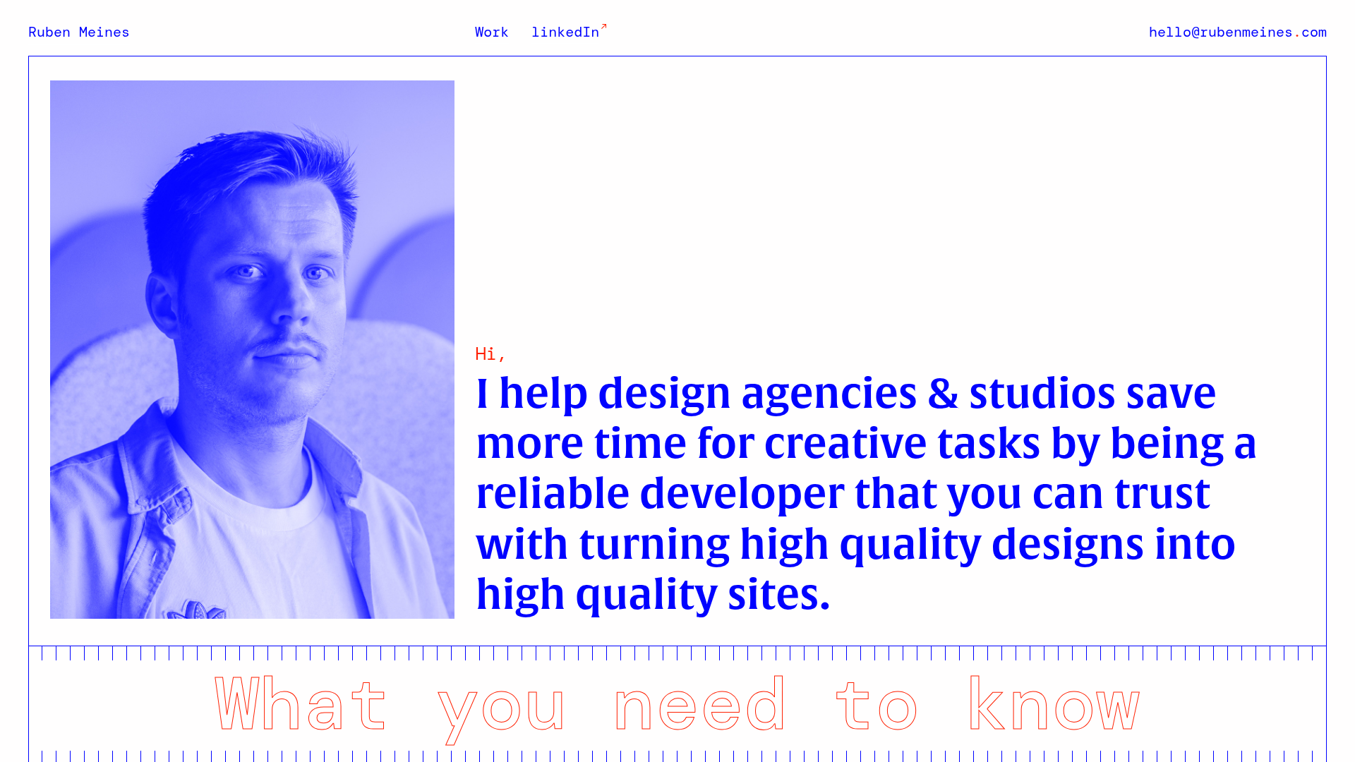
Ruben Meines Minimalist Developer Portfolio
A clean typography-focused layout featuring a duotone hero image, a decorative CSS grid border system, and a structured service list with outlined custom typography.
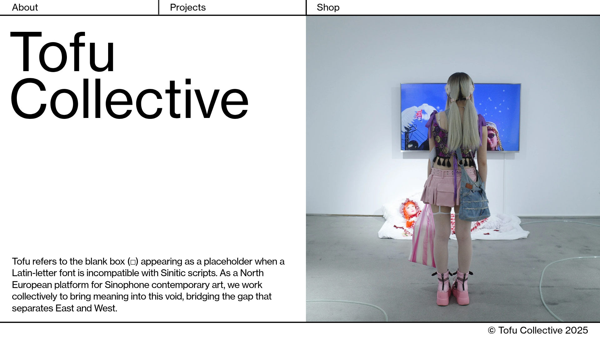
Tofu Collective Minimalist Art Gallery
A clean, split-screen landing page layout featuring a large-typography hero section, sticky grid navigation, and an integrated full-height image slideshow component.

Unknown Untitled Design Portfolio Screensaver
A minimalist, experimental design agency website featuring an automated image-layout screensaver and oversized typography overlays.
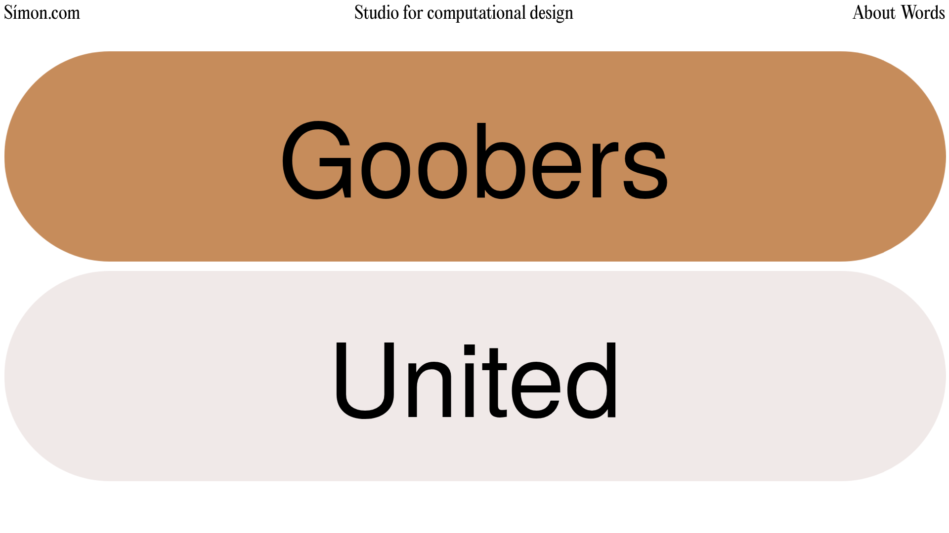
Simon Studio Computational Design Portfolio
A Svelte-based portfolio featuring a vertical project list with large rounded-pill interactive labels and smooth scroll-triggered project transitions.
