Koichi Takada Architects Portfolio Home
A high-end architectural portfolio featuring a split-screen layout with an interactive project slider, sticky typography, and smooth transition animations.
Overview
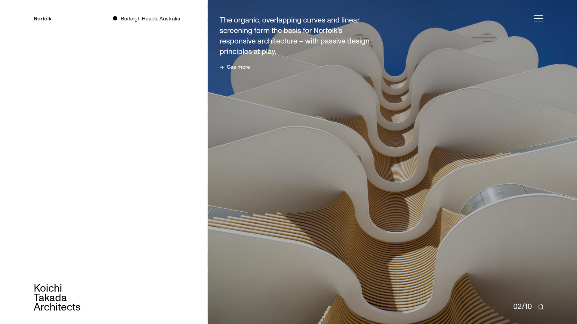
This high-end architectural portfolio features a sophisticated split-screen layout that balances minimalist typography with large-scale immersive imagery. It is a premier reference for builders looking to implement a premium, narrative-driven project showcase that uses white space and horizontal sliders to guide user attention.
Design System
- Color Palette & Visual Hierarchy: A stark, professional palette of high-contrast black and white (
sub-title-black,copy-black,pull-out-white). The hierarchy uses the left-hand white space for fixed branding and metadata, while the right-hand side serves as a dynamic canvas for high-resolution project photography. - Typography: The system relies on a clean, sans-serif font family. It uses a "sticky" heading pattern where titles remain fixed or move at different speeds than body text. Emphasis is achieved through light font weights for descriptions and bold weights for project names.
- Page Structure: The layout starts with a full-height
project-gallerysplit into a left-side data panel and a right-side image slider. This is followed bylarge-text-blocksections and anews-rowssection featuring alternating image-text layouts (layout-1andlayout-2). - Reusable Components:
- Project Slider: A
slider-uiwith a fractional counter (e.g., "02/10") and a customclockcanvas-based progress indicator. - Arrow Links: Minimalist link components (
arrow-link) featuring horizontal arrows and a signature hover state that reveals text inside an<i>tag. - Navigation Overlay: A full-screen menu triggered by a three-line hamburger icon.
- Project Slider: A
- Interaction & Motion: The site utilizes heavy entrance animations (
data-animate) and stagger effects. A unique "hover-collector" widget handles image scaling and text transitions. The project slider usesz-indexlayering andtransform: translatefor smooth, stacked transitions between slides. - Implementation Clues: The HTML uses a custom data-attribute architectural pattern (
data-widget,data-block) indicating a bespoke JavaScript component system rather than a standard utility framework like Tailwind. It relies on avisual-grid-containerto maintain strict alignment across 12-16 columns.
Use Cases
- Who should clone this: Architectural firms, high-end interior designers, luxury real estate developers, and creative agencies with a "less-is-more" brand identity.
- Effective Remixes: This pattern is ideal for "lookbooks" where visual storytelling is more important than immediate technical specs. The split-screen logic can be adapted for a boutique e-commerce shop where the left side stays static with product names while the right side scrolls through lifestyle shots.
- Remix Directions:
- Info Architecture: Adapt the
news-rowssection to serve as a blog or service list. - Branding: Swap the minimalist black/white for a more earthy palette to suit sustainable or organic brands.
- Scope: Reusing just the
project-galleryslider is a high-value "quick clone" for any landing page hero section, while the full-page clone is best for comprehensive portfolio sites.
- Info Architecture: Adapt the
Related Inspirations

Transmissions Balenciaga Portfolio Showcase
A minimalist fashion exhibition site featuring a full-width image slider, masked text reveal animations, and a responsive grid of portrait and landscape project canvases.
Bridget Baker Photography Portfolio
A minimalist photography showcase featuring a full-screen image slider, overlapping absolute-positioned gallery thumbnails, and a custom numerical navigation counter.

Caserne Design Studio Portfolio
A minimalist, high-impact portfolio featuring a dynamic masonry grid of project thumbnails with overlay text and a clean, oversized typography-driven footer.
David Fiz Visual Design Portfolio
A minimalist portfolio featuring a fixed sidebar navigation paired with an immersive, full-screen media showcase and interactive project-specific image carousels.

Vita Architecture Portfolio Landing Page
A minimalist, high-end architecture portfolio featuring a custom canvas-based image gallery, split-text animations, and a project slider with dynamic image masks.

Offten Interactive Typographic Hero
A Svelte-based immersive landing page featuring a full-screen WebGL background, brush-style text underlines, and scroll-triggered character animations.
