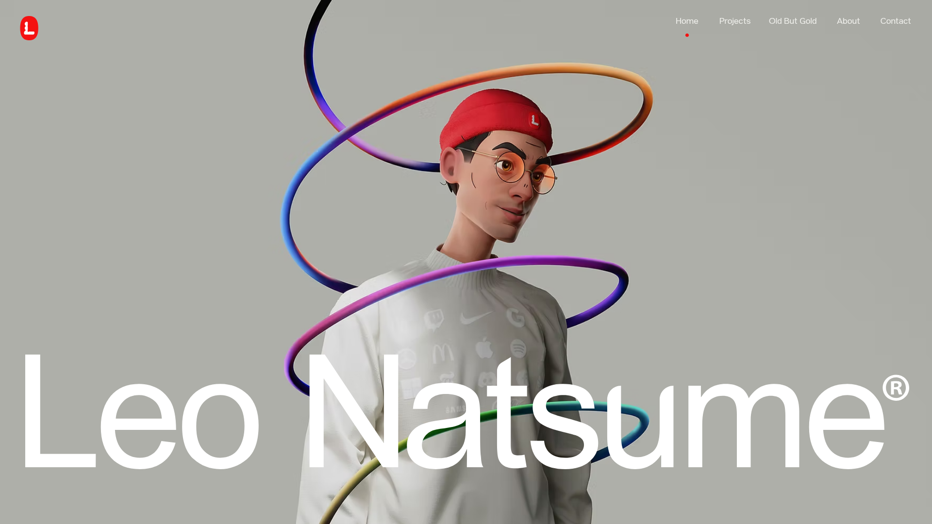
Leo Natsume Creative Portfolio
A high-impact portfolio featuring an animated 3D hero section, horizontal project separators, sticky navigation, and embedded video-based case study previews.
Overview
Leo Natsume’s portfolio is a masterclass in high-impact personal branding, combining a 3D-dominant hero section with a clean, grid-based project showcase. It serves as an excellent reference for creators who need a website that balances bold artistic character with professional, structured case studies. The site effectively uses large typography and video-based previews to create an immersive, tactile browsing experience.
Design System
- Color Palette & Visual Hierarchy: The background uses a neutral metallic gray (#C1C1C1 base) to allow the vibrant, multi-colored 3D assets to pop. Visual hierarchy is established through extreme scale—enormous white headlines (e.g., "Leo Natsume") vs. small, refined navigation items.
- Typography System: A bold, geometric sans-serif (resembling Inter or a custom variant) is used for the name and headings. Body text is kept minimal, often using uppercase tags like "FEATURED WORK" for architectural clarity.
- Page Structure:
- Hero Section: Full-screen 3D character with a large nameplate.
- Contextual Statement: A large-type mission statement centered on digital experiences.
- Horizontal Project Strips: Structured rows containing project titles, subtitles, and a 2-column layout for an image/video preview.
- Partner/Client Section: A marquee or designated area for brand authority.
- Reusable Components:
- Sticky Nav: A minimalist top navigation bar with a red indicator dot below the active link.
- Project Strips: Each project is a repeatable
wixui-sectioncontaining awixui-horizontal-lineand side-by-side media boxes. - Video Case Study Previews: Auto-playing, muted video blocks (
wixui-video-box) provide instant visual feedback on work samples.
- Interaction & Motion: The site uses parallax on background images (
parallaxSpeed:1.5) and entering animations for text blocks (--motion-translate-y). Project rows use horizontal lines to "cut" the layout, creating a sense of physical layers. - Implementation Clues: Developed on Wix, the structure relies heavily on relative positioning and CSS variables to handle motion (
--motion-clip-start). It uses modern image formats (AVIF) and responsive<picture>sources for optimized loading.
Use Cases
- Who Should Clone: Independent designers, 3D artists, and creative directors who want their personal brand to feel as high-fidelity as their work.
- Effective Remixes: This pattern works well for luxury product landing pages or high-end agency sites where "vibe" and brand personality are as important as the information.
- Practical Remix Directions:
- Minimalist Option: Replace the 3D hero with a high-res video background or a large SVG pattern while keeping the oversized nameplate.
- Portfolio Adaptation: Reuse the horizontal project strips to showcase UI/UX case studies, moving the description into one column and a screen recording into the video box.
- Brand Swap: Shift the neutral gray background to a deep dark mode (black/dark blue) to make neon or glassmorphism-style assets stand out.
- Suggested Clone Scope: A quick clone of the Hero Section + Project Strip sequence is sufficient to build a professional-grade one-page portfolio.
Related Inspirations
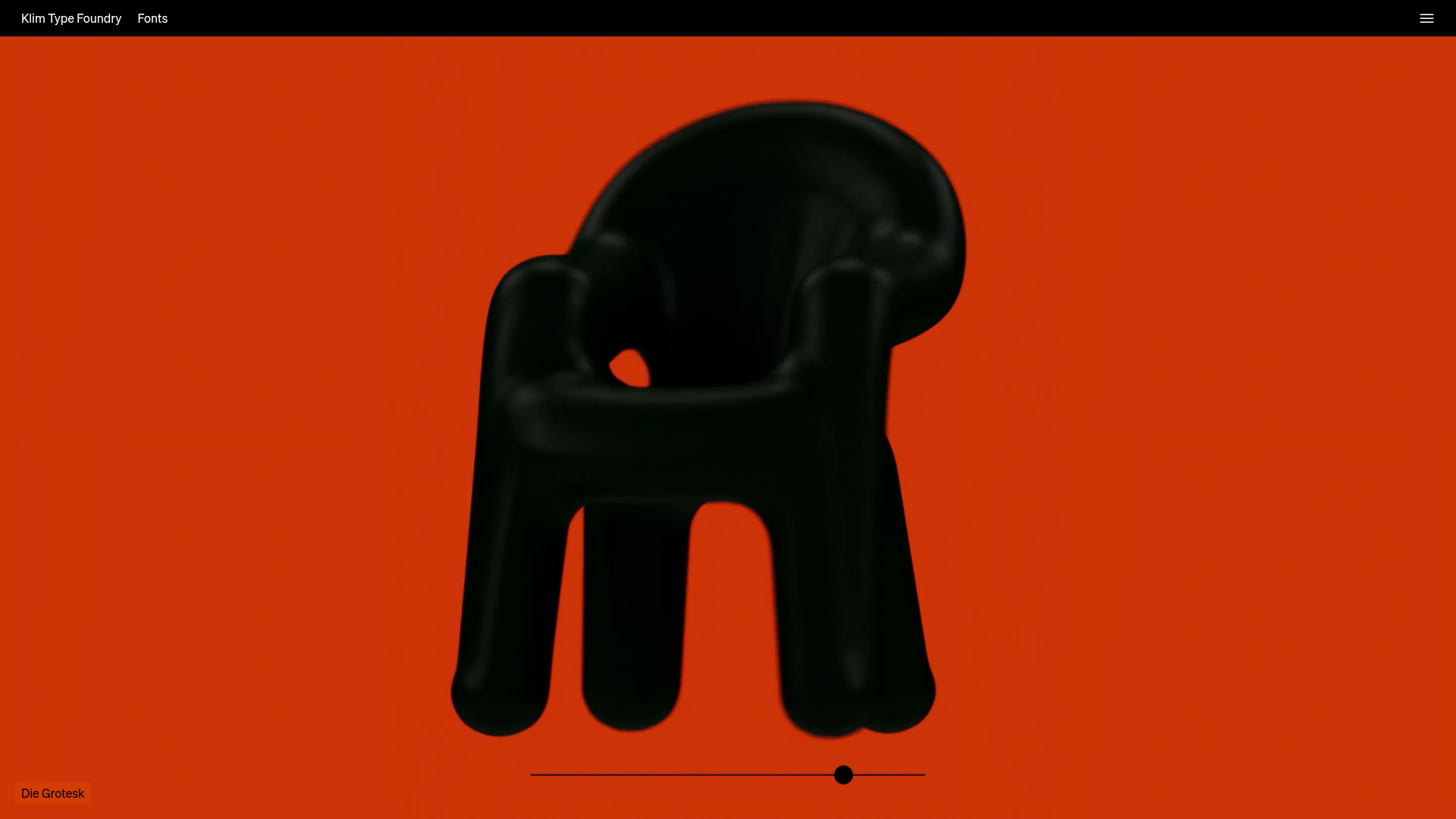
Klim Type Foundry Interactive Typography Landing Page
A high-impact landing page featuring a minimalist full-screen image gallery, interactive slider controls, and a clean, hidden navigation menu.
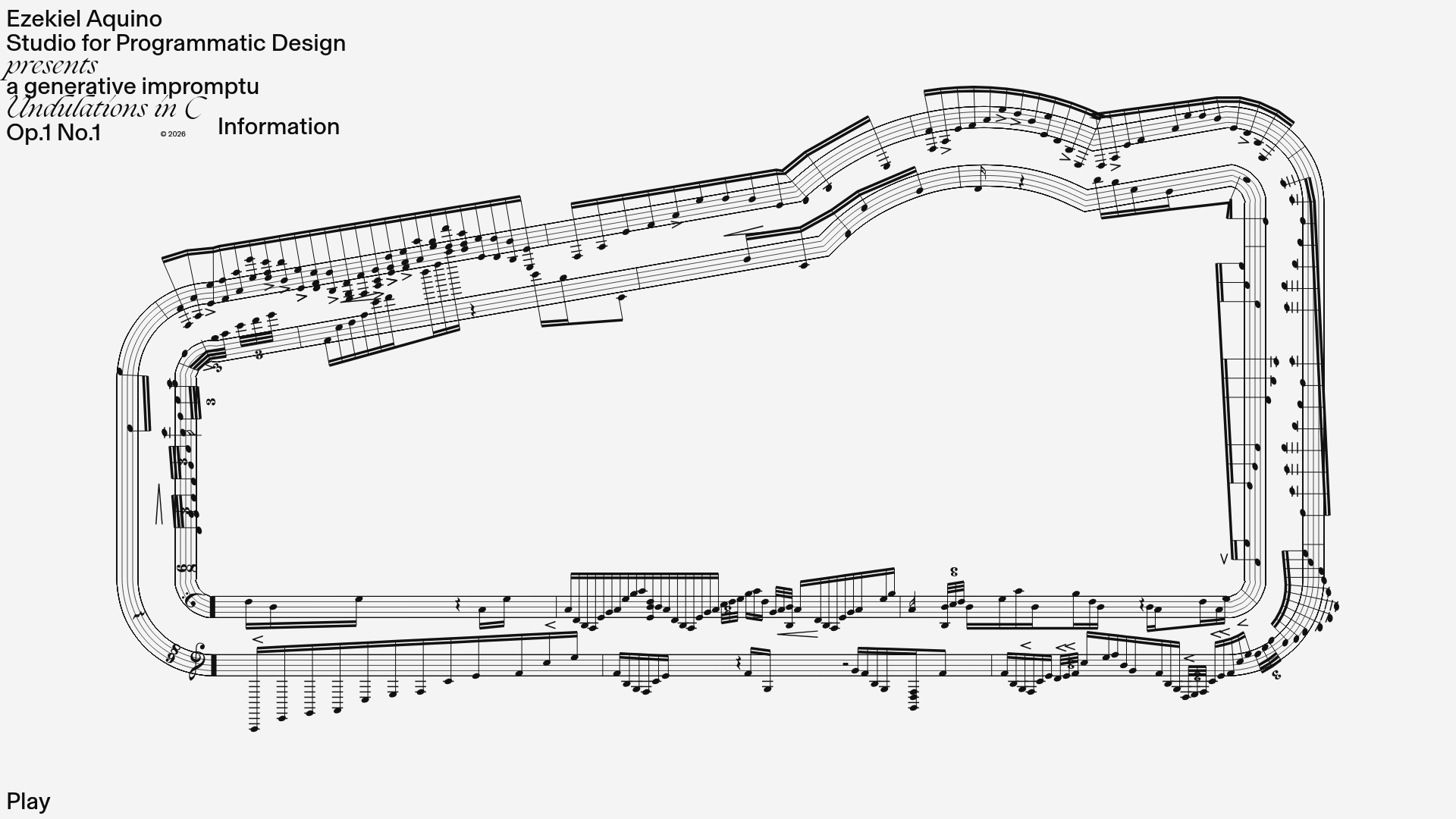
Generative Music Visualization Portfolio Canvas
A creative coding project featuring a generative musical score on a dynamic canvas with a play/pause interaction and custom notation rendering.
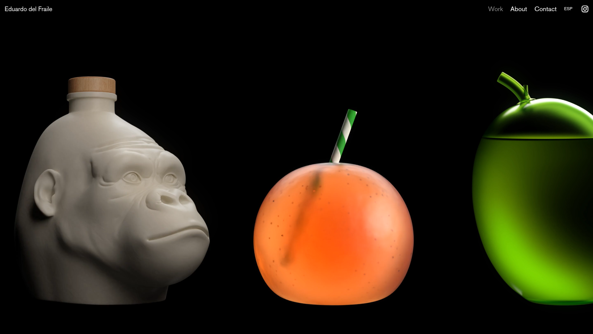
Eduardo del Fraile Horizontal Portfolio
A minimalist horizontal-scroll gallery featuring large-scale media blocks with integrated video-on-hover effects and a custom scrollbar tracker.
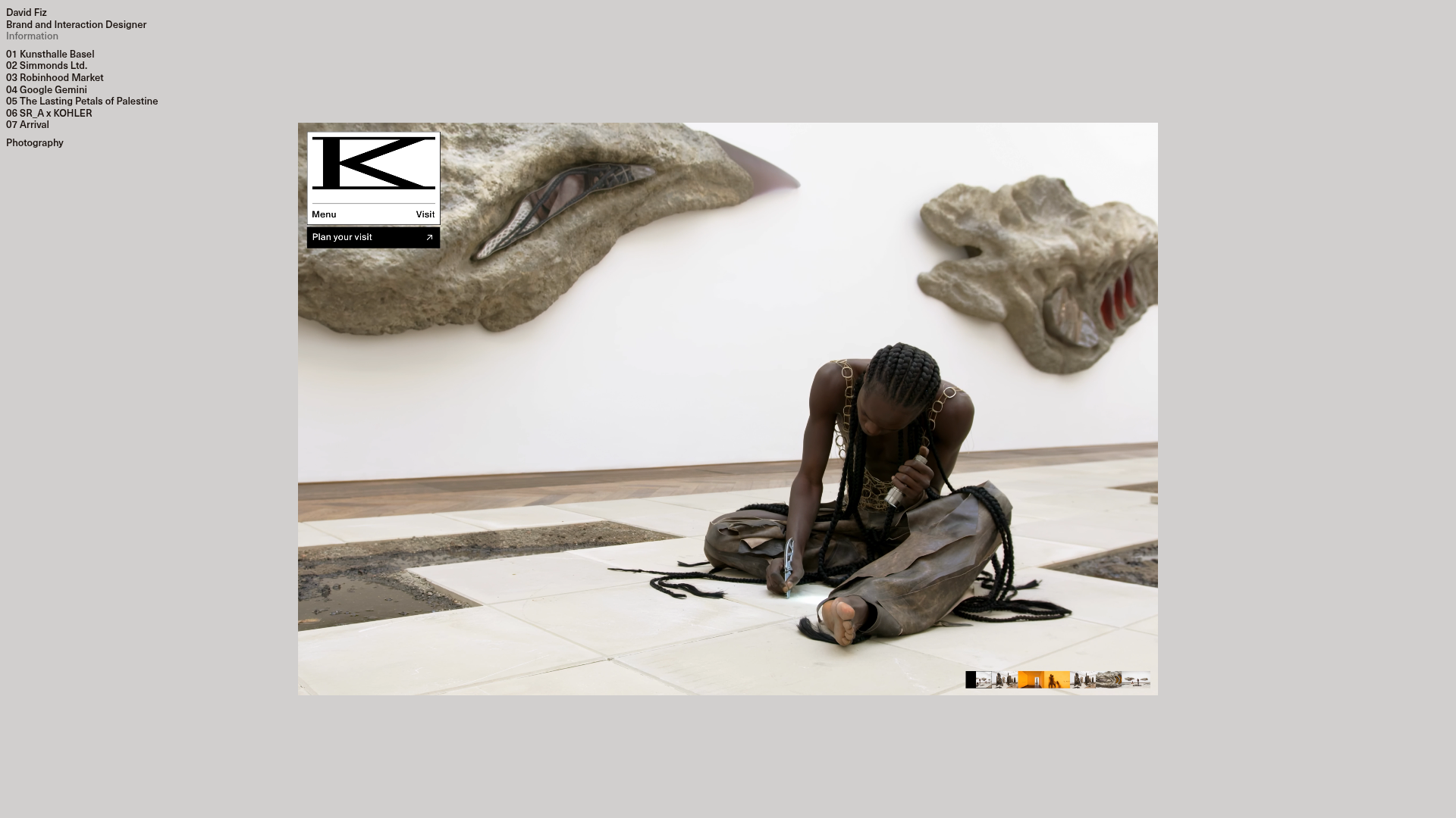
David Fiz Visual Design Portfolio
A minimalist portfolio featuring a fixed sidebar navigation paired with an immersive, full-screen media showcase and interactive project-specific image carousels.
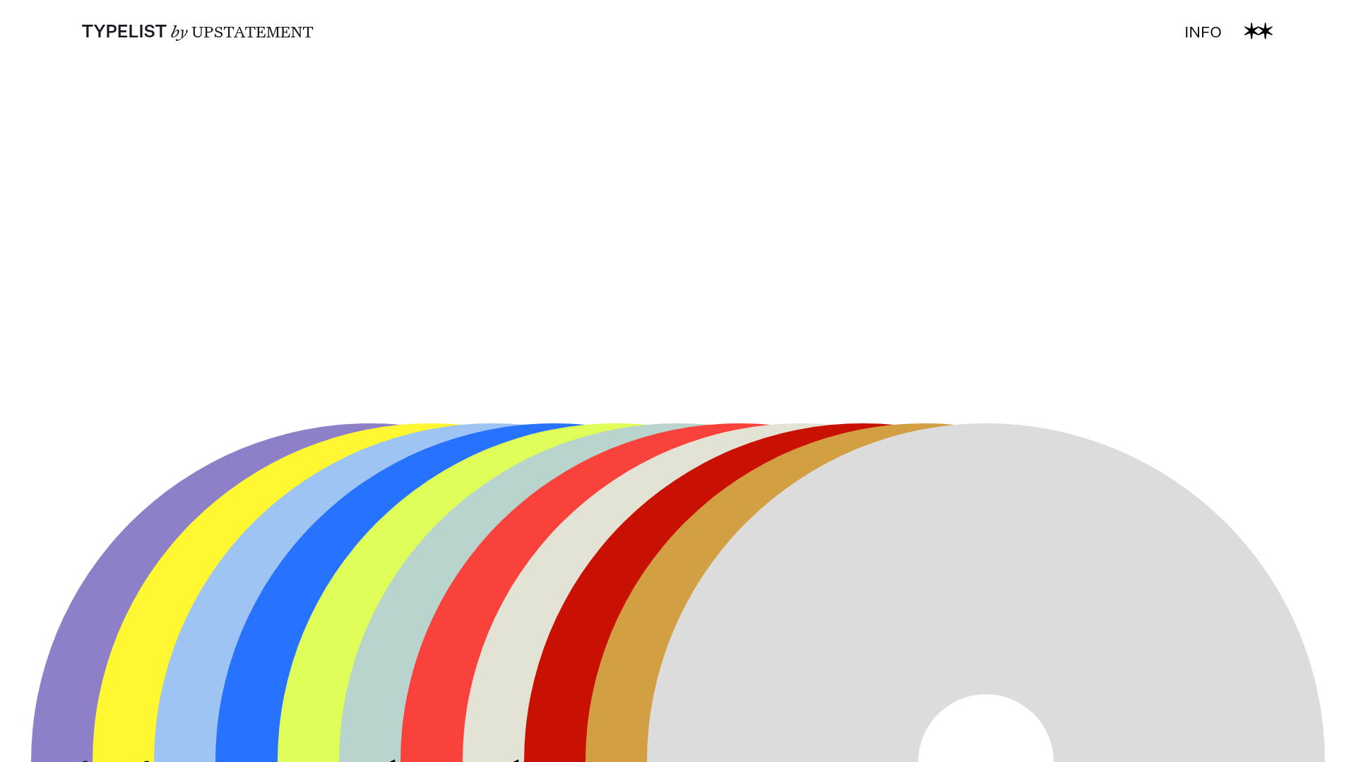
Typelist Typography Playlist Gallery
A creative curated gallery featuring a horizontal overlapping disc navigation pattern, CSS-driven theme color shifting, and smooth page transitions for showcasing design collections.
Offten Interactive Typographic Hero
A Svelte-based immersive landing page featuring a full-screen WebGL background, brush-style text underlines, and scroll-triggered character animations.
