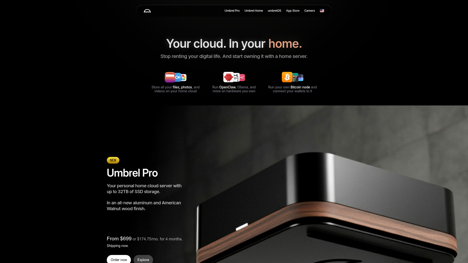
Umbrel Personal Home Cloud Landing Page
A dark-themed hardware landing page featuring a glass-morphism sticky header, icon-based feature grid, and high-contrast product sections with sleek typography.
Overview
This landing page for Umbrel showcases a premium hardware product using a "dark mode" aesthetic and a distinct tech-minimalist design language. It is an excellent clone reference for its effective use of high-resolution product photography integrated with a sophisticated hierarchy of typography and custom app-style iconography.
Design System
- Color Palette & Visual Hierarchy: The design uses a deep black background (
#000000) to create a high-contrast environment. Primary text is stark white for maximum legibility, while secondary text uses muted greys. Accents are introduced sparingly through a sunset-orange gradient (on the word "home.") and a "NEW" tag in gold, drawing immediate attention to key conversion points. - Typography System: The site relies on a clean, sans-serif typeface (likely Inter or a similar high-quality grotesque). It uses a clear scale: massive h1 headlines for emotional impact, bold h2 titles for product names, and medium-weight body text for descriptions. Text is often centered in the hero section and left-aligned in feature sections to create visual interest.
- Page Structure & Flow: The layout follows a logical marketing funnel: a high-level value proposition hero, an icon-driven feature grid highlighting ecosystem capability, and a large-scale product spotlight (Umbrel Pro) with pricing and CTA buttons.
- Reusable Components:
- Sticky Header: A pill-shaped, translucent glass-morphism navigation bar centered at the top.
- Icon Groups: Overlapping app icons that visually represent software versatility.
- Conversion Block: A pair of contrasting buttons—a white "Order now" button for primary action and a dark-grey "Explore" button for secondary navigation.
- Interaction Design: The layout suggests a scroll-heavy storytelling approach where large product imagery sits tucked behind the content sections, creating a sense of depth and physical presence.
Use Cases
- Who should clone this pattern: Developers or designers launching high-end hardware products, local-first software platforms, or privacy-focused cloud services.
- Effective Remixes: This pattern works well for SaaS dashboards that want a "Pro" landing page or luxury electronics brands.
- Remix Directions: Swap the dark-mode theme for a "Paper-white" light mode using thin borders rather than glow effects; replace the app icon clusters with screenshots of softare features; or adapt the sticky header to include a secondary "Buy" button that appears on scroll.
- Suggested Clone Scope: For a quick start, clone the sticky navigation bar and hero section to establish a premium brand identity. For a full project, the integrated product/pricing block is the most valuable asset to replicate.
Related Inspirations
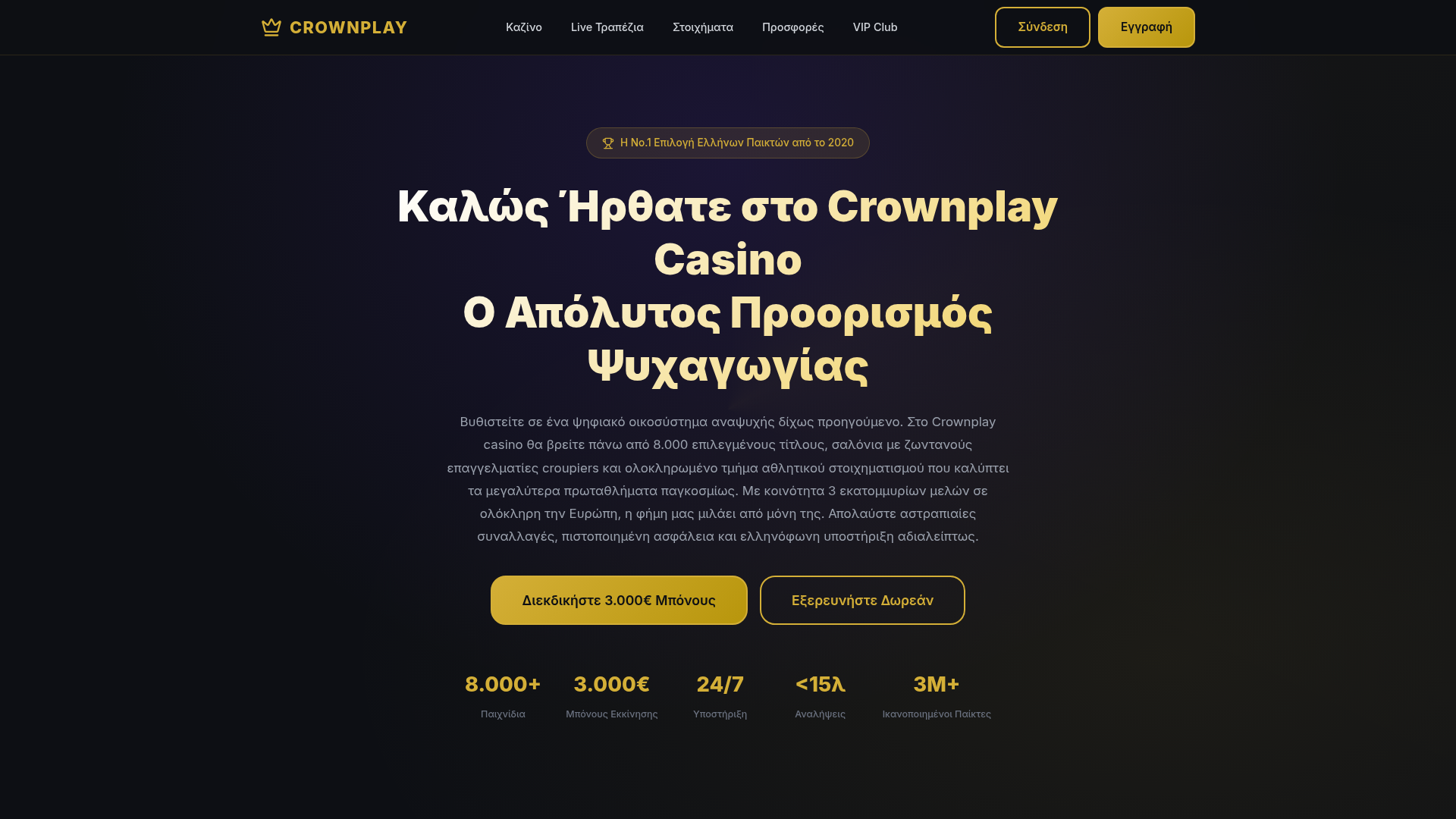
Crownplay Casino Landing Page
A luxury-themed dark mode landing page featuring a center-aligned hero section, value proposition counters, and a high-contrast call-to-action button layout.
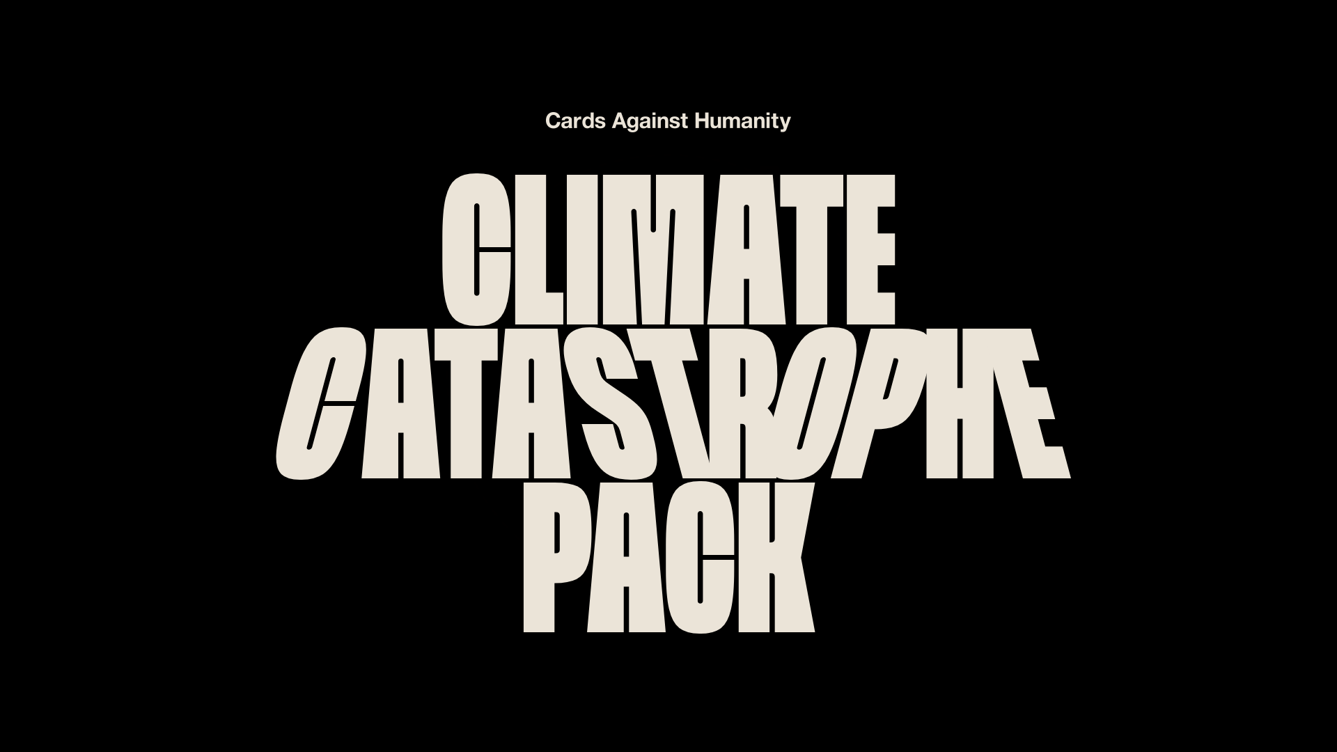
Cards Against Humanity Climate Landing
A high-impact single-page layout featuring a distorted typography hero, parallax scroll animations, interactive Zip code discount logic, and a classic iconography-based FAQ section.
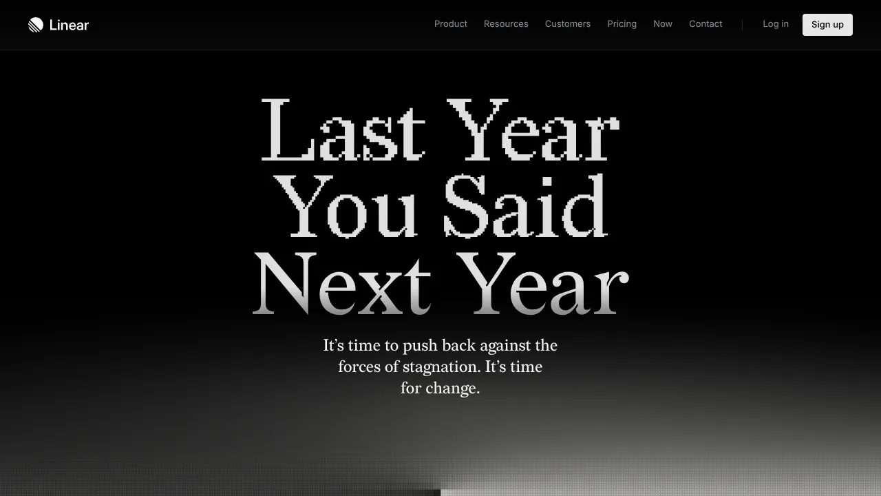
Linear Campaign Landing Page Mockup
A high-contrast dark mode hero section featuring pixelated serif typography, a minimalist navigation header, and a subtle monochrome gradient background.
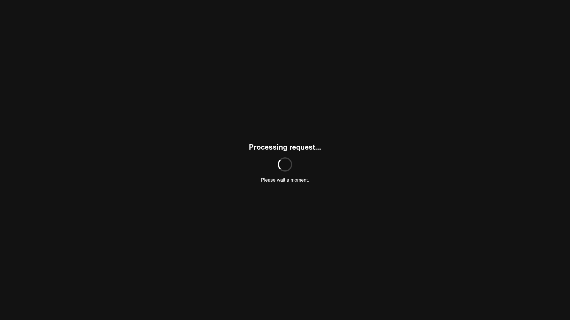
Minimalist Dark Mode Loading Screen
A clean, dark-themed redirection page featuring a centered typography layout and a CSS circular loading spinner for asynchronous processing states.
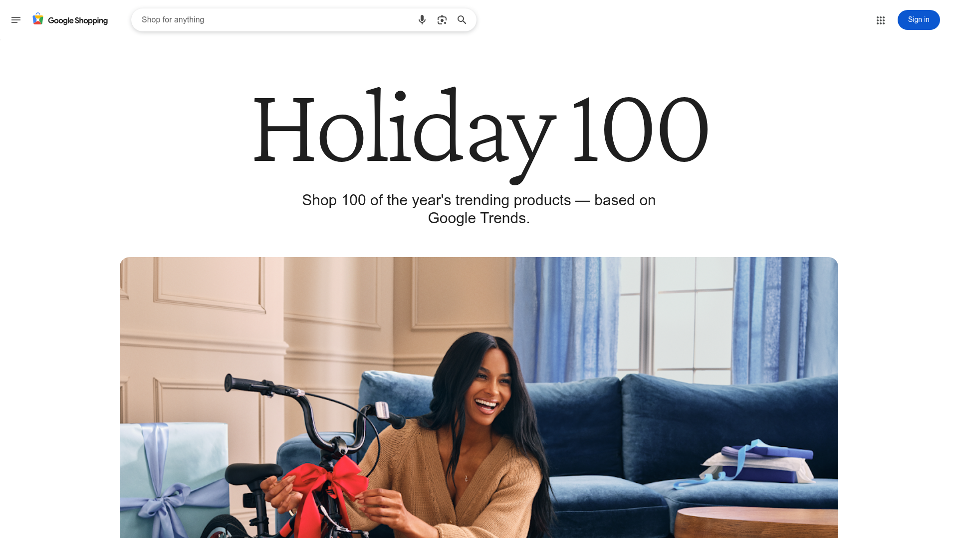
Google Holiday 100 Curator Landing Page
A minimalist e-commerce showcase featuring a wide hero section, clean search integration, and a bold typography-driven header designed for trending product collections.
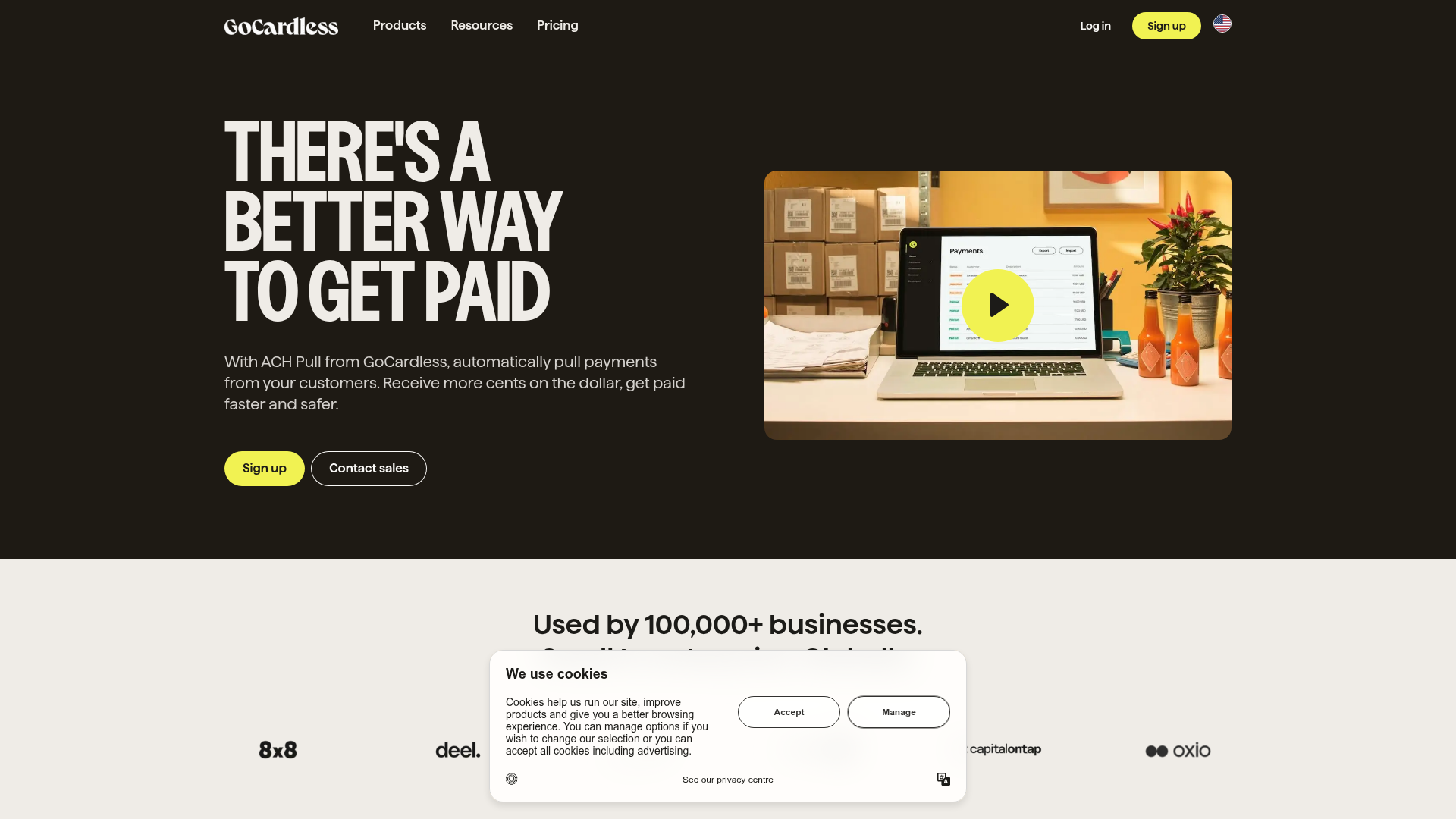
GoCardless Payments Platform Landing Page
A dark-themed fintech landing page featuring a split-screen video hero, bento-style feature cards, a horizontal logo slider, and step-by-step accordion guides.
