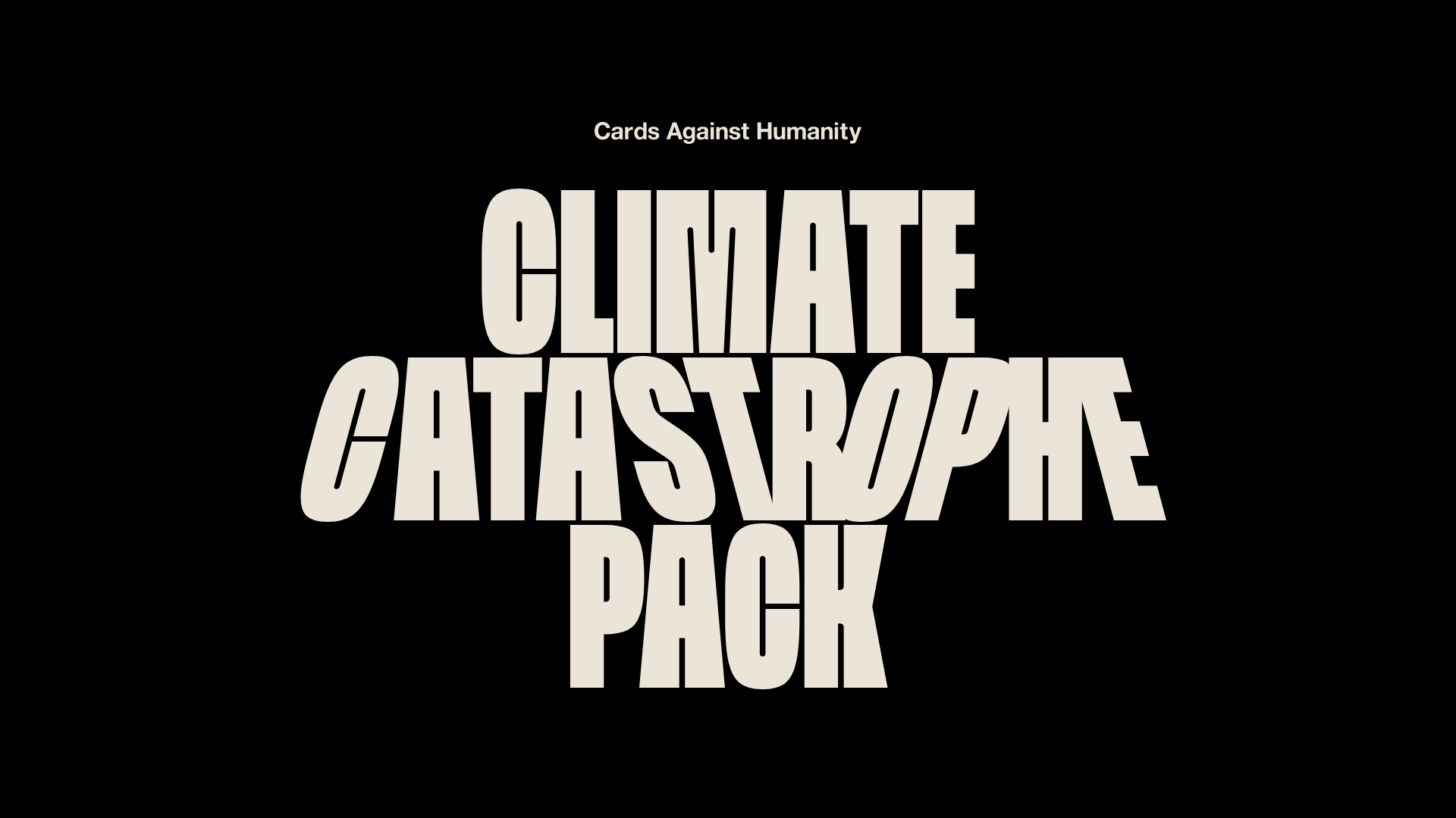
Cards Against Humanity Climate Landing
A high-impact single-page layout featuring a distorted typography hero, parallax scroll animations, interactive Zip code discount logic, and a classic iconography-based FAQ section.
Overview
This high-impact landing page for Cards Against Humanity uses a brutalist aesthetic and aggressive typography to market a topical expansion pack. It is an excellent reference for builders wanting to master unconventional grid layouts, complex parallax scroll animations, and dynamic, data-driven user experiences within a minimalist framework.
Design System
- Color Palette & Visual Hierarchy: The site uses a high-contrast, three-color system: stark Black (#000000), a warm Tan base color, and a vibrant Red for emphasis and urgency. Hierarchy is established through extreme shifts in point size rather than a broad color spectrum, keeping the focus on message and motion.
- Typography System: The system is dominated by a condensed, thick san-serif display face (FFV) with heavy weight on titles. The hero text is manually "distorted" using CSS skew and slant classes (
hero__slant--right,slant). Body text is a cleaner, readable san-serif set at a large scale (18px to 30px) for a "loud" editorial feel. - Page Structure:
- Hero: Heavy distorted typography over a black background.
- Context: Rich-text intro with a red flame animation transition.
- Product Block: Interactive card-stack feature with a "Click for cards!" toggle.
- Interactive Discount Tool: A ZIP code lookup tool centered in a circular layout with scrolling "wiggle" line accents.
- FAQ Section: Icon-heavy list using repetitive custom glyphs to anchor questions.
- Reusable Components:
- Animated Tickers: Marquee-style rows (
ticker__item) used for both decorative lines and logo walls. - Circle Containers: The discount tool and product pack are housed in large, overflow-hidden circles that break the standard rectangular grid.
- Brutalist Buttons: Solid black or red shapes with sharp corners and centered white/tan text.
- Animated Tickers: Marquee-style rows (
- Interaction & Motion: The site is heavily driven by scroll-based parallax. The HTML reveals
data-speedanddata-offsetattributes used to handle layered movements. Specifically, the flame animations and background icons rotate and scale as the user scrolls. The product pack features a state-change button that triggers a CSS transform transition to fan out the pack cards. - Implementation Clues: The structure uses a utility-first approach (classes like
dffor flex,aicfor align-items center,xfor width 100%). The layout is responsive viashow--mdandhide--mdvisibility classes, shifting from a vertically stacked sequence on mobile to a more complex overlapping layout on desktop.
Use Cases
- Campaign-Specific Products: Ideal for limited-edition drops or "shock" marketing where a standard e-commerce template feels too corporate.
- Data-Driven Microsites: The ZIP-code discount logic provides a blueprint for any site needing to fetch location-based status or pricing to drive user engagement.
- Editorial Content: The FAQ and intro sections can be remixed for long-form brand stories that require high visual interest to sustain attention.
- Remix Directions: Builders can swap the brutalist aesthetic for a softer palette and rounded typography while keeping the functional parallax and ticker components. The "ZIP code to discount" logic can be adapted into a "postal code to shipping estimate" or "region to representative" look-up tool.
Related Inspirations
Crownplay Casino Landing Page
A luxury-themed dark mode landing page featuring a center-aligned hero section, value proposition counters, and a high-contrast call-to-action button layout.
Schema by Figma Event Landing Page
A dark-themed virtual event landing page featuring a minimalist header, high-contrast typography, and a geometric abstract footer design.
Umbrel Personal Home Cloud Landing Page
A dark-themed hardware landing page featuring a glass-morphism sticky header, icon-based feature grid, and high-contrast product sections with sleek typography.
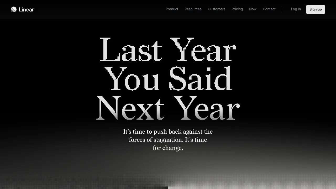
Linear Campaign Landing Page Mockup
A high-contrast dark mode hero section featuring pixelated serif typography, a minimalist navigation header, and a subtle monochrome gradient background.

Good Glyphs Font Showcase Landing Page
A single-page layout featuring an interactive type tester, donation form with custom amount logic, and a contributor gallery using swiper-based glyph previews.
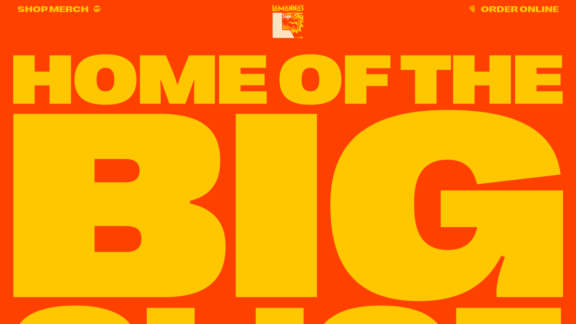
Lamanna's Bakery Vibrant Landing Page
A bold, high-contrast Italian bakery site featuring massive typography, parallax floating elements, marquee banners, and a flickity-powered product carousel.
