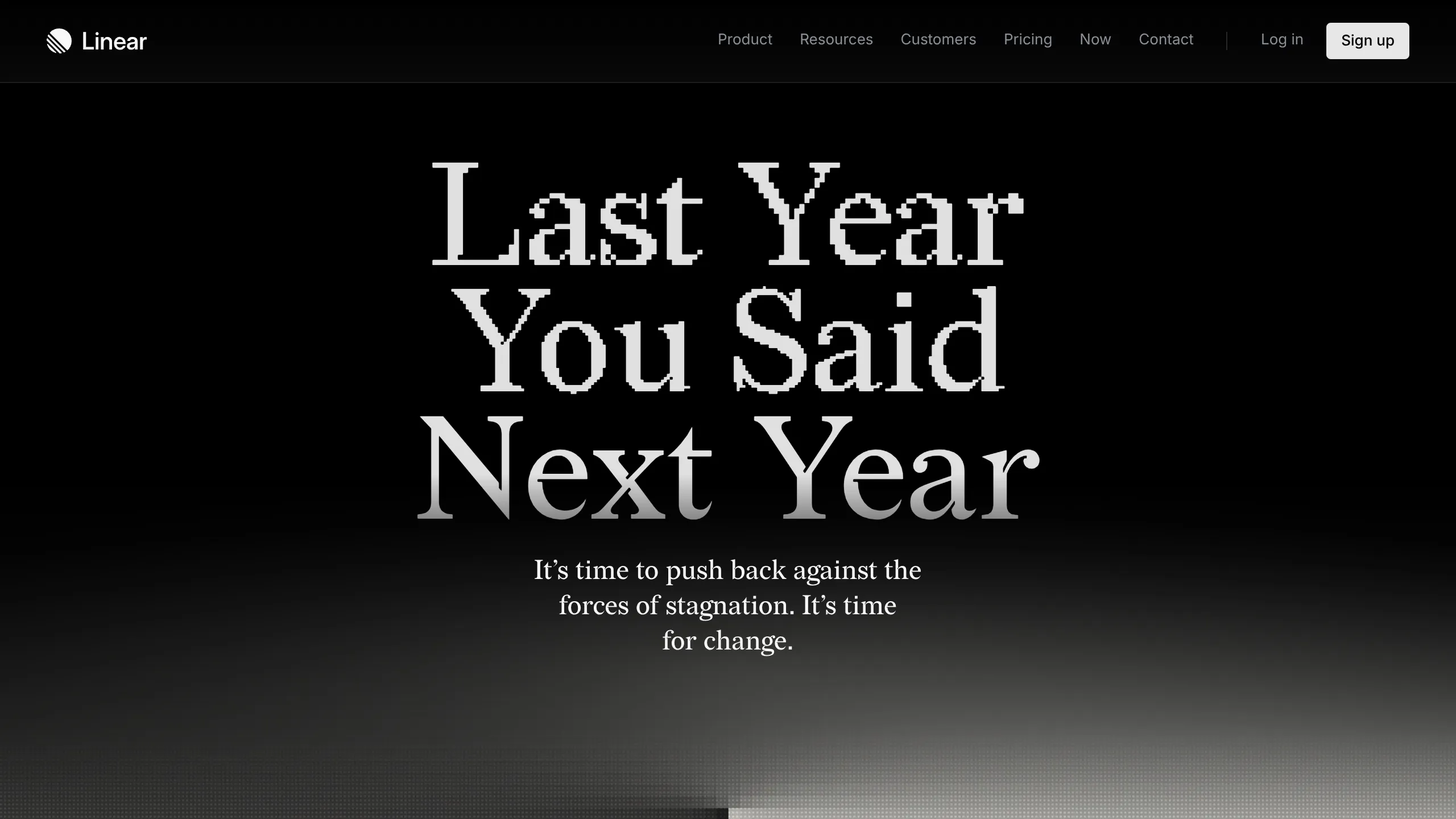
Linear Campaign Landing Page Mockup
A high-contrast dark mode hero section featuring pixelated serif typography, a minimalist navigation header, and a subtle monochrome gradient background.
Overview
This landing page is a high-impact, minimalist hero section designed for brand-led campaigns. It is an excellent clone reference for developers looking to achieve a "luxury tech" aesthetic through extreme contrast, custom pixel-art typography, and sophisticated background gradients.
Design System
- Color Palette & Visual Hierarchy: A strictly monochromatic palette dominated by pitch black (
#000000). The hierarchy is established through a center-aligned "dark-to-light" vertical gradient that settles into a soft grey footer area, ensuring all white text remains the primary focal point. - Typography System: The design utilizes a high-contrast serif typeface. The headline "Last Year You Said Next Year" features a unique pixelated/glitch effect on the upper half of the characters, transitioning into smooth curves. The body text and navigation use a clean, small-scale sans-serif for functional clarity.
- Page Structure: The layout follows a classic vertical stack: a fixed-height minimalist header, a centered hero container with massive leading/kerning for the headline, and a secondary sub-headline for the call to action.
- Reusable Components:
- Navigation Bar: A clean, horizontal link list with a distinct "Sign up" button featuring high contrast (white background, black text).
- Hero Text Block: A centered typography stack with carefully tuned line-heights and letter-spacing.
- Interaction & Motion: The design suggests a static, bold entrance. The gradient at the bottom implies a fade-in scroll transition or a "light-at-the-end-of-the-tunnel" metaphor common in high-end product launches.
- Implementation Clues: The HTML structure indicates a utility-first approach with semantic container divs. The use of custom brand fonts is central to the identity, requiring
@font-faceimplementation for the pixelated serif headers.
Use Cases
- Who should clone this: Creative agencies, product designers launching a "rebrand," or high-growth tech companies announcing a significant platform shift or new year campaign.
- Effective Remixes: This pattern works perfectly for product launch countdowns, manifesto-style "About Us" pages, or exclusive membership landing pages where exclusivity and prestige are key.
- Practical Remix Directions: Swap the monochrome gradient for a brand-specific hue (e.g., deep midnight blue or forest green) while maintaining the centered typography. Replace the pixelated font with a standard high-fashion serif (like Didot) to shift from "tech glitch" to "editorial."
- Suggested Clone Scope: This is best cloned as a standalone hero section or a single-page "coming soon" splash screen to maximize the impact of the typography without overwhelming the user with complex navigation.
Related Inspirations

GoCardless Payments Platform Landing Page
A dark-themed fintech landing page featuring a split-screen video hero, bento-style feature cards, a horizontal logo slider, and step-by-step accordion guides.
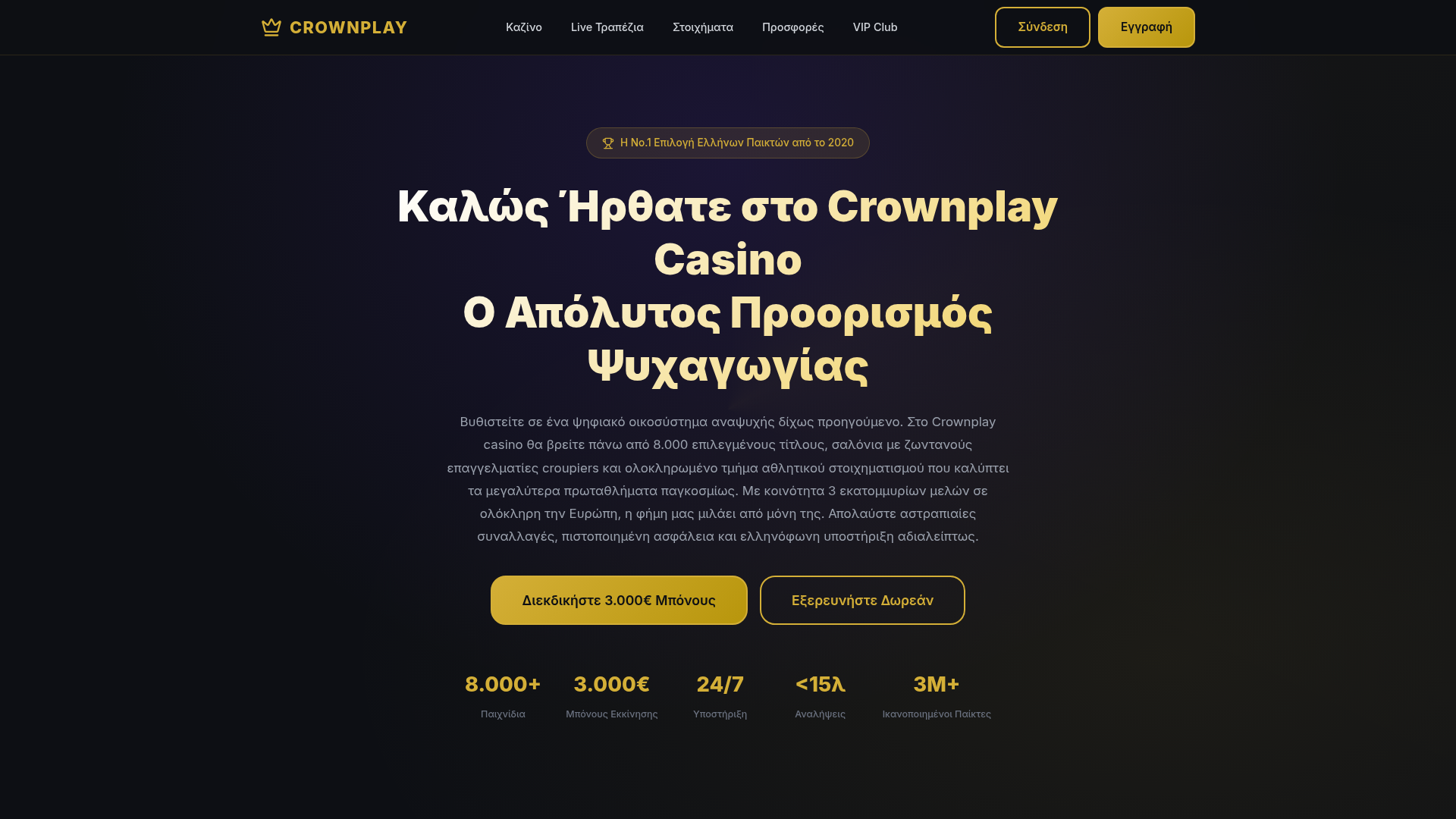
Crownplay Casino Landing Page
A luxury-themed dark mode landing page featuring a center-aligned hero section, value proposition counters, and a high-contrast call-to-action button layout.
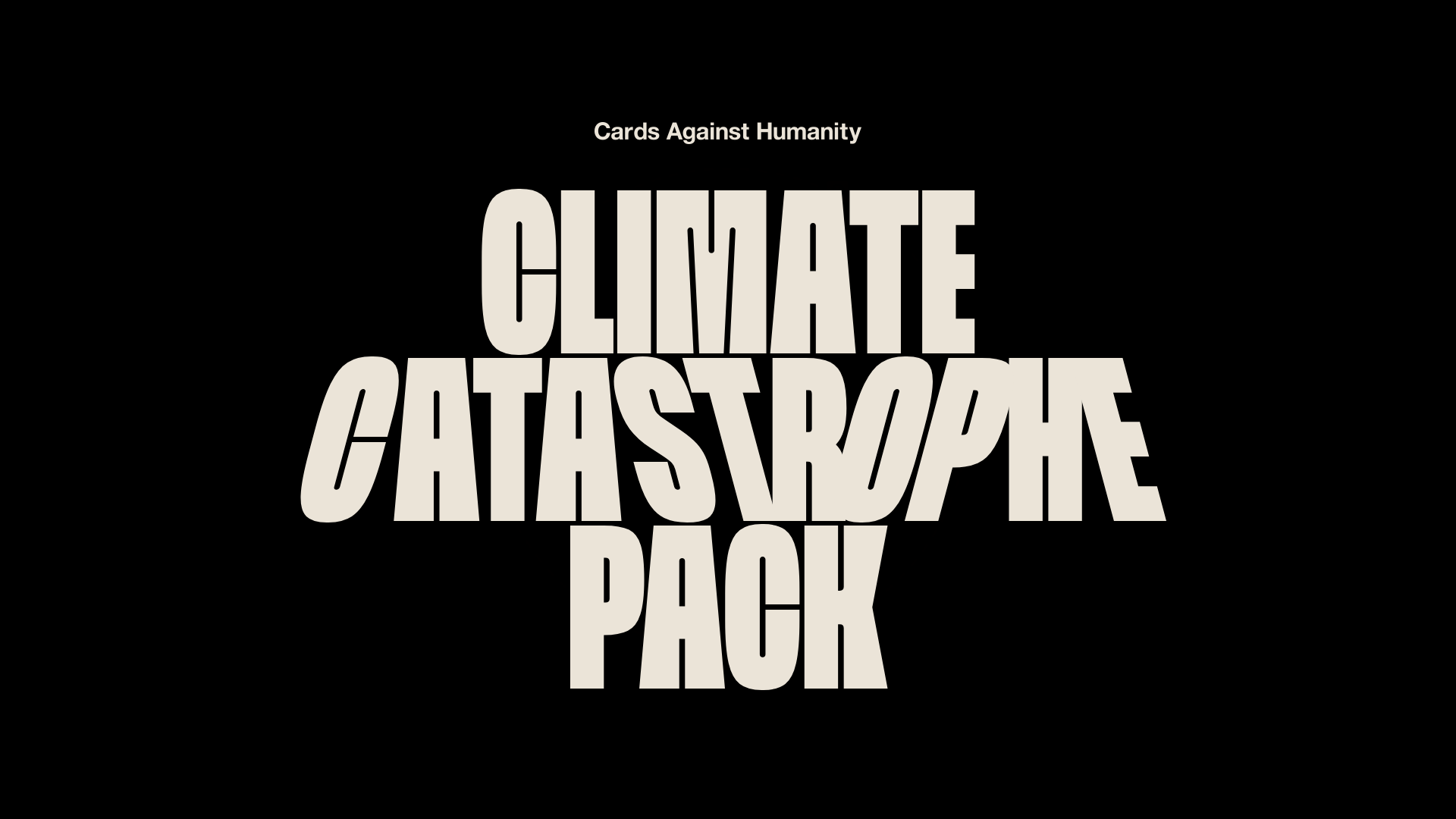
Cards Against Humanity Climate Landing
A high-impact single-page layout featuring a distorted typography hero, parallax scroll animations, interactive Zip code discount logic, and a classic iconography-based FAQ section.
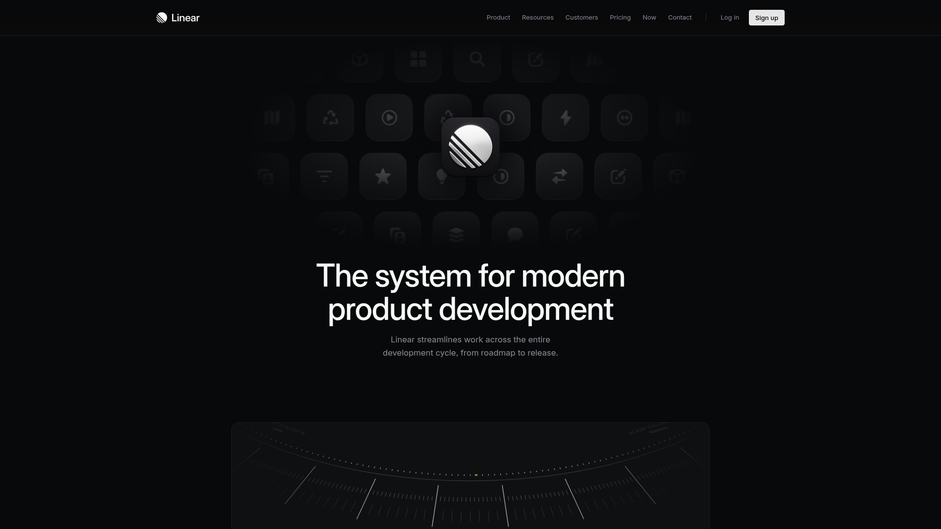
Linear Product Features Landing Page
A premium dark-themed landing page featuring a minimalist aesthetic, bento style icon grids, sleek typography, and high-contrast call-to-action buttons.
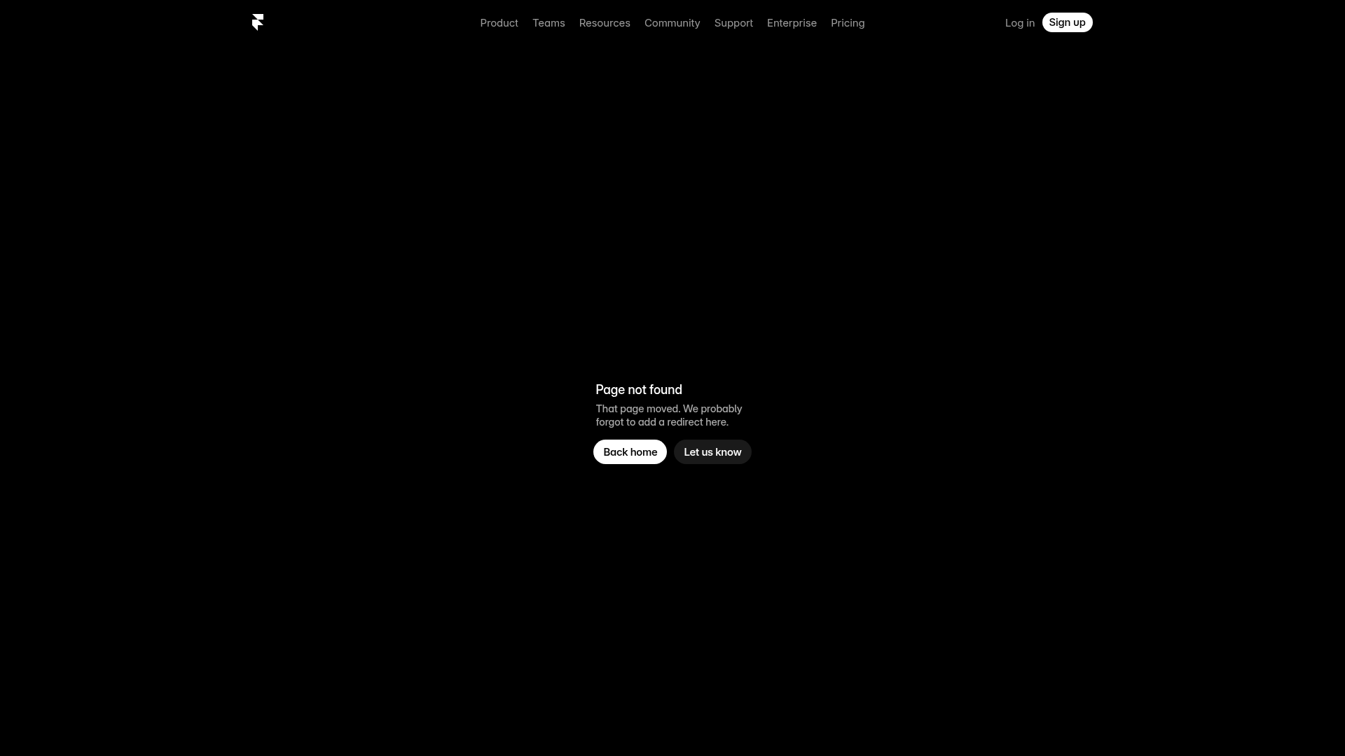
Framer Dark 404 Error Page
A minimalist dark mode error page featuring a clean centered layout, monochromatic navigation, and pill-shaped call-to-action buttons.
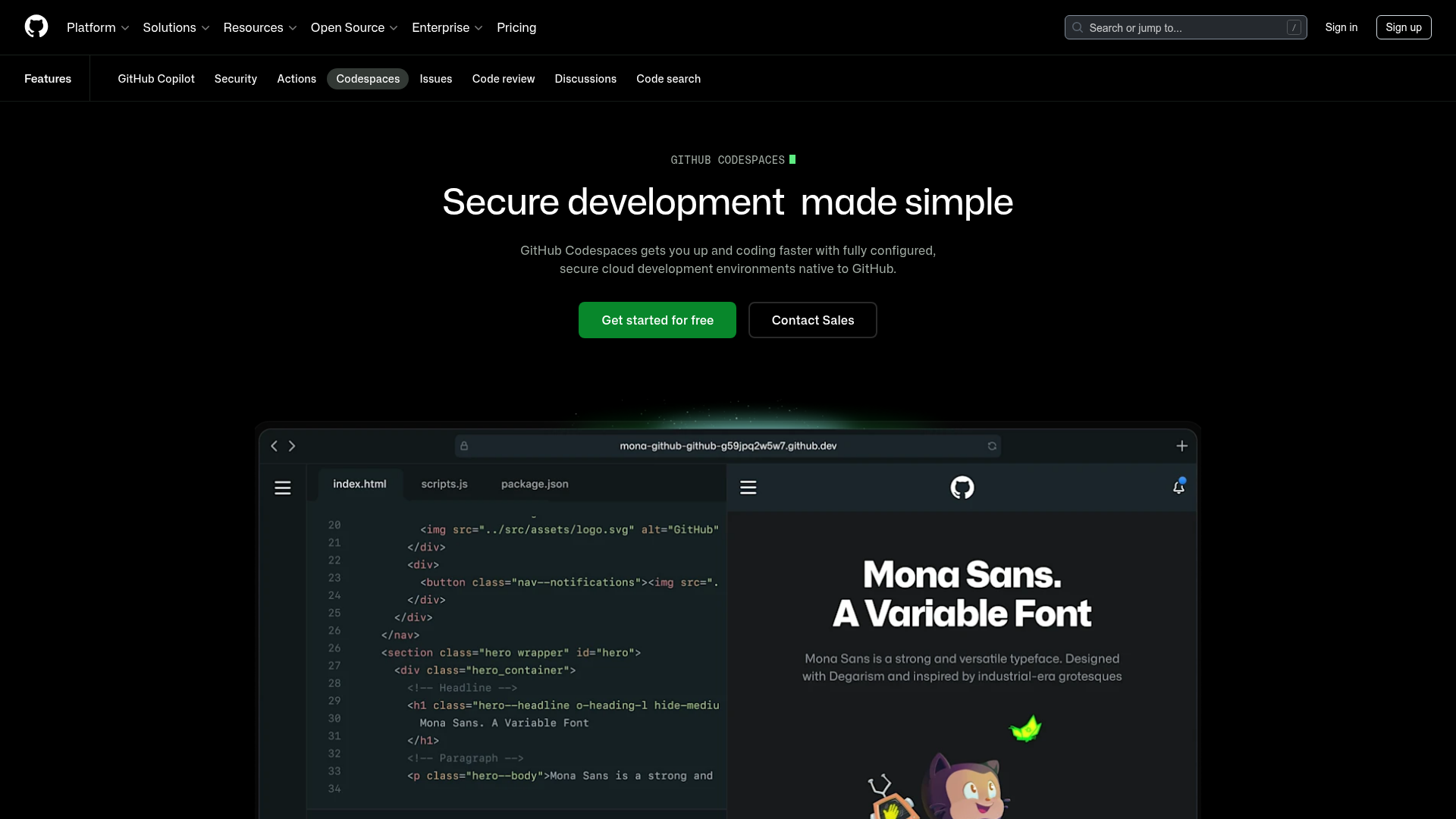
GitHub Codespaces Feature Landing Page
A dark-themed product page featuring a terminal-inspired hero section, cursor animations, staggered feature 'rivers' with media, and a breakout wide-image component for dashboards.
