HAPE Prime Digital Fashion Experience
A high-fidelity immersive site layout featuring complex interactive loading sequences, a vertical roadmap component, and integrated fullscreen video player controls.

Overview
HAPE Prime is a high-fidelity immersive web experience for digital fashion, leveraging WebGL and sophisticated UI overlays to create a luxury metaverse atmosphere. It is an exceptional clone reference for builders looking to master complex asset-loading sequences, interactive toolbars, and high-quality video integration within a clean, minimalist layout.
Design System
- Color Palette & Visual Hierarchy: The design uses a sophisticated grayscale foundation (black, white, and varying shades of gray) to let 3D assets and high-quality photography stand out. Hierarchy is established through bold black typography on light backgrounds and illuminated buttons.
- Typography: The system utilizes a combination of heavy sans-serif headers (h1, h3) for impact and monospaced or small-caps utility text for labels and "eyebrows" (e.g., the
.text-eyebrowclass for section numbering like "01/"). - Page Structure & Section Flow:
- Interactive Loader: A centered progress-tracked loader (
.site-loader) with a logo sprite. - Fullscreen Video Layer: Integrated via the Plyr framework (
.site-trailer), featuring custom close buttons. - Immersive Header: Split-screen intro text focusing on digital fashion redefining digital space.
- Vertical Content Blocks: Minimalist sections (
.content-block) with sequential numbering. - Roadmap Component: A detailed vertical timeline with dot-indicators and hover-responsive image/text content.
- Persistent Toolbar: A fixed footer-style nav (
.site-toolbar) containing interaction hints (scroll/drag icons), sound toggles, and ecosystem links.
- Interactive Loader: A centered progress-tracked loader (
- Reusable Components:
- Icon Buttons: Circular buttons using the
.button--with-backgroundand.button--with-labelclasses with SVG masks. - Theme Switcher: An custom interactive toggle (
.theme-switcher) with an internal progress bar indicator. - Roadmap Items: Card-based structures (
.roadmap-item) containing lazy-loaded images and descriptive text perfect for project timelines.
- Icon Buttons: Circular buttons using the
- Interaction & Motion: The site uses scroll-triggered animations (evidenced by the
.link--animateclasses) and interactive 3D scene controls. The UI includes a "Debug UI" (Tweakpane) in the source, suggesting a high degree of control over lighting and material properties (IBLDiffuseFactor,lightPower). - Implementation Clues: Built using Vue.js (noted by
data-v-app), utilizing Sanity.io as a headless CMS for assets and the Plyr library for video controls.
Use Cases
- Who should clone this pattern: NFT collection creators, high-end digital fashion labels, and creative agencies wanting to showcase individual case studies in an atmospheric, interactive way.
- What products can remix it: Product launches for hardware (like headphones or designer furniture), immersive storytelling for gaming projects, and digital art portfolios.
- Practical remix directions:
- Quick Clone: Reuse the
.site-loaderand.site-toolbarlogic for a lighter portfolio site to add immediate "high-end" polish. - Architecture Remix: Adapt the
.site-roadmapinto a product feature timeline or a historical brand archive. - Style Swap: Change the monochrome palette to vibrant gradients for a more accessible consumer tech brand while retaining the professional UI spacing.
- Quick Clone: Reuse the
- Suggested clone scope: A full-page clone is recommended for high-stakes product launches where the "experience" is as important as the information. For basic utility, the mobile-optimized toolbar and section headers are the most reusable elements.
Related Inspirations
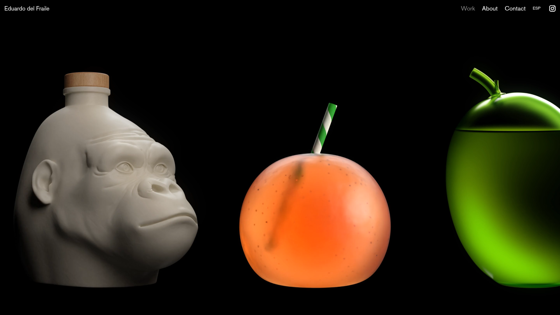
Eduardo del Fraile Horizontal Portfolio
A minimalist horizontal-scroll gallery featuring large-scale media blocks with integrated video-on-hover effects and a custom scrollbar tracker.
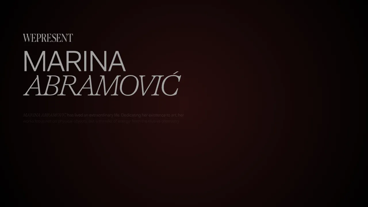
Marina Abramović Immersive Storytelling Gallery
A high-end multimedia experience featuring a 3D canvas background, custom cursor effects, interactive audio controls, and an overlay-based menu for immersive digital narratives.

Gemini Immersive WebGL Motion Showcase
Features a cinematic Three.js WebGL canvas stage with interactive navigation buttons, a hold-to-interact pattern, and data-driven terminal-style UI overlays.

Muzeum MZA Horizontal Scroll Exhibition
A swiper-based immersive timeline featuring horizontal full-page slides, synchronized audio playback, video backgrounds, and interactive 360-degree vehicle interior views.
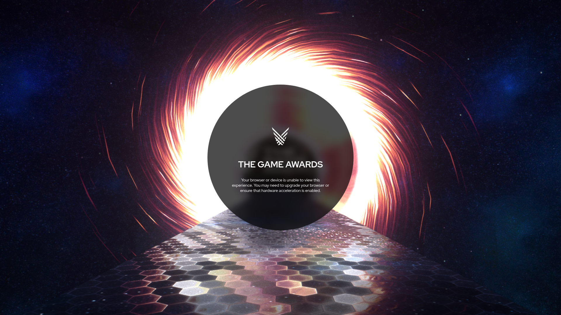
The Game Awards WebGL Experience
A high-end multimedia site featuring a WebGL canvas background with space themes, hexagon-tiled flooring, and a centered circular UI for status messaging.
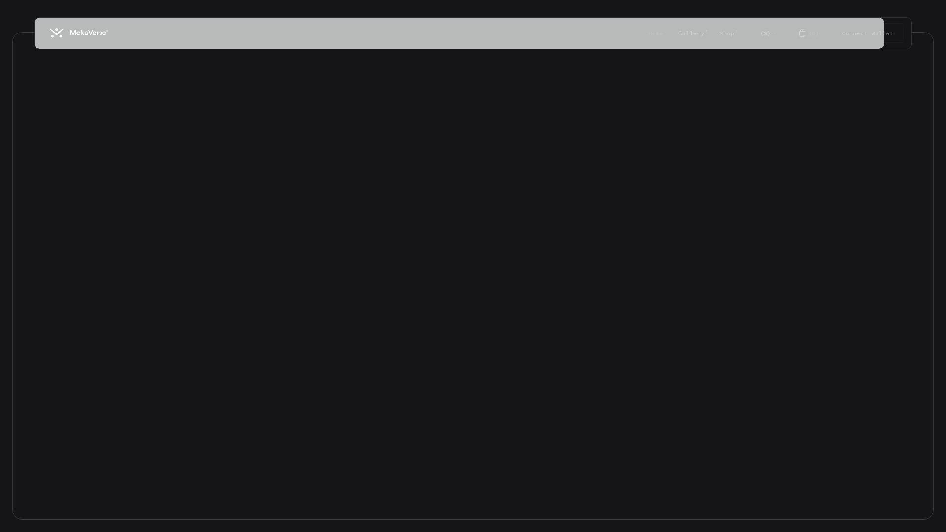
MekaVerse NFT Parallax Landing Page
An immersive NFT landing page featuring a minimalist glassmorphism navigation bar and full-screen vertical scroll sections with smooth parallax image transitions and clipped borders.
