Muzeum MZA Horizontal Scroll Exhibition
A swiper-based immersive timeline featuring horizontal full-page slides, synchronized audio playback, video backgrounds, and interactive 360-degree vehicle interior views.

Overview
This site is an immersive, horizontal-scroll digital museum that uses a timeline-driven navigation to showcase the history of Warsaw's public transport. Built on a swiper-based architecture, it serves as a high-quality reference for developers looking to create interactive storytelling experiences, portfolios, or product catalogs that require synchronized multimedia and full-page transitions.
Design System
- Color Palette & Visual Hierarchy: The UI uses a deep charcoal background (#1A1A1A) to provide high contrast for photography and branding. Accents are primarily a muted earthy brown (
.c-brown) and white, creating an elegant, archival atmosphere. Text and buttons are kept minimal to ensure the large bus imagery and historical photography remain the focal points. - Typography: The system utilizes a bold sans-serif typeface for headlines (years and titles) with a clear scale: large year markers (e.g., "1920") paired with smaller range indicators. Captions and descriptions use a lighter weight for readability against the dark background.
- Page Structure: The site is structured as a
swiper-container-horizontal. It begins with a full-screenmovie-introvideo slide, followed by distinct decade slides (#decade-20,#decade-30, etc.). Each decade contains a gallery, a main vehicle image, a title with a (+) button, and a short description. - Reusable Components: Notable components include the customized Swiper navigation arrows with "Skip" (
.skip-intro) labels, an audio toggle button with dual state icons (sound on/off), and a "360 Interior" viewer launcher. Theloader-containerfeaturing a bus-themed SVGs is an excellent standalone piece for themed loading states. - Interactions & Motion: The experience relies on a horizontal slide-to-slide transition. Specific data attributes like
data-audiosuggest that sliding triggers localized narration or soundscapes. Elements like thelink-arrowinclude hover transitions, and images useswiper-lazyfor performance optimization. - Responsive Behavior: The HTML includes dedicated mobile navigation classes (
.show-mobile,.style-for-mobile) and logic for resizing placeholders, indicating a layout that stacks gallery elements or adjusts the swipe behavior for smaller touch screens.
Use Cases
- Interactive Timelines: Ideal for corporate history pages, educational modules, or brand heritage sites where chronological progression is key.
- Product Showcases: High-end luxury brands or automotive companies can remix this to showcase vehicle models or product evolutions with immersive 360-degree interior previews.
- Portfolio Sites: Creative professionals can adapt the full-page horizontal scroller to treat each project as a separate "era" or gallery chapter.
- Remix Directions: Replace the historical bus imagery with product renders or architectural shots. The audio-sync logic can be reused for guided tours or narrated case studies. Builders should consider cloning the
swiper-wrapperstructure and the audio-toggle UI for a quick, high-impact interactive section.
Related Inspirations

HAPE Prime Digital Fashion Experience
A high-fidelity immersive site layout featuring complex interactive loading sequences, a vertical roadmap component, and integrated fullscreen video player controls.
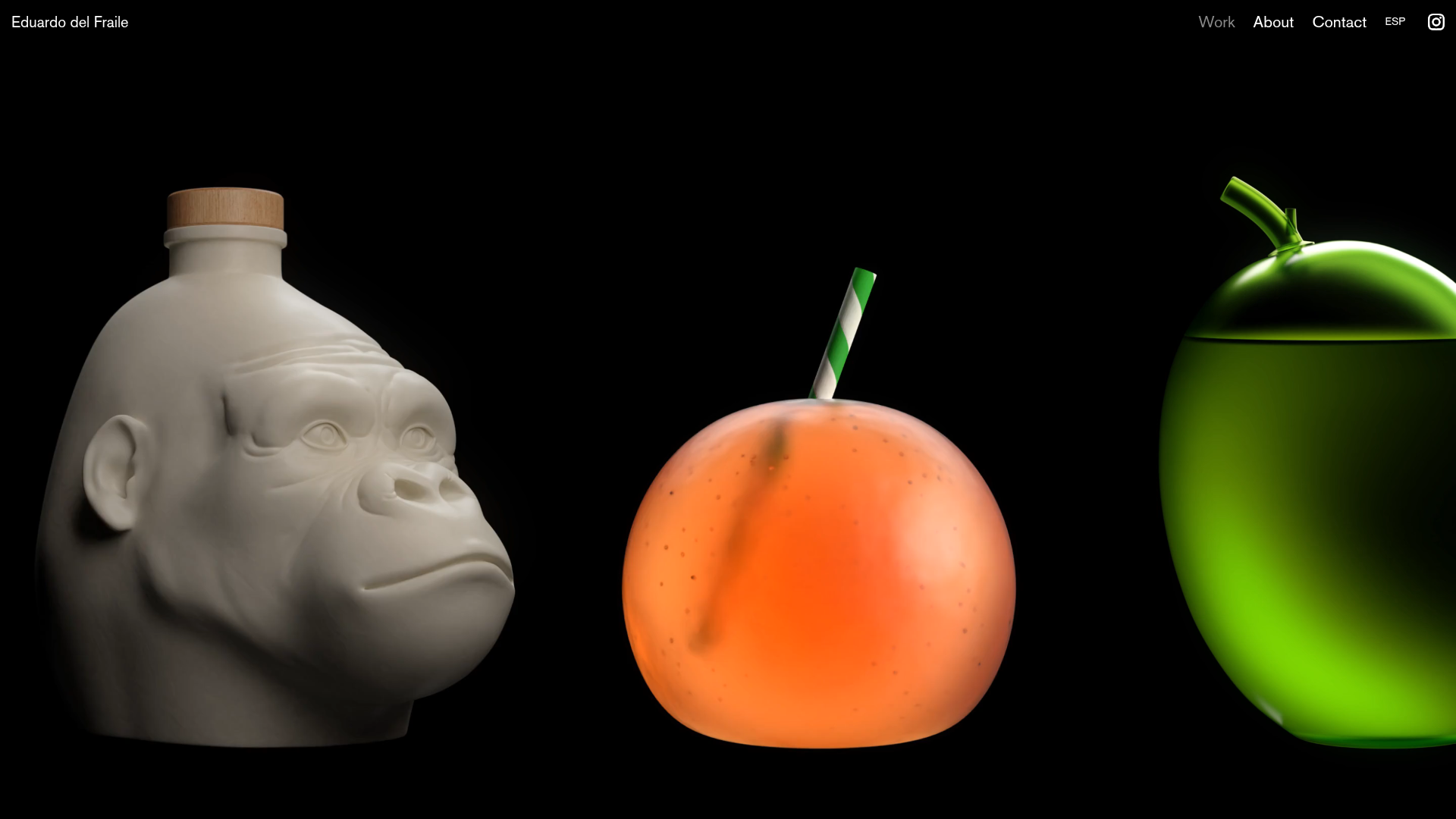
Eduardo del Fraile Horizontal Portfolio
A minimalist horizontal-scroll gallery featuring large-scale media blocks with integrated video-on-hover effects and a custom scrollbar tracker.

Post Familiar Minimalist Winery Storefront
An experimental e-commerce layout featuring a high-contrast age verification screen, bold typography grids, and a horizontal scrollable product showcase.
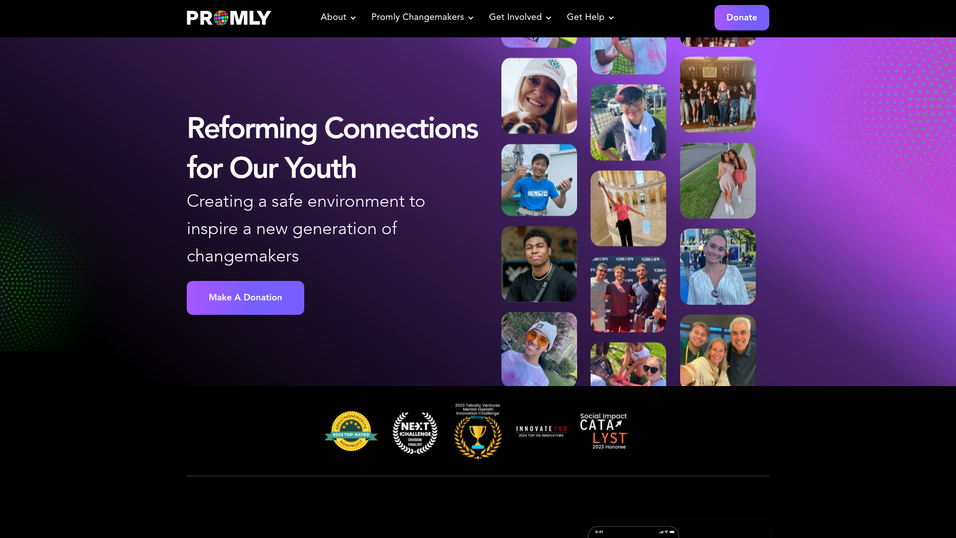
Promly Youth Platform Landing Page
A vibrant dark-mode layout featuring a vertical image marquee, bento-style reward cards, and a press-worthy horizontal slider for community-focused organizations.
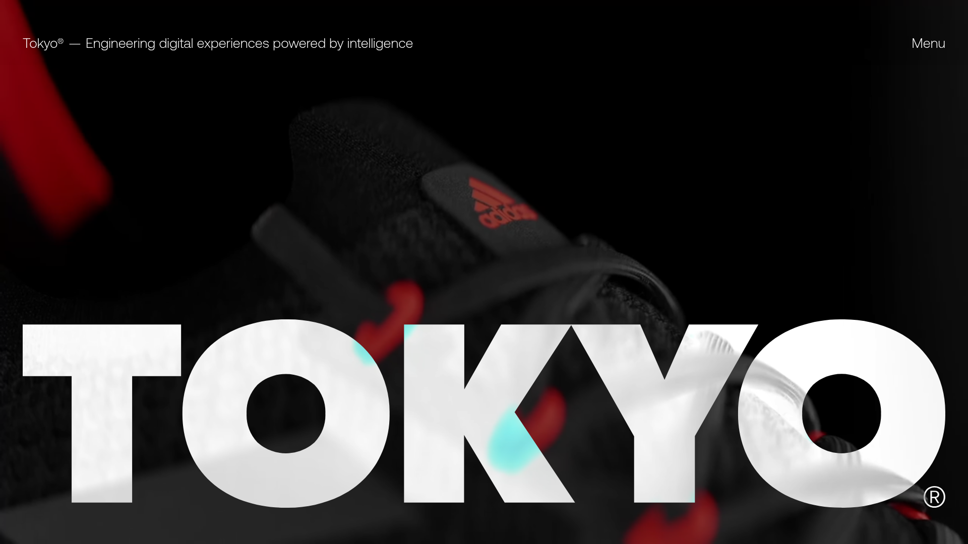
Tokyo Digital Agency Showcase Site
A high-impact agency landing page featuring an animated video hero with oversized typography, logo ticker, and a multi-column project grid with integrated media sliders.
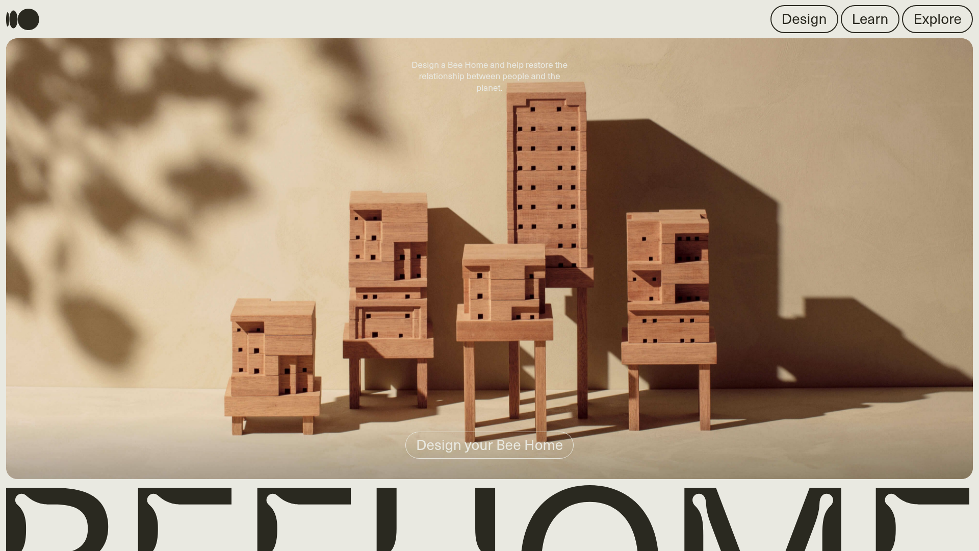
Bee Home Modular Design Landing Page
A minimalist landing page featuring an animated hero section, custom typography, and a modular component architecture built with Gatsby and Emotion CSS.
