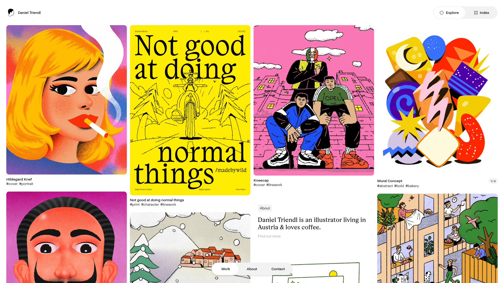
Daniel Triendl Illustration Portfolio Grid
A minimalist masonry-style portfolio featuring a variable-width image grid, integrated text cards, and a clean fixed navigation overlay.
Overview
This website is a sophisticated illustration portfolio that utilizes a dynamic masonry grid layout to showcase visual works of varying aspect ratios. It is an excellent clone reference for creatives and agencies due to its seamless integration of high-impact imagery with minimalist UI elements and embedded textual content.
Design System
- Color Palette & Visual Hierarchy: The UI follows a strict minimalist 'white-label' approach, using a neutral white background (
#ffffff) and black text (#000000). This ensures the vibrant and diverse color palettes of the illustrations remain the primary focus. A light grey (#f5f5f5) is used for UI pill backgrounds (e.g., 'About' tag). - Typography: The system uses a clean sans-serif for navigation and metadata (header, tags) paired with a traditional serif typeface for descriptive content and headlines (e.g., the 'About' section). Metadata like hashtags and titles are scaled down to maintain a lightweight feel.
- Page Structure: The layout follows a non-uniform masonry grid. Unlike standard grids, this implementation allows for varying widths and heights, with occasional text-based 'About' cards interspersed among the image assets. A fixed header contains a minimal logo and utility links ('Explore', 'Index'), while a floating pill-shaped bottom navigation provides core site routing.
- Reusable Components:
- The Grid Card: A flexible container hosting an image with a caption area below for titles and hashtag categories.
- Floating UI Pills: Rounded navigation bars and toggle buttons (Explore/Index) that sit 'above' the content.
- Tagging System: Simple text links starting with '#' used for categorization and filtering.
- Interaction & Motion: The layout focuses on a scan-heavy browsing experience. Based on the UI cues, the grid is likely responsive, reflowing based on viewport width.
- Implementation Clues: The HTML structure suggests a flat, high-level hierarchy where grid items are likely positioned via CSS Grid or a Masonry script to manage the vertical packing of different image heights.
Use Cases
- Target Audience: Illustrators, photographers, muralists, and brand designers who need a visual-first repository for their work.
- Effective Remixes:
- Agency Portfolios: Replace individual illustrations with project case study thumbnails.
- Mood Boards: Use the layout as a digital scrapbooking tool where text cards act as notes or sources.
- E-commerce Lookbooks: Adapt the grid to showcase lifestyle product photography with 'Shop Now' tags replacing the hashtags.
- Remix Directions: Swap the serif font for a bold monospaced font to create a more 'technical' or 'brutalist' aesthetic. The 'About' cards can be expanded into newsletter signup forms or contact prompts.
- Suggested Clone Scope: A full-page clone is recommended to capture the spatial relationship between the floating navigation and the overlapping grid items.
Related Inspirations

MA Quilts Textile Portfolio Site
A vibrant portfolio layout featuring a two-column animated hero, horizontal marquee text, and dynamic CMS-driven grid galleries for showcasing artistic products and blog posts.
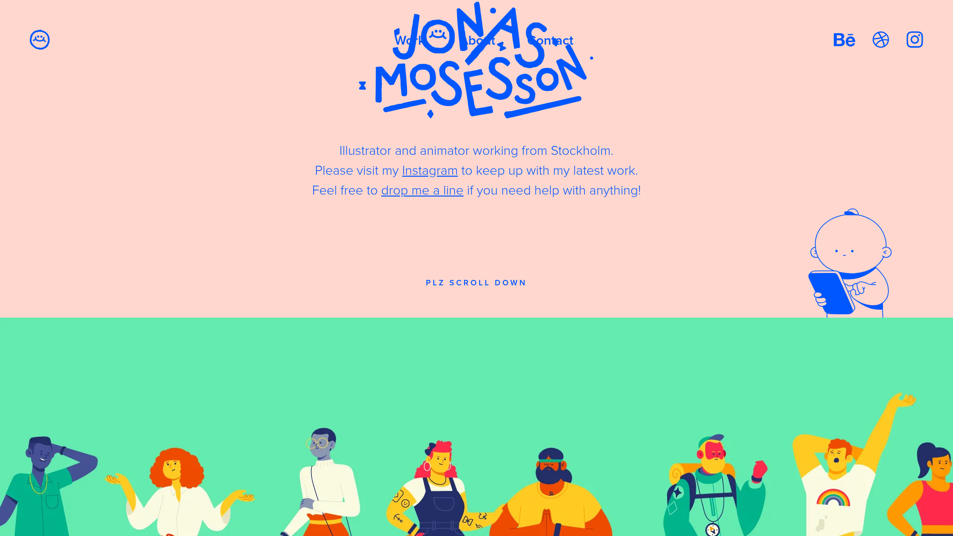
Jonas Mosesson Illustrator Portfolio Layout
A playful portfolio featuring a custom-animated logo header, a responsive multi-column project grid with hover-revealed details, and a distinct minimalist sectioned about page.
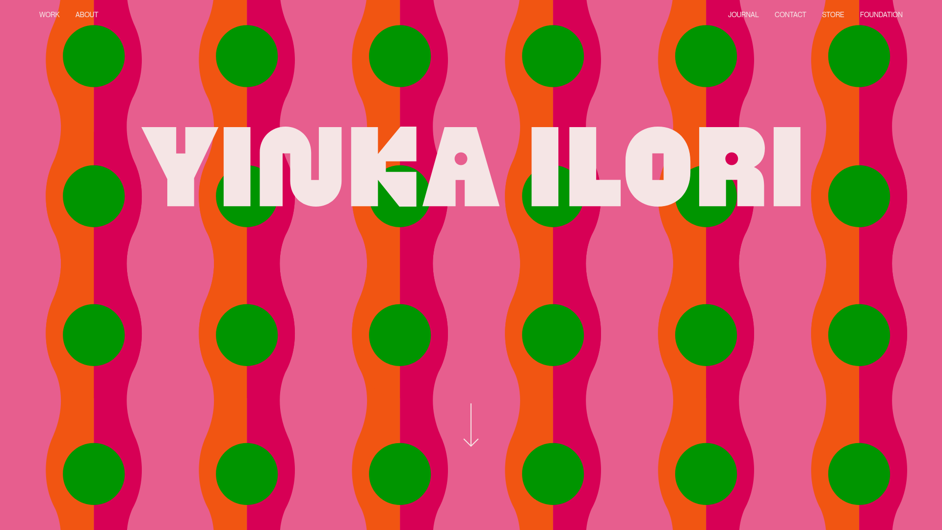
Yinka Ilori Portfolio Mosaic Grid
A vibrant portfolio featuring a scroll-activated parallax hero, bold typography, and a staggered mosaic image grid with asymmetric layouts and fade-in animations.
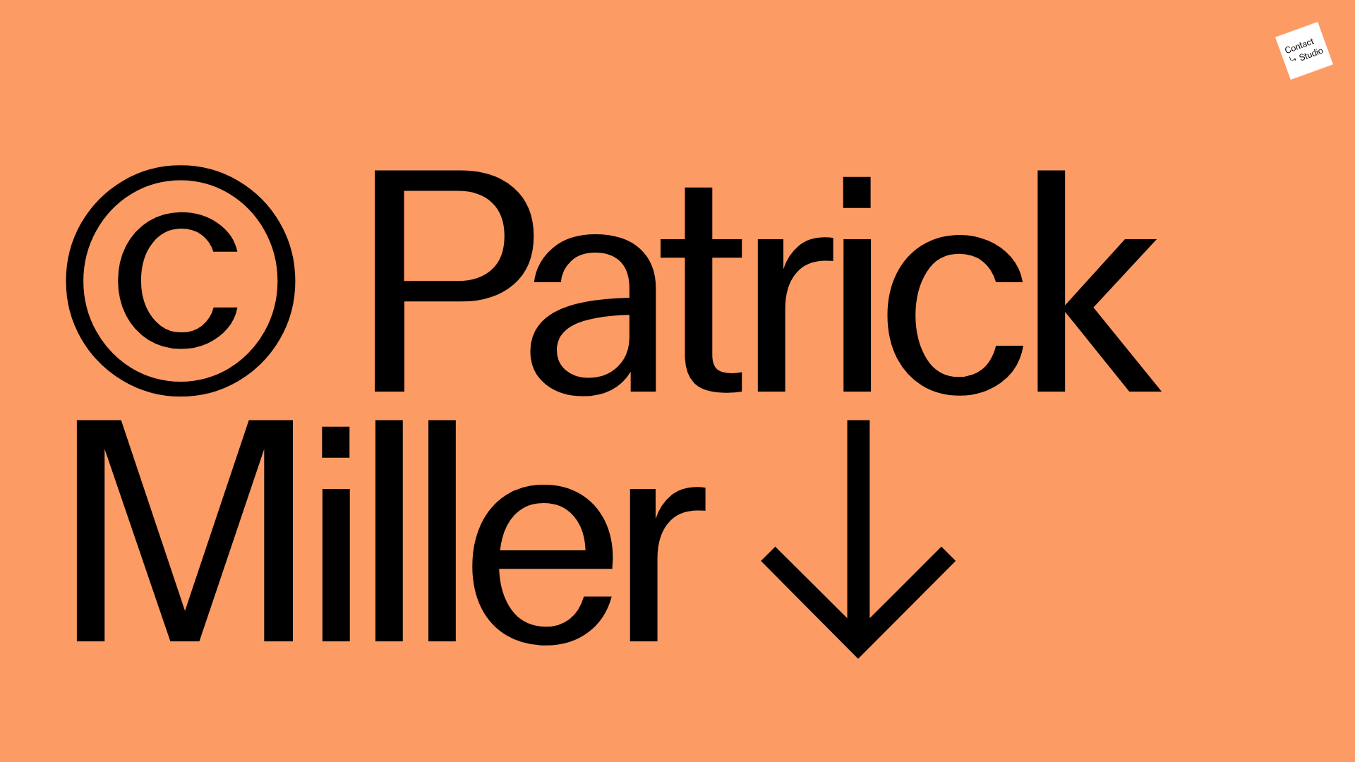
Patrick Miller Photography Portfolio Template
A minimalist, full-bleed photography portfolio featuring a split-screen grid, scroll-triggered section transitions, and integrated Swiper.js image carousels for project galleries.
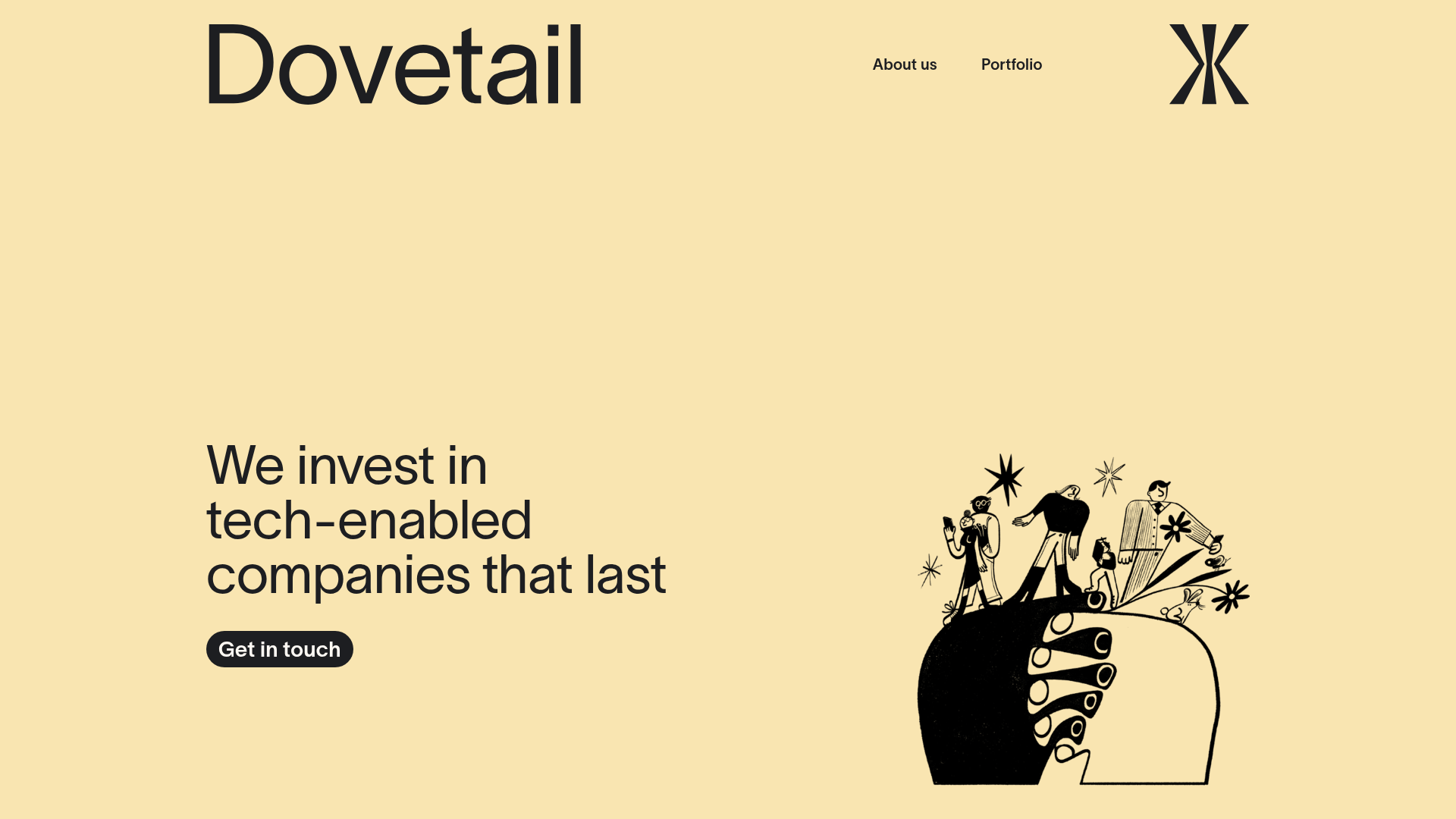
Dovetail Venture Portfolio Landing Page
A minimalist investment site featuring a warm pastel palette, distinctive hand-drawn illustrations, horizontal carousel for project cases, and a clean typography-focused grid layout.
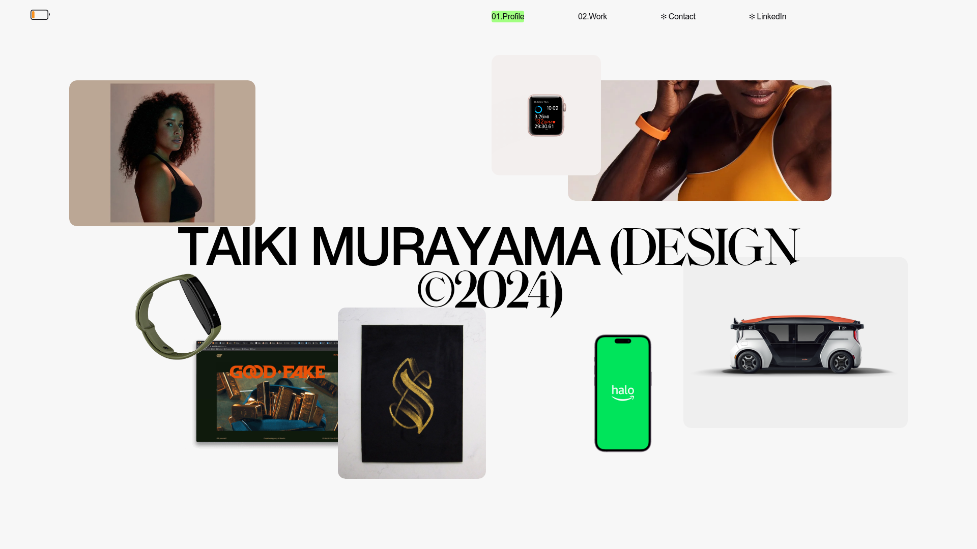
Taiki Murayama Portfolio Bento Grid
A minimalist designer portfolio featuring a dynamic bento-style layout for project imagery, integrated accordion project lists, and high-contrast typography.
