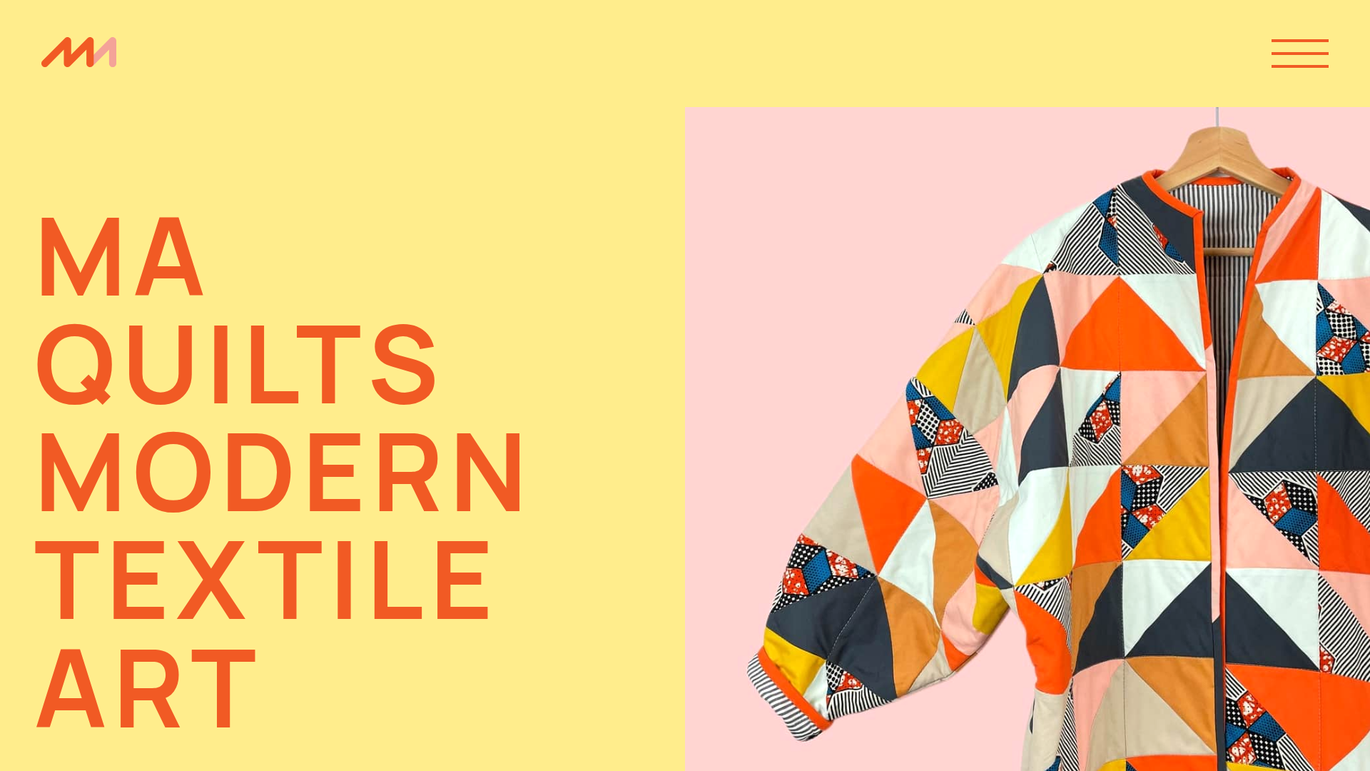
MA Quilts Textile Portfolio Site
A vibrant portfolio layout featuring a two-column animated hero, horizontal marquee text, and dynamic CMS-driven grid galleries for showcasing artistic products and blog posts.
Overview
This textile portfolio website serves as an excellent reference for creators who want to combine bold, graphic design with a structured gallery experience. It uses a high-contrast two-column hero section and dynamic CMS-driven grids to balance artistic expression with professional content organization. Builders should look to this site for its effective use of color blocking, marquee motion, and a tactile, material-inspired UI.
Design System
- Color Palette & Visual Hierarchy: The site uses a high-saturation primary palette featuring warm yellow (#F7E07E), vibrant orange, and soft pink backgrounds. Visual hierarchy is established through extreme scale; large, bold orange headings contrast against clean, spacious backgrounds to guide the eye immediately to the brand message.
- Typography: The system relies on a bold, sans-serif typeface (as seen in the
home-intro-headingandlarge-headingclasses). Text is used as a graphic element, utilizing all-caps and tight line-heights for impact, while body copy remains centered and readable. - Structure & Layout:
- Split Hero: A
home-hero-columnslayout with text on the left and a large, high-quality product image in an overflow container on the right. - Grid Galleries: CMS-driven
more-quilts-feed(4-column) andblog-block(3-column) grids for visual storytelling. - Marquee Section: A full-width
process-blockfeaturing large-scale sliding text (marquee-heading). - Dynamic Footer: A two-part footer with a logo-heavy top section and a decorative
footer-patternbase.
- Split Hero: A
- Reusable Components:
large-btn: A simple, high-contrast button style used for clear CTAs.more-quilts-item: A reusable card component combining a square image ratio with a clean bottom-aligned heading.menu-overlay: A full-screen slide-out navigation menu triggered by the hamburger icon.
- Motion Patterns: The HTML reveals sophisticated animations including
transform3dtransitions on the menu, a marquee-style sliding header in the process section, and a Lottie animation integration (data-animation-type="lottie") for interactive visual interest. - Responsive Behavior: The use of
w-col-stackandw-col-small-small-stackclasses indicates a robust grid system that collapses columns into a centered vertical stack for mobile devices, ensuring high-impact typography remains legible.
Use Cases
- Who should clone this: Artists, fashion designers, and makers whose work is physical, vibrant, and pattern-oriented. It is ideal for portfolios that need to feel as creative as the work being showcased.
- Effective Remixes: High-end boutique e-commerce sites can remix this by replacing the "See all quilts" buttons with "Shop Collection" CTAs. Interior design firms could leverage the bold typography to highlight specific project themes.
- Remix Directions:
- Color Swap: Replace the bright yellow/orange for a more muted, monochromatic palette to adapt the site for a luxury minimalist brand.
- Scope Selection: Clone the
home-hero-introandprocess-blocksections first to create a high-impact landing page without needing a full blog infrastructure. - IA Adaptation: Use the 3-column blog grid as a services section or a client testimonial grid.
Related Inspirations
Patrick Miller Photography Portfolio Template
A minimalist, full-bleed photography portfolio featuring a split-screen grid, scroll-triggered section transitions, and integrated Swiper.js image carousels for project galleries.
Taiki Murayama Portfolio Bento Grid
A minimalist designer portfolio featuring a dynamic bento-style layout for project imagery, integrated accordion project lists, and high-contrast typography.
Ángel Valiente Design Portfolio
A minimalist design portfolio featuring a full-bleed hero slider, a bento-style product grid with randomized image rotations, and a clean two-column industrial layout.

Clase Agency Branding Portfolio
A minimalist design agency portfolio featuring a typographic hero section, full-width image articles, sticky title bars, and integrated scrolling text marquees for a clean editorial layout.
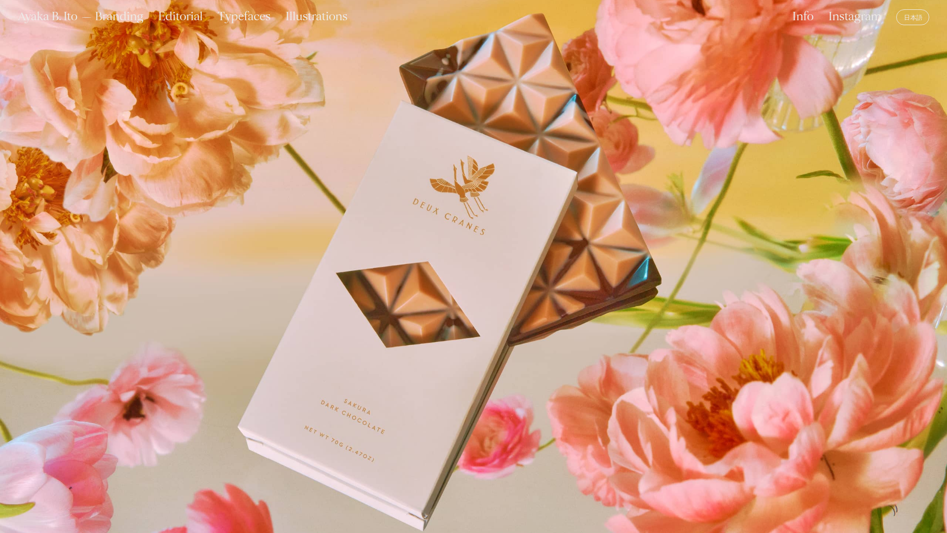
Ayaka B. Ito Creative Portfolio
A minimalist design portfolio featuring an immersive full-screen hero image, clean typographic navigation, and a structured layout for showcasing branding and editorial projects.
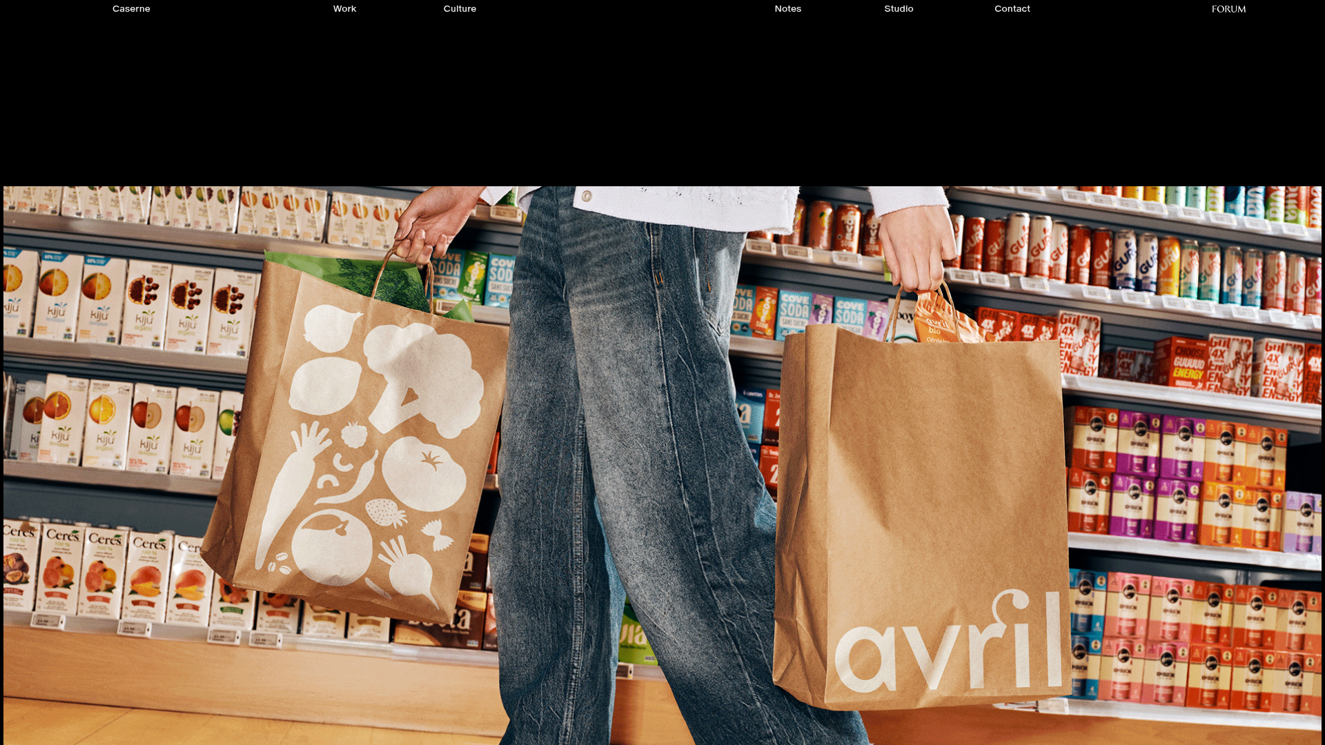
Caserne Design Studio Portfolio
A minimalist, high-impact portfolio featuring a dynamic masonry grid of project thumbnails with overlay text and a clean, oversized typography-driven footer.
