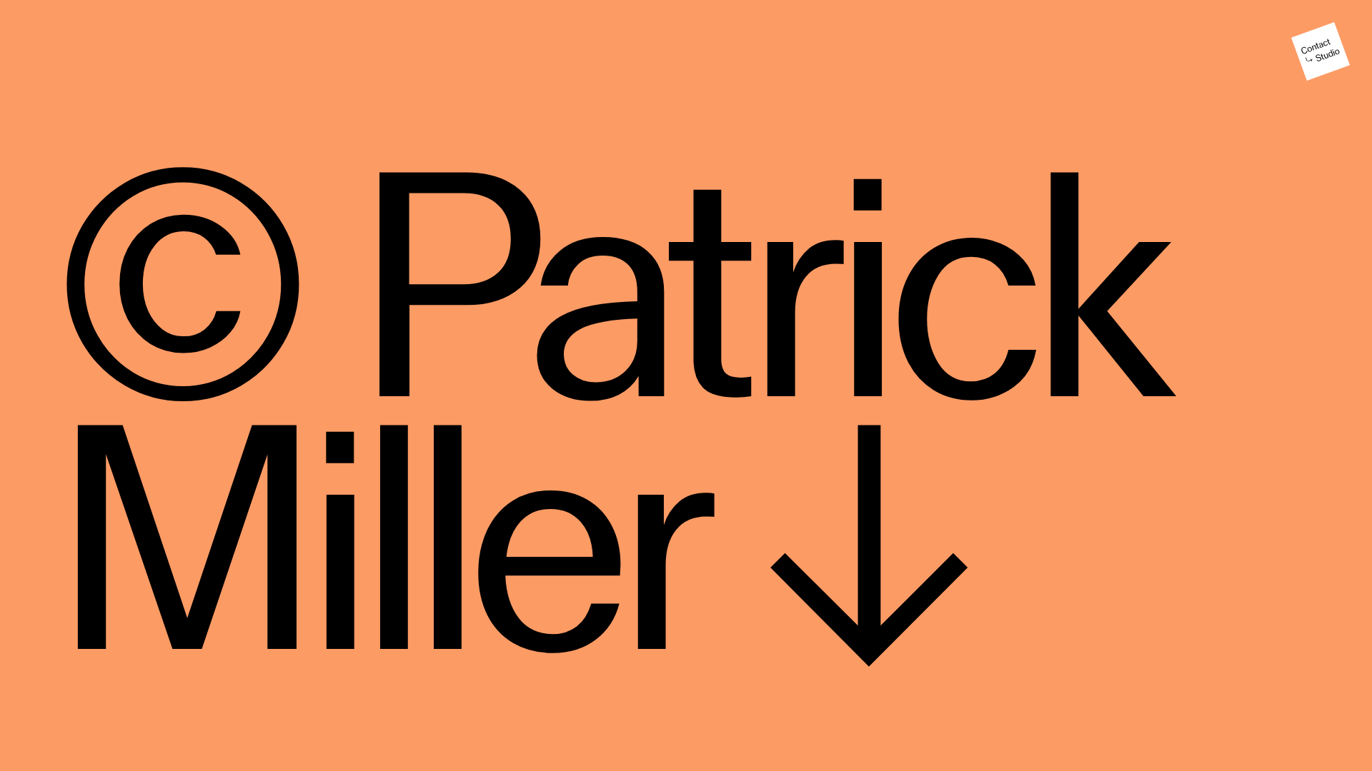
Patrick Miller Photography Portfolio Template
A minimalist, full-bleed photography portfolio featuring a split-screen grid, scroll-triggered section transitions, and integrated Swiper.js image carousels for project galleries.
Overview
This portfolio for photographer Patrick Miller is a masterclass in minimalist, high-impact visual storytelling. It utilizes a bold, split-screen grid and seamless scroll-triggered transitions to showcase imagery with varying scales and background treatments. It is a strong reference for builders because of its elegant integration of Swiper.js for effortless horizontal project browsing within a vertical scroll flow.
Design System
- Color Palette & Visual Hierarchy: The site uses a high-contrast base of deep blacks and pure whites, punctuated by bold, monochromatic background blocks (e.g.,
bg-color-1tobg-color-8) that correspond to specific photo series. This creates a clear visual distinction between projects as the user scrolls. - Typography: A clean, neo-grotesque sans-serif dominates the site. Headlines (H4) are used sparingly for series titles (e.g., "Form Magazine", "Architecture"), while the landing hero uses massive, high-weight type with a heavy copyright symbol and arrow glyph to set the tone.
- Page Structure: The layout follows a strictly modular vertical stack of
<section>tags. Each section alternates between three layouts: awholewidth view, ahalfwidth split-screen, and ahalfwidth container hosting a project-specific slider. - Reusable Components:
- Integrated Sliders: The
swiper-containerimplementation includes fraction pagination (e.g., "1 / 10") and simple text-arrow navigation (→,←), making it highly reusable for any creative gallery. - Full-Bleed Grid: The
halfandwholeclass system provides a predictable framework for responsive imagery.
- Integrated Sliders: The
- Interaction & Motion: The design utilizes custom CSS classes like
.swingand.upon images, suggesting subtle entry animations. The transition between full-color backgrounds and product carousels creates a dynamic, magazine-like reading experience. - Implementation Clues: The HTML reveals a dependency on
Swiper.jsfor carousel logic and a utility-first approach to layout (classes likebg-color-black,bg-color-white,half, andshow).
Use Cases
- Who Should Clone: Photographers, cinematographers, and editorial designers looking for a high-end, uncluttered way to present diverse bodies of work.
- Remix Products: This pattern works effectively for high-fashion brand lookbooks, architectural firm portfolios, or premium product catalogs where visual storytelling outweighs text.
- Practical Remix Directions:
- Archive/Index: Add a fixed hamburger menu or a filterable project index for easier navigation across many projects.
- Information Layer: Overlay captions or tech specs on the
halfwidth slides for more context. - Brand Switch: Swap the monochromatic background classes for a brand's primary and secondary palette to shift the mood from artistic to corporate.
- Suggested Clone Scope: Start with a single
<section>containing aswiper-containerto master the horizontal-slide-within-vertical-scroll layout, then expand to the full-page split-screen architecture.
Related Inspirations
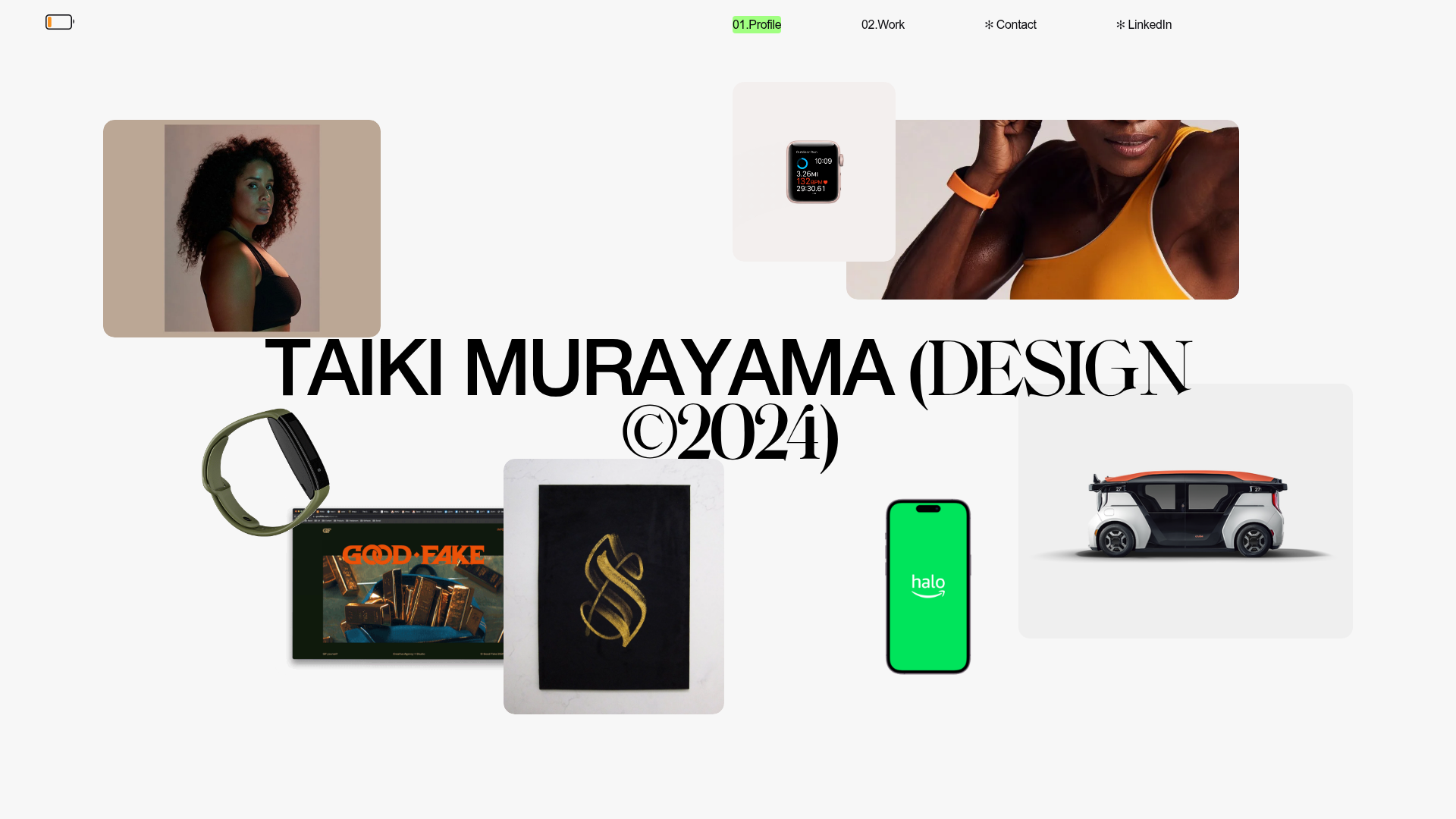
Taiki Murayama Portfolio Bento Grid
A minimalist designer portfolio featuring a dynamic bento-style layout for project imagery, integrated accordion project lists, and high-contrast typography.
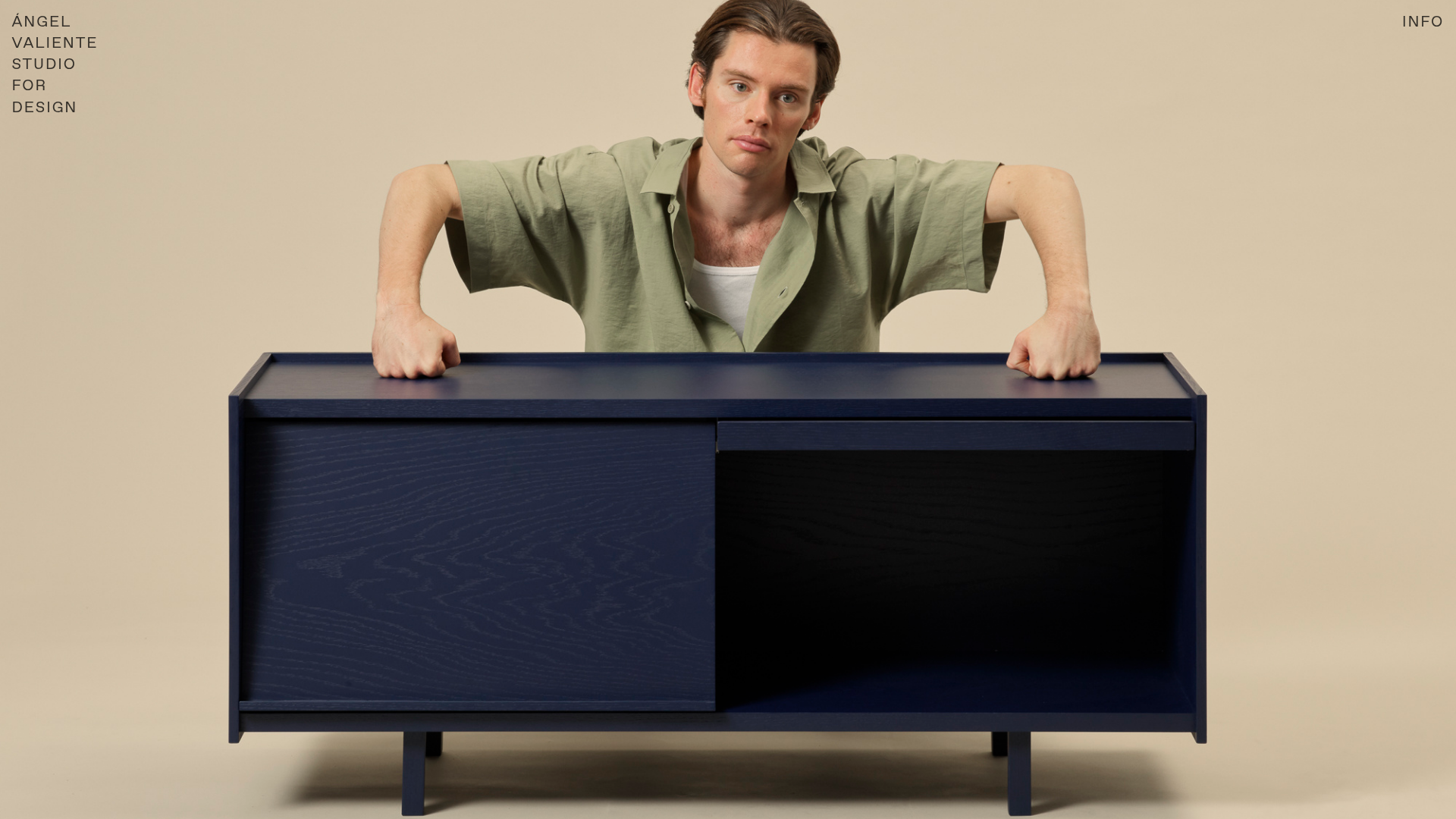
Ángel Valiente Design Portfolio
A minimalist design portfolio featuring a full-bleed hero slider, a bento-style product grid with randomized image rotations, and a clean two-column industrial layout.
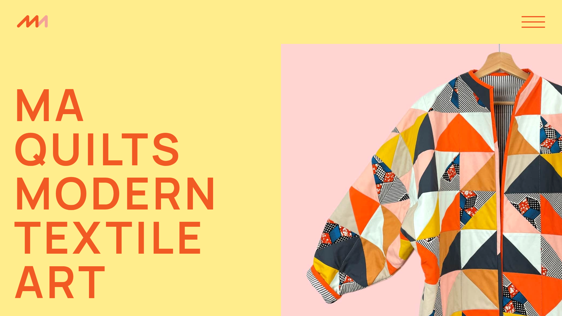
MA Quilts Textile Portfolio Site
A vibrant portfolio layout featuring a two-column animated hero, horizontal marquee text, and dynamic CMS-driven grid galleries for showcasing artistic products and blog posts.

Clase Agency Branding Portfolio
A minimalist design agency portfolio featuring a typographic hero section, full-width image articles, sticky title bars, and integrated scrolling text marquees for a clean editorial layout.

Ayaka B. Ito Creative Portfolio
A minimalist design portfolio featuring an immersive full-screen hero image, clean typographic navigation, and a structured layout for showcasing branding and editorial projects.

Caserne Design Studio Portfolio
A minimalist, high-impact portfolio featuring a dynamic masonry grid of project thumbnails with overlay text and a clean, oversized typography-driven footer.
