Dovetail AI SaaS Landing Page
A dark-themed landing page featuring a grid-pattern hero, layered product dashboard previews, feature walkthroughs with sticky scrolling, and integrated logo carousels.
Overview
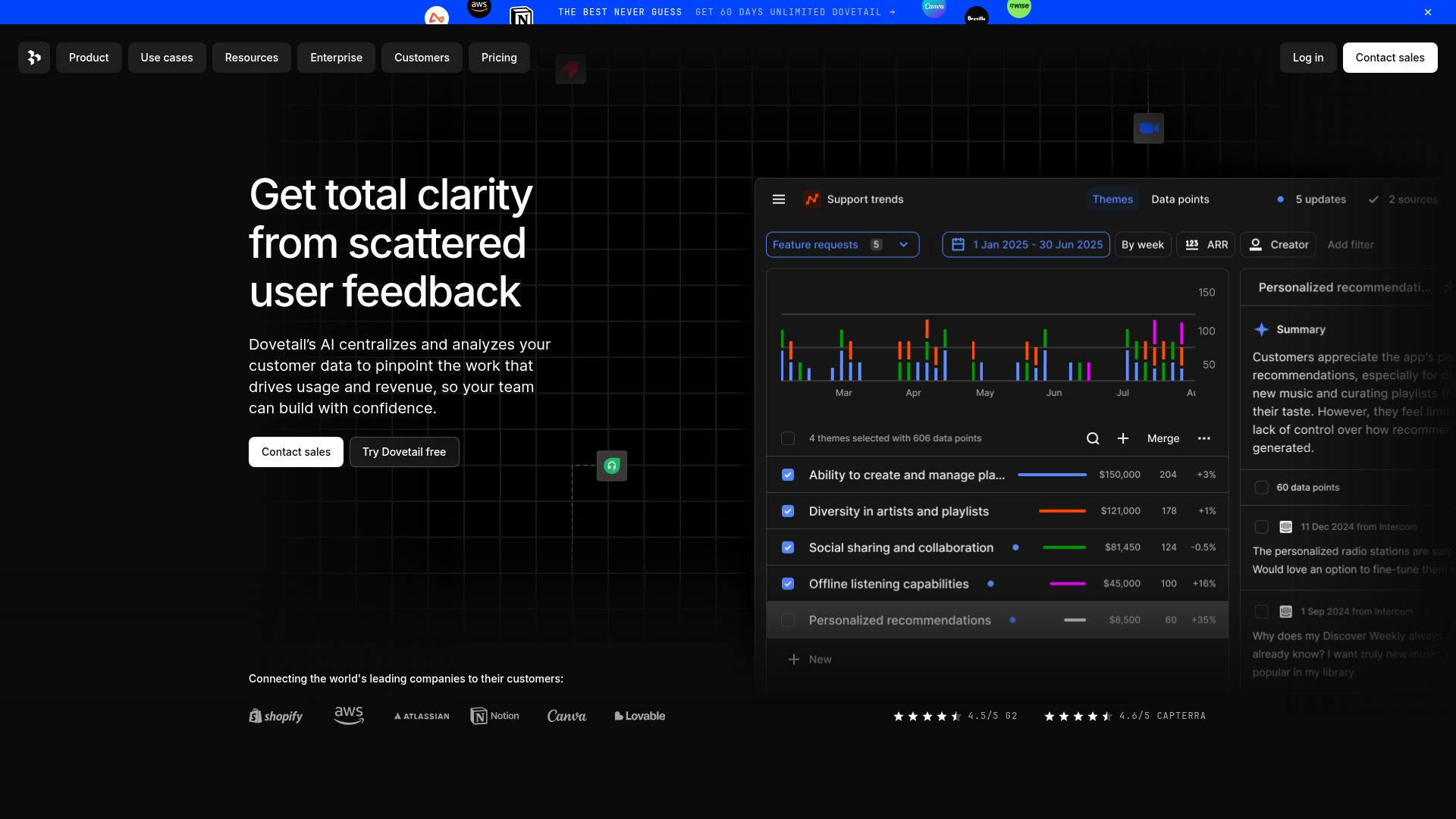
Dovetail’s landing page is a masterclass in modern, dark-themed SaaS design, utilizing high-contrast typography and a sophisticated "grid-pattern" aesthetic. It is a strong reference for designers building data-intensive products that need to convey authority, intelligence, and high-tech capabilities through layered dashboard previews and structured feature storytelling.
Design System
- Color Palette and Visual Hierarchy: The site uses a deep black (#000000) background paired with a subtle dark grey grid. Primary branding utilizes a vibrant spectrum of neons (purple, green, orange) within the UI mockups to break the monochrome. Primary CTAs are high-contrast (pure white with black text) to ensure immediate focal points against the dark backdrop.
- Typography System: Primarily sans-serif (Inter or similar), focusing on bold weights for the hero (H1) and a structured hierarchy for feature headings. It uses a wide line-height in paragraph text to maintain readability on dark backgrounds and uses utility monospaced text (e.g., "[01] Centralize") for technical emphasis.
- Page Structure and Section Flow: The flow starts with a minimalist top-aligned nav, followed by a wide-margin hero. It transitions into a logo carousel of high-profile enterprises (Shopify, AWS, Canva), followed by a modular 4-step feature walkthrough that uses sticky scrolling to keep product mockups visible while text descriptions cycle through.
- Reusable Components:
- The Grid Hero: A video-backed grid background that creates depth without clutter.
- Feature Stepper: A vertical list with bracketed numbering (e.g.,
[01]) and nested pill badges (e.g., "Beta"). - Logo Bar: A clean, single-row monochrome logo cloud for social proof.
- Review Badges: Simple star-rated badges footer-aligned in the hero section for immediate trust.
- Interaction and Motion Patterns: The page features sticky-positioning for product screens, allowing the UI to remain fixed on the left while the corresponding feature descriptions scroll on the right. Buttons use a subtle backdrop-blur (8px) and hover transitions to indicate interactivity.
- Implementation Clues: Built with Gatsby (evident from
id="gatsby-focus-wrapper") and utilizes Emotion/Styled Components for CSS, indicated by the hashed class names (e.g.,css-1y9rjz). The layout relies heavily on a flexible grid system and stackedz-indexlayers for the dashboard overlays.
Use Cases
- Who should clone this: B2B SaaS companies, AI-driven analytics platforms, and developer tooling startups looking for a "Pro" or "Enterprise" aesthetic.
- What products can remix it: Project management tools, CRM dashboards, or any software that needs to showcase complex data visualizations within a clean marketing framework.
- Practical remix directions: Developers can swap the black background for a deep Navy to soften the look or replace the grid video with a static noise texture. The "Feature Stepper" is the most valuable logic to reuse—it can be adapted to explain any multi-step onboarding or workflow process.
- Suggested clone scope: High-impact clones would focus on the Hero section (for the grid effect) and the Sticky Feature Walkthrough (for the interaction logic). A full-page clone is ideal for brands attempting to establish a premium, high-trust identity quickly.
Related Inspirations
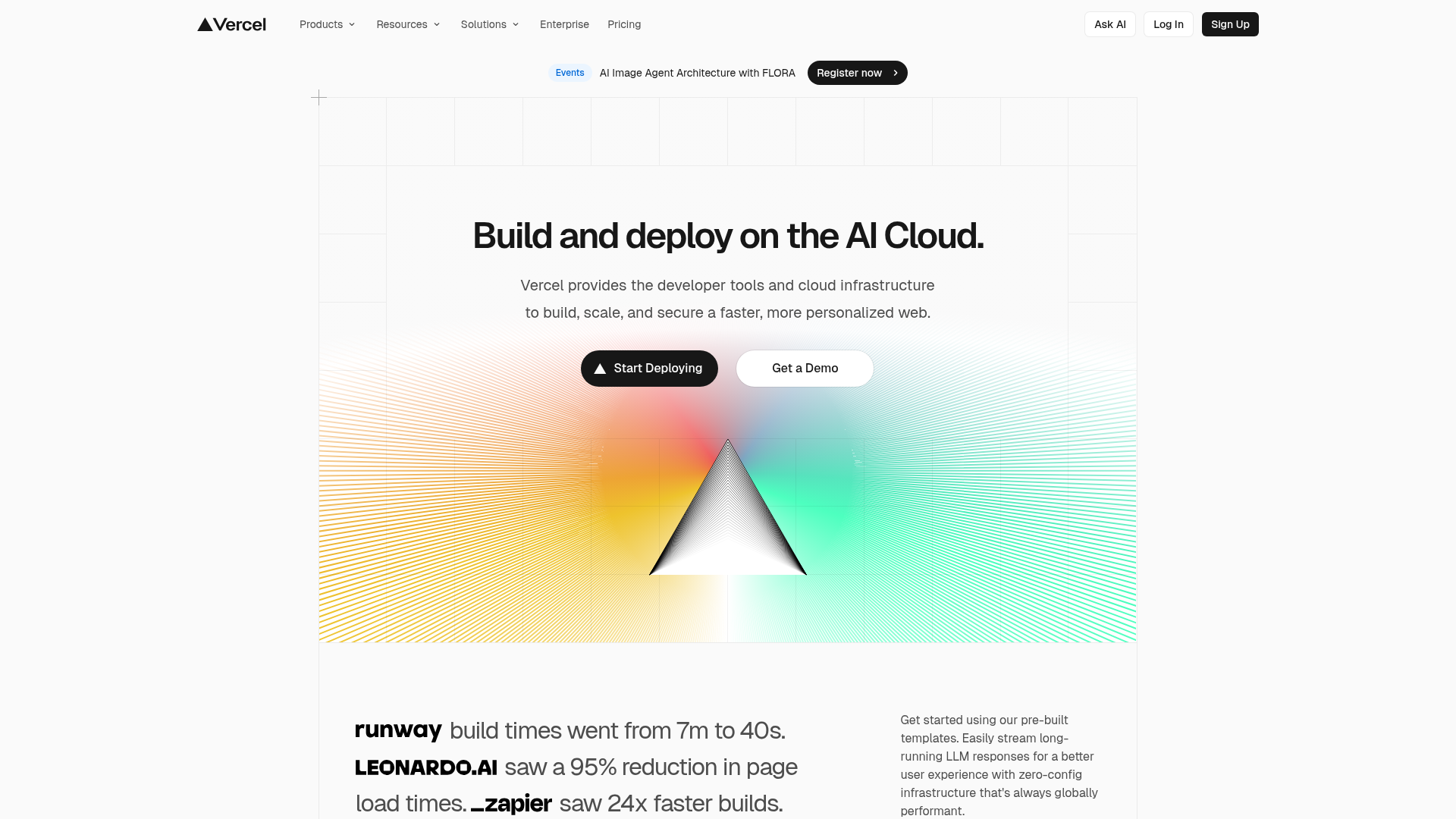
Vercel AI Cloud Landing Page
A modern landing page featuring a minimalist dark-themed navbar, a grid-overlay hero section with radial color gradients, and high-contrast typography for customer success stories.
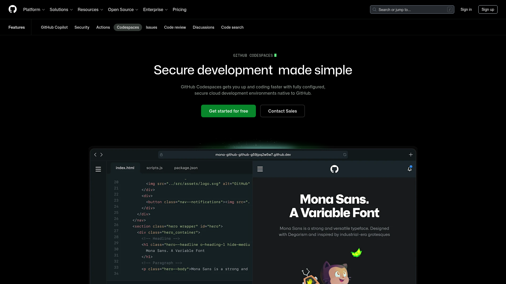
GitHub Codespaces Feature Landing Page
A dark-themed product page featuring a terminal-inspired hero section, cursor animations, staggered feature 'rivers' with media, and a breakout wide-image component for dashboards.
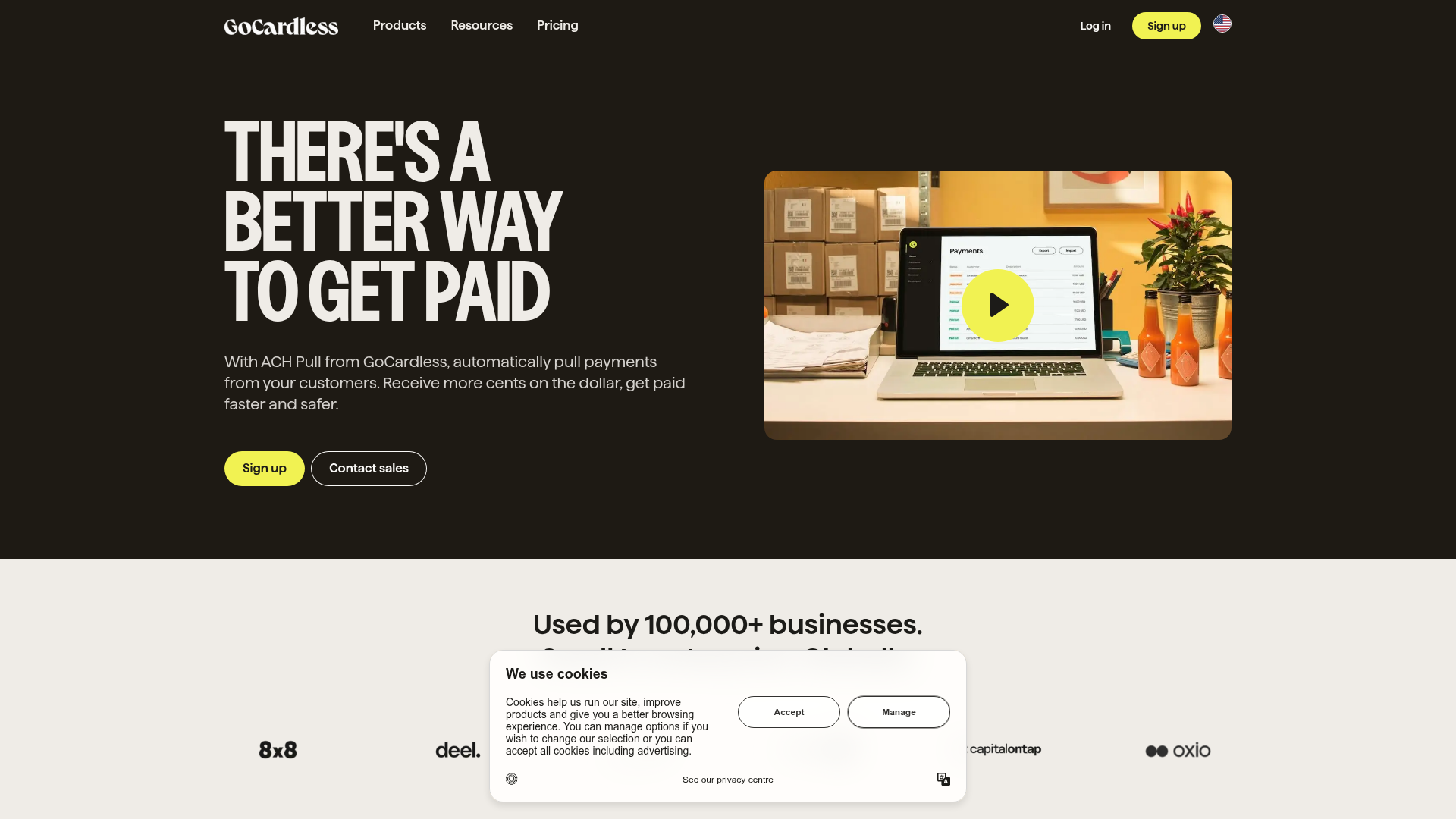
GoCardless Payments Platform Landing Page
A dark-themed fintech landing page featuring a split-screen video hero, bento-style feature cards, a horizontal logo slider, and step-by-step accordion guides.
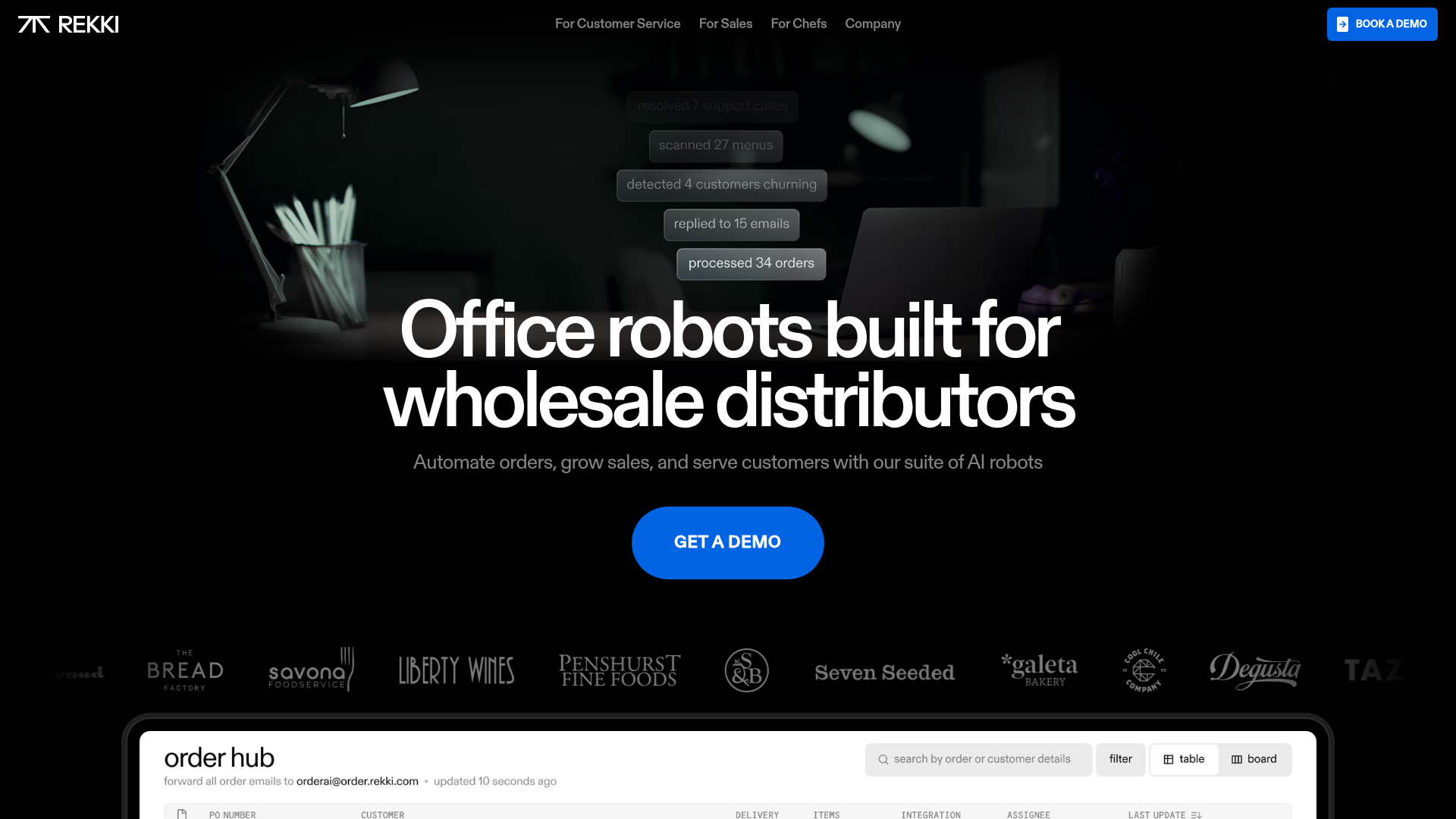
REKKI AI Automation SaaS Landing Page
A high-impact dark-mode landing page featuring a floating label hero section, marquee brand logos, an interactive dashboard UI preview, and card-based testimonial grids.
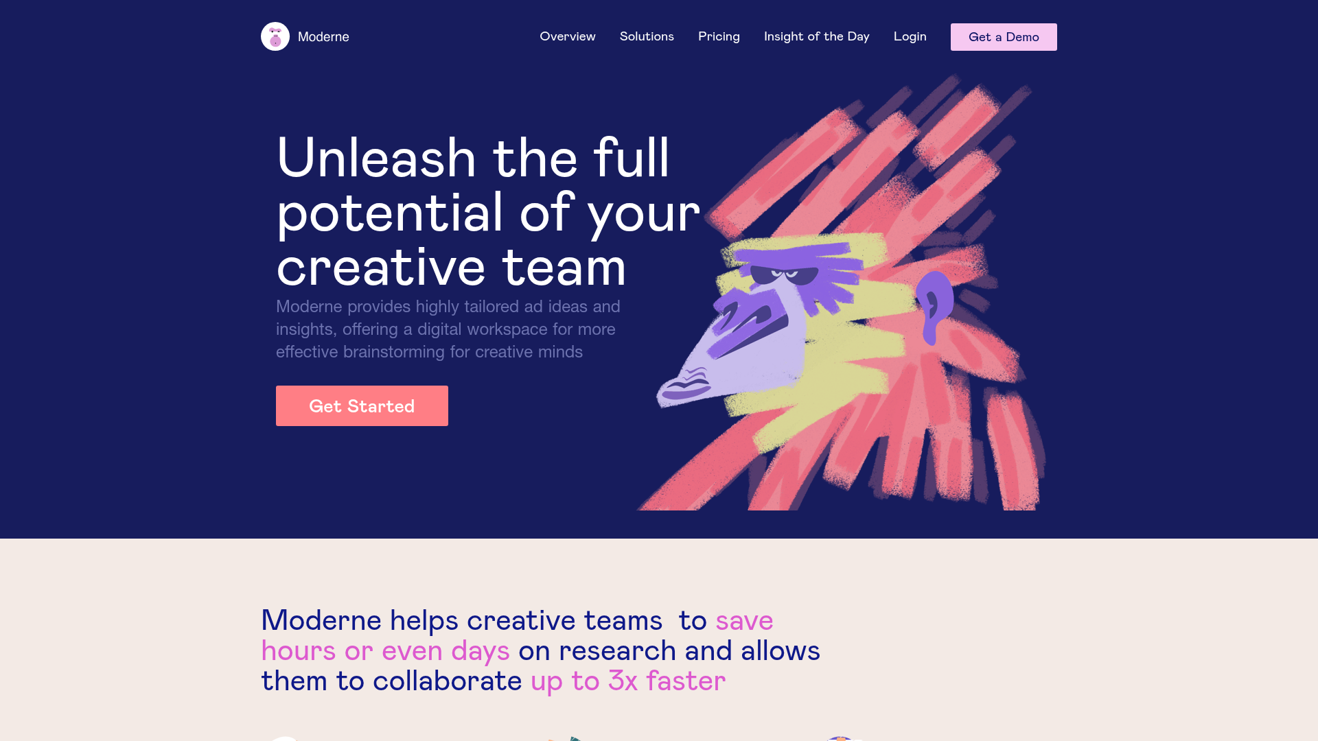
Moderne Creative Landing Page
A high-contrast landing page featuring a dark hero section with an artistic illustration overlay, distinct alternating content blocks, and a visual comparison bar chart component.
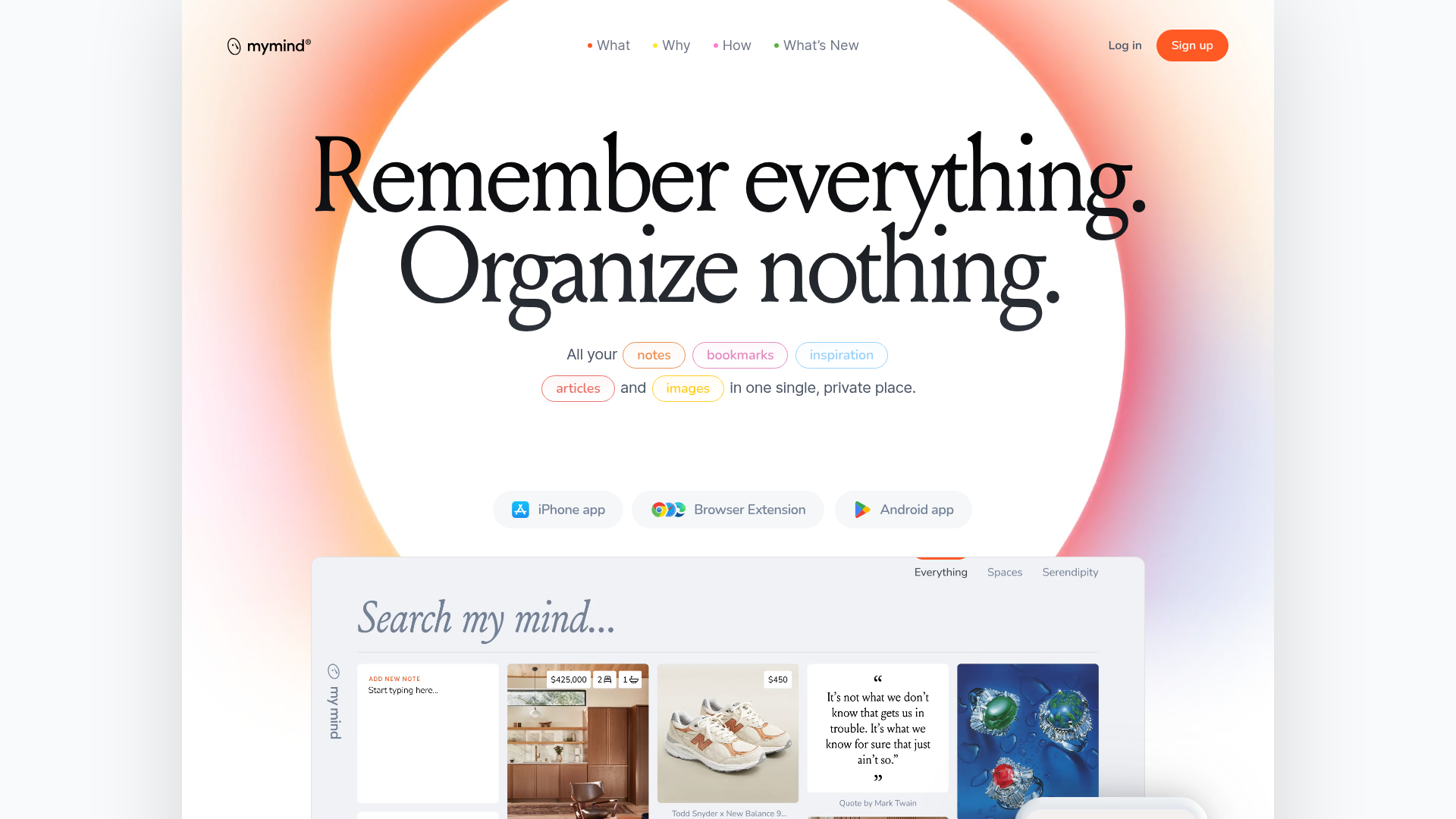
Mymind AI Tool Landing Page
A minimalist SaaS landing page featuring a soft-gradient hero section, custom pill-shaped text badges, and a dynamic bento-style search result preview grid.
