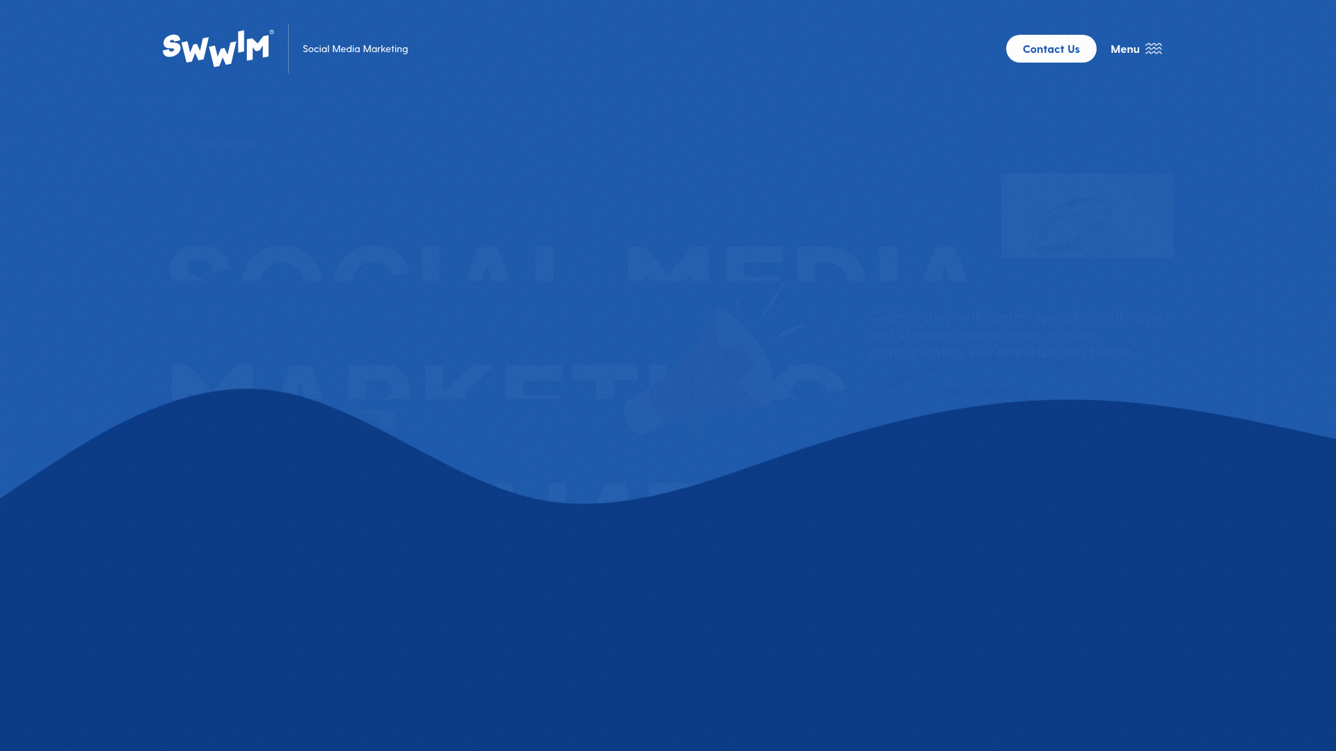
SWWIM Social Agency Landing Page
A high-impact agency design featuring a wave-styled hero section, marquee ticker, floating animated SVGs, and a boutique content feed layout for case studies and news.

Overview
This landing page is a high-impact agency showcase for SWWIM, featuring a bold, liquid-inspired aesthetic that breaks traditional grid boundaries. It is an excellent reference for builders looking to implement organic shapes, fluid scrolling animations, and a sophisticated monochromatic-to-high-contrast color transition.
Design System
- Color Palette & Visual Hierarchy: The site uses a deep "Blue-Dark" and a vibrant "Blue" base accented with white and a "grain" texture overlay for tactile depth. Hierarchy is established through massive display typography and negative space, transitioning from a dark blue hero into a clean white content section.
- Typography: A heavy, all-caps sans-serif font-display is used for headers (up to 170px) to create high visual impact. Body copy uses a medium-weight sans-serif for readability, with "Social Media Marketing" and "That Floats" serving as the primary anchors.
- Page Structure:
- Hero Section: Large-scale typography overlaying a wave-shaped divider.
- Ticker Marquee: A horizontal scrolling list of services (Brand Strategy, Events, etc.) between borders.
- Intro Grid: An asymmetrical layout featuring overlapping images with parallax speeds and floating SVG icons (megaphone, rubber ring).
- News/Feed Section: A vertical list of articles with high-contrast text and hover-active image previews.
- Reusable Components:
- Floating SVGs: Elements with
animate--wiggleandanimate--floatclasses. - Marquee: A two-part CSS animation creates a seamless loop for service lists.
- Wave Divider: A large SVG/div shape that creates the liquid transition between background colors.
- Fancy Links: Links with a bottom border and marquee hover state.
- Floating SVGs: Elements with
- Interactions: The design relies on
data-scroll-speedfor parallax effects andtransform: translateYfor text reveal animations. Buttons feature scale transitions (hover:scale-[1.15]), and the custom grain overlay (.grain) is fixed to the viewport to maintain texture during scroll. - Implementation Clues: Built with Next.js (
__next), Tailwind CSS (utility classes likebg-blue-dark,flex,z-[100]), and Sanity CMS for image assets. Scroll-based triggers are handled via a custom library indicated bydata-scroll-containerandis-inviewattributes.
Use Cases
- Who should clone this: Creative agencies, boutique studios, or freelancers needing a high-energy, personality-driven portfolio that feels premium and custom-coded.
- Remix Directions: Swap the blue palette for a brand-specific primary color; the grain texture and wave-style dividers will work with any high-contrast pairing (e.g., Deep Green to Cream). The asymmetrical image grid is perfect for showcasing product photography or architectural projects.
- Suggested Scope: Developers should prioritize cloning the Hero Wave Section and the Scroll-Triggered Image Grid as standalone modules to elevate existing flat designs. The full-page clone is best for those wanting to replicate the specific high-motion "smooth scroll" feel of the original.
Related Inspirations
SWWIM Social Agency Animated Hero
A dynamic landing page featuring a wave-layered layout, ticker-tape marquees, floating SVG illustrations, and high-contrast typography in a blue-and-white nautical aesthetic.
Squadeasy Employee Engagement SaaS Landing Page
A vibrant wellness platform layout featuring a sticky navigation bar, modular high-contrast sections, interactive testimonials slider, and animated data counting components.
ilovecreatives Edu-Commerce Landing Page
A high-impact educational landing page featuring a parallax image hero, elegant serif typography, inline-image text treatments, and a horizontal carousel for course listings.
Letter Private Banking Landing Page
Features a high-impact dark hero section with video backgrounds, elegant typography, and a staggered grid of service panels using varied color themes and video assets.
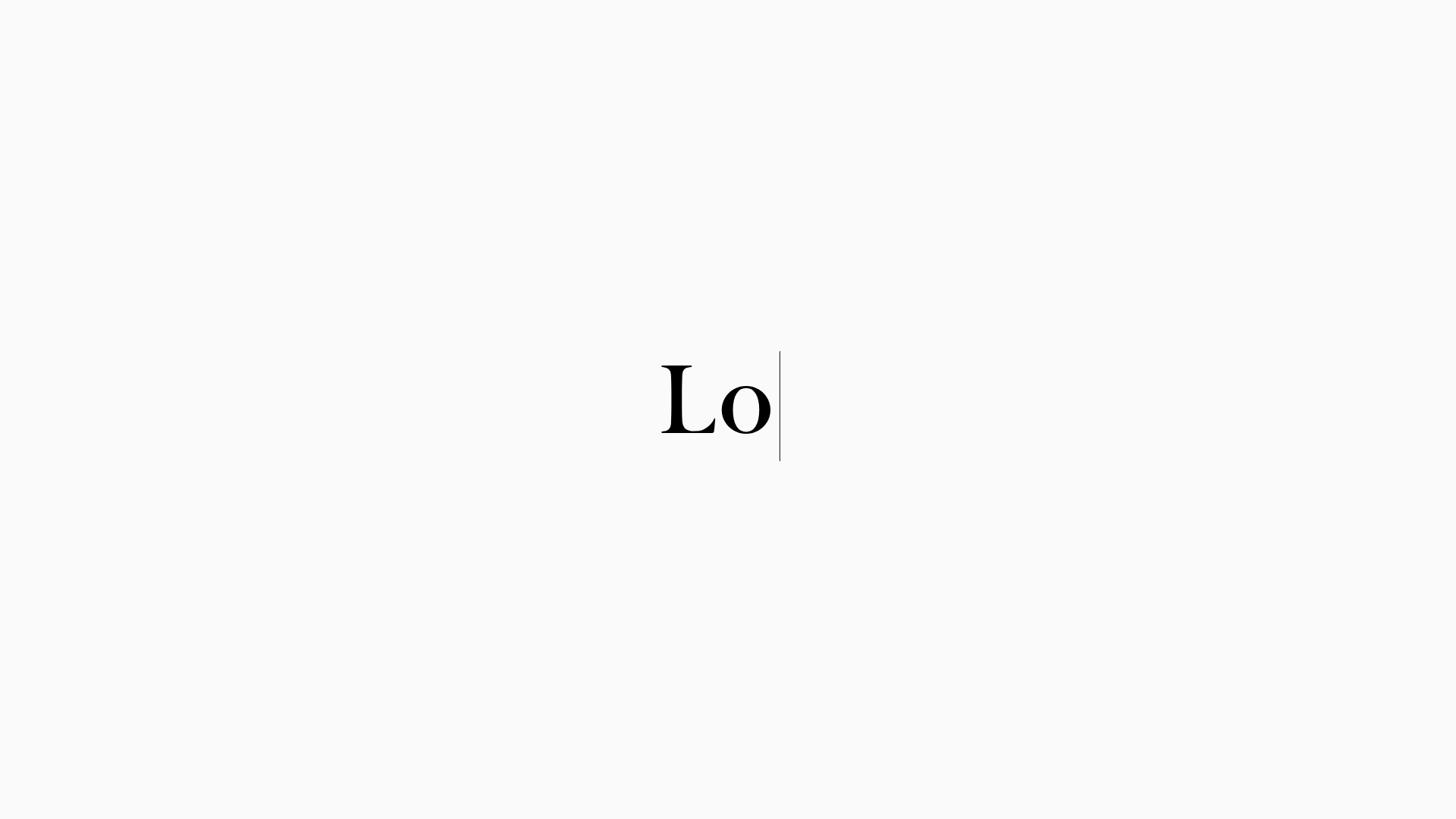
LoveFrom Minimalist Animated Wordmark Landing
A minimalist landing page featuring a center-aligned animated wordmark, a hidden info panel, and a decorative bear animation overlay.
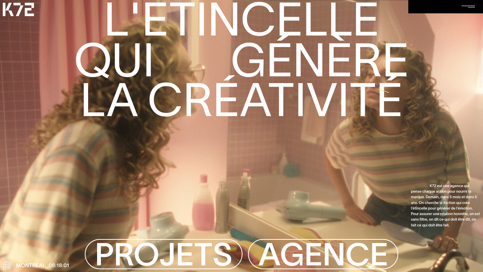
K72 Agency Immersive Video Landing Page
A high-impact agency landing page featuring a full-screen background video, bold oversized typography with masks, and pill-shaped navigation buttons.
