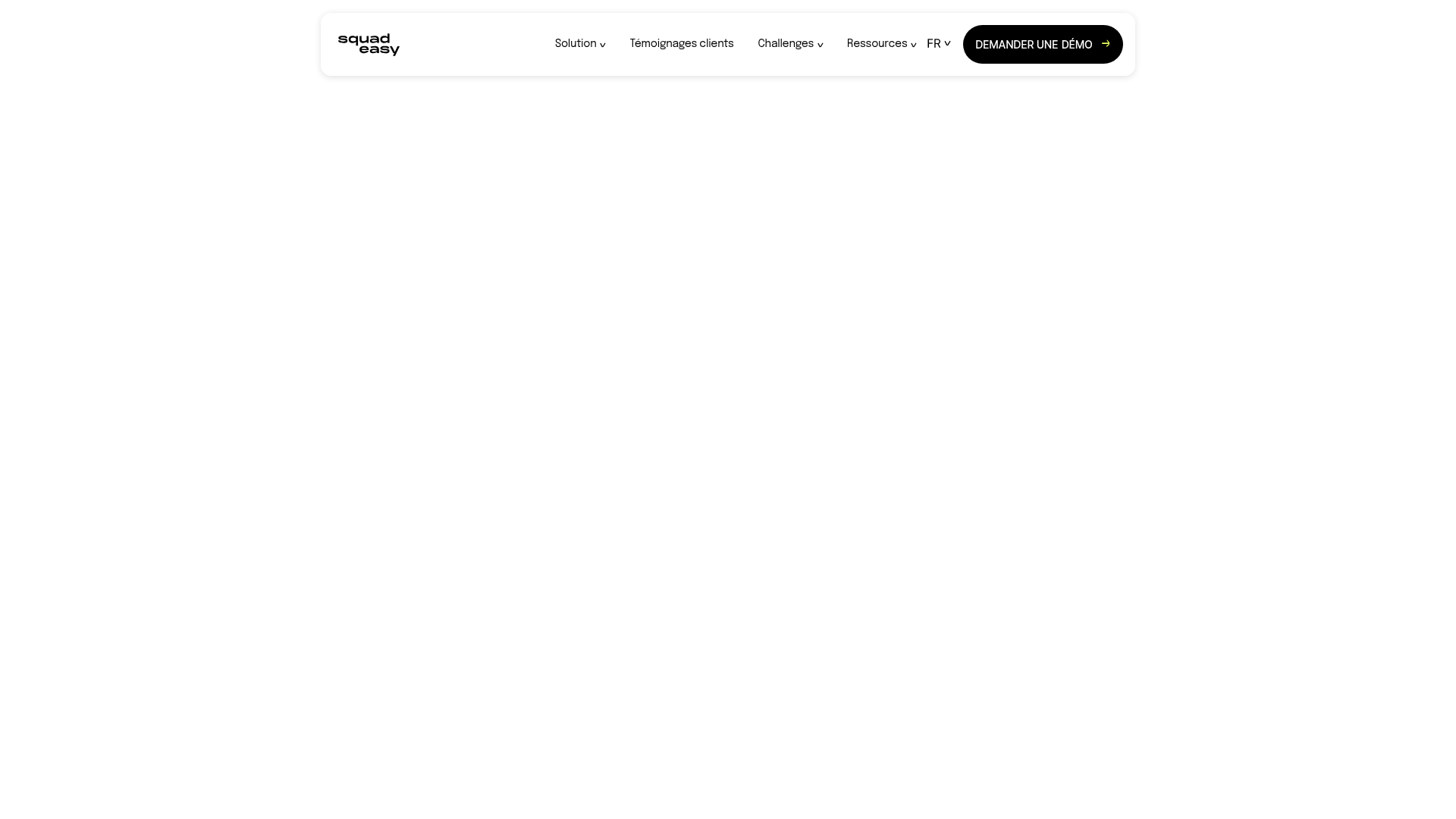
Squadeasy Employee Engagement SaaS Landing Page
A vibrant wellness platform layout featuring a sticky navigation bar, modular high-contrast sections, interactive testimonials slider, and animated data counting components.
Overview
This landing page is a vibrant, high-energy SaaS showcase for an employee engagement and wellness platform. It is a strong reference for builders because it masterfully combines bold typography, organic shapes, and a modular layout that remains playful while maintaining professional credibility for B2B sales.
Design System
- Color Palette & Visual Hierarchy: The design uses a high-contrast palette of 'Cyber Yellow' (#FFD200), 'Deep Black', and a series of pastel backgrounds (soft greens, pinks, and blues) to differentiate sections. Hierarchy is established through oversized black headings and bright yellow CTA buttons that pop against both light and dark backgrounds.
- Typography System: The brand uses a bold, geometric sans-serif (resembling Montserrat or similar) in uppercase for primary headers like "NOUS SOMMES SQUADEASY." Contrast is achieved through smaller, regular-weight body text and stylized italicized accents for personality.
- Page Structure: The flow is highly modular: a dynamic hero section with floating decorative elements, followed by a 'Post-it' style statistics section, a logo marquee of enterprise clients, a dedicated 'About Us' block, an interactive features slider, and finally a testimonials carousel.
- Reusable Components:
- Interactive 'Post-it' Cards: Small, colorful blocks with animated counters (
js-counter) that appear in staggered layouts. - The Sticky Nav: A clean, white floating header with a prominent black 'Demander une démo' button.
- The Hero Section: A sophisticated multi-layered grid (
hero-section__abs-img) featuring floating png graphics that respond to layout positioning. - Testimonial Slider: A standard Slick-slider implementation using cards with integrated company logos and professional avatars.
- Interactive 'Post-it' Cards: Small, colorful blocks with animated counters (
- Interactions & Motion: The site relies heavily on AOS (Animate On Scroll) for fade-ups and staggered entrance animations. Hover states on buttons feature a distinct "double layer" text shift (as seen in the
hero-section-cta), and the phone mockups utilize lazy-loaded parallax effects. - Implementation Clues: Built on the HubSpot CMS (evident from
hs-cos-wrapperclasses), the layout uses a standard 12-column liquid grid system (row-fluid) allowing for flexible spacing between the high-impact visual blocks.
Use Cases
- Who should clone this pattern: B2B SaaS companies focused on human resources, wellbeing, or social impact that want to avoid the "boring corporate" look in favor of an energetic, approachable brand identity.
- Effective Remixes: Mobile app developers can repurpose the feature slider section to showcase app screenshots, while non-profits can reuse the 'Post-it' stat blocks to highlight impact metrics.
- Practical Remix Directions: Swap the organic floating shapes in the hero for industry-specific icons (e.g., medical icons for health tech) and change the 'Cyber Yellow' to a signature brand color to completely transform the mood while keeping the efficient layout.
- Suggested Clone Scope: A full-page clone is ideal for those needing a comprehensive single-page story, but the 'Post-it' statistics section and the interactive image-text slider are excellent individual components to lift for existing sites.
Related Inspirations
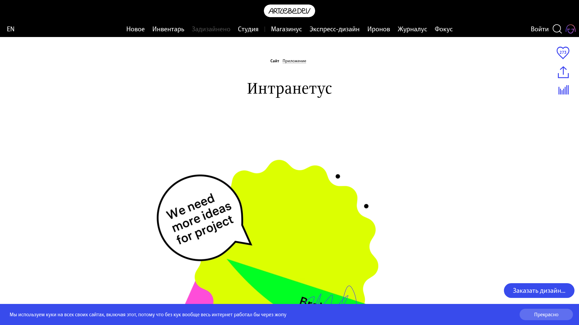
Intranetus Project Showcase Landing Page
A high-concept portfolio page featuring a large-scale video hero, Lottie animations, layered parallax transition effects, and a vertical grid of browser-mockup feature cards.
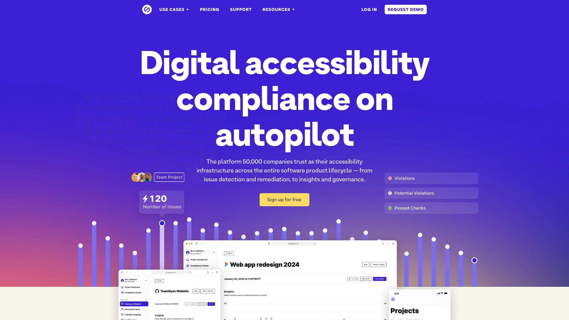
Stark Accessibility Software SaaS Landing Page
A vibrant SaaS landing page featuring a purple gradient hero, layered dashboard mockups, grid-based feature highlights, and segmented user-persona navigation.
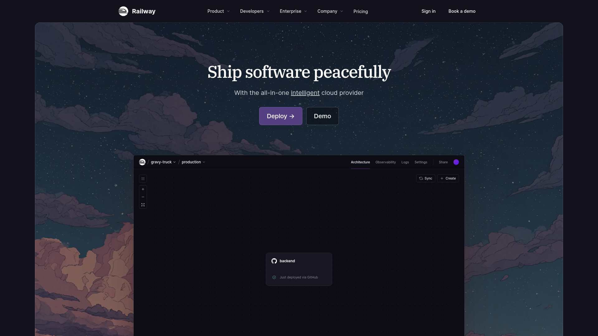
Railway Cloud Platform Landing Page
A dark-themed developer tool landing page featuring a twilight sky background, a custom dashboard interface mockup, and clean navigation with purple accents.
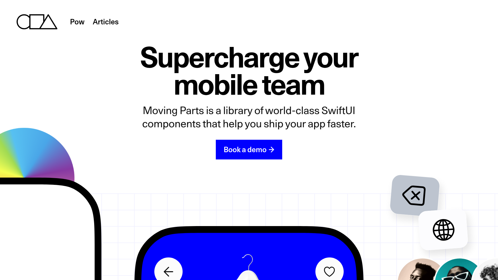
Moving Parts SwiftUI Component Library
A high-performance landing page featuring a interactive code comparison toggle, animated mobile UI previews, and a clean minimalist aesthetic for developer tools.
MetaMusic Service Landing Page
Features a horizontal scrolling card deck, animated SVG illustrations, a partner logo marquee, and a multi-step process layout with notched corner UI components.
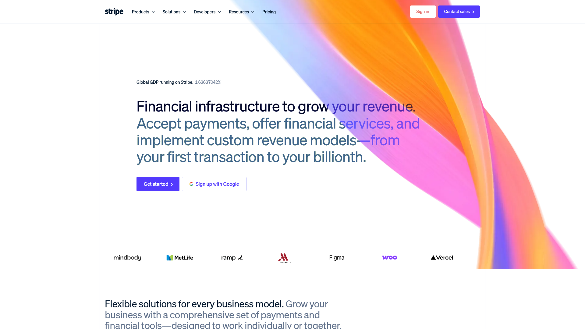
Stripe Modern SaaS Landing Page
A high-conversion landing page featuring a complex mesh-gradient hero, sticky navigation, and a horizontal logo wall for brand social proof.
