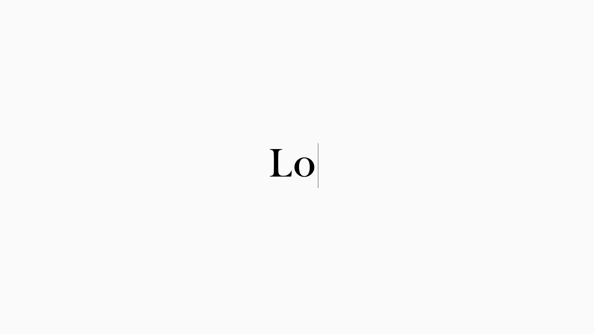
LoveFrom Minimalist Animated Wordmark Landing
A minimalist landing page featuring a center-aligned animated wordmark, a hidden info panel, and a decorative bear animation overlay.
Overview
This landing page is a masterclass in minimalist digital identity, featuring a center-aligned animated wordmark that serves as the singular focal point. It is an excellent reference for builders looking to implement high-end branding through refined typography, sophisticated CSS animations, and a non-traditional hidden information architecture.
Design System
- Color Palette & Visual Hierarchy: A stark, "high-contrast monochrome" interface using a pure white background and deep black text. The hierarchy is extremely flat; there are no traditional navigational elements, forcing the user's focus entirely onto the central wordmark.
- Typography: The site utilizes a custom high-contrast serif typeface (
LoveFrom Serif). The scale is large and centered, with specific attention to character spacing and the weight of the letterforms to convey luxury and precision. - Page Structure: The layout is unconventional, centered around a
#wordmark-wrapper. The content is segmented into two main layers: a fixed background/foreground containing a decorative bear animation (#bear-shell) and a hiddeninfo-panelthat reveals the collective's background information. - Reusable Components: The
info-panelis the primary reusable structural component—a slide-over or overlay containing multi-column list data. The animated comma (#comma-animation) serves as a unique signature interaction element. - Interaction & Motion: The site relies heavily on "silent" interactions. The wordmark animates upon entry, and a secondary layer features a walking bear animation that scales and moves across the viewport. The HTML indicates the use of ARIA labels to ensure these visual animations remain accessible to screen readers.
- Implementation Clues: The structure uses semantic but custom HTML elements like
<info-panel>. It avoids standard utility frameworks in favor of absolute positioning and fixed viewport units (dvw,dvh) to maintain centering across all screen sizes.
Use Cases
- Who should clone this: Creative studios, high-end architecture firms, or independent designers who want to project an image of extreme detail and "less is more" philosophy.
- Remixing for products: This pattern is perfect for "Coming Soon" pages or brand launch teasers where the goal is to generate mystery and focus on a new identity rather than providing immediate dense information.
- Practical Remix Directions: Retain the central typography layout but swap the serif font for a bold sans-serif to change the brand's voice; replace the bear animation with a product-specific 3D model or abstract svg path animation; adapt the hidden info-panel into a full-screen drawer for contact details or project portfolios.
- Suggested Clone Scope: Start with a full-page clone of the centered animation logic and the responsive
info-paneloverlay to capture the site's unique atmospheric feel before populating it with traditional content.
Related Inspirations

Play Studio Minimalist Portfolio Landing
A high-impact agency layout featuring a oversized typography header, a full-width integrated Vimeo video background, and a unique expandable accordion list for industry showcases.
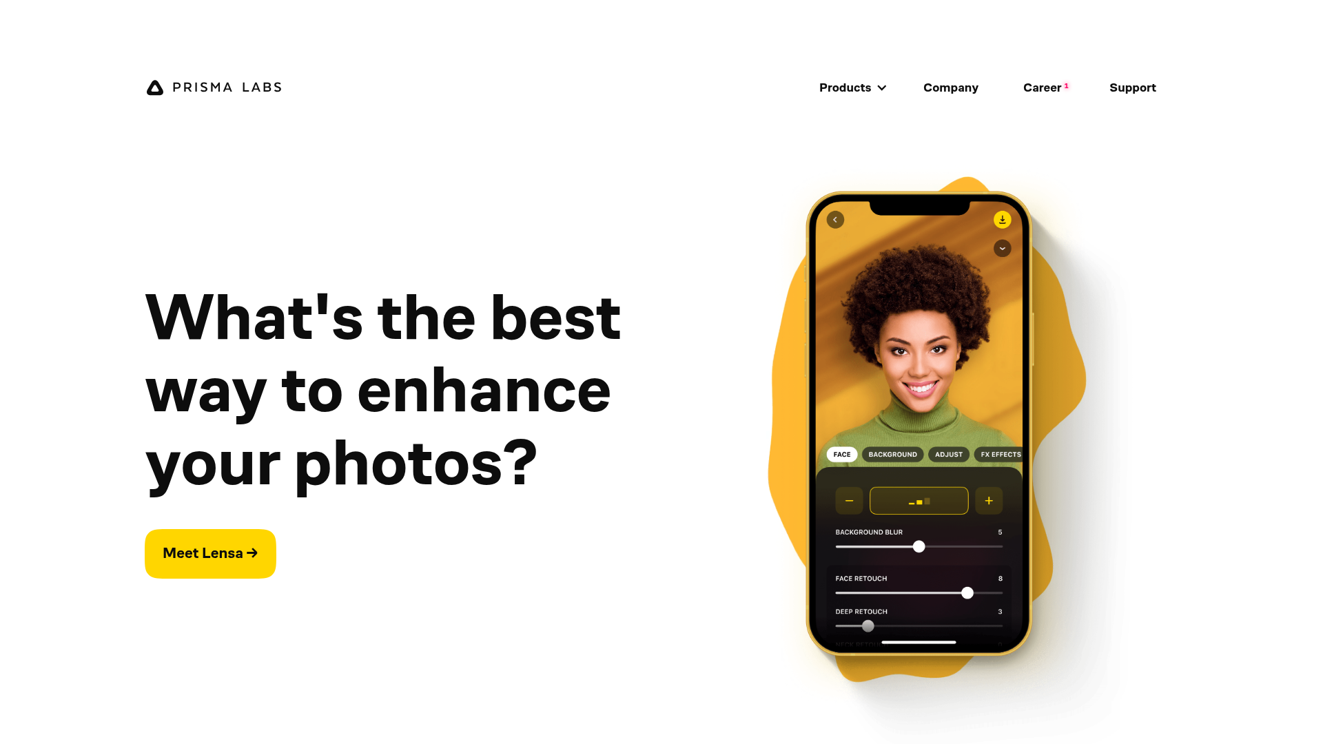
Prisma Labs App Showcase Landing
A clean SaaS landing page layout featuring large typography, magnetic hover buttons, and high-fidelity mobile app mockups with animated video blob backgrounds.

Zeus Jones Agency Landing Page
A minimalist, Gatsby-powered brand agency layout featuring a clean typography focus and a blank canvas aesthetic for high-end portfolio builds.
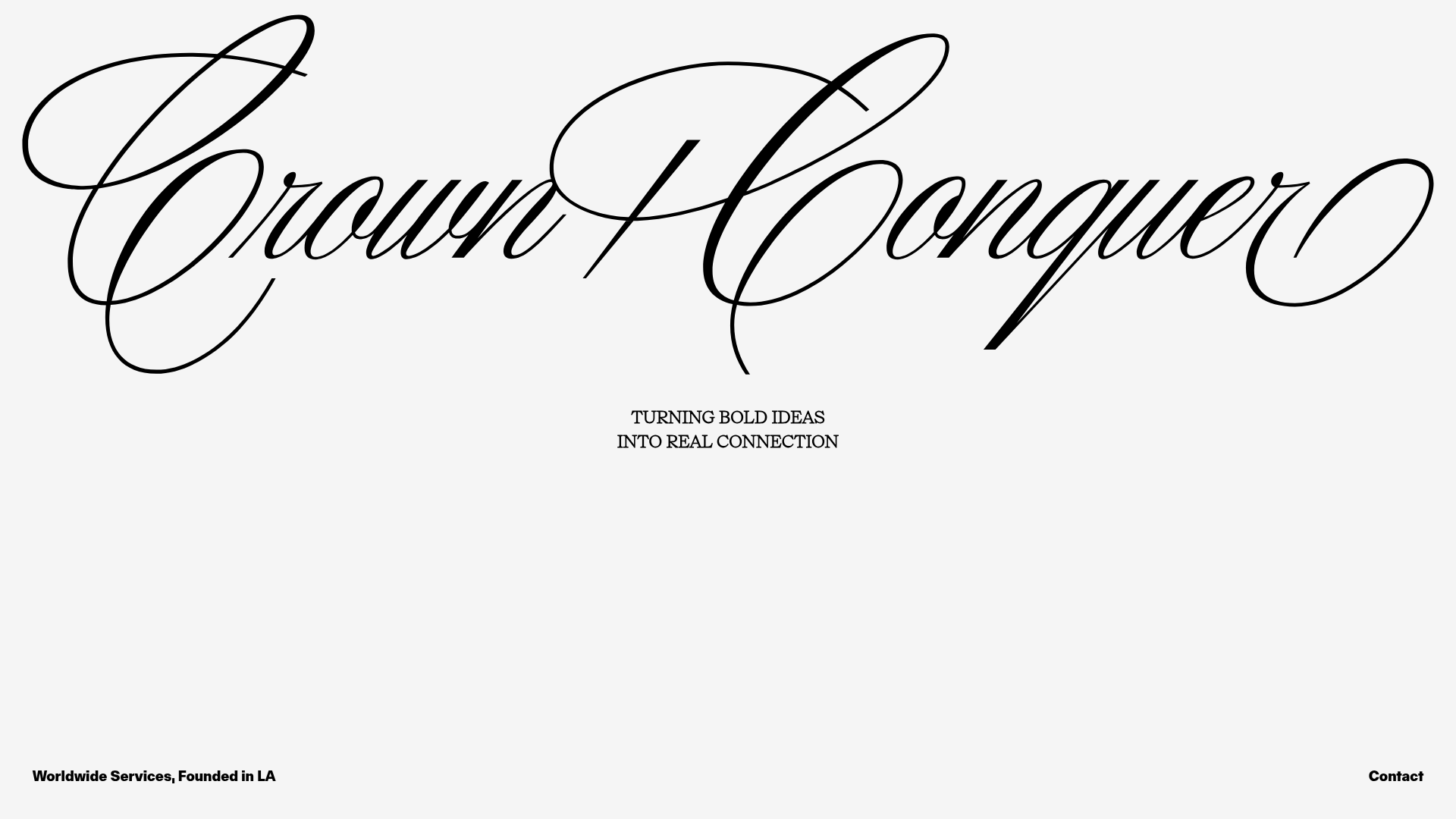
Crown & Conquer Agency Landing Page
A minimalist landing page featuring elegant script typography, a centered hero tagline, and a clean, whitespace-heavy layout for high-end branding.
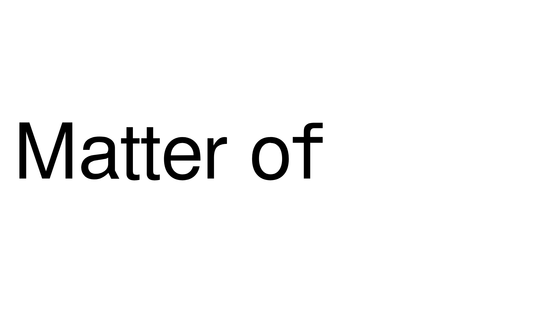
Matter of Fact Typography Landing Page
A minimalist landing page featuring a vertical scrolling text marquee animation for dynamic hero typography using GSAP or CSS transitions.
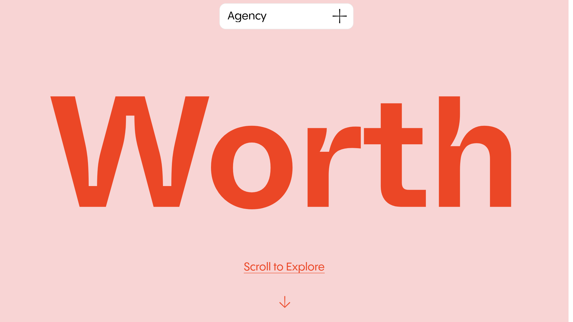
Worth Agency Minimalist Portfolio Landing
A vertical-scroll landing page with large typography, sticky navigation elements, and a clean portfolio grid featuring on-hover image animations and smooth scroll transitions.
