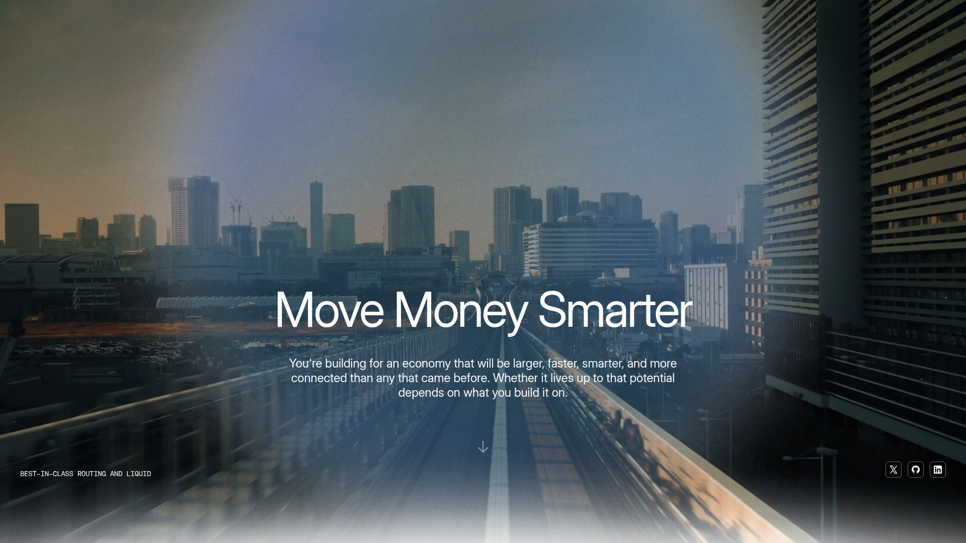
Letter Private Banking Landing Page
Features a high-impact dark hero section with video backgrounds, elegant typography, and a staggered grid of service panels using varied color themes and video assets.
Overview
This landing page serves as a high-end interface for Letter, a modern private banking platform. It is a premier reference for builders looking to execute a "prestige" aesthetic, utilizing a dark-mode base, sophisticated motion design, and a structured grid of high-contrast service panels.
Design System
- Color Palette & Visual Hierarchy: The design centers on a deep charcoal/black base (
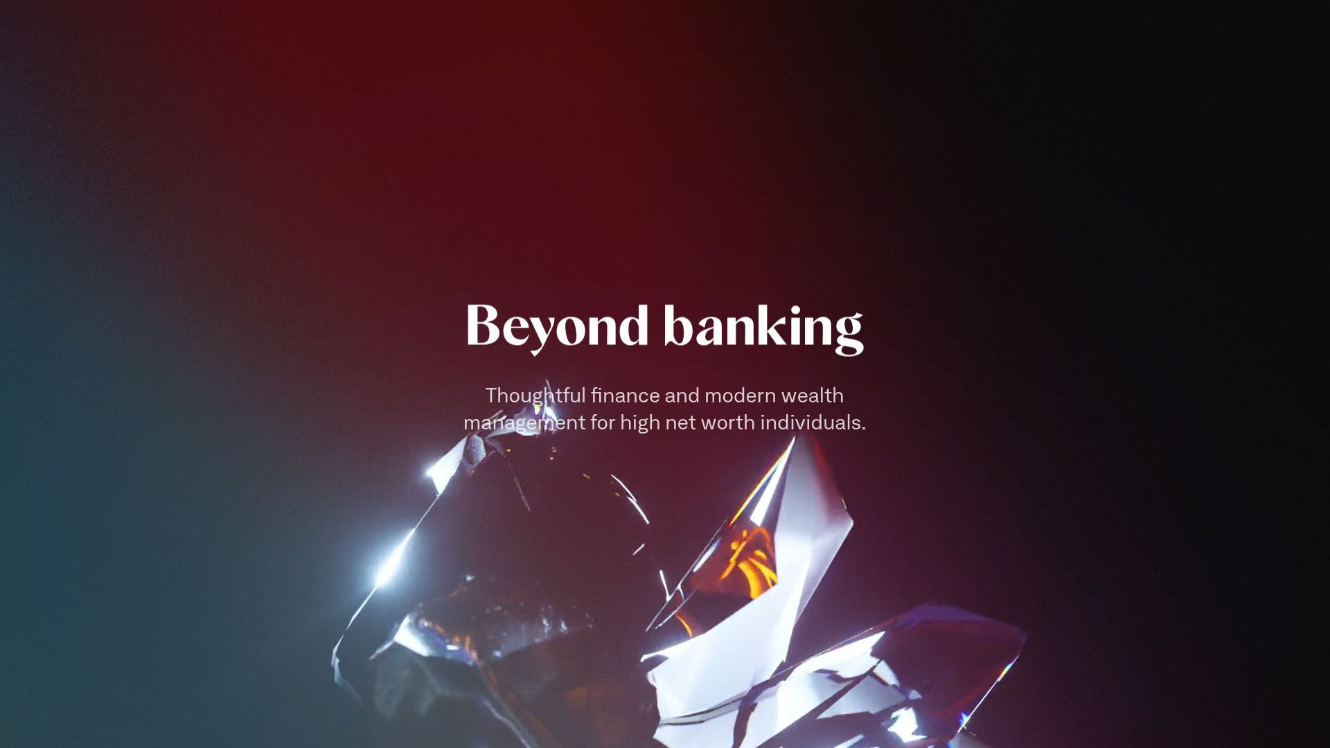
#0E0E0F) accented by a vibrant range of thematic background colors for service panels, includingtheme-midnight,theme-cream,theme-lake(blue), andtheme-pine-dark. This creates clear visual separation between features while maintaining a premium feel. - Typography: The system leads with a high-contrast serif display font for headlines (
Beyond banking) and a clean, wide-tracking sans-serif for body copy. Large scale headings (xxxxl display) are used for impact, with subtle muted spans for descriptive subheadings. - Page Structure: The layout follows a classic narrative flow: a cinematic hero section, a high-level value proposition with large text, a two-column feature list, and a dense, staggered grid of feature blocks with integrated video loops.
- Key Components:
- The Intro Section: A full-height hero with a centered text overlay and a looping crystal-like abstract video background.
- Service Panels: A reusable
panel-excerptcomponent that combines a 1:1 aspect ratio looping video with descriptive text and two-button action sets. - Floating Image Row: The
panel-floatycomponent uses a parallax effect with three overlapping images (photo-01tophoto-03) to break the grid. - Interactive Elements: Buttons utilize a pill-shape design with clear primary and secondary (ghost) states.
- Interactions & Motion: The site uses
text-letters-inanimations, which stagger the entry of individual words or letters on scroll. High-quality MP4 video posters are used in lieu of static images to provide a sense of life and "aliveness" to the UI. - Implementation Details: The HTML indicates a modular CSS structure using utility-like classes (
pt-4,w-60,flex,m-stack) and a smooth page transition framework (Barba.js wrapper).
Use Cases
- Who should clone this: Fintech startups, venture capital firms, high-end real estate agencies, or luxury product brands that need to convey trust, exclusivity, and technological sophistication.
- Remixing Directions:
- The Grid Only: Clone the staggered
col-2andflexpanel section to showcase a diverse product catalog or a multi-service portfolio. - The Hero Pattern: Reuse the
section-introstructure to create a high-impact branding moment for any landing page. - Color Shift: Swap the dark background for a stark white/cream theme to transition the design from "private banking" to "minimalist lifestyle/wellness."
- The Grid Only: Clone the staggered
- Clone Scope: For a fast win, clone the service panel grid (
section#home-pmbethrough the panel flexbox) to create a modern feature list that feels significantly more interactive than standard icon-and-text rows.
Related Inspirations
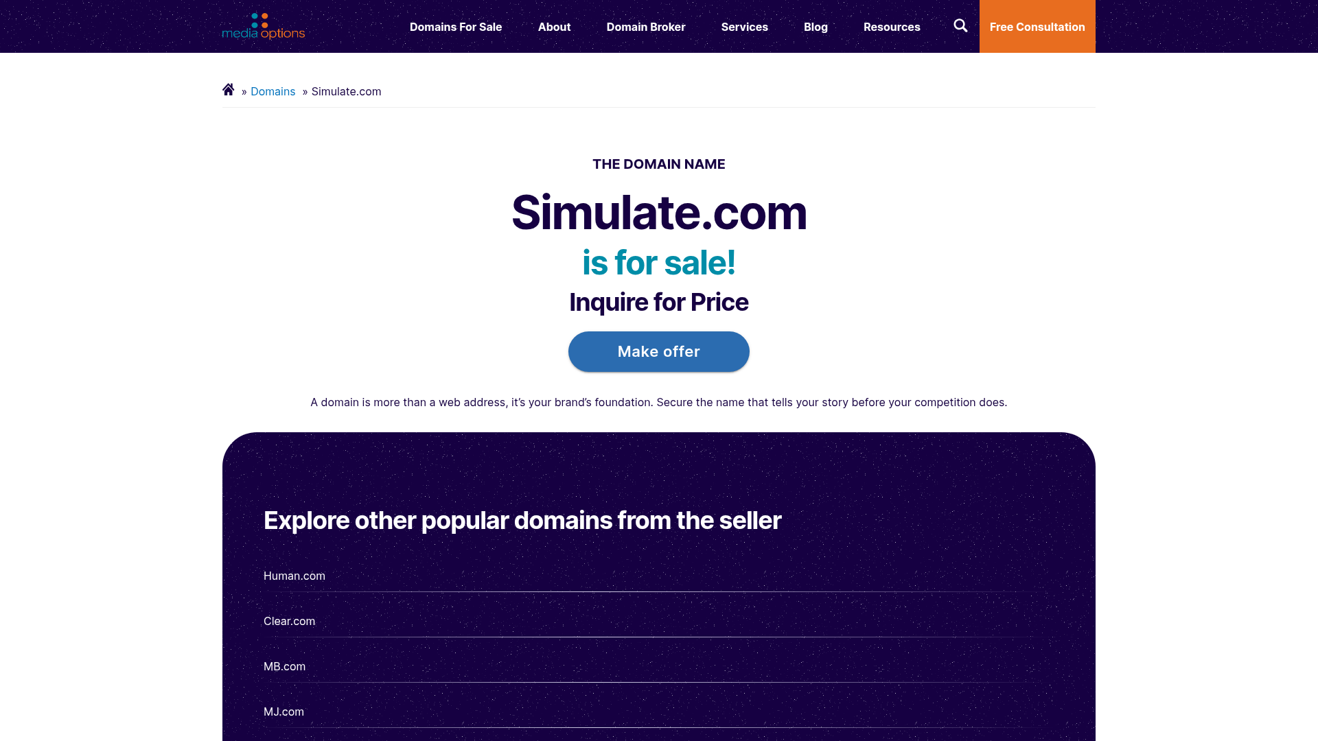
Domain For Sale Landing Page
A clean, centered landing page layout featuring a hero section for asset sales, a prominent CTA button, and a list-based showcase of related items.
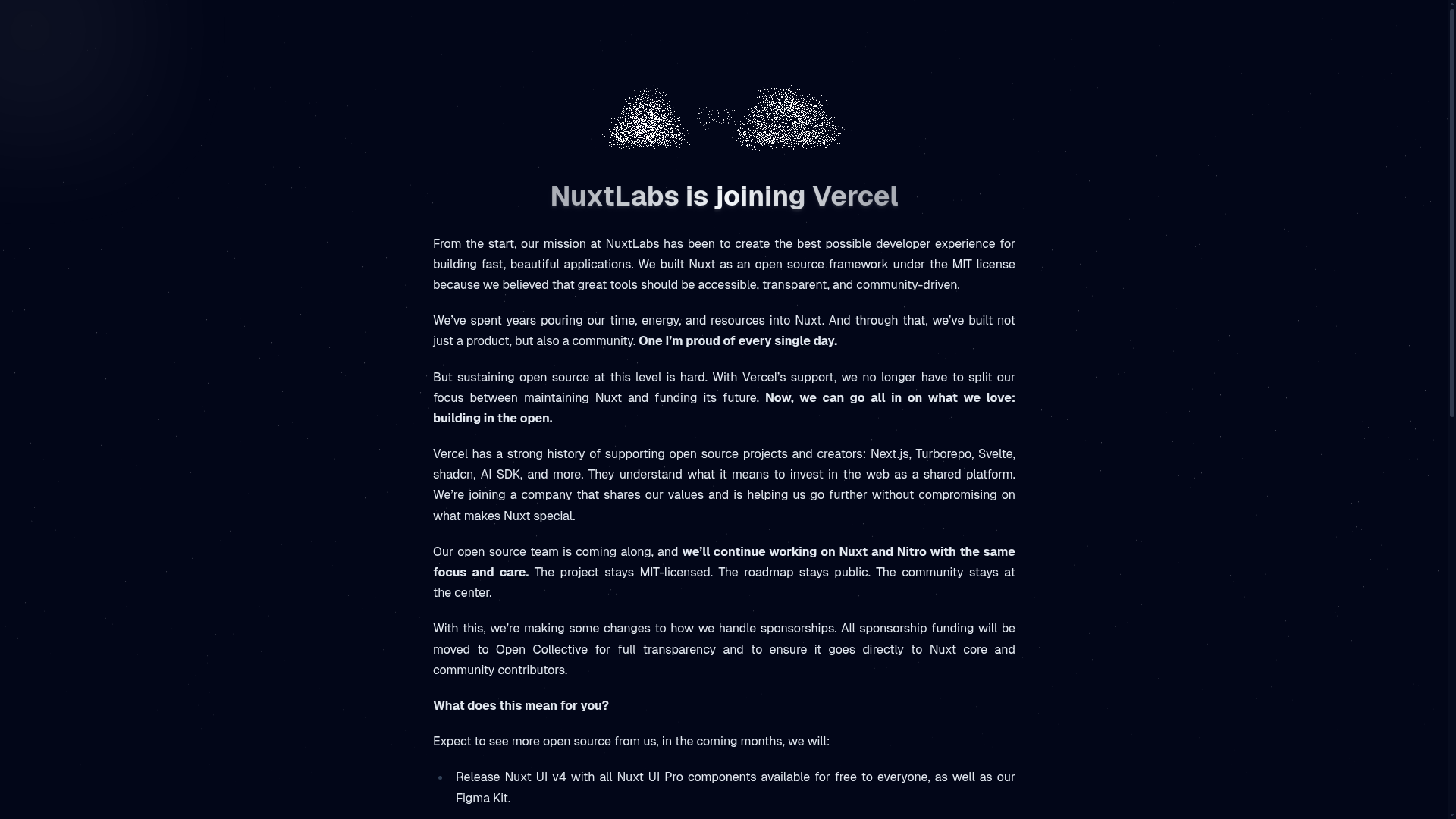
NuxtLabs Company Announcement Landing Page
A dark-themed typography layout featuring a starry background effect, grain texture gradients, and a centered long-form text section ideal for letters or press releases.
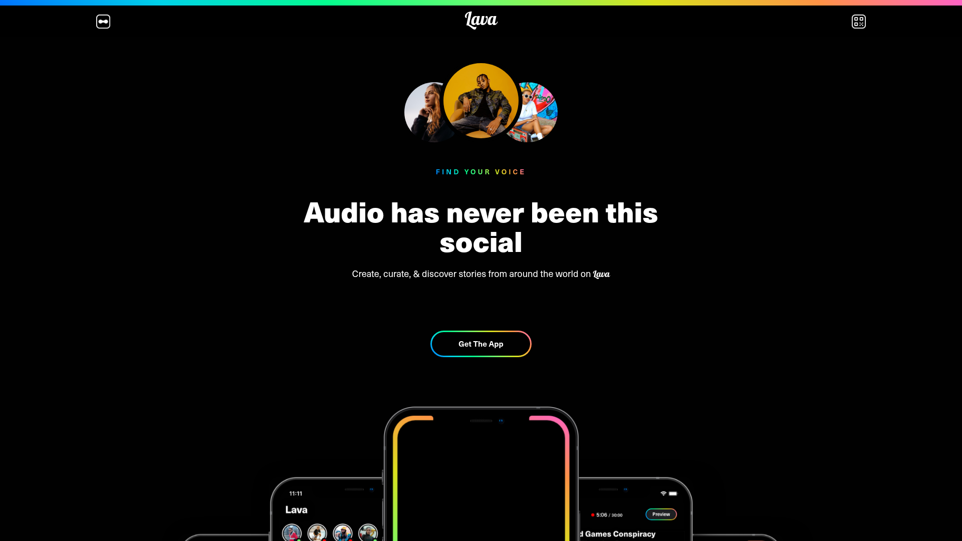
Lava Social Audio Landing Page
A dark-themed mobile app landing page featuring a centered hero section, floating phone mockups, gradient-bordered CTAs, and a bento-style feature grid.
Eco Stablecoin Infrastructure Product Site
A sophisticated Web3 site featuring a video hero section, vertical scrolling accordion for product features, and a dark-to-light theme transition.
Minimalist Dark Mode Loading Screen
A clean, dark-themed redirection page featuring a centered typography layout and a CSS circular loading spinner for asynchronous processing states.
Moving Parts SwiftUI Component Library
A high-performance landing page featuring a interactive code comparison toggle, animated mobile UI previews, and a clean minimalist aesthetic for developer tools.
