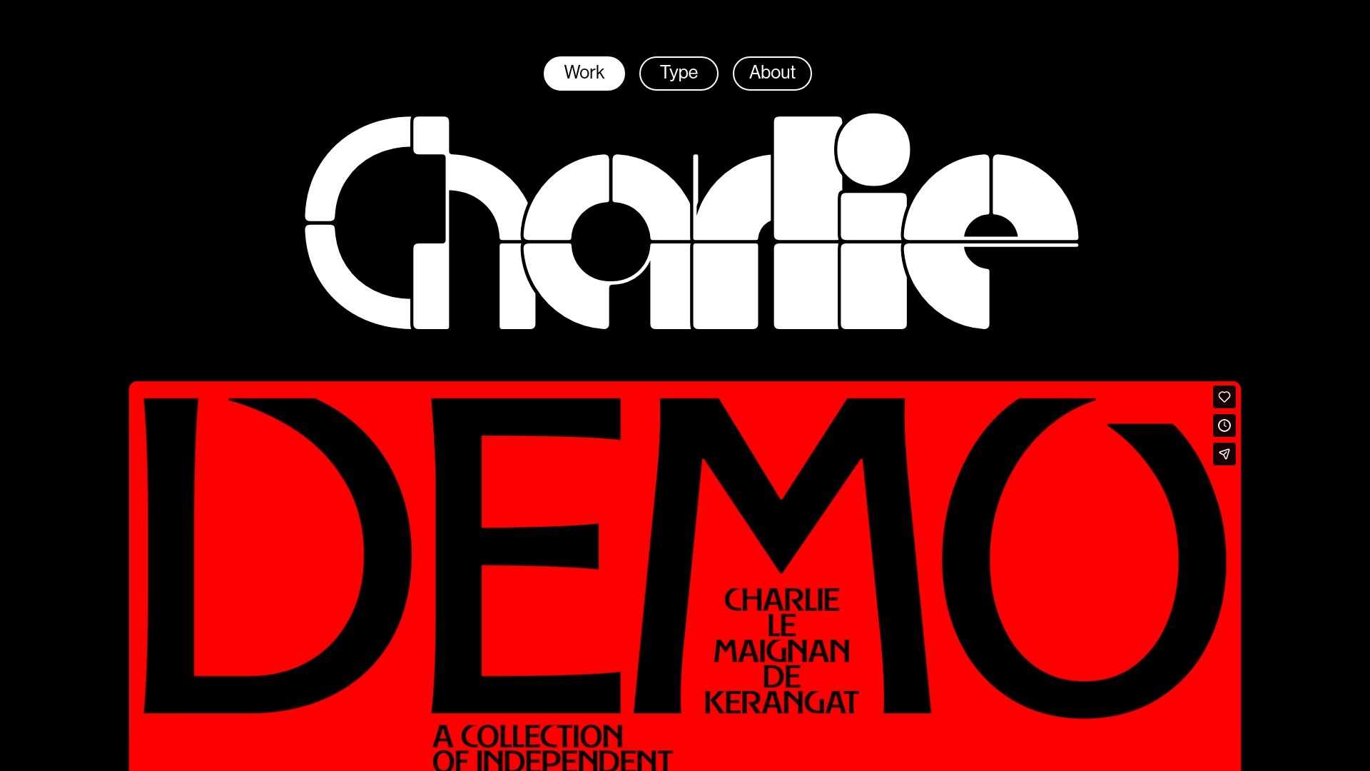
Charlie Le Maignan Portfolio Archive
A minimalist dark-mode portfolio featuring high-contrast typography, a geometric logo header, and an integrated full-width video gallery showcasing independent creative work.
Overview
This portfolio for Charlie Le Maignan is a masterclass in brutalist minimalism and typography-first design. It stands out as a strong clone reference for its bold use of negative space, large-scale geometric branding, and a seamless integration of high-definition video as a primary content driver. Builders should look to this for inspiration on how to create a high-impact visual identity using simple layouts and stark color contrasts.
Design System
- Color Palette & Visual Hierarchy: The site uses a high-contrast binary palette of pure black (#000000) and pure white (#FFFFFF), with red accents used in featured content (like the "DEMO" video). Hierarchy is established through extreme scale rather than color, with the logo and headlines dominating the viewport.
- Typography System: The system relies on custom, experimental display typefaces. The header features a thick, geometric stencil-style font constructed from circles and squares. The content within the red block uses a high-contrast serif with flared terminals, creating a sophisticated yet aggressive aesthetic.
- Page Structure: The layout follows a top-down vertical stack: a centered pill-shaped navigation, a giant hero brand mark, and a series of full-width or grid-based media containers (
template1AContainer) showcasing video reels. - Reusable Components:
- Pill Navigation: Minimalist top-center buttons with thin borders and white backgrounds for active states.
- Video Wrapper: A responsive container designed to house Vimeo iframes with custom "loading" states (
loader.gif). - Animated Page Title: The HTML reveals a
spanbased title system with--char-indexCSS variables, suggesting staggered entry animations for the typography.
- Interaction & Motion: The design emphasizes static power, but the HTML indicates motion hooks (
PageTitle_animation) likely used for page transitions or letter-by-letter reveals upon loading. - Implementation Clues: Built using Next.js (evident from the
__nextID andnext-route-announcer). It uses CSS Modules for styling (e.g.,Header_container__bLbkd) and a template-based grid system for organizing portfolio blocks.
Use Cases
- Who should clone this: Creative directors, motion designers, and high-end fashion or architectural agencies looking for a "gallery" feel that prioritizes visual impact over text-heavy explanations.
- Effective Remixes: This pattern is perfect for a cinematic landing page where the product (like a luxury watch or auto brand) needs to lead with high-resolution video and atmospheric branding.
- Practical Directions:
- Swap Brand Style: Keep the layout but replace the experimental typography with a clean Swiss sans-serif for a more corporate-modern look.
- Information Architecture: Adapt the
template3KContainergrid for a shopify storefront, replacing videos with minimalist product shots.
- Suggested Clone Scope: A quick clone of the pill-nav and hero logo section provides an instant high-end identity. A full-page clone is best for projects where media assets (video/photo) are already of professional quality, as the design relies heavily on the strength of the visual content.
Related Inspirations
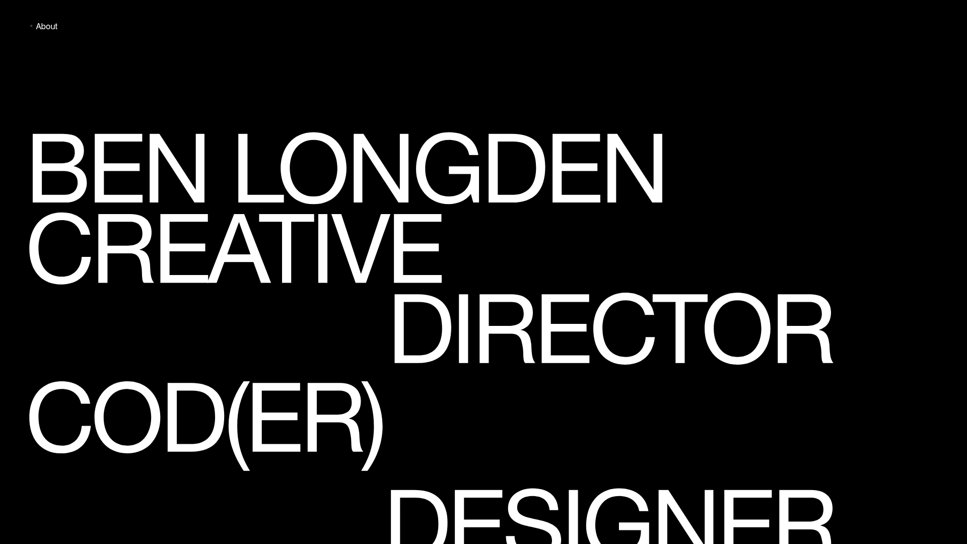
Ben Longden Minimalist Creative Portfolio
A bold typography-focused site featuring a large-scale overlapping hero section, horizontal image carousels for projects, and a scrolling text marquee footer.
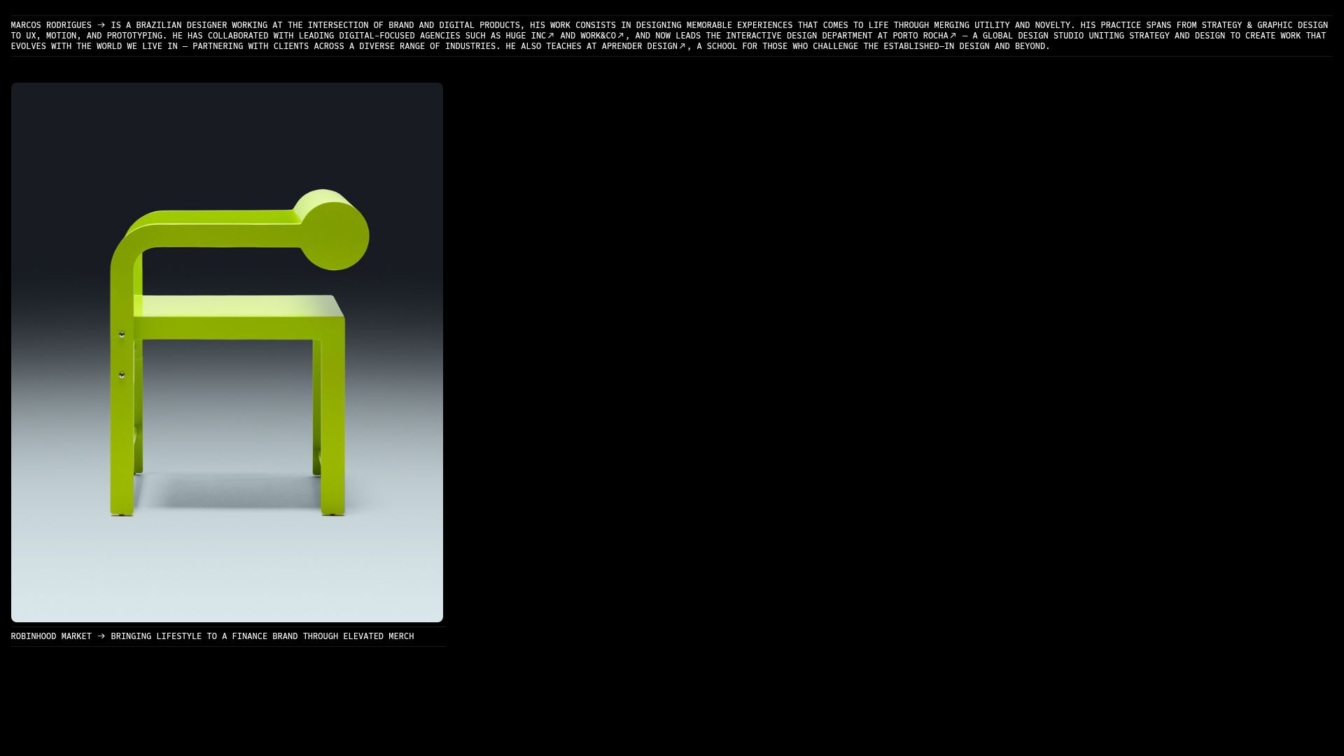
Marcos Rodriguez Minimalist Design Portfolio
A dark-themed personal site featuring a high-contrast monospaced header, a full-height centered image/video slideshow, and minimal thin-rule horizontal dividers.
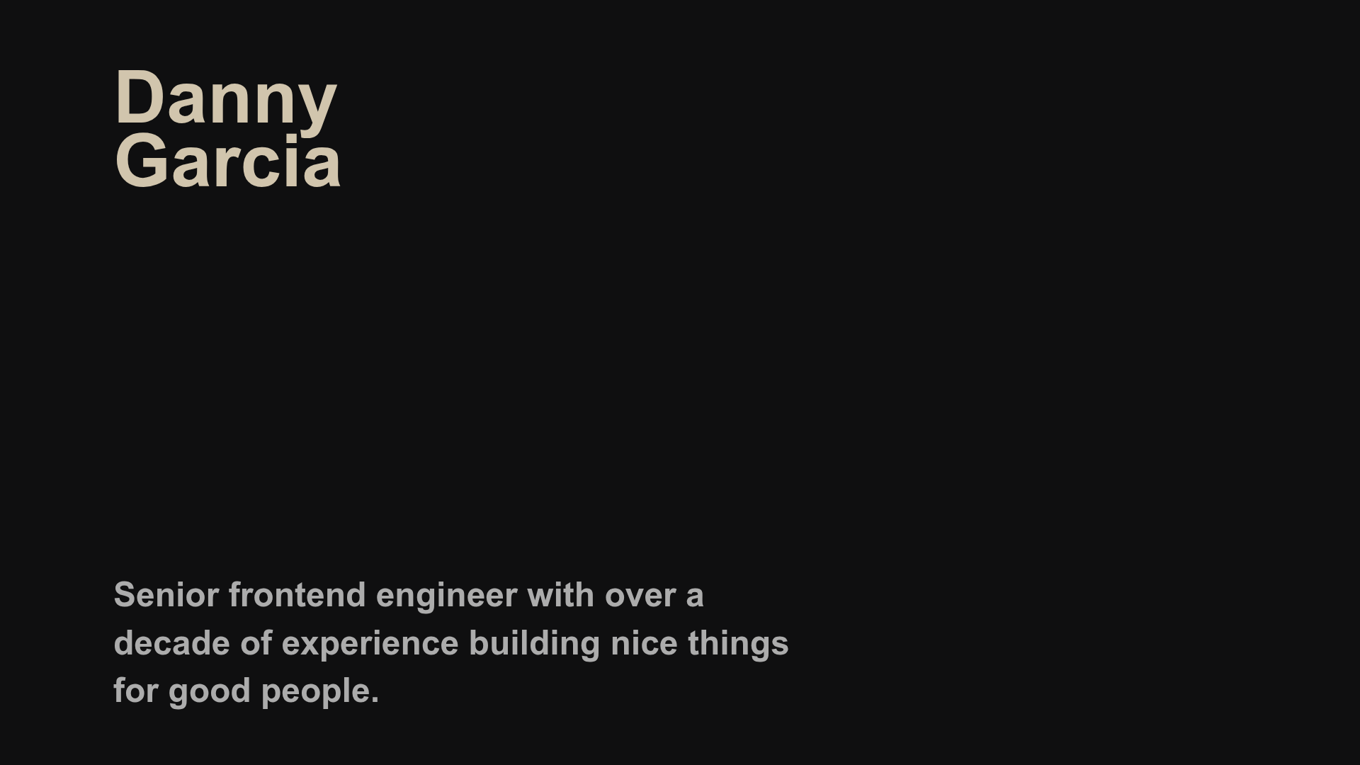
Danny Garcia Portfolio and Blog
A minimalist, typography-focused personal website featuring a dark mode aesthetic, canvas-based hero background, and a structured timeline layout for blog posts and work history.
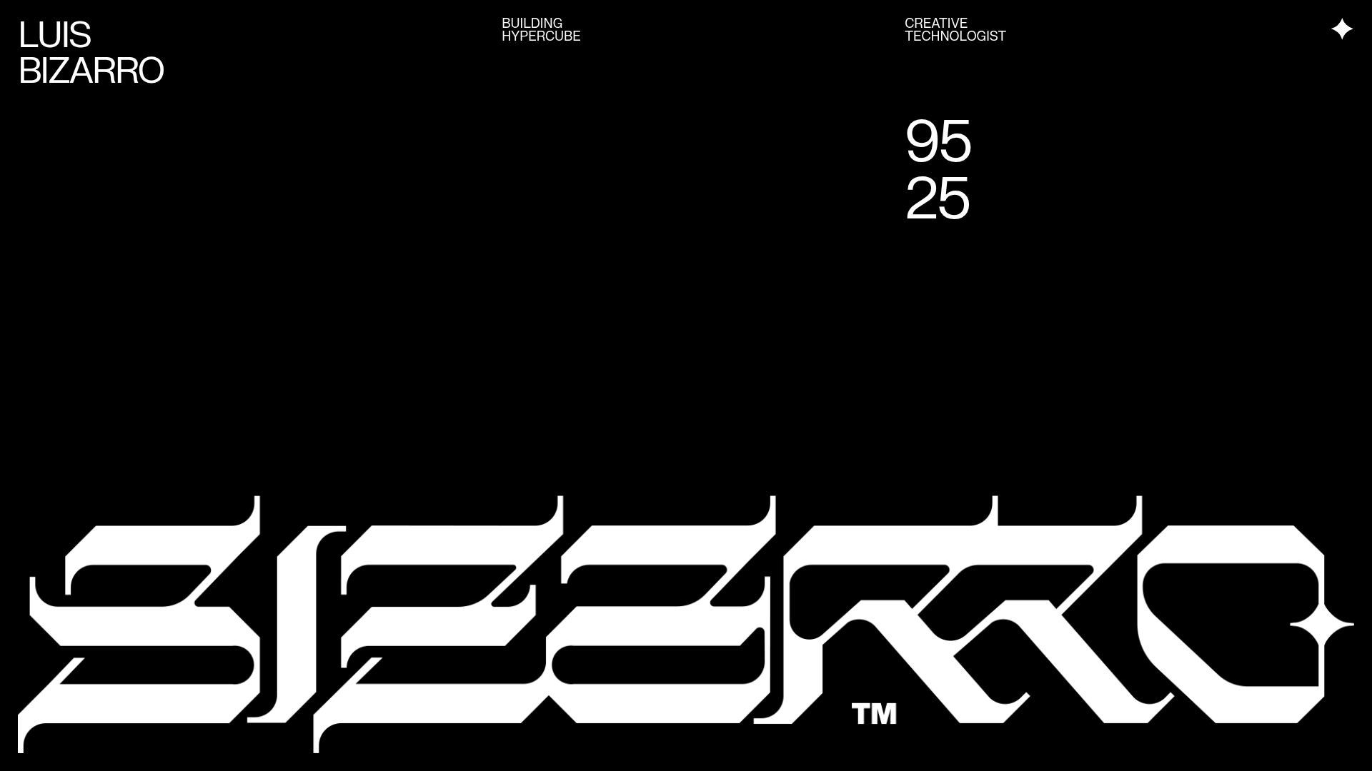
Luis Bizarro Creative Technologist Portfolio
A high-contrast dark mode portfolio featuring a custom blackletter logotype, minimal typography grid, and a video-heavy project showcase using WebGL-based content transitions.

Ingmar Coenen Digital Design Portfolio
A dark-themed minimalist portfolio featuring a custom animated hero intro, a switchable grid/list project gallery, and an auto-scrolling client logo ticker.
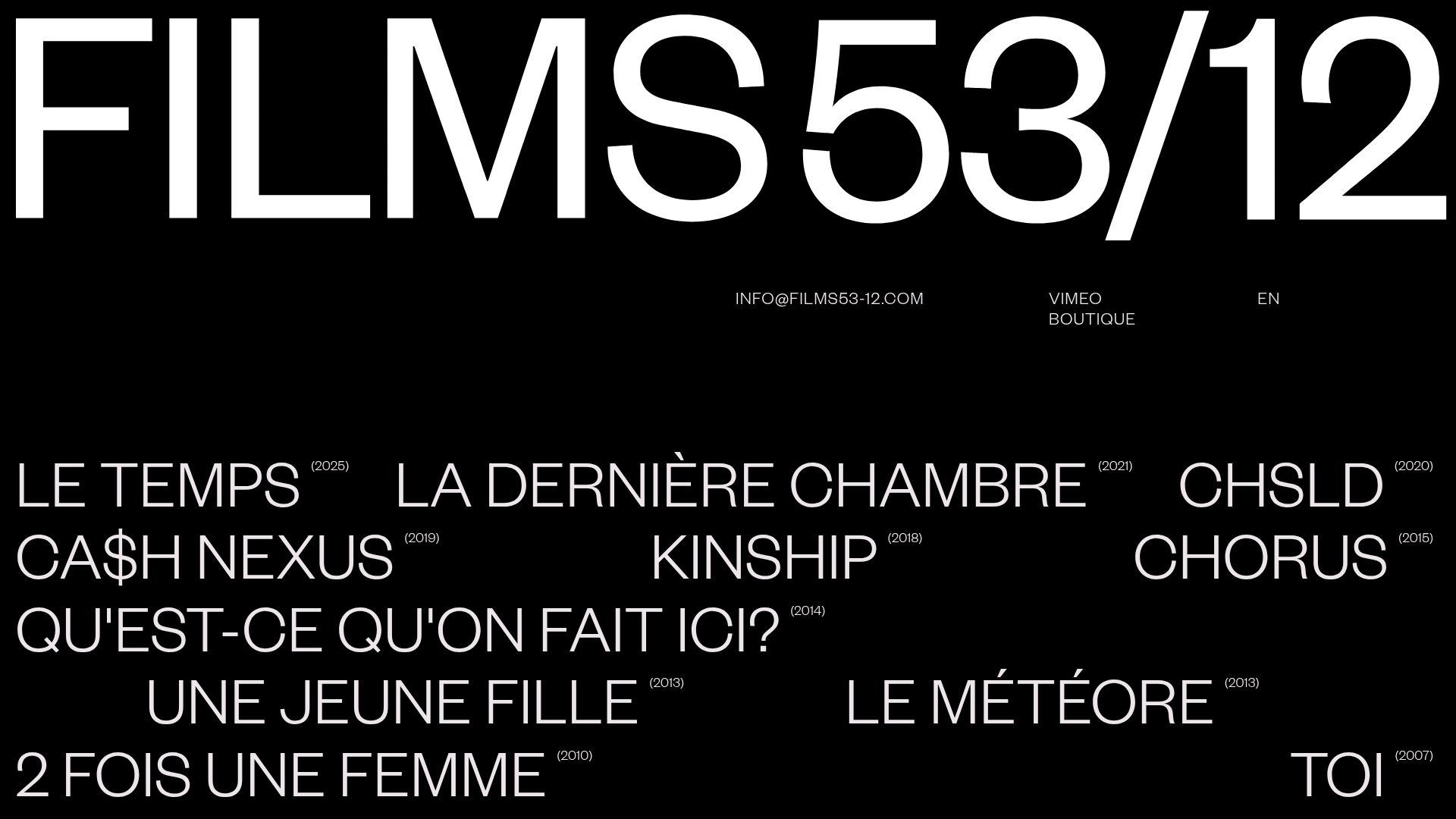
Films 53/12 Cinematographic Portfolio Layout
A minimalist dark-mode production site featuring a scattered typography grid, interactive hover-to-reveal image states, and a clean list-based film catalogue.
