Hai Fashion E-commerce Product Grid
Minimalist boutique layout featuring asymmetrical product imagery, specialized typography, a floating circular call-to-action, and a clean grid for showcasing apparel and accessories.
Overview
Hai is a minimalist fashion e-commerce site focused on high-end silk accessories and apparel. It serves as an excellent clone reference for its sophisticated use of asymmetrical whitespace, large-scale typography, and a deliberate mixing of serif and sans-serif fonts to create a boutique editorial feel.
Design System
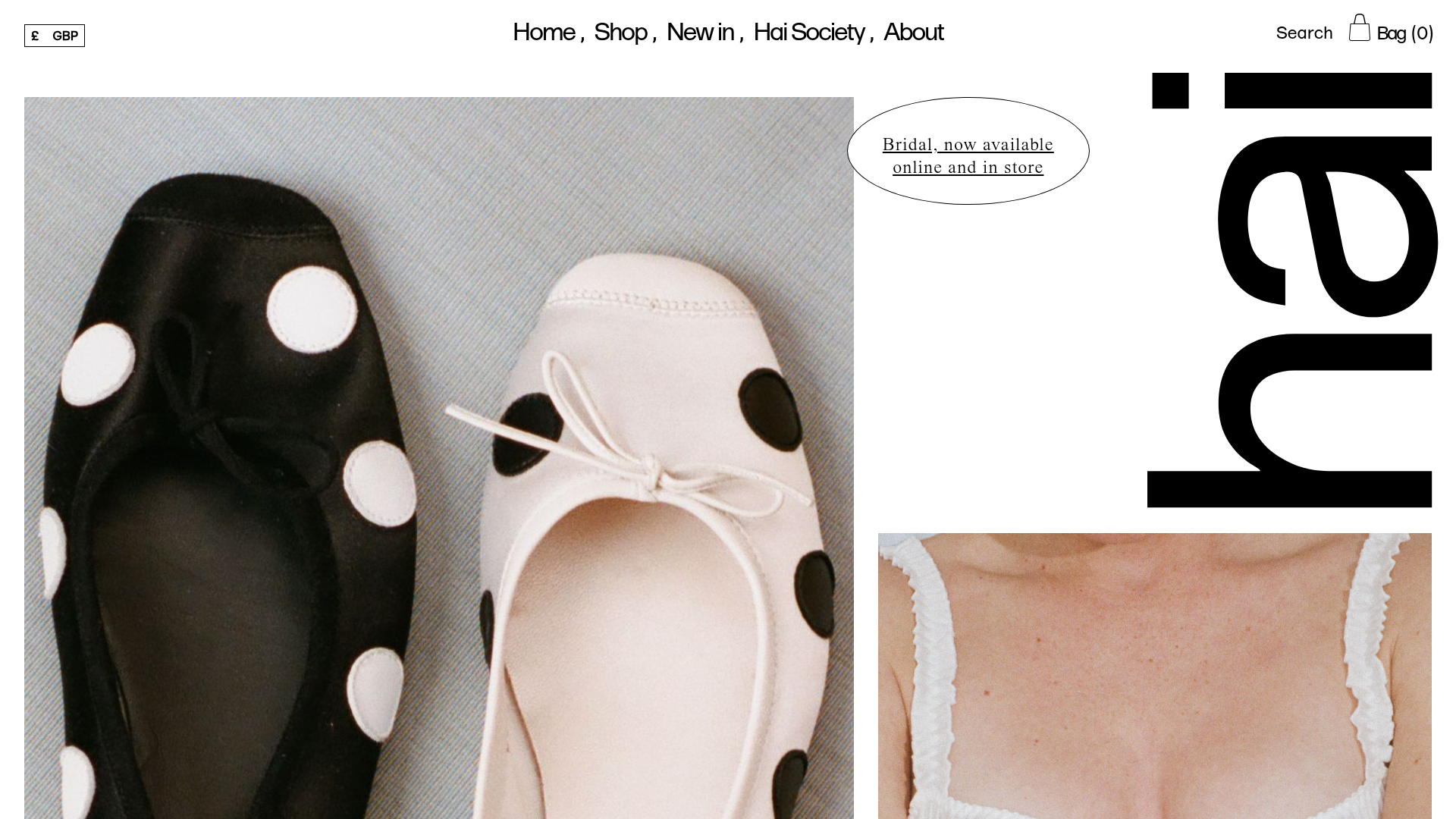
- Color Palette & Visual Hierarchy: The design uses a high-contrast monochrome base (stark black and off-white) allowing product photography to provide the color. Hierarchy is established through extreme scale—vertical brand text and oversized product images dominate the view.
- Typography: A dual-font system is employed. Class names
ff-forma(likely a geometric sans-serif for navigation and calls-to-action) andff-times(a classic serif for product titles and prices) create a balance between modernity and heritage. Large, vertically oriented lettering adds a high-fashion editorial layer. - Page Structure: The layout breaks the traditional grid. It begins with skewed horizontal navigation, followed by a "featured products" section using staggered, variable-height imagery. A floating, oval call-to-action (
message-banner) breaks the linear flow, followed by a product grid with varying card sizes (card large). - Reusable Components:
- Dashed Buttons: Standardised CTAs with
btn--dashedborders. - Floating CTA: The oval "Bridal" badge used for out-of-flow announcements.
- Asymmetrical Image Containers: Product blocks with varying aspect ratios and
mix-blend-mode: multiplyfor seamless photo integration. - Hover States: Product cards (
initial-imagevshover-image) that swap images on hover to reveal alternative angles.
- Dashed Buttons: Standardised CTAs with
- Implementation Clues: Built using Nuxt.js (evident from
#unit-nuxtand__layout), the site uses scoped CSS modules (e.g.,data-v-f5bfa0a0) and a utility-first approach for typography (fs-medium,ff-times).
Use Cases
- Who should clone this: Independent fashion designers, niche boutique owners, or lifestyle brands looking for an "anti-Amazon" minimalist aesthetic.
- Effective Remixes: High-end jewelry, luxury skincare, or artisanal home goods where brand storytelling and visual mood are as important as the individual products.
- Practical Directions: Reuse the staggered image grid for lookbooks; extract the floating oval CTA for seasonal promotions; or swap the stark monochrome for earth tones to adapt to sustainable fashion brands.
- Suggested Scope: Start by cloning the Product Grid with Hover Swap for immediate impact, or the Asymmetrical Navigation/Header to establish a high-concept site structure.
Related Inspirations

Context Gallery High-End Furniture Landing Page
A minimal editorial layout featuring a multi-column product carousel, designer biographies with image-text pairings, and a magazine-style content grid for curated design stories.

Glein Minimalistic Bento Grid eCommerce
A clean, modular layout using a bento-style responsive grid of text teasers and large-scale product imagery for lookbooks and collection browsing.

Isla Beauty Skincare E-commerce Store
A clean Shopify-based storefront featuring a split-hero landing page, a step-by-step product system carousel, and a split-screen testimonial section with localized product image sidebars.

Stojo Collapsible E-commerce Storefront
A Shopify layout featuring a prominent discount modal, mosaic grid hero sections, and clean product cards with integrated color swatches and quick-buy functionality.

Basic.Space E-commerce Gallery Clone
A minimalist product marketplace featuring a clean sticky navigation bar, nested flyout menus, and a horizontally scrollable product carousel with hover-state image switching.

Ashley & Co Lifestyle E-commerce
An elegant Shopify-based storefront featuring a split-screen animated hero, horizontal ticker-tape collection carousel, and dynamic mega-menus with scent-specific color switching and image previews.
