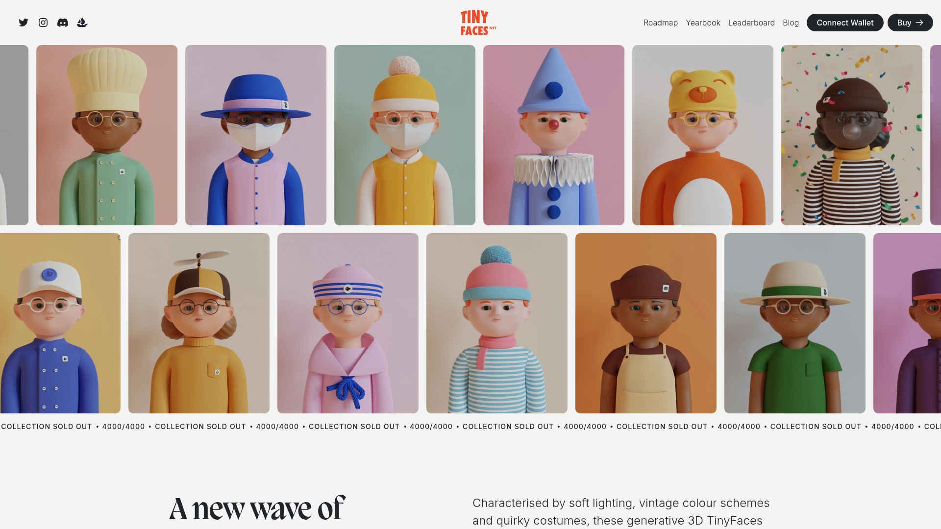
TinyFaces NFT Collection Landing Page
A high-fidelity Web3 landing page featuring an animated infinite image marquee, sticky navigation with wallet connection, a Swiper-based character carousel, and a collapsible FAQ accordion.
Overview
This landing page is a quintessential example of a modern Web3 NFT collection site, designed to showcase high-fidelity 3D assets through a playful, high-energy interface. It serves as a strong reference for developers because it demonstrates how to balance dense visual data (image grids) with clear calls to action and structural storytelling.
Design System
- Color Palette & Visual Hierarchy: The site uses a neutral off-white background (#F9F9F9) to let the vibrant character colors (pastels, bold oranges, and blues) stand out. Visual hierarchy is established through massive display typography and high-contrast black buttons that anchor the user through the scroll.
- Typography: The system pairs a classic, high-contrast serif for headings (likely for a "premium/vintage" feel) with a clean, geometric sans-serif for body text and navigation. Headings use large scales with specific words highlighted in a different font style or colored spans for emphasis.
- Page Structure: The flow begins with a double-row, bi-directional animated image marquee, followed by a "sold out" status ticker. The narrative then shifts to "Value Prop" grid layouts, a horizontal Swiper carousel for character discovery, a collapsible FAQ, and a community-focused footer.
- Reusable Components:
- Sticky Navigation: Contains social links, logo, navigation links, and a signature 'Connect Wallet' button.
- Infinite Marquee: The image grid and status ticker use CSS keyframe animations for continuous looping.
- Collapsible FAQ: Standard accordion pattern using clean top-border dividers.
- Action Buttons: Large capsule-shaped buttons with hover states and decorative arrow icons.
- Interaction & Motion: The site features bi-directional scrolling marquees (one row left-to-right, one right-to-left) and a Swiper-powered character carousel. The HTML reveals the use of
react-collapsiblefor the FAQ andframer-motionpatterns for smooth section transitions. - Responsive Behavior: The character grid and carousel likely collapse from a multi-column desktop view to a single-column or mobile-scrolling view, with the marquee maintaining its movement on smaller viewports.
Use Cases
- Who should clone this: Web3 developers launching NFT collections, digital artists building portfolios, or gaming studios looking for a character-centric showcase.
- Effective Remixes: This pattern works for any visual-first product, such as a clothing brand (replacing NFTs with apparel) or a design agency (replacing characters with project thumbnails).
- Practical Directions:
- Quick Clone: Reuse the header and the horizontal marquee sections for an immediate high-impact hero.
- Information Architecture: Adapt the tiered grid layout (Text + Video/Image) for feature explainers in SaaS products.
- Stylistic Shift: Swap the playful serif for a bold mono-spaced font to pivot the design toward a "cyberpunk" or "technical" aesthetic while keeping the layout logic.
- Suggested Scope: A full-page clone is ideal for one-pagers that need to convey high trust and brand polish through motion and curated layout.
Related Inspirations

Good Glyphs Font Showcase Landing Page
A single-page layout featuring an interactive type tester, donation form with custom amount logic, and a contributor gallery using swiper-based glyph previews.
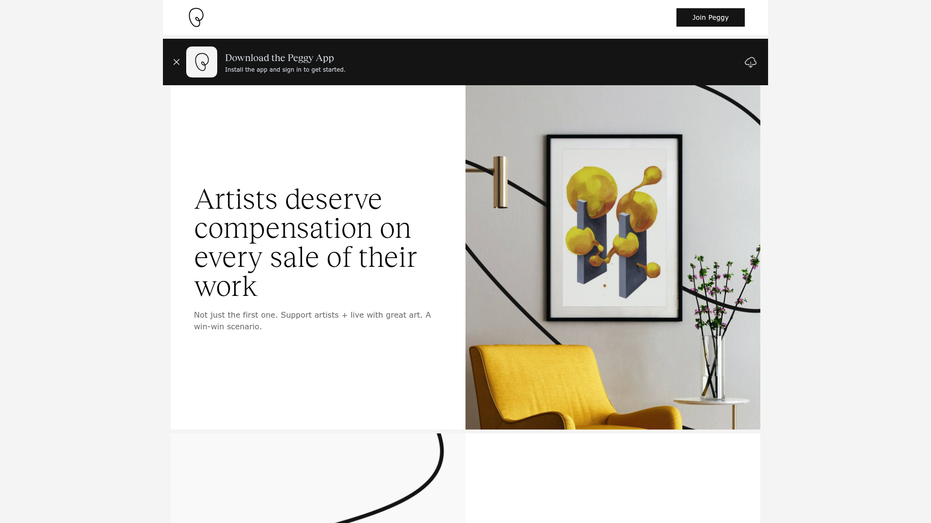
Peggy Art Royalties Pitch Page
A clean storytelling layout featuring alternating image-text sections, a three-column testimonial grid with circular avatars, and a icon-based feature grid for brand values.
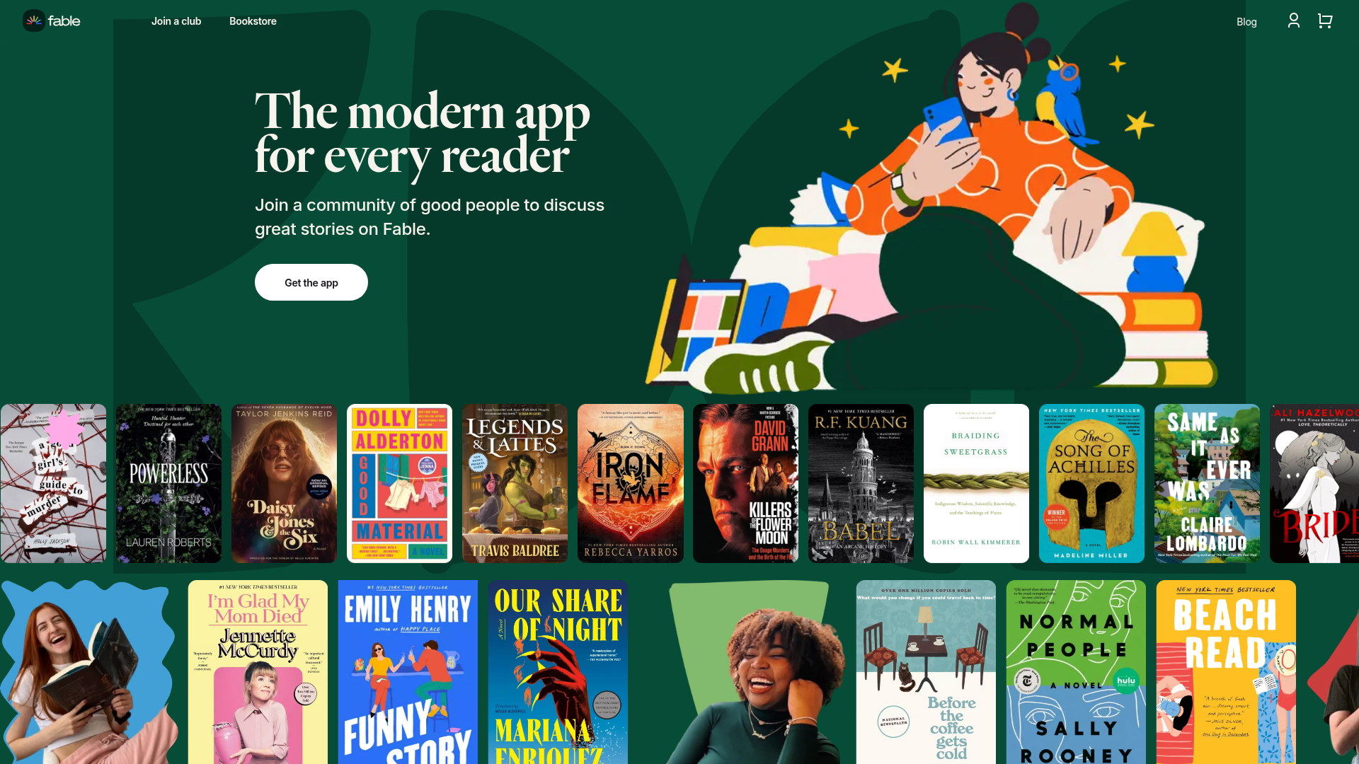
Fable Social Reading Landing Page
A vibrant community site featuring a dual-row animated book cover slider, bento-style feature cards with parallax transforms, and a horizontal gallery of popular clubs.
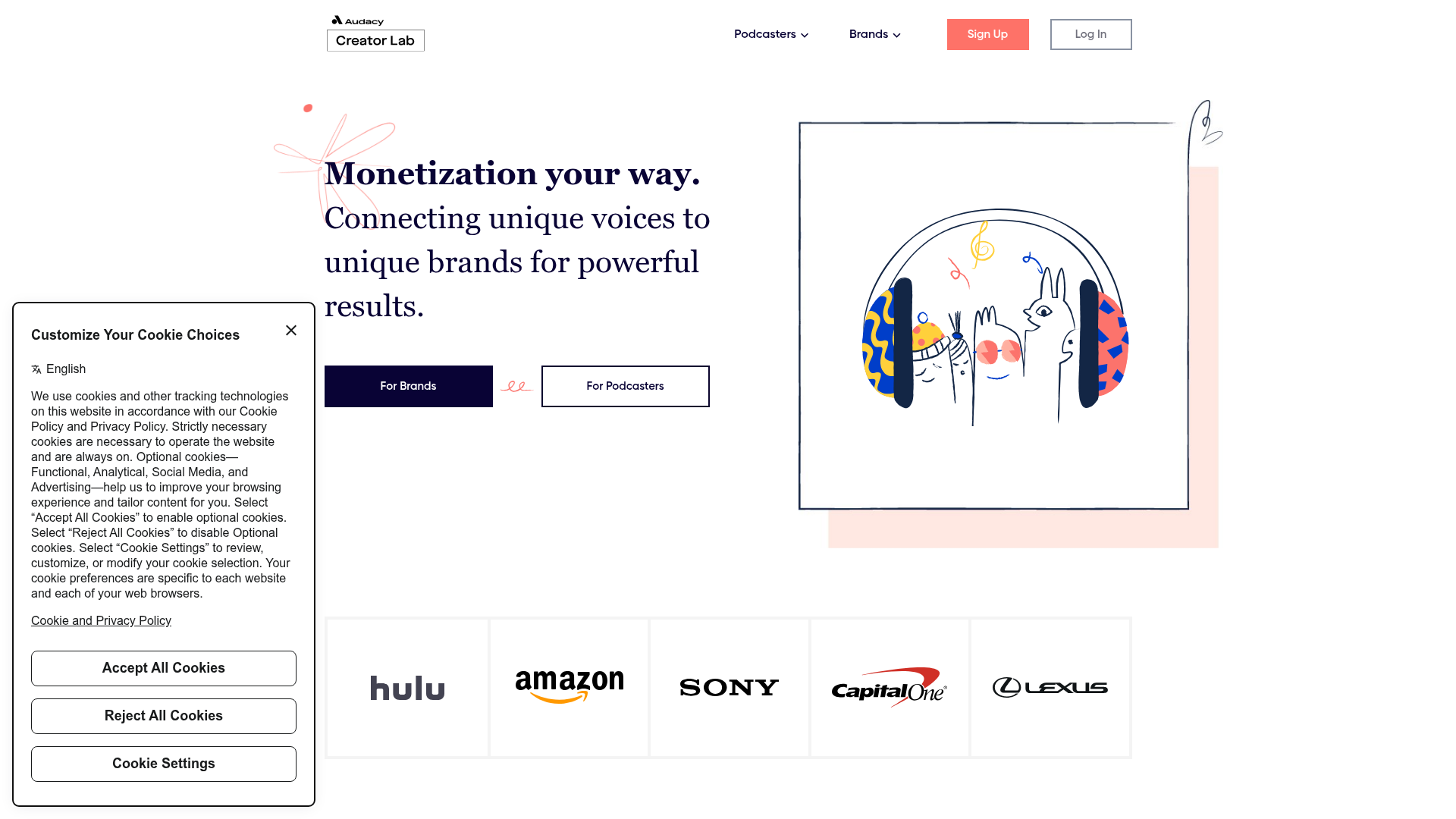
Audacy Creator Lab Marketplace Landing Page
A clean marketplace landing page featuring a dual-CTA hero section, an auto-scrolling partner logo ribbon, animated illustration containers, and three-column feature cards.
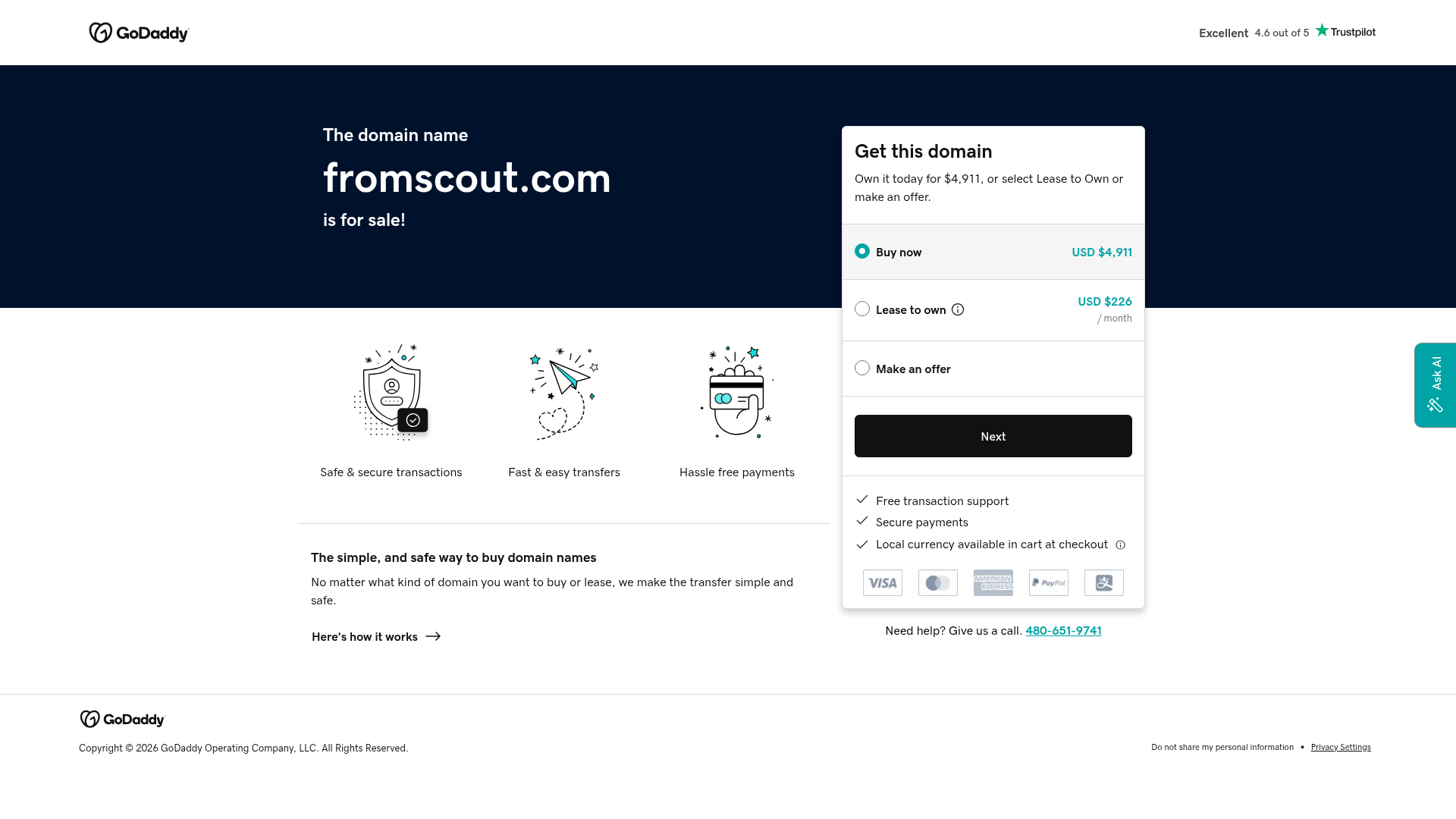
GoDaddy Domain Sales Landing Page
A clean, functional landing page layout featuring a split-hero section with a multi-option pricing card, payment method icons, and custom SVG benefit modules.
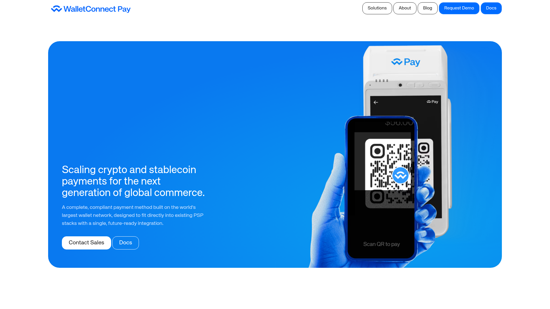
WalletConnect Pay Crypto Hero Page
A high-impact landing page featuring a full-width blue hero section with side-by-side text and hardware mockup, bento-style feature grids, and a clean blog post masonry layout.
