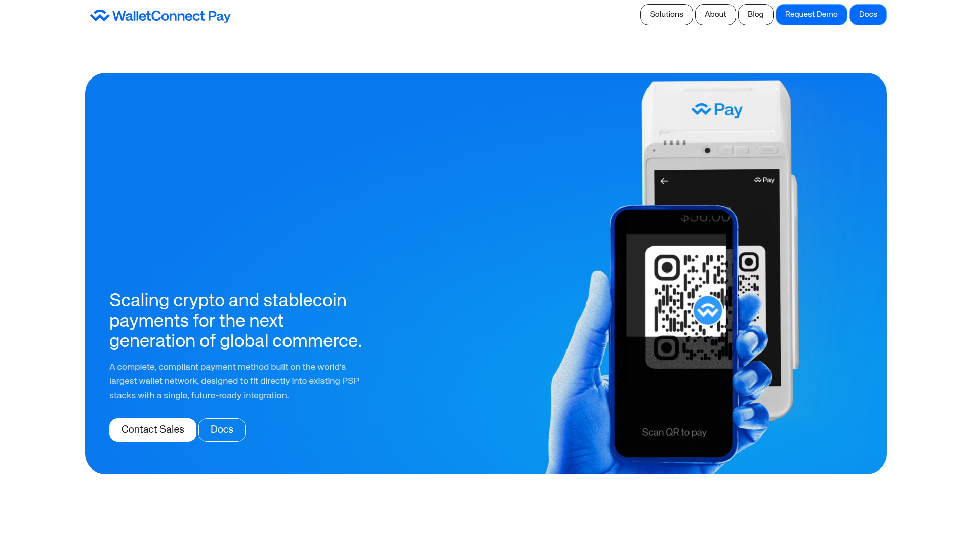
WalletConnect Pay Crypto Hero Page
A high-impact landing page featuring a full-width blue hero section with side-by-side text and hardware mockup, bento-style feature grids, and a clean blog post masonry layout.
Overview
This high-impact landing page for WalletConnect Pay demonstrates how to market complex B2B infrastructure through a clean, fintech-inspired aesthetic. It effectively balances bold branding with high-fidelity hardware mockups and structured feature grids, making it an excellent reference for SaaS, Web3, or Fintech products needing to establish immediate technical credibility.
Design System
- Color Palette & Visual Hierarchy: A saturated primary blue (#0066FF) dominates the brand identity, used for the main hero background and selected feature cards. This is contrasted against a clean white canvas for content sections. Hierarchy is established through extreme contrast between full-bleed color blocks and minimalist white-space-heavy sections.
- Typography: A modern, geometric sans-serif (f-headline/f-body). The scale is aggressive, with large headlines for value propositions and smaller, high-contrast secondary text for technical descriptions. Headings are typically weight-balanced with medium to semi-bold emphasis.
- Page Structure: The layout follows a modular flow: a 16:9 full-width hero card, an inline announcement bar, a three-column image gallery, a 50/50 text-and-logo-grid section, a three-column benefit grid with icon badges, and a blog masonry footer.
- Reusable Components:
- Bento Cards: The core unit of the page, using
card_card__tO5C5with CSS variables for column spans (--col-span-desktop) and aspect ratios. - Buttons: Rounded-pill CTAs including primary white/blue, dark, and ghost-outline variants.
- Logo Grid: A flexible grid with rounded borders for displaying integrations or partners.
- Blog Cards: Integrated vertically into a masonry-style list with clean image headers and date/category kickers.
- Bento Cards: The core unit of the page, using
- Interaction & Implementation: The HTML reveals a Next.js-based framework using CSS Modules. The appearance of "in-view" classes suggests scroll-triggered entrance animations. Components are built to be highly responsive, as seen in the grid attributes that reorder elements for mobile (
--order-mobile).
Use Cases
- Who should clone this: B2B technology companies, infrastructure providers, and fintech platforms that need to showcase both physical hardware (POS) and digital integration (APIs).
- Effective Remixes:
- Hardware Showcase: Swap the payment terminal mockup for servers, medical devices, or smart home products.
- Integration Focus: Use the 50/50 logo grid section to highlight ecosystem compatibility.
- SaaS Pricing: Adapt the three-column feature grid into a pricing tier comparison by replacing icons with price points.
- Clone Scope: Builders can perform a quick section clone of the Hero Card (ideal for high-conversion landing pages) or a full-page clone to leverage the cohesive B2B content strategy and professional color-blocking.
Related Inspirations
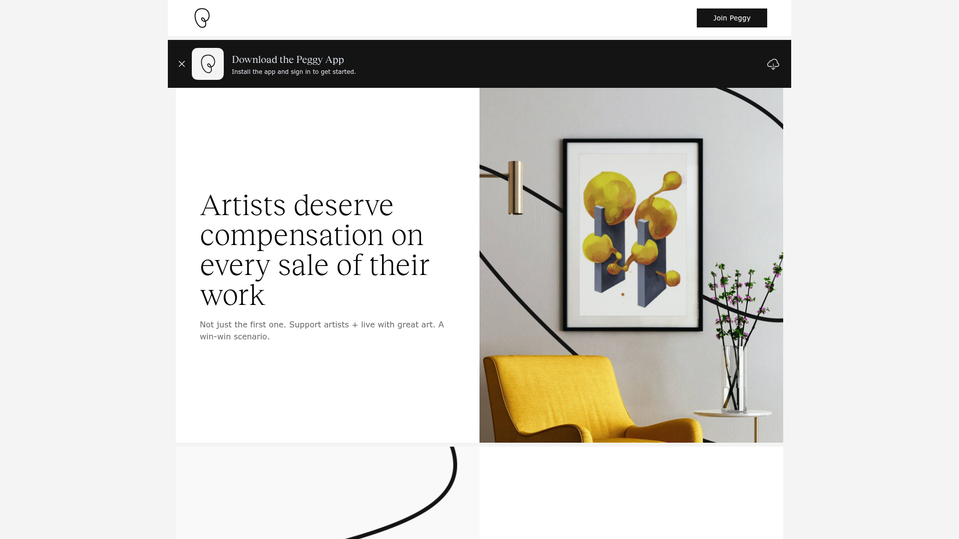
Peggy Art Royalties Pitch Page
A clean storytelling layout featuring alternating image-text sections, a three-column testimonial grid with circular avatars, and a icon-based feature grid for brand values.
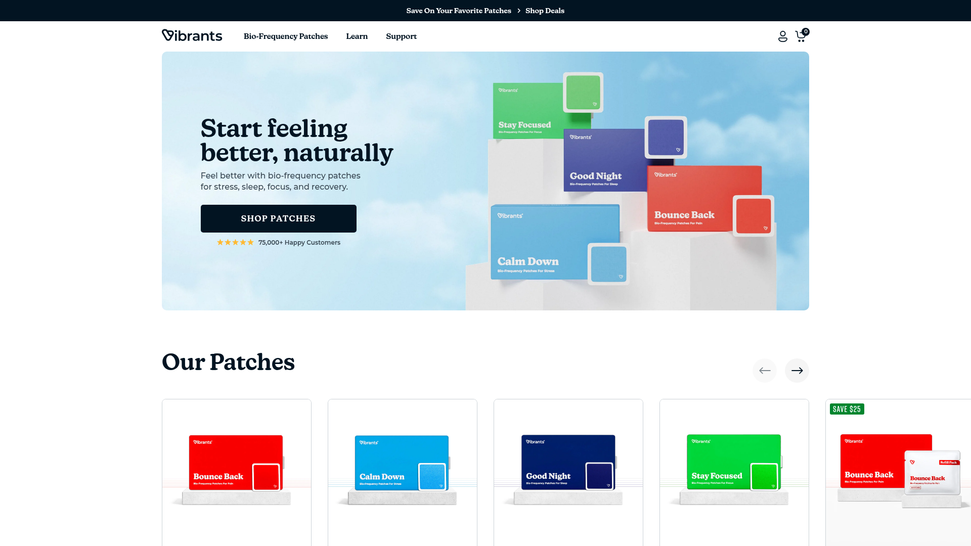
Vibrants Wellbeing E-commerce Landing Page
A clean Shopify-style landing page featuring a full-width hero with overlaid product cards, a horizontal product slider, and interactive cart drawer with utility progress bars.
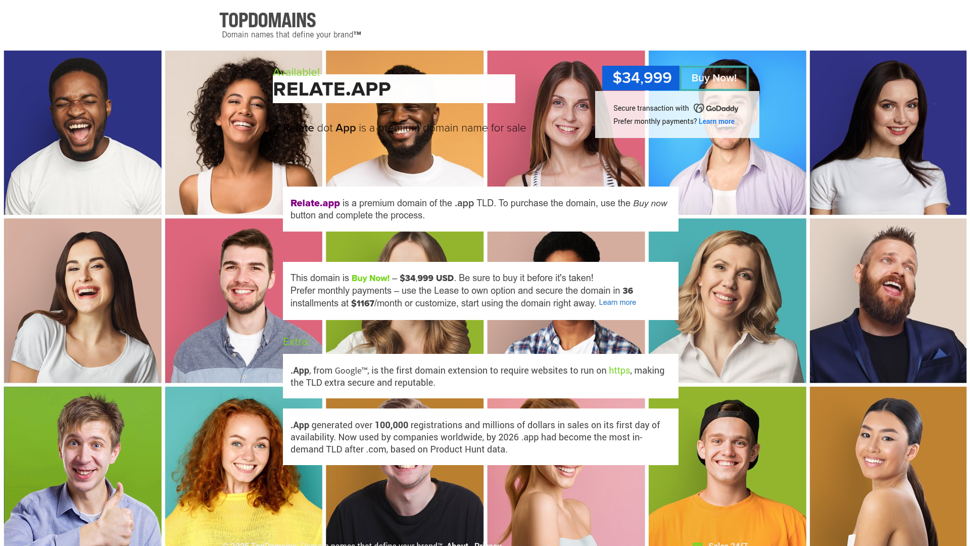
Relate.app Domain Sales Landing Page
A high-impact domain landing page featuring a centered content overlay on a dynamic human-centric background grid with clear pricing and 'Buy Now' call-to-action components.
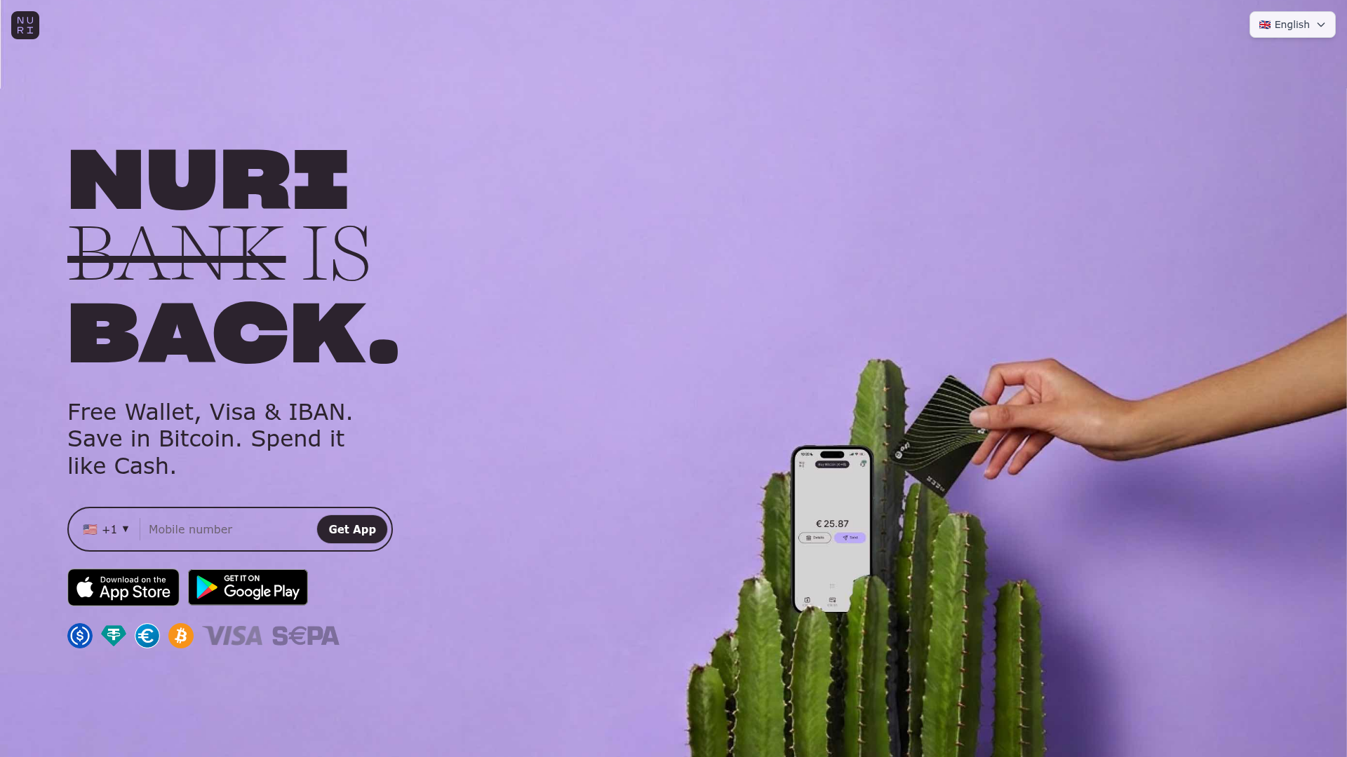
Nuri Cryto Banking Landing Page
A high-impact landing page featuring a bold typography hero, a phone-number signup component, and a sticky scroll-driven feature showcase with centered mobile mockups.
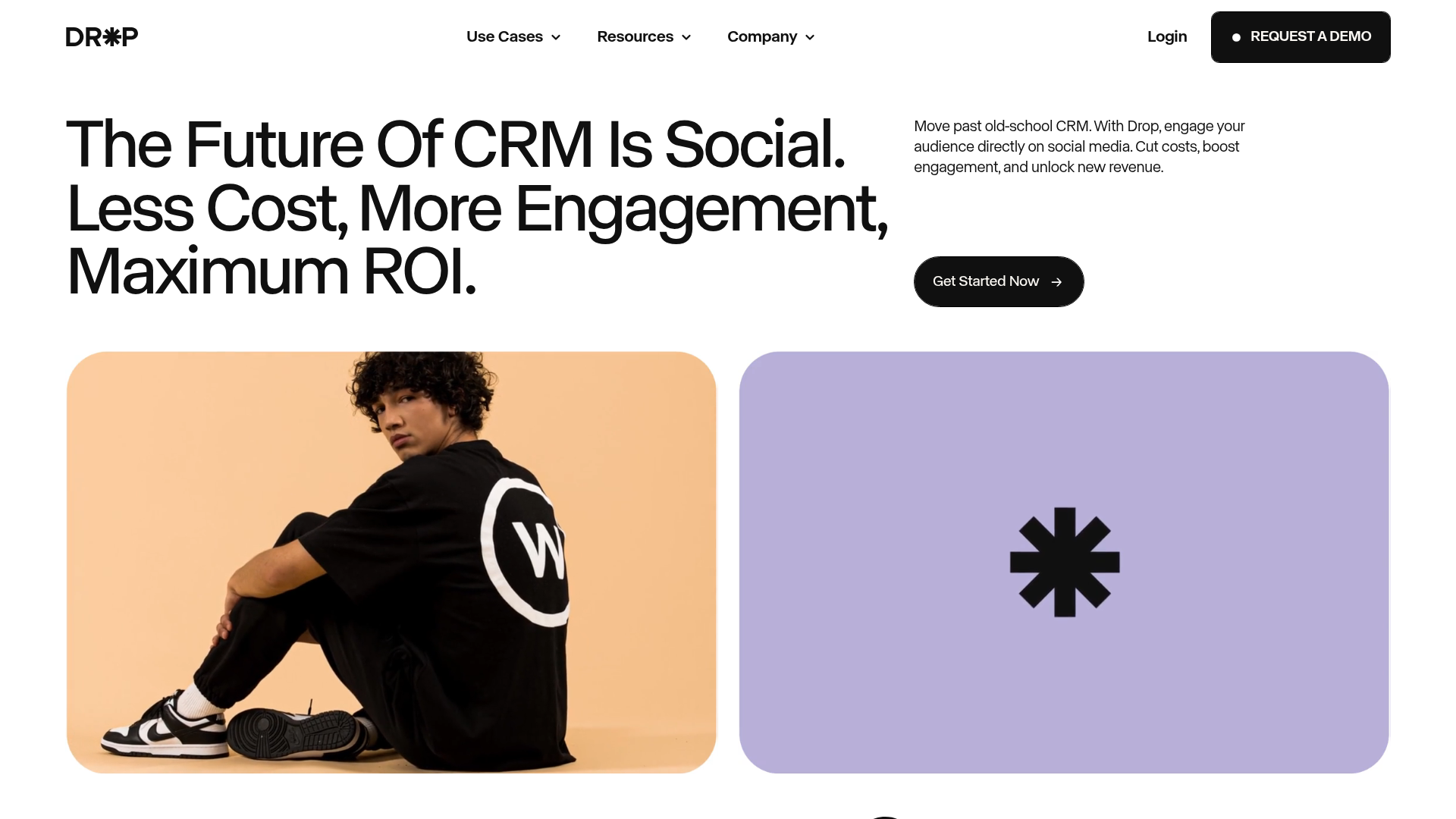
Drop Social CRM Landing Page
A modern SaaS landing page featuring a minimalist large-typography hero section, rounded bento-style image containers, and a clean navigation bar with a CTA.
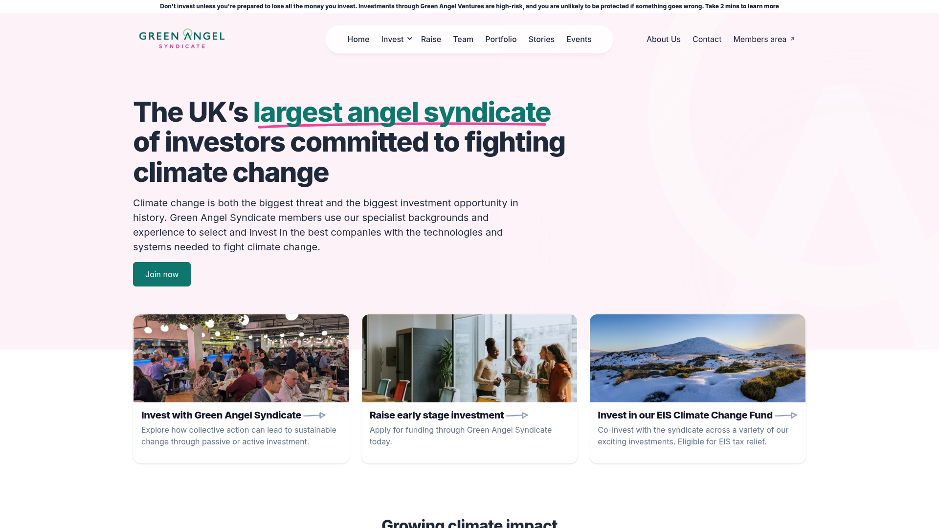
Green Angel Syndicate Investment Landing Page
A clean venture capital landing page featuring a hero section with card-based navigation, a four-column stat grid, and alternating split-layout content sections with image-text pairings.
